Readymag Websites of the Year: Behind the scenes of the design contest
The Readymag team shares the whys and hows behind the Websites of the Year contests, highlights their favorite projects and gives advice to future participants.
Have you ever wanted to get a sneak peek at the backstage of a design contest to learn why and how such competitions are held? Let us bate your curiosity: in this article we’re opening up about our yearly Websites of the Year contest, which celebrates skill and creativity in web design. Find out more about the contest’s background and motivation, its challenges and changes, and get firsthand advice from the Readymag team for your future winning designs. And don’t miss the bonus: we’re sharing the best picks from previous contests, so you’ll get a massive splash of visual inspiration.
The mission
Alya Datiy, Head of Marketing at Readymag: At Readymag, we consider ourselves advocates for designers. Besides practical goals we set as a tool, we give users space for creativity and self-expression. Readymag was created by designers for designers, that’s why we understand how important it is to get recognition and have a platform where you can experiment and show your work to the community.
We’re committed to promoting experimental and outstanding designs in different ways: on social networks, on the Examples page, in this blog, and in editorials. The Websites of the Year contest is one of these ways, and it stands out for two reasons. First, in this contest, the designs speak for themselves without words. Second, during the competition, the community has more influence on the selection of projects to win than on which projects end up on social networks or the Examples page.
In addition to advocating design work, we’re excited to pick the best use cases for our tool.
The selection process helps us understand which features are most relevant to our users.
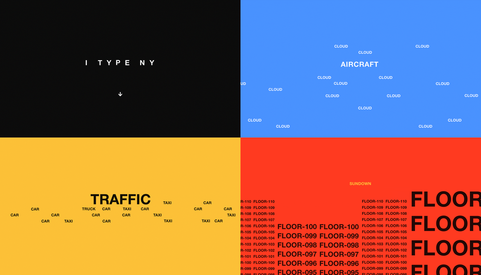
Tsvetelina Miteva, editor at Readymag: We’ve been holding the Websites of the Year contest since 2013, and have seen the quality of submissions grow each year. In earlier contests, projects were technically and visually simpler because Readymag itself had fewer features. But all of the projects were still visually different and belonged to their own era.
If you keep track of the Websites of the Year, you can watch how visual and web design trends change over the years and see the avant-garde of the web.
What's more, from experience we see that the chosen works set the bar high, and the ones that follow pick it up. The winning designs perfectly reflect the development of Readymag. The more technical and creative opportunities we give, the more designers use them to create increasingly complex and functional projects with broader goals.
Challenges and changes
Alya Datiy, Head of Marketing at Readymag: We strive to refine the contest by making it more transparent, getting higher quality applications, and increasing users' motivation to vote for projects. That’s why we’ve introduced several novelties in recent years.
Until 2020, we awarded winners a free annual subscription, but last year we acknowledged that the best way to support designers is to offer them cash prizes.
Now we provide extra value not only within our tool, but also give a grant that motivates creators to be bolder in their designs.
We've extended the deadline, so don’t hesitate to submit your projects before October 12, 2022, and compete for the prize supporting your boldest future experiments.

In 2021 we faced cheating in the voting process for the first time but managed to settle the problem. We contacted the team of the voting tool and made sure that unauthorized votes were not counted. The situation was clearly unpleasant, but there was also a positive side: we saw that the Websites of the Year contest had become valuable enough for users to come up with tricks to win. This time we will ensure the security and fairness of voting.
This year we came up with a submission system. Previously, the Readymag team selected nominees from the projects featured in Examples during the year. There were so many great designs that our internal judging process became long and burdened. The submission system makes the selection more efficient and open, letting designers select particular projects for the contest.
In addition, this year we’ve changed the jury: the team that selects the nominees will now include both designers and people who interact with projects on other levels: the content and marketing teams.
A lossless contest
Tsvetelina Miteva, editor at Readymag: Readymag Websites of the Year is designed so that if your project was nominated but didn't win, you still get as much attention as we’re able to give. We mention the nominees on the landing page and actively promote them on our social networks. Even if you don’t win this contest, nomination itself is a great perk.
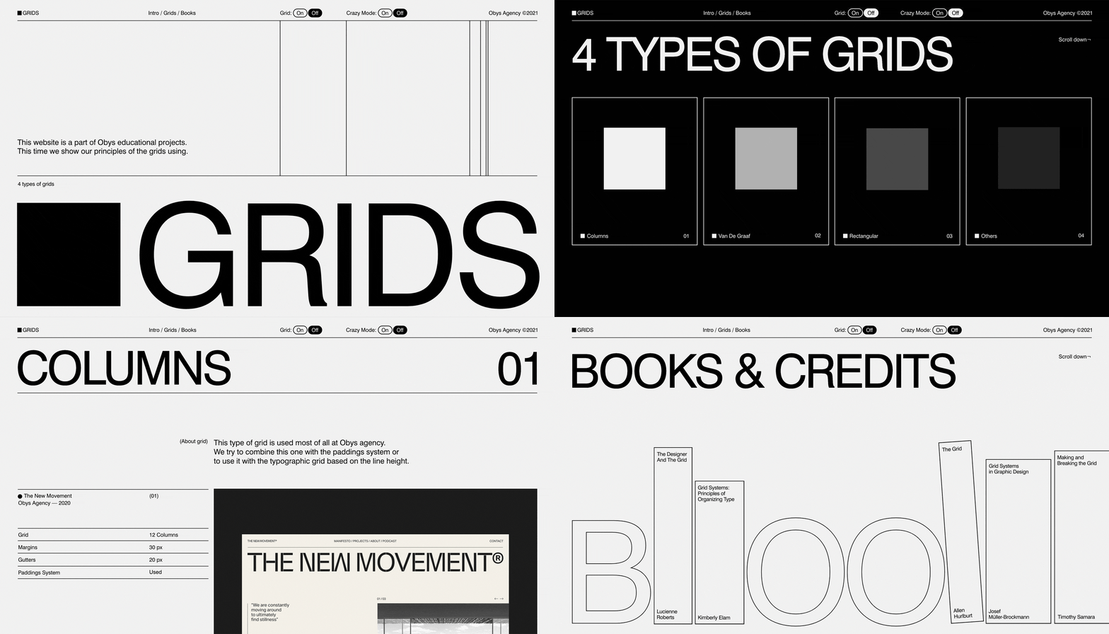
There are no repeat winners who make it impossible to get to the top. Our contest is always about fair and equal competition, in which you only show your design skills. There are some great individuals and studios who, from year to year, submit extremely cool projects, getting at least to the shortlist—for example, designs by the Ukrainian studio Obys Agency or solo creator Anton Repponen. We keep and develop relationships with the authors of great designs: featuring them in our articles, spotlighting their creative processes and giving them extra coverage.
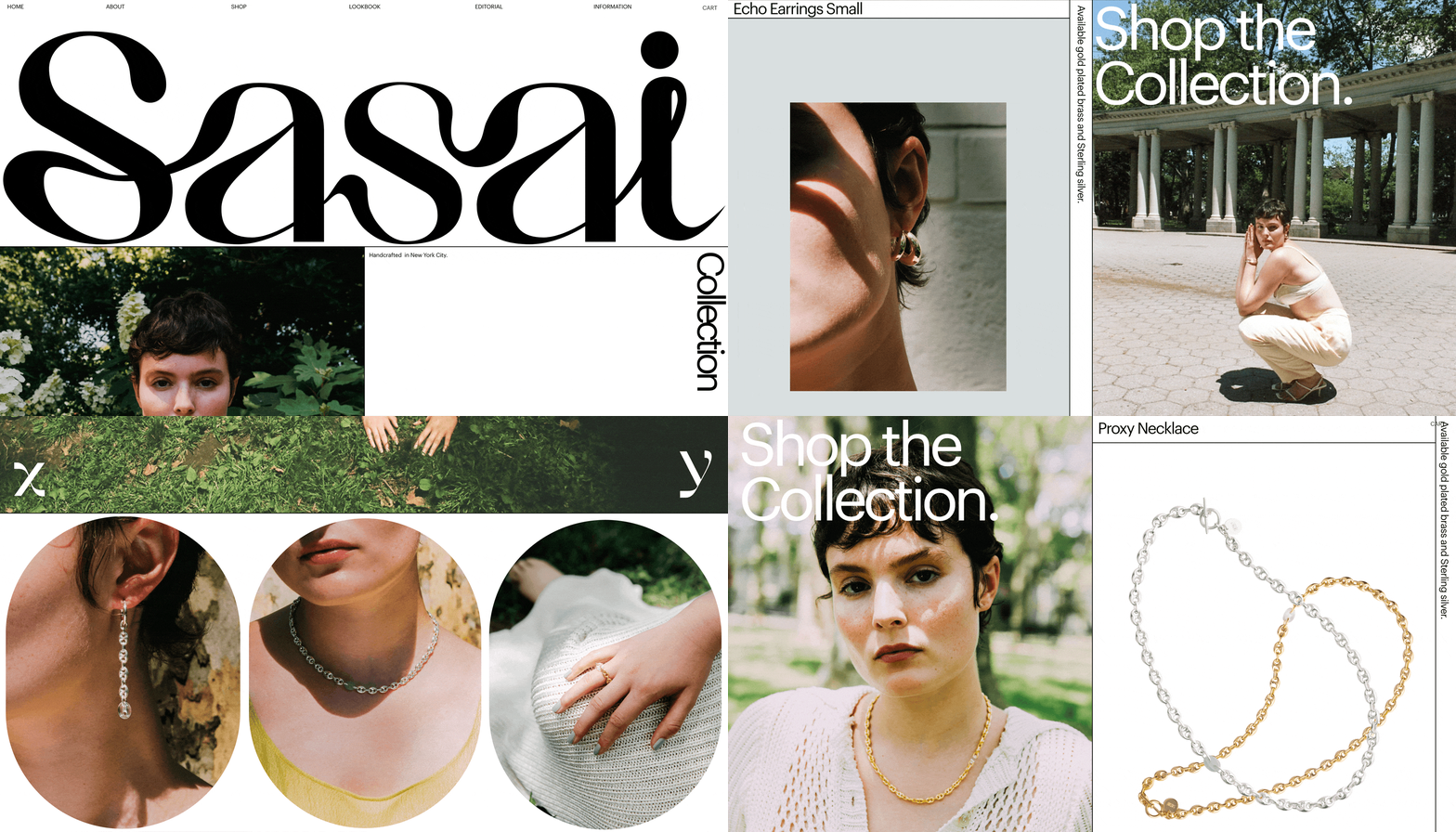
Alya Datiy, Head of Marketing at Readymag: We’ve always had specific selection criteria: we mainly focus on the innovative spirit of the project, the typography, and mastery of Readymag. As an unconventional tool, we select outside-of-the-box solutions where designers use their skills not only to achieve an obvious commercial goal but to bring something new to the visual language of the Internet.
Our logic can be proven by the composition of the nominees and winners: some designers may even have only one site on Readymag. They choose the tool for their specific purpose, do a great and unconventional job, and win the contest.
Before you submit
Tsvetelina Miteva, editor at Readymag: Read our article on the selection criteria carefully to increase your chances of winning. There are plenty of tips from the team and links to helpful advice, so you can use the article as a checklist to evaluate your projects. For the same reason, check out the winning projects, especially those from 2021. And most importantly—take the time to dig into the Readymag arsenal. We're constantly adding new features and improving the ones you already love, and the more you use them, the cooler the outcome.
Tatsiana Egoshina, designer at Readymag: It’s crucial to keep an eye on the little details: whether the mobile version is properly adapted, the loading speed and the quality of the pictures are good.
You need to fix anything that might distract or annoy the viewer because these subtle aspects spoil the overall impression.
Even the most incredible design loses out if you have to wait for it to load.
Alya Datiy, Head of Marketing at Readymag: I feel that putting your own creative work out for judgment is always nerve-wracking. So you have to observe how contests affect your self-esteem. Of course, there are certain advantages in pushing yourself against the opinion of the community—you can learn a lot that way. But entering contests and winning them is not a crucial part of being a great studio or designer. I recommend considering the contest as personal entertainment, a chance to tickle your nerves, look at others and get some extra promotion.
Ready to stand out? Submit your website for Readymag Websites of the Year 2022 before October 12 — the extended deadline.