Readymag Websites of the Year 2022: shortlisting criteria explained and exemplified
The Readymag team elaborates on the criteria we’ll consider when assessing submissions to the Readymag Websites of the Year 2022 competition.

Readymag Websites of the Year celebrates works that push the boundaries of the web. We look for websites that set the bar in terms of functionality, aesthetics, social impact and humanistic values that make them deserving of the limelight. Launched in 2013, the contest levels the playing field to ensure that solo designers, studios and agencies all have a chance to be recognized.
This year we’ll be using a dual judging system. First, all submissions will be reviewed by the Readymag designers and editors, who will draw up a shortlist. Then, finalists will be upvoted by the public. Below, the Readymag team elaborates on the criteria they’ll consider when assessing submissions to the 2022 competition. In each category a project can score 1-5 points, which will make up a cumulative shortlist.
Command of Readymag
Readymag aims to spark creativity in its users in many ways, but first and foremost we do our best to develop and release up-to-date features that allow designers to create functional, interactive, eye-catching websites, explains Stas Aki, Readymag Product Designer.
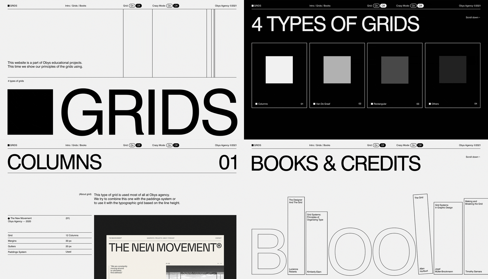
Our first criterion is your command of Readymag as design software. Just to name a few power features:
- Animations: In Readymag, you can create triggered, multi-step movements that activate on click, hover, load or scroll. Animations are for sure a key ingredient for interactive visual storytelling.
- Shots: This feature allows you to create a sequence of user-controlled video experiences and bring your interactive animations to a new level. Your video will only play On Scroll or On Hover, giving users manual control over the speed and repetition of playback.
- Video backgrounds: These can bake some much-needed depth into your visual storytelling by converting an entire page into a story and immediately setting the tone.
- Custom cursors: By transforming the classic cursor into an offbeat and unique visual device you can add a nice aesthetic twist, enrich user experience and even make the project friendlier to people with poor eyesight.
- Code embed: With code embed, the number of user scenarios becomes infinite. You can use it to add more creative features, drive engagement and manipulate the structure of projects.
Consider these features as a source of inspiration, not a necessary requirement for victory. We appreciate how features are used, not their number.
Craftsmanship in design
Secondly, Stas continues, we assess the level of craftsmanship in design. The most important skill for a designer is the ability to build visual hierarchy: by masterfully ranking design elements, a designer can capture people’s attention and pull their focus in the right direction.
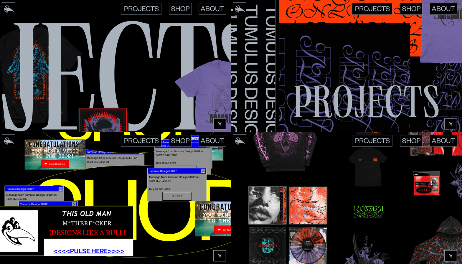
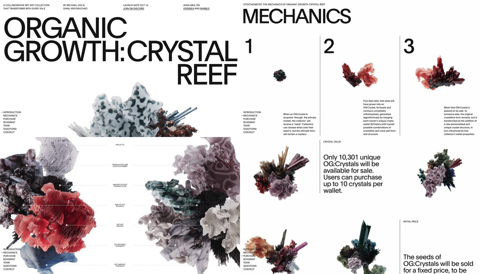
Design has many tools for creating visual hierarchies. Here are a few of them:
- Composition: The flow of composition determines how the eye is led through a design: where it looks first, where it looks next, where the eye pauses, and how long it stays. The Readymag Design Almanac explains the basics of the grid—any designer’s core tool for organizing visual space. As always, remember that rules are meant to be broken.
- Rhythm: By alternating design elements with negative space, a designer creates movement, which then repeats and varies to create rhythm, activate space and create mood. Rhythm can lead visitors through a website.
- Sizing: By increasing the scale of an element, you can immediately attract the viewer’s attention. By playing with perspective, you can create the illusion of distance and separation in your elements to bring focus to the important areas in your designs. Typography: This has a profound effect on the way users digest and perceive the information conveyed by the text. Good typography should guide and inform your viewers, optimize readability and accessibility, and ensure an excellent user experience.
Visual storytelling
‘Show, don’t tell’ is probably the most common piece of storytelling advice. But what makes an effective story? These are the key ingredients:
- Authenticity: This means connecting with the audience and fully depends on your knowledge of its preferences, values and mindset.
- Setting: The location where your narrative takes place. A well-established setting creates the mood you intend and provides the backdrop and environment for your story.
- Plot: This is the sequence of events that connects the audience and their ultimate goal.
- Theme: This is what the story is really about, the main idea or underlying meaning.
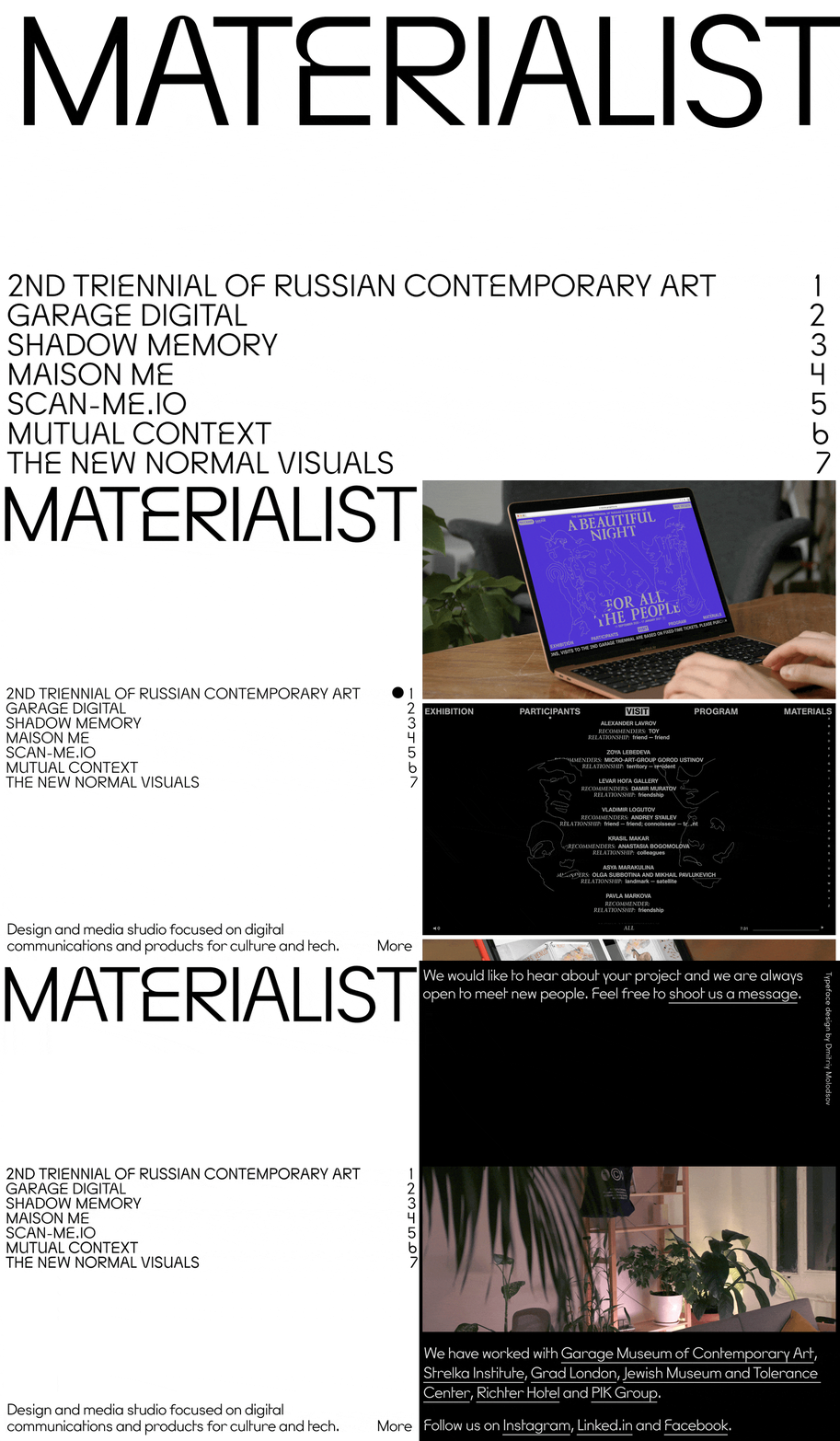
Well-crafted storytelling makes complex subjects entertaining and easy to understand and entertaining, allowing viewers to engage with visual elements without forcing a reaction, explains Readymag Designer Tanya Egoshina.
Readymag provides a degree of interactivity to tell next-level visual stories. Embedded videos and audio bring content to life through sight and sound. Infographics wrap numbers and statistics in visuals that make them more compelling. Illustrations add a sense of artistry that can further add to a website’s mood or emotion.
Speed & performance
Features are not the ultimate factor in determining a website’s value: features on a website that takes more than a few seconds to load will most likely go unseen. A project that aspires to reach and impact must load fast and be optimized for all types of devices. Optimizing websites for different platforms is a common courtesy in web design; moreover, it betters user experience, SEO rankings, traffic and conversions. See our recommendations on how to improve SEO in a project, plus our ultimate pre-launch checklist.
Accessibility
A must for websites, accessibility helps create a more inclusive digital environment for people with different needs. Most basic requirements include:
- Alt tags for images: They help visually-impaired visitors using screen readers.
- Nested heading levels: Organizing web pages using headings helps users get a sense of the page’s organization and structure. Using headings and making them visually apparent is especially helpful for users with cognitive impairment.
- No seizure-triggering animations: Flickering lights may trigger seizures in users with epilepsy. The defined threshold is no more than three flashes in one second.
Consult with our accessibility checklist to learn how to make your Readymag website comply with these requirements.
Text content
If you use writing in your project, do it meaningfully: every word must contribute to the story you’re trying to tell. We firmly believe that ideas conveyed in the project must be original and coherent. In terms of tone of voice, ideas and text must seem reasonable and boost the overall project impression.
Impact
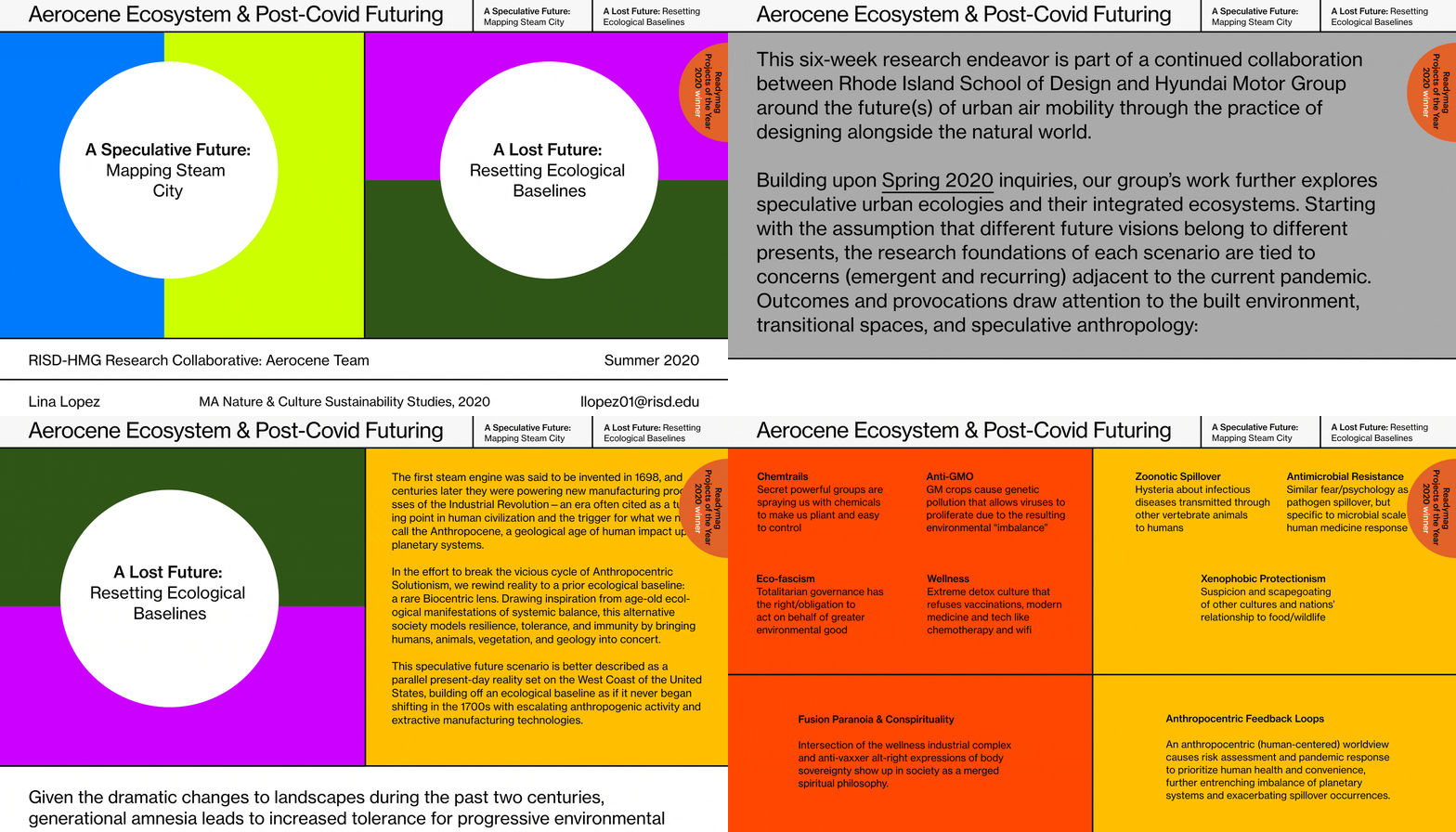
Impact is the positive change that your project has or creates over time. We appreciate both projects that challenge global issues (for example, peace, ecology, inequality, women’s rights, and others) and aim to boost development in the design community. Promote your values and connect to important world issues.
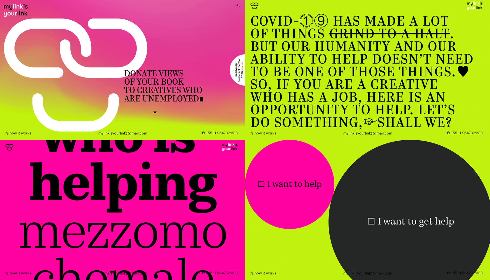
“There is always space for impact, especially in design work. It’s more obvious, of course, in socially oriented projects. But commercial designs can be impactful, too, and it’s not only what you sell that counts, but how you present it.”— Alya Datiy, Head of Marketing at Readymag.
We’re constantly looking for ways to develop spaces for creativity and highlight groundbreaking designs, and are looking for innovative, visually impactful websites that overcome old tropes in new ways.
Want to take part in the 2022 contest? Don’t hesitate to send us your submission October 12 — the extended deadline.