Readymag website of 2022: Design portfolio made as an online gallery
Graphic designer Janice Feryn speaks about her award-winning portfolio and the principles that fuel her work.

Janice Feryn’s portfolio won the Readymag Websites of the Year ’22 award in Navigation for its overall immersive feeling of a refined digital gallery. A freshly-squeezed Belgian graphic designer, Janice is currently working at London-based design studio Accept & Proceed. We asked her about her work principles, aesthetic preferences, worst fears and things that attract her to join a project as a designer.
A penchant for art, architecture and tech
I’ve always been a very visual person, but I wouldn’t say pursuing an artistic career is something that came super naturally to me. After graduating high school I was clueless about what to study, so I decided to take a Media & Arts course in New York and London for half a year. That was where I first got in touch with design and started to play with the idea of studying something within the arts.
Having graduated only two years ago, I’d say I’m still a freshly squeezed designer finding my way in the industry. In my design practice I primarily focus on visual and brand identities, web design and editorial design. I like exploring the fields of art, architecture and technology—all of these things inherently influence my work.
I love to work on projects that aim to make a positive impact. They force me to understand people on a deeper level and translate this knowledge into something digestible.
Projects of that character often come with complex challenges, which is where things get really interesting. My worst fear is my work being shallow and abused in the interest of it solely being cool.
Translating meanings into things
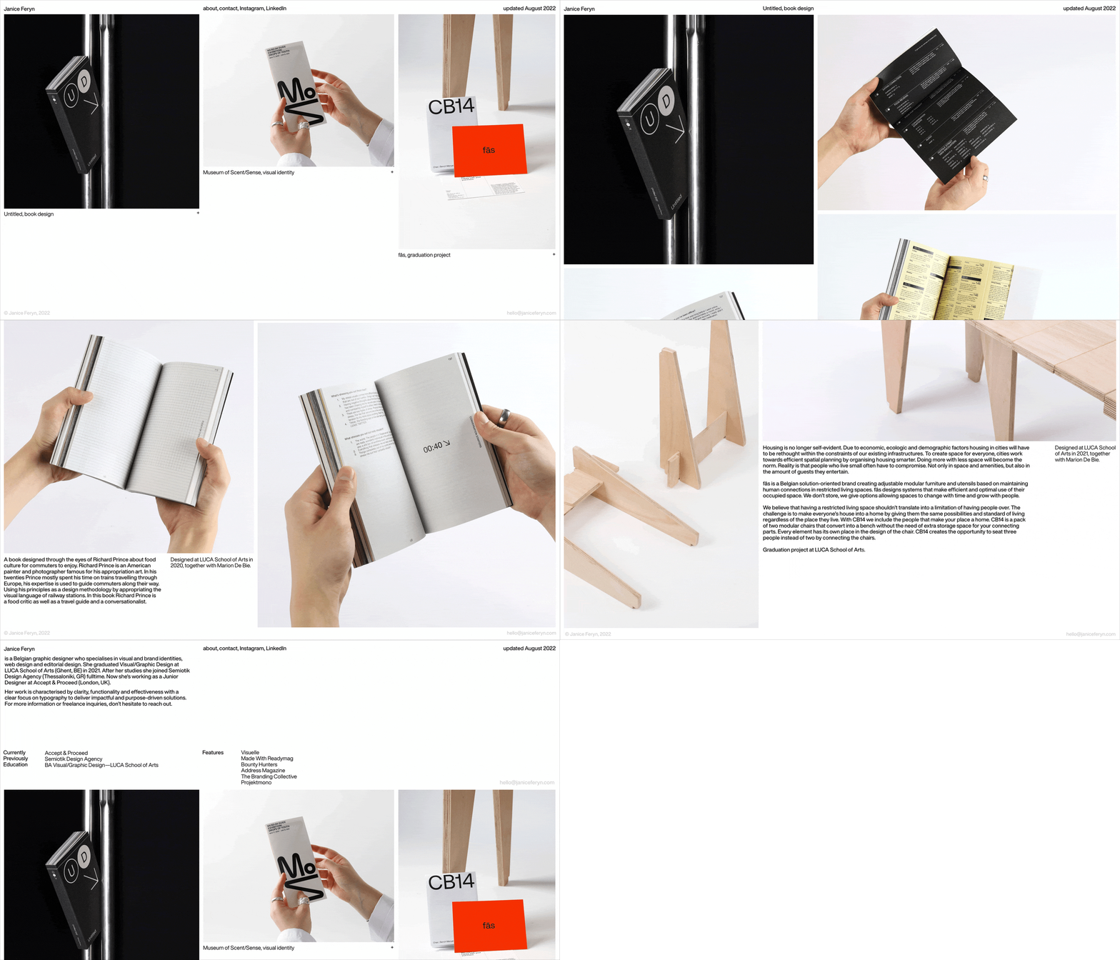
My most loved job is still my graduation project CB14 that I did together with a friend of mine, Marion De Bie. We’re both fascinated by architecture and the way people live around the world, and together we devised fās—a solution-oriented brand that creates adjustable, modular furniture based on maintaining human connections in restricted living spaces.
CB14 is designed as a product by fās. It’s a pack of two modular chairs that convert into a bench without the need for extra storage space for its connecting parts. Every element has its own designated place in the chair’s design. That way, three people can be seated instead of two while occupying as little space as possible.
Digital gallery on the web
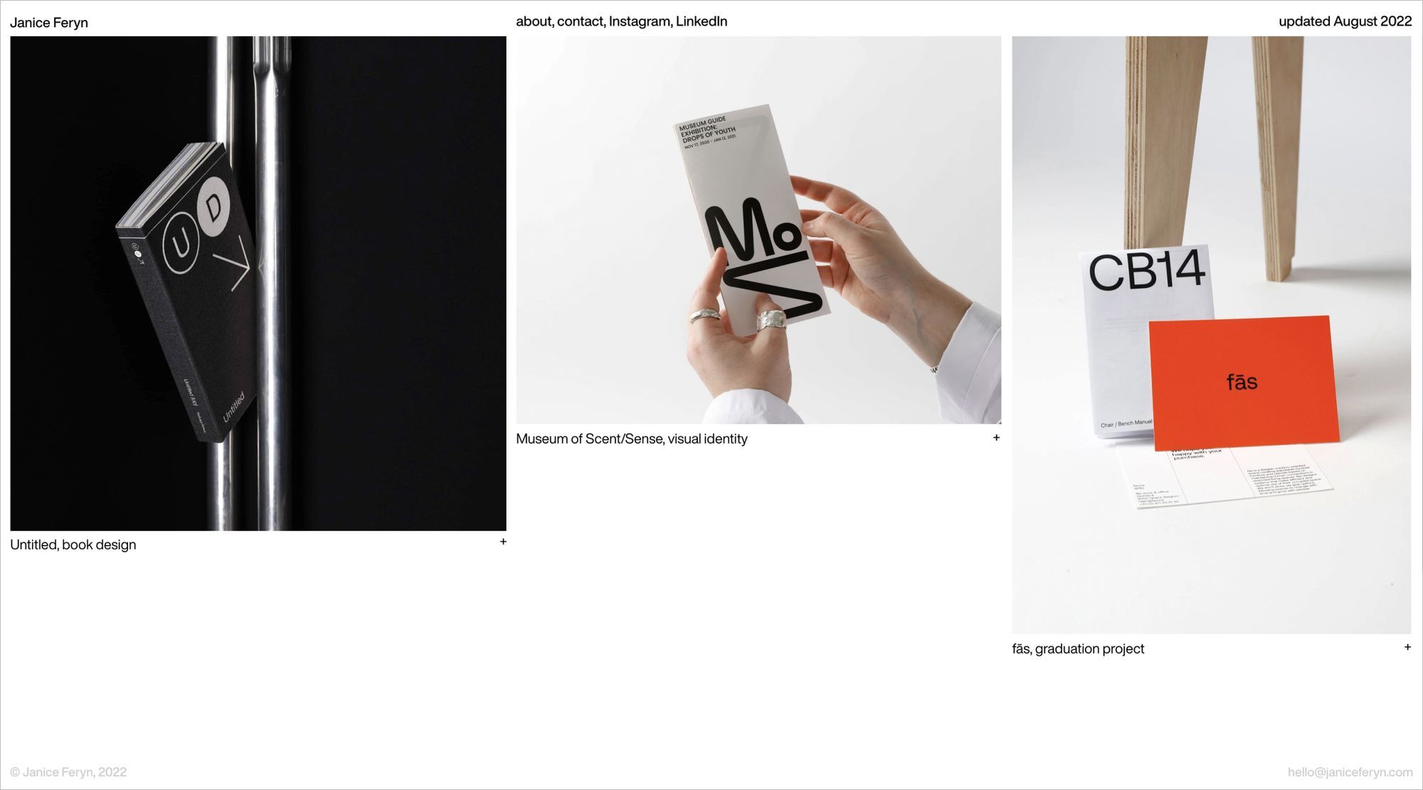
The principle behind my portfolio is to draw visitors’ attention directly to the projects. The use of thought-out white space, consistency in art direction and refined typography limited all distractions to create a gallery-like feeling—I aimed to make the viewers feel as if they would be walking through an exhibition.

This idea came to life thanks to a series of useful widgets that Readymag made available in its toolkit. Simple, yet effective animations—such as click-on plus slide—let me include my biography in the homepage in a non-disruptive way. The (side)scroll paired with move animations allowed me to present my thumbnails vertically to further enhance the gallery-like experience of the website. Also, Readymag’s advanced typography settings enabled me to polish up text legibility. The sleek implementation of digital assets tied the portfolio together to give it an effective look.
Readymag is easily the best web tool for design purposes—especially for designers without any knowledge of creative coding—as it gives you the ability to work with pixel-to-pixel accuracy.