Readymag new profile
Product designer Stas Aki explains changes made to Readymag profile.
Readymag’s user profile page has recently been updated. Product designer Stas Aki explains the recent changes and new features that have been added.
From several pages to two
The first goal we had was to simplify the profile page. The new profile has only two subpages: Projects and Settings.
All of the projects are now displayed on the Projects page. We tried to distill the layout so that space felt flatter and more unified, like the classic OS file systems. All projects are now sorted together. We also added search, archive, and group functions.
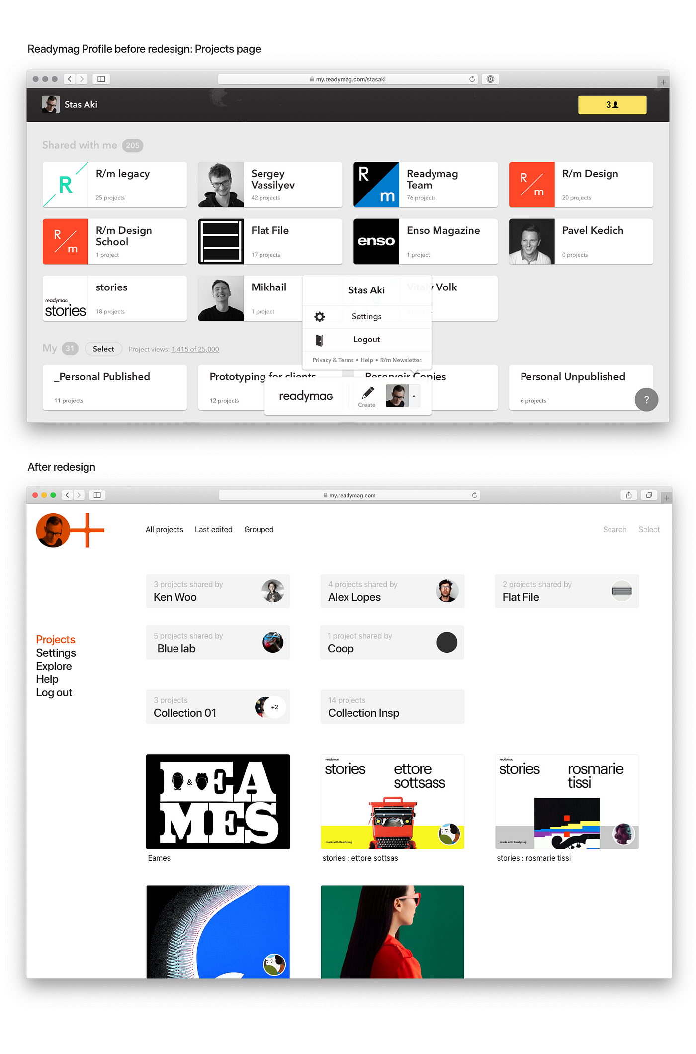
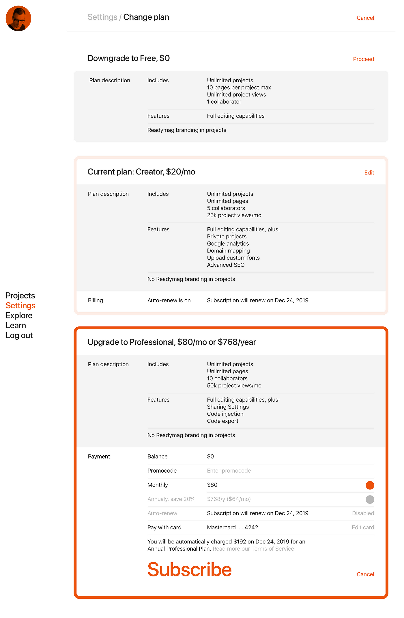
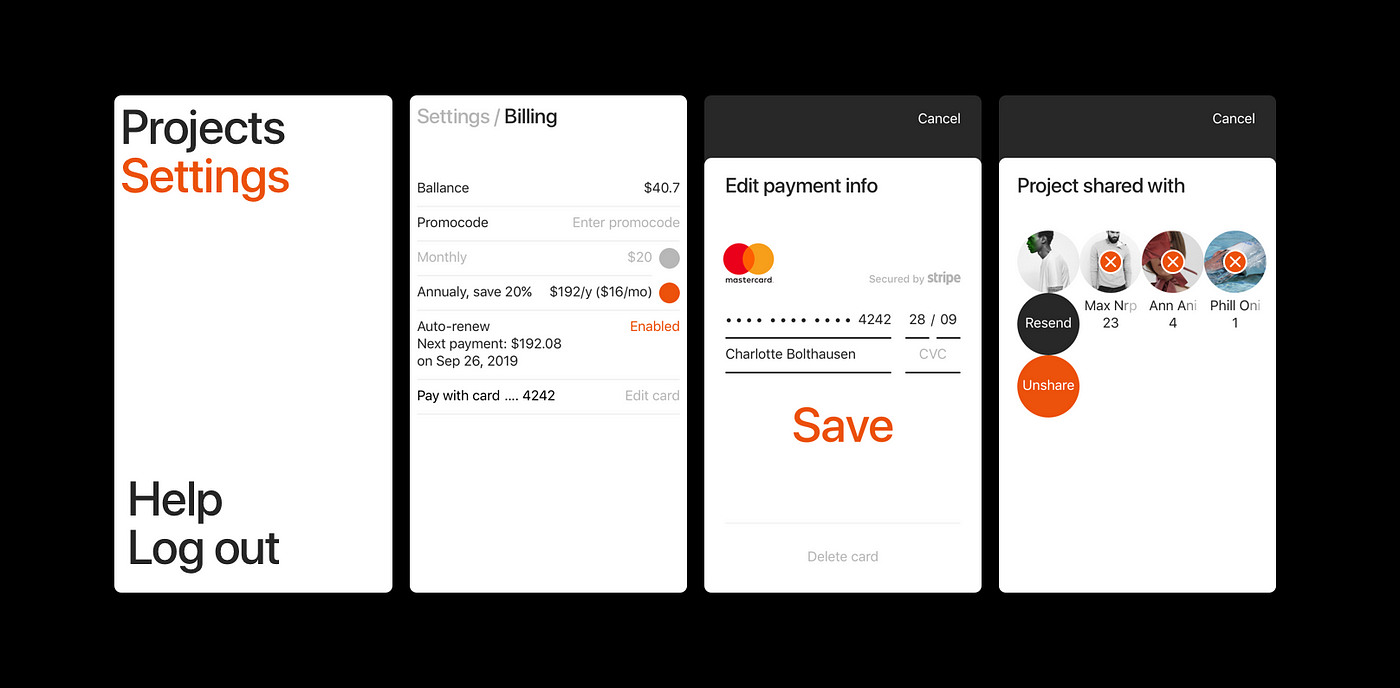
Settings page is the page for managing a profile. Before this update, the settings page was a pop-up, with several subpages. Now it’s a single white page without any graphics, very clean.
We tried to collate all the relevant details there, to diminish unnecessary inconveniences. For instance: previously, users attempting to alter their subscription plan that forgot to click the Update button wouldn’t have their changes saved (since the button was below the fold).
Yet another update pertains to mobile: the mobile version of the profile page offers a full range of functions that are useful when away from one’s workspace.
Group work
We significantly revised the instruments for group work.
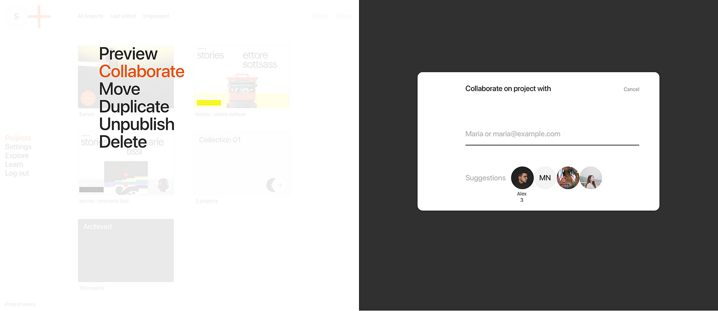
Earlier collaborations were a bit tricky: the full list of projects shared with someone was visible only from a pop-up. Now projects can be shared right from the profile page, by selecting the particular project and inviting others using a simple modal window. You can also view collaborators from a project list, indicated with a circle sign.
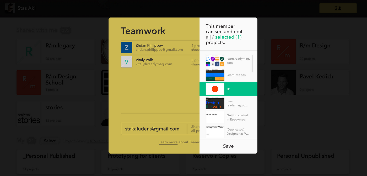
We also added filtration tools. Now projects that were shared by you or with you can be shown or hidden depending on one’s preference.
You can share multiple projects simultaneously, or an entire folder. When sharing a folder, all of its contents are shared as well — which means if you add new projects to it, they will be shared automatically, too.

Visually the profile is much cleaner: we’ve hidden all irrelevant information, such as the Readymag logo, leaving only one’s username and a brief bio.
Users can also make as few, or as many, folders public as desired. These folders can exist separately from the rest of the profile, which is useful when sharing projects with a customer.
Radically simple design
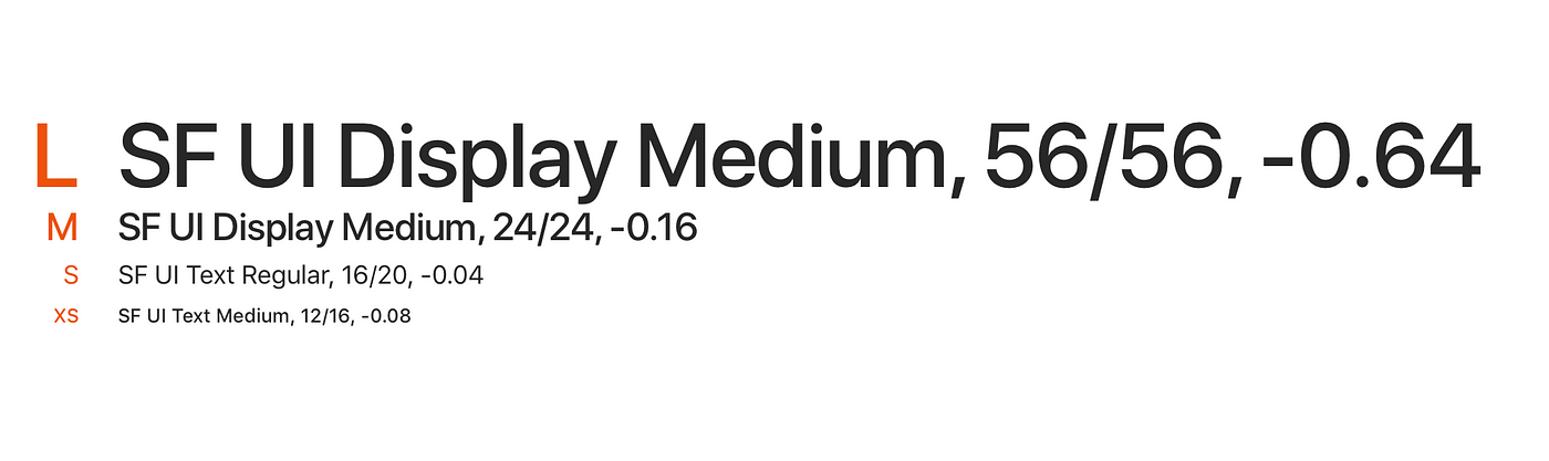
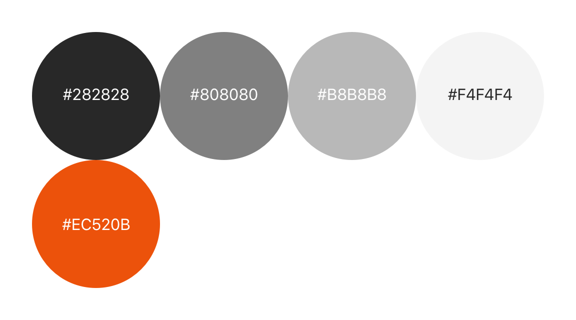
The functional simplification is also reflected in the updated design. The new profile has no shadows, no volume, and almost no animation. We’ve used only five colors — of which four are black, white, and two shades of gray. There are only four text styles with fixed parameters, including interlining. Every design component fits into a four-pixel grid. We also don’t use any particular typefaces, utilizing system fonts instead: San Francisco for Mac, Segoe on Windows, Roboto on mobile, etc.
And there are still more changes yet to come — stay tuned!
Love this story? Explore other pieces from Readymag.
Design digital publications and websites with Readymag.