Read me, break me, recreate me: how to lay out a stunning longread with templates
Pavel Kedich, a graphic designer and Readymag brand ambassador, explains how to adapt each template to your needs and lay out a stunning publication.

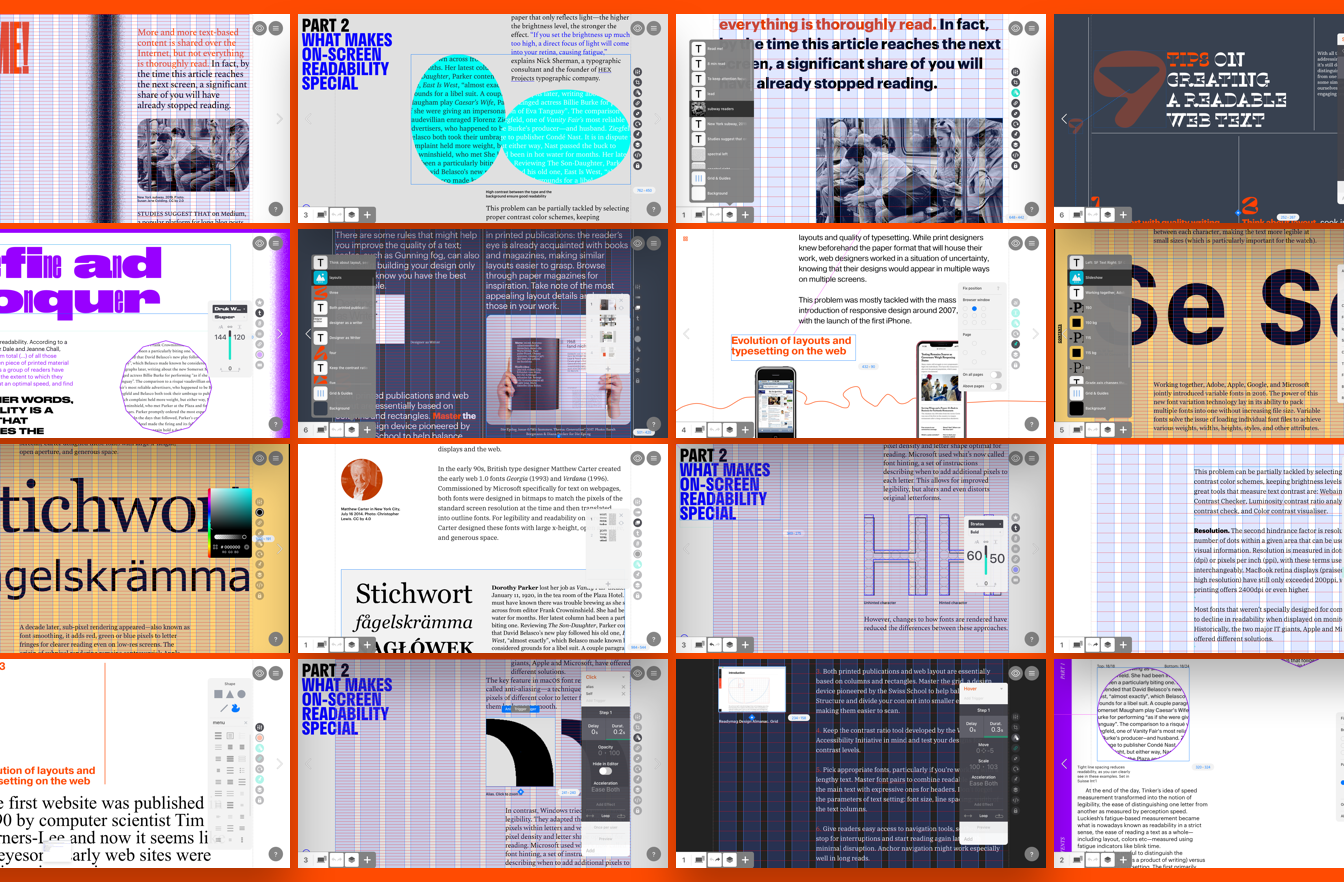
Readymag has rolled out two new templates for editorials and longreads. The first is targeted at juniors learning to handle texts and layouts. The second will catch the fancy of more experienced designers, presenting a building set of typography-rich blocks.
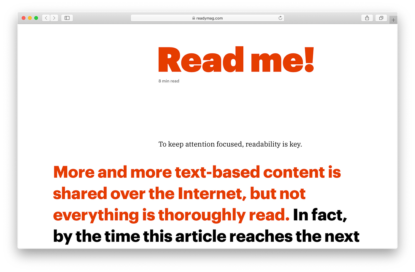
Both templates are based on an essay exploring the evolution of text readability in print and on the web, written by Readymag editors Tsvetelina Miteva and Vitaly Volk. They were created by Pavel Kedich, a graphic designer and Readymag brand ambassador. In this hybrid project, text and layouts complement each other: each template offers tips and tricks to help focus readers and ease text perception.
Today, Pavel explains how to adapt each template to your needs and lay out a stunning publication.
Functional template

This template is a good choice for online publications that don’t want layout to distract readers. Simplicity is its virtue — using this template even a Readymag newbie can quickly lay out almost any text.
Note that headlines and body text stay in the same containers. This helps users swap out dummy text more quickly. It can also help when adjusting the mobile version of your project.
Just a couple basic recommendations
Take a close look at template structure. Explore how text styles, images and captions all align with the horizontal lines of the grid — the space between design elements is regular, which creates a certain visual rhythm. It makes the layout look cleaner and more consistent.
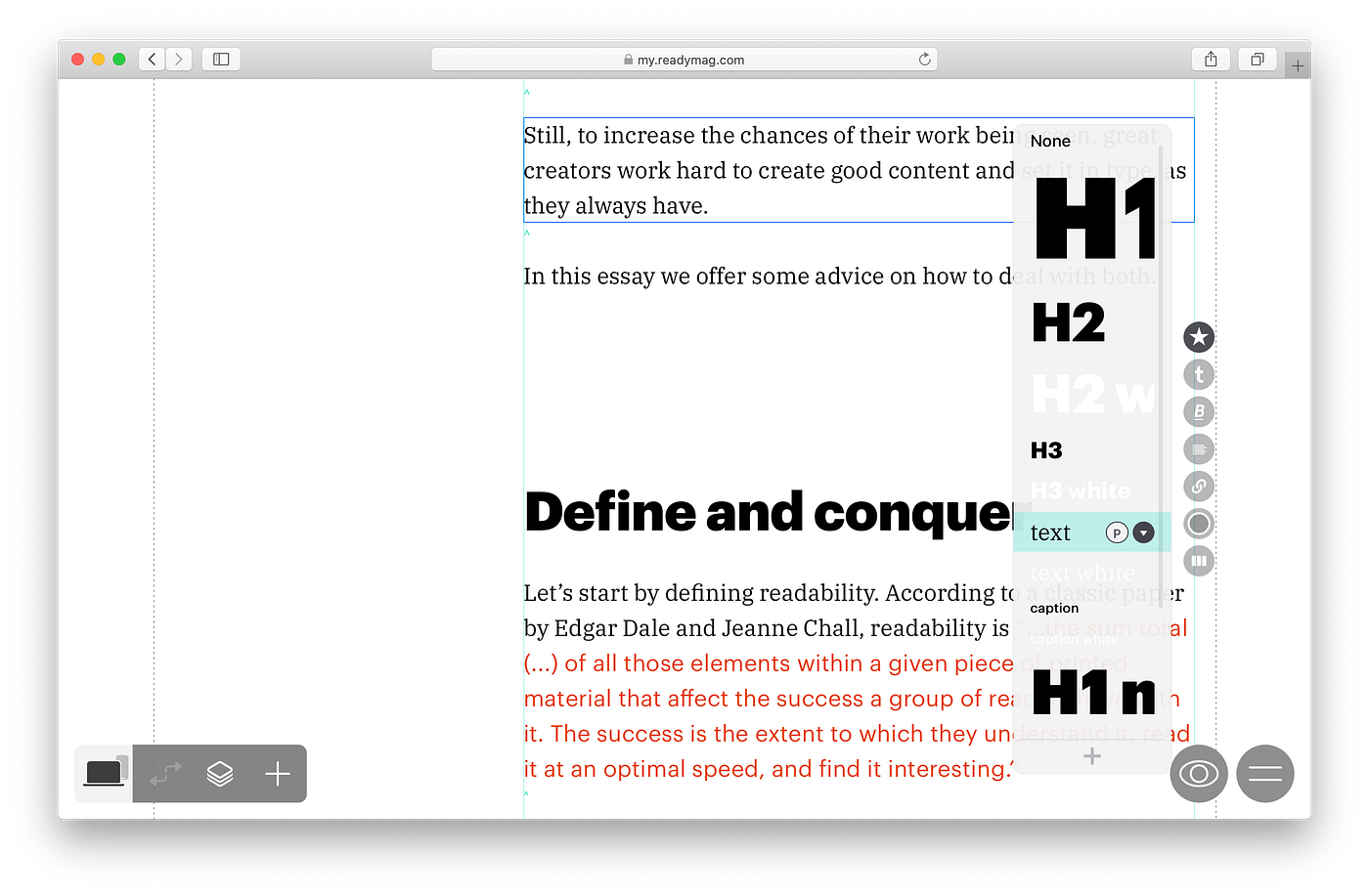
Styles, styles, styles. Look into text styles. Use pre-built fonts or pick something new. But bear in mind that styles are global — once you change font parameters, they will update throughout your project.

Highlight key points. This makes the design more varied. In the template, quotes are set in Graphik and highlighted in orange. Along with that, the size of the font used for quotes and its weight looks similar to the body text, which is set in IBM Plex Serif.
Serif over sans. The choice of Antiqua font for body copy was not accidental: high-quality typography boosts readability and deepens any reader’s commitment. For example, text set in Antiqua with strokes tends to look more expressive than a formal re-telling of the content in geometric grotesque — as a rule, such narratives lack their own personality and character. Use the included font or try to find your own voice by experimenting with other Antiquas (Georgia, Plantin, Garamond, Skola) offered by Readymag.
Asymmetry as a tool. The block with body copy occupies the right eight columns of a standard 12-column layout. Use the remaining columns on the left for illustrations, photographs or additional captions. Leave central alignment and perfect symmetry to blogging platforms.
Template — graphic manifesto
This template presents a constructor made up of six independent text blocks, aimed at audacious and zetetic users. Each of the blocks has its own character and inner logic. Treat them as a set of concepts or sketches, to help you give your narrative a catchy and up-to-date visual expression.
Text styles are not defined in these blocks. After you choose whichever best fits your purposes, you can set text style in the Styles palette.
Block 1: Big fonts and fixed menu

The chunky headline will attract viewers and the fixed menu with contents in the lower-left corner will always remain visible. This organization is well-suited for long texts that demand easy navigation.
Using larger fonts in body copy is a growing trend. The relatively narrow width of text blocks prevents lines from looking too long. Compact and rhythmic sentences are always perceived more easily. To separate paragraphs visually, I shifted the text lines horizontally.
Block 2: Variable font in the headline

Use various styles of Druk font in the headline to make your headline more expressive. Don’t hesitate to make the headline really substantial or chunky — it’s an accidental font and it deserves to be used boldly.
In this layout, indents are made with tabulation: place the cursor at the beginning of a line and press the Tab key.
Away with dull links! Note how the padding and thickness of the underlining turn the link into a curious and unhackneyed design element.
The template also includes some illustrations with on-scroll animation.
Block 3: vertically-shifted paragraphs

Use animation when it can help boost your narrative. To understand the mechanics a bit better, take a look at our example with click-triggered animation in this block.
Also, look into the list of included widgets: in all templates, layers are stacked according to the order in which they appear in the project. Giving names to each layer and keeping them in hierarchical order is a good practice.
Block 4: Smaller headlines and larger fonts for body text

Switching the roles of these design elements can lead to interesting results. The headline in this block is set in a smaller font than the body text. The headline is up against a large white space to balance their proportions.
Fixed widgets and illustrations with on-scroll animations make a layout look catchy, even if it doesn’t feature lots of different design elements.
Block 5: XL headlines and margin illustrations

Find your own way to make stunning headlines. Using a bold font and an indent in the first line may turn your headline into a graphic statement. Make the contrast background a bit more sophisticated: a rectangle with rounded corners above the black background creates a framing effect. Use the margins for illustrations, captions and explanations. This makes the narrative look more vivid and creates an additional layer of information. Look into our example with on-hover animation in the block with variable font.
Block 6: Playful figures

Following a few of the recommendations in our readability essay, I’ve used some lettering with figures in this block — they are included in the form of an SVG file.
The figure in the headline, which starts moving on scroll, is a good example of how to focus readers’ attention. Using the Readymag’s recent update, users are able to set up to four types of animation on one widget.
Also, don’t hesitate to set body copy in a chunky font! This makes the text block look more substantial — and even more catchy in a layout with color inversion.
These templates do not offer any revolutionary ideas, they are intended to demonstrate the abundance of useful techniques for laying out longreads. Don’t be afraid to experiment — each offers its own inventory of preloaded widgets for you to use anyway you want. In case something goes wrong, you can add the template to your project again and have a fresh start.
Use other templates made by Readymag.
Design digital publications and websites with Readymag.