Radical Russians take Readymag to rock Venice Biennale
The 16th Venice Biennale of Architecture began with two Russian pavilions working simultaneously. Next to the official “Station Russia” opened a curious newcomer: Virtual Russian Pavilion. It’s been launched by a defiant collective calling itself 🦁🦄 (Lion and Unicorn).
The 16th Venice Biennale of Architecture began with two Russian pavilions working simultaneously. Next to the official “Station Russia” opened a curious newcomer: Virtual Russian Pavilion. It’s been launched by a defiant collective calling itself 🦁🦄 (Lion and Unicorn). They objected to the method of selecting curators for the official Russian Pavilion and created a virtual space for independent projects.
Since the website of the Virtual Pavilion was made with Readymag we invited its author, graphic designer Maria Kosareva, to share her thoughts about the project and its identity.
To Open What Has Been Close
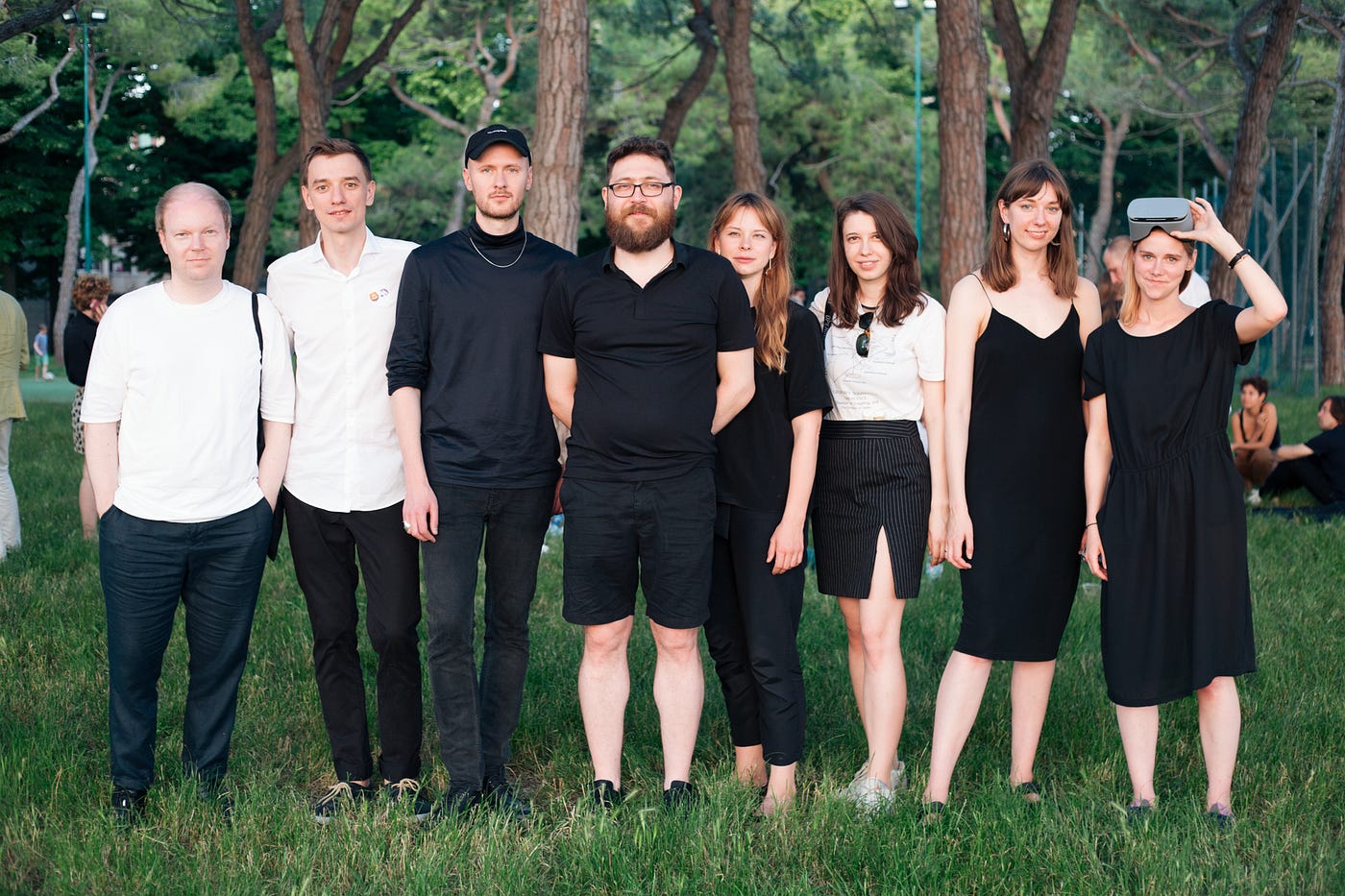
“Besides myself the group includes architects Liza Dorrer, Masha Kachalova, and Pekka Airaxin, urbanist Ivan Kuryachiy, designer Karina Golubenko, and curator Anton Kalgaev. All of us, except Masha Kachalova, are graduates of the Strelka Institute for Media, Architecture and Design. We are friends. The idea for a virtual pavilion took shape in the beginning of 2018 when we got together at a New Year’s celebration.
We discussed the theme of the 2018 architecture biennale, Freespace, and the situation surrounding the Russian national pavilion. There’s no actual competitive procedure for its choice of projects. Even in 2014, when Strelka represented Russia in Venice, the selection was made solely by pavilion commissioner Grigory Revzin. At that time Anton Kalgaev was one of the curators of the Fair Enough project exhibiting in the Russian Pavilion, and I created its identity.
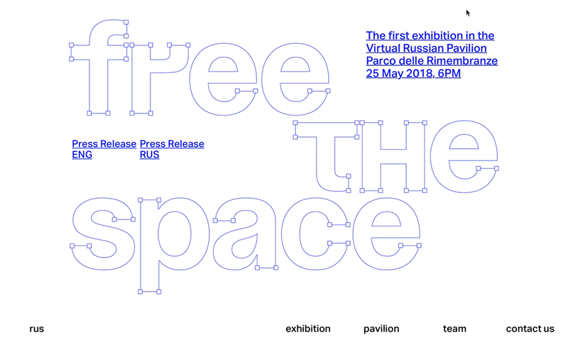
It was during our get-together that Liza Dorrer came up with the notion of doing an exhibition for the Russian pavilion using virtual or augmented reality. We began to develop the idea, everybody contributing, and that’s how the idea of the virtual pavilion came into being. We named our first exhibition “Free the Space,” repurposing the biennale’s “Freespace” theme as a call to action. Wearing VR headsets, visitors find themselves in the absolutely empty central hall of the official Russian pavilion. Generally the only people who ever encounter space in this form are show curators and organizers. We’re inviting architects and curators to put forward their own shows — that’s the whole idea of the virtual pavilion, to be open, free, and independent.
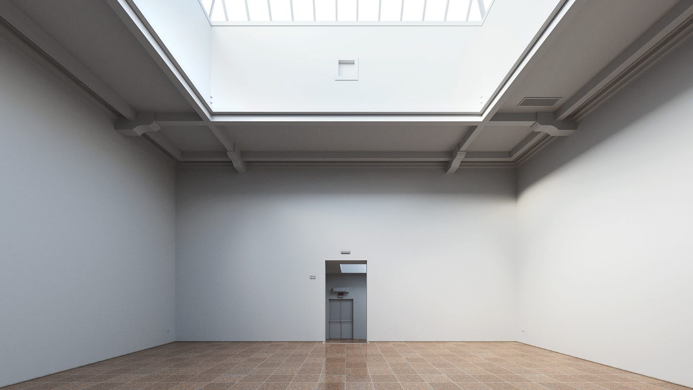
From a technical standpoint the realization of our idea was quite simple, as we had photos of the inside of the official pavilion, because Anton documented the building’s interior in 2014, between exhibitions, when it was empty. Using the photos architects Liza Dorrer, Valterri Osara, Vladimir Goncharov, and Elena Viskovic created a 3D render and “assembled” the virtual space.
We haven’t asked anyone about opening the pavilion: neither the Venetian authorities, nor Biennale’s officials. It was essentially just a joyful party in a picturesque park with free wine and a pair of VR headsets. The 120 guests at the opening included all the “Russians in Venice:” architects, curators, architectural historians, journalists; in short, everyone with whom we hoped to cooperate with on the project in the future. Several foreign curators supported our idea, including Andreas Ruby, the director of the Swiss Architecture Museum. He said he thought the Biennale needed a separate “lion” for independent pavilions and felt ours was an example of this.
Soyuz Grotesk And Emojis as Text
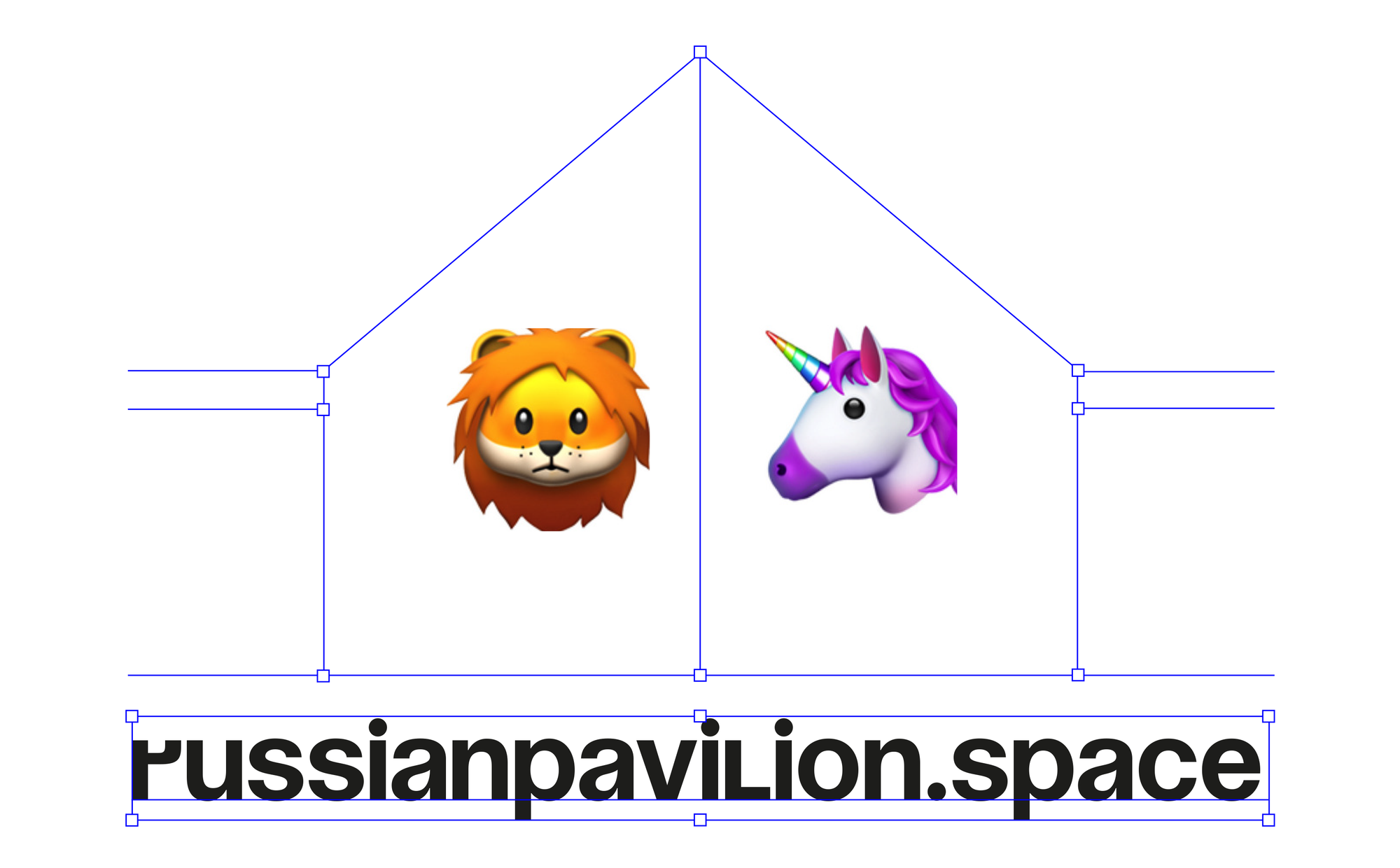
I spent a few days creating the identity of the Virtual Pavilion and then an additional couple of days to make our website with Readymag. I wanted the design to express our core values: openness, freedom, and independence. Since the Virtual Pavilion is a sort of interface between architects and the Biennale, our logo includes interface elements familiar to anyone who has ever worked with a graphics editor. Thus, our logo presents a text box holding the address of the site: russianpavilion.space. The logo is dynamic — it can change form and content, yet remains recognizable.
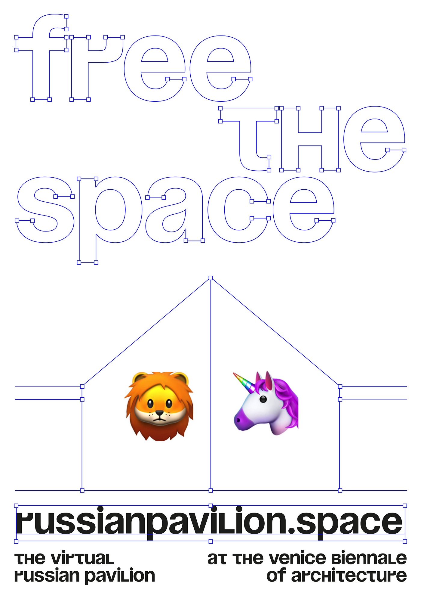
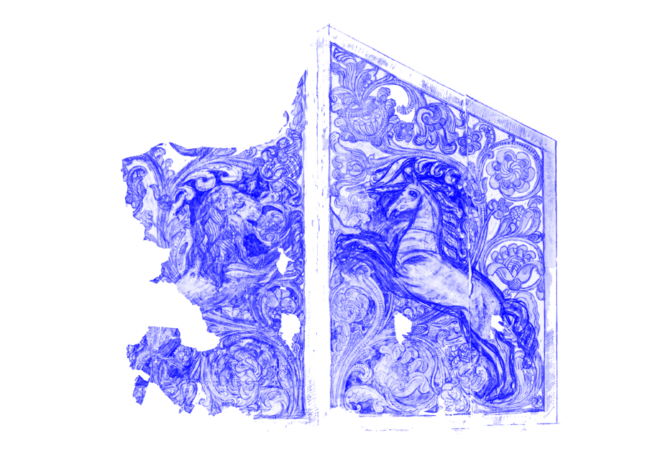
The other part of the design is a lion and unicorn depicted on schematized gates. These images reference the history of the official Russian pavilion building. In 1914 architect Alexy Shchusev placed a lion and unicorn on the gates of the building. We interpret them as symbols of Venice (lion) and Russia (unicorn). We chose to depict them with emojis — a touch that is both ironic and contemporary. Further, emojis continue the theme of virtual reality in that they are unpronounceable.
The identity of the Free the Space exhibition uses a similar approach. The lettering appears as if it was “dragged” from the virtual space of an edited font. The design may be change in the future but for now we wanted everything to cohere as a unified visual story.
The typeface Soyuz Grotesk, which is currently very popular, was used for all elements of the design. The font itself has an interesting history. In 1963 two Soviet designers, Yury Kurbatov and Maksim Zhukov, created a Cyrillic version of Helvetica. It was very convincing but, unfortunately, wasn’t digitized for over 50 years. In 2018 the Russian font designer Roma Gornitsky used this Soviet version of Helvetia to create a Latin variant: Soyuz Grotesk. Helvetica is generally considered the most popular font among architects, so ubiquitous it’s barely noticeable. Since Soyuz Grotesk is the most ‘Russian’ of possible grotesques, it seemed the best choice for the Biennale, where there is always a dichotomy of the national and the global.
We are going to update the site in the near future so we can publish research studies and reports on future discussions. And in the next iteration it will become a platform for the selection of participants for future exhibitions. The first exhibition designed this way will open at the Venice Biennale of Architecture in 2020.