R/m for sales & marketing: an easy workflow for versatile presentations
When it comes to presentations, treatments, and pitches, Readymag is particularly useful: you can easily create and publish online, protect your work with a password, and then send the link to your clients.

When it comes to presentations, treatments, and pitches, Readymag is particularly useful: you can easily create and publish online, protect your work with a password, and then send the link to your clients. You can also export the presentation to PDF. So, the tool comes very much in handy for sales and marketing decks. In this article, we describe how to make a presentation with Readymag and easily turn it into a reusable template.
“We use Readymag for presentations because of its ability to personalize every element and create a fully immersive experience with so many multi-sensory elements such as animations, sound, and film. That is a truly engaging way to tell stories, communicate, and create an emotional connection”, says Chloe Perisson, the founder of studio.xyz.

The best way to arrange presentations’ workflow is to start a Readymag account and perform all of the preparatory steps, described below, with a designer.
Desktop first
Start with the desktop version of your presentation. First, choose how the project will be viewed — vertically or horizontally. Open the Editor and add any necessary widgets to the blank page — text, images, buttons, etc. Use grid & guides to build the layout and organize the visual space. This Youtube playlist offers tutorials on how to assemble a Readymag project from scratch.
Widgets behave as layers in traditional graphics editors — you can work with them one-by-one, or unite them in groups. Make sure all of your widgets are placed inside the dotted frame — it emulates the smallest screen size your viewers may have.

Pay attention to the Text widget’s bound
Make sure the lower bound of each text widget is not red. If it is, you need to drag it — this way, the text will be fully displayed in all browsers and PDF exports. Find out more about working with text here.

Add animations
Feel free to explore Readymag’s rich animation options. “I realized that I need to make my treatments more interactive and enrich them with GIFs and animations, but the workflow in traditional tools like KeyNote and InDesign is so time-consuming. Readymag turned out to be my solution — its interface is simple and clear to the utmost,” says Anastasia Mokhan, head of Anamtreatments studio. She specializes in directors’ treatments and works with Russian, European, and American clients.
“We have been enjoying playing with Readymag as we see its potential to replace boring PDF’s. That said, we also see its limitations as it’s labour intensive when you go wild on the creative scope. So we have to get the balance right between using Readymag and using PDF’s. We are yet to nail this but we are getting there”, says Chloe Perisson. “As up until now, we have been exploring Readymag for really immersive and engaging presentations with lots of animations”.

Adjust page height
If you want some of the pages in your presentation to be longer than others, adjust their height: you can do this by entering the desired number of pixels manually or by dragging the blue diamond at the end of the page. For desktop, the minimum page height is 672 pixels.

Planning to export to PDF? Stay aware of limitations
Note that if you plan to export PDFs of your presentations, pages should all be of the same height — otherwise, longer pages will be split up. As PDF does not support animations, GIFs or videos, they will be rendered static. When exporting complex projects to PDF, the best practice is to create a copy and remove all dynamic elements before exporting. Save yourself some hassle by keeping all of the limitations of the format in mind from the very beginning
Speed up your workflow
Use shortcuts to speed up your process. If you want some widgets to appear on all pages, make them global. You can find several other time-savers here.

Switch on Scale Layout
Once you’re happy with the design of the desktop layout, adapt it to bigger screens! The best workflow is to put a standard laptop next to a big screen (e.g., iMac). Enable Scale layout and play around with its breakpoint. We recommend starting with 1200 pixels and increasing from there. Basically, the bigger the breakpoint, the more zoomed your design looks on bigger screens. Here you can view several Readymag projects that cleverly utilize this feature.
Go mobile
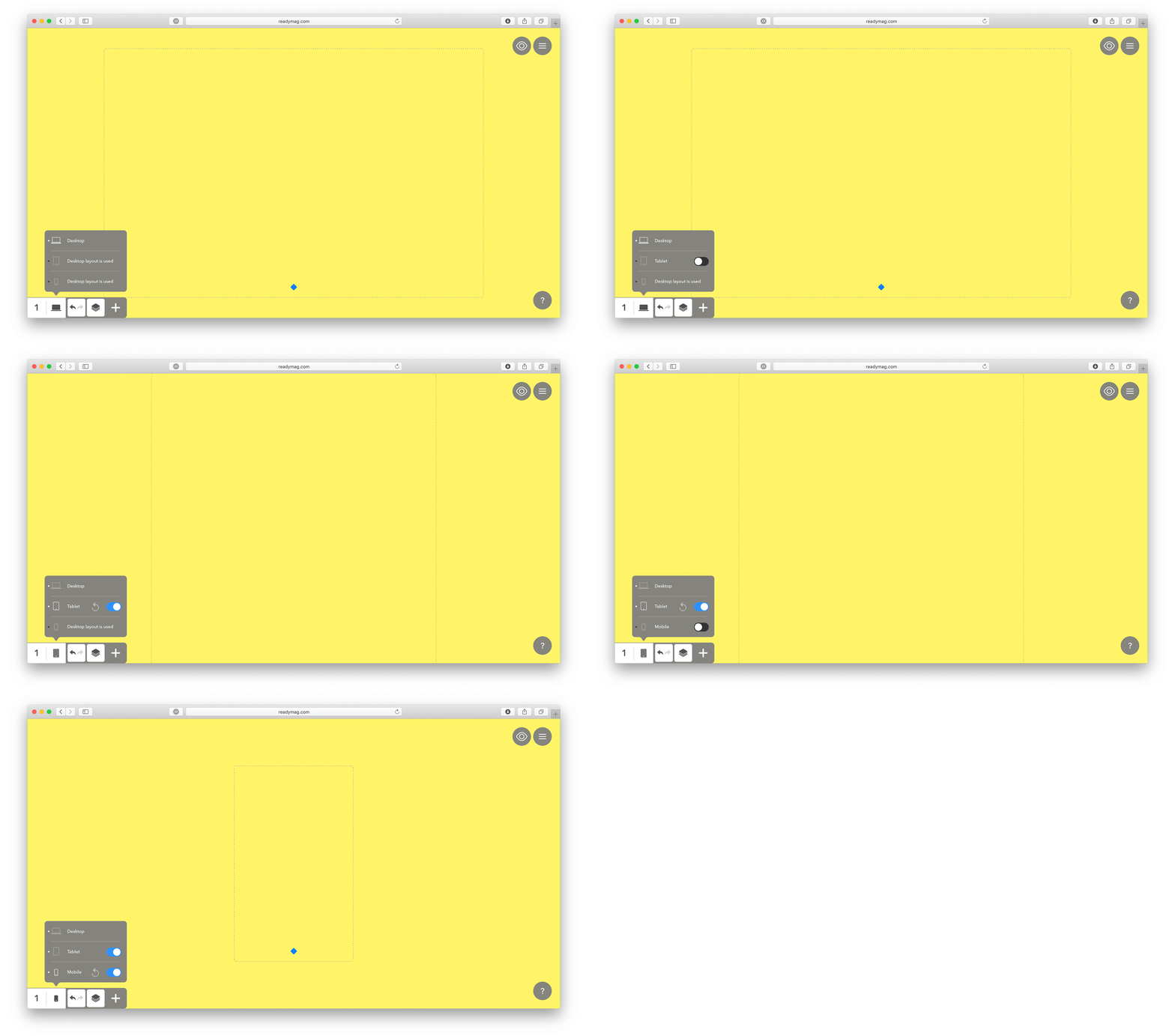
If needed, you can also create mobile and tablet versions of your project.
This mainly depends on your client and what you might be producing. We’ve found that most sales teams create dedicated mobile and tablet layouts, so the recipients can check it out on a device even if they are on the road. “I love how my treatments easily turn into mini-websites with Readymag. You don’t need to turn them into PDF or compress. My clients often prefer to get a link instead of downloading presentations,” Anastasia Mokhan says. Take a look at our ultimate guide to mobile projects and for more inspiration you can also explore our selection of projects with great mobile versions.

Invite colleagues
In Readymag, you can easily collaborate with your team members. Once invited, they will be able to work on whatever projects or collections (folders with projects) you give them access to. They’ll also be able to finish presentations and publish or export to PDF. None of your colleagues will need a paid plan to work with you on your project. That is, your team can create endless (yes, the number of pages is unlimited) presentations.
“Sometimes this feature can be very valuable — several times my US clients have made last-minute changes to text overnight,” Anastasia Mokhan says.
Map to a custom domain
Map your profile to a custom domain — this way, each published project will be accessible via your own corporate link. You’ll also be able to customize it in each project so it looks like mybusiness.com/google/.

Protect with a password and publish in a single click
When you’re happy with your project, you can publish it online in just one click. We highly recommend using password-protection for projects containing any sensitive or private data. This way, you’ll be able to test it live without worrying about search engines crawling your text and images. Also, check that the SEO toggle is switched off.

Turn into a template
Once you’re 100% happy with the way everything works, it’s time to turn the project into a template. Give each page a clear name and save each page as a template via the project menu. Now, you can quickly create dummy projects and collections for your team: give them clear names such as “Sales decks” and fill them with template pages that will be suitable for each project.

For inspiration, check out our interview with Bohdan Broviy, a creative director at Edsson Software and a web design tutor at Kyiv-based MEAT Study, in which he tells how to master extensive product presentations.