Quality over quantity: how we approach brand marketing at Readymag and why it works
Take a behind-the-scenes look at our editorial process and gain new insights on creating exceptional web publications.
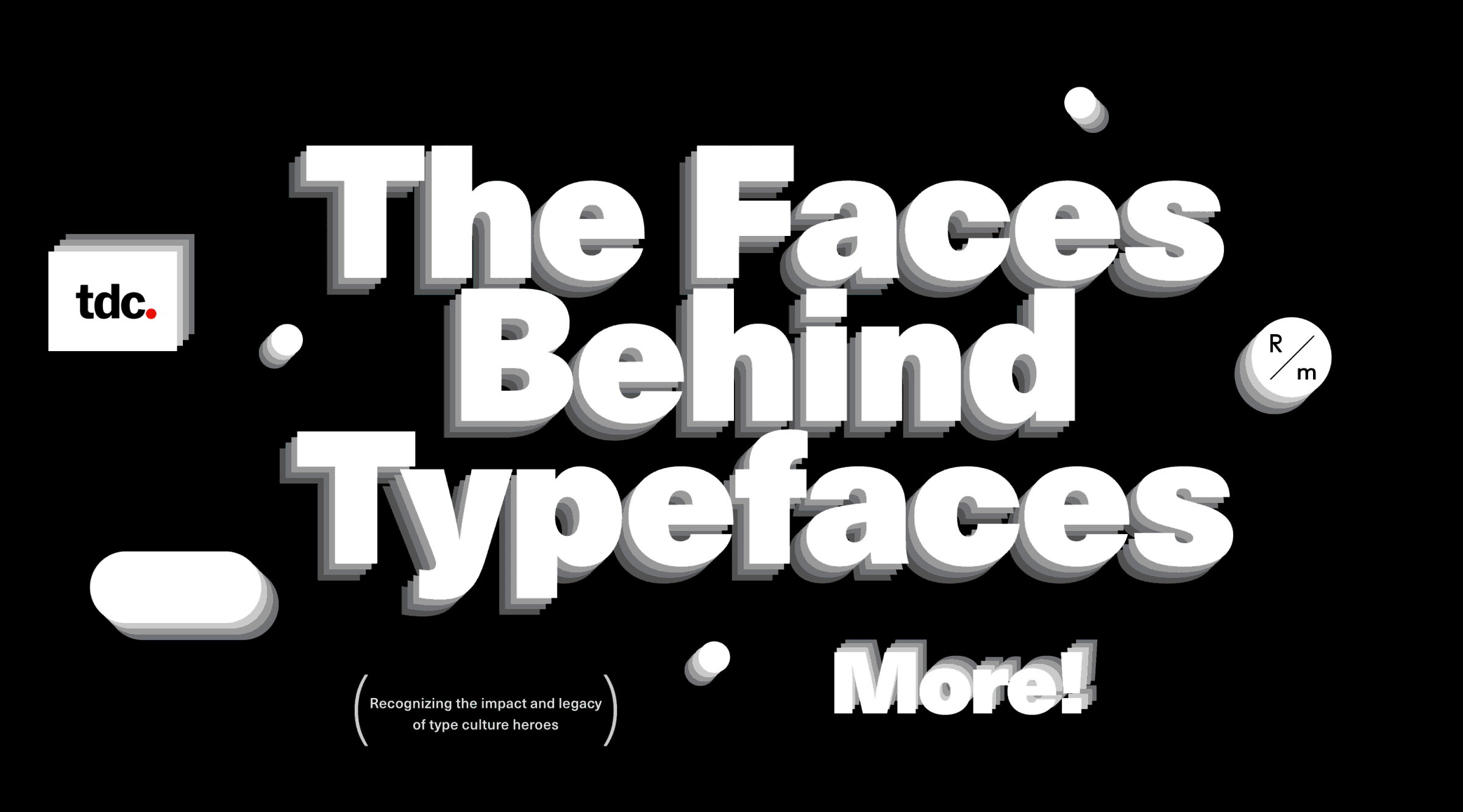
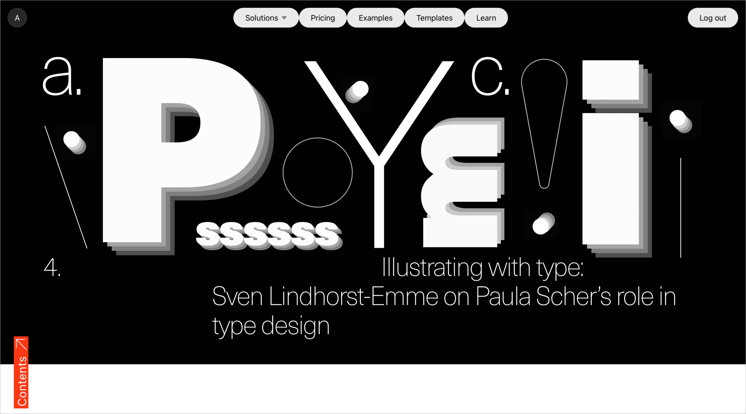
The Faces Behind Typefaces, our joint project with TDC, has won a Red Dot, one of the most sought-after awards in the design world. The Faces Behind Typefaces was the first editorial we submitted to design awards, and it was recognized immediately. We attribute this success to our marketing approach: what matters most isn’t what we do, but how we do it. And the Red Dot win is a good reason to talk about this unconventional approach and offer a fresh perspective on how to make standout web publications.
Speakers:
Alya Datii, Head of Brand Marketing at Readymag.
Tanya Egoshina, Digital Designer at Readymag.
Carol Wahler, Executive Director at TDC.
Roots of the approach
From the very beginning, Readymag came about as a passion project—it was created by people who were design aficionados themselves. Its marketing started from the same place—the co-founders of the company started to make examples of editorials on topics they were passionate about. This is how Alya Datii puts it: “Since the first projects, the team had freedom. We could come up with whatever we wanted and didn't really look at the metrics. The main criterion was to get a kick out of the process and the result.”
How does this approach impact the design now? As Tanya Egoshina says, “We don't have a brandbook and guides, and it's very easy to use all sorts of fashionable moves, to introduce something unexpected. Of course it takes longer, and sometimes it's a bit difficult when you need to invent something quickly, but for editorials it's very cool, and they all turn out differently.”
“Our brand needs space to evolve visually, to be at the forefront of trends, not follow them, and rules could be an obstacle for that,” Alya adds. “Everything starts with the interface. We constantly get feedback that the product interface is unconventional and familiar at the same time, with icons instead of complex preset menus with mysterious technical names, and a few clicks instead of lines of code. Whatever the project, we prioritize innovative visual language.”
Metrics and effectiveness
Of course, we’ve grown significantly in the last 10 years. Now we do look at metrics: it's impossible to ignore them when operating in such a competitive environment. But we’ve managed to keep the vibe of the early days, when numbers weren’t at the top of everything.
This is Alya's take on it: “The metrics vary from project to project, but always stem from the fact that the key objective of brand marketing is to make as many people as possible aware of the product. And in that sense, the key metric is views. But we also look at how many people continued their Readymag journeys—how many people subscribed. Bounce rate and average time on page are also important for us.”
The discovery we’ve made during the last few years is that our initial ideas about how the project will work can be at odds with reality. When we came up with The Faces Behind Typefaces, we thought that our audience and the TDC audiences combined would bring in an incredible number of eyes, and that they would read the editorial and remember it. The project did get seen by a lot of people, but what surprised us was its PR potential. We got more publications on this project alone than we did in the entire 2022 year. And this is something we’ll work with in the future—metrics aren’t only trivial views and conversions, but also things like this. You can't predict everything: in the end, it's up to the audience to decide how to interact with the work.
The experience was similar with our Guide to Presentation Design. We wanted to try out the mechanics of downloading the guide after leaving mail and subscribing. Indeed, there were enough people who did that, but what impressed us even more was that people were registering in Readymag more than from other projects: the conversion rate was four times higher than usual! Continuous learning is crucial. “I hope we'll get new insights and tune the content accordingly with each new project,” says Alya.
We still have the non-numerical metrics too. You can’t measure beauty—the only way is to feel it. That’s how Tanya puts it: “I have a personal goal to do better each time than I did last time. I like all the latest projects, but for those that are two years old or more, I already think I could have done better. It's an inner feeling when you look at it and realize that visually it could have been done differently, simpler and prettier. This is ever evolving with new experience and knowledge.”
Take on awards
Let’s talk about the elephant in the room—enter Red Dot. We don’t really do projects specifically for awards. Our motivation for making The Faces Behind Typefaces was, as with any other project, to explore topics we're interested in and contribute knowledge to the design community. It was later when we decided to apply to awards to see how we measure up to other brands and bring more eyes to the editorial. It appeared that what we were doing was already of great quality. Again, it's hard to measure. “That's what happens when you do things not through blood and sweat and tears, but slowly and lovingly. This way, all the hard work you put in the project really pays off,” Alya says.
Tanya adds: “I don't really do projects for the sake of awards. Even Red Dot—it was never a goal for me. But it's very cool when you do a project and it gets something as a bonus. It’s a very nice feeling, knowing how much effort our little team put into it.”
And as it turns out, the quality-focused approach pays. As Carol from TDC puts it, “Key reasons for the project’s success include its choice of subject matter, use of highly qualified writers who are themselves experts in the field, and a comprehensive approach to storytelling. When great writers explore great typographers and type designers and highlight their iconic work, it results in a substantive yet engaging project that benefits the global community at large. The experience is enhanced by the wonderful design, with beautiful navigation leading to appealing and informative page layouts.”
How we choose partners
We couldn't have done our latest editorials without collaborations with respected design organizations. Partnerships are important, first of all, to broaden our perspective. As Alya explains, “We all have a certain set of experience, contacts and knowledge, but many of us have been working at Readymag for 5-6 years and have become set in their ways. When a new collaboration comes along, it adds impetus for change and movement. There are more down-to-earth goals, like expanding the reach. But there's also substantive value.” TDC in this regard helped with the concept itself and—most importantly—introduced us to speakers and resources that we used in the project. We do everything in-house, so this kind of help is very important.
We choose organizations that coincide with us in terms of values and that can bring something new to the table content-wise. We have to complement each other. Our partners at TDC couldn’t agree more: “The Faces Behind Typefaces is perfectly aligned with both the Type Directors Club and The One Club for Creativity. These two organizations exist to support and celebrate the global creative community, with TDC specifically dedicated to acknowledging the importance of typography and the letterform. Both the organizations and your special project successfully showcase creative excellence, providing an educational platform and well-deserved recognition for leaders in the field.”
Finding an organization or an NGO we can design for, package their content beautifully and together make a difference or just deliver beauty to the world is our ongoing dream.
The backstage of a Readymag editorial
“We don’t have an 'average' project: each of them is like a snowflake—unique with its own idea, goals and production,” Alya says with a smile. There is no average cycle too, but there is an average pace: we make 4 projects per year, and each one usually takes around 3 months in production. Almost every person on the marketing team is involved in the process, but everyone has a lot of autonomy and freedom in what they do. We strive to make sure that each team has confidence in the professionalism of the others. And more often than not, the professionals are right in their opinion—in the case with The Faces Behind Typefaces, we had three initial design options, Tanya picked one and we won.
In Tanya's own words: “After an initial layout is done I discuss it with the producer of the project. I also sometimes discuss it with our Head of Design, but he usually says that he believes I'll do great. Now he's mostly dealing with the product, but he sometimes looks at the marketing stuff too to make sure it's coherent.”
The coolest thing about it—time for some shameless self-promotion—is that everything can be done without any help from developers, who can concentrate on the product. Custom code is only needed if some very special effects are required, but it's a very rare case and hasn’t happened for a long time. As Tanya puts it: “I immediately see what I get, and I love that I don't have to wait through someone for this result. The first stage is constantly making changes, you make one variant, then rebuild everything completely, then look at the second variant. Like with a piece of clay: you mold it, then break it, then mold it again.”
Every project in Readymag starts with a blank page instead of templates to allow space for creativity. This is what we try to reflect in our marketing efforts. We raise questions that our main persona—the designer—wants answers to, and it’s not always about building the perfect landing page or what kind of colors are trendy at a given moment. It’s also how to implement your ethics and vision in design, how the pioneers of the design industry made it and how new generations challenge them or learn from them, how to be fearless in visual experiments and bold with defending your design decisions. This spans across our web specials, social media posts, live discussions, the partnerships we build, and our internal processes alike.
More than just marketing
Our editorials are just tip of the iceberg. The approach starts with hiring: Readymag's team includes people who are genuinely interested in great design, like to read about it, look at examples from other companies, and put this knowledge into special projects.
We try to be sustainable and don't bet on sudden surges, because that's not an audience that will stick with us for long. The key parameter here is the sincere interest of participants, and in some sense this is unconventional by itself. There’s no marketing brandbook, no set of visual techniques and practices that would be clearly described, so we always stay fluid. The company has business goals, but it's equally important that everyone on the team shares the ideas of beauty and purpose and works without thinking how many dollars the company earned that day. “It's also about predictability and regular pace of work,” Alya adds. “There are no situations when the CEO comes up with something today and therefore tomorrow it should already be done. This allows us to take on complex projects and push back non-urgent things if necessary.”
We have a strong emphasis on quality over quantity. Red Dot is the best example of that—our internal censor was already strict enough to be on the same level as the expert jury. We don't choose the easy way, we take the harder and more honest ways on a daily basis. This is a company-wide approach that translates to all Readymag processes and products. Marketing, and specifically editorials, are just the quintessence of it.