“Print thrives on limits, digital thrives on the illusion of limitlessness”. How medium defines reading experience
What sets print and web editorial design apart and how each shapes our reading experience.

Print editorial design offers a tactile, sensory-rich experience through the careful use of typography, material, and structured storytelling, all shaped by its permanence—once it’s printed, it’s final. Web design, on the other hand, thrives on flexibility and interactivity, creating dynamic, ever-changing experiences. While digital takes inspiration from print, it also introduces new possibilities like personalization and instant updates. In this piece, we’ll look at what sets print and web editorial design apart, what they borrow from each other, and how they influence the way we engage with content.
What characterizes print editorial design
Print is durable—at least, that’s the conventional wisdom. Its basic components create a unique and tactile experience:
Typography. Fonts, their weight, spacing, and other properties are carefully calibrated for readability. The strict rules of print design stem from the permanence of the medium—errors are physical, expensive, or impossible to correct.
Material. The texture of paper, the richness of ink, and even the scent of freshly printed pages create a sensory connection that deepens engagement.
Linearity. Information is presented in a set sequence, guiding the reader through a structured narrative from start to finish.
Limits and frames. While physical constraints—page size, number of pages, and print colors—shape the design, these boundaries often act as creative catalysts, inspiring designers for innovation.
What about digital?
Digital edutainment has transformed how we consume information on the web, with features that distinguish it from print:
Interactivity. Buttons, hyperlinks, scrolling, hover effects, and animations allow readers to actively participate in shaping their reading experience.
Multimedia. Text is no longer the sole medium. Video, audio, GIFs, and animations add layers of meaning and emotional resonance.
Adaptability. Digital content is fluid, able to adapt to the audience's preferences and context. Updates can be immediate, responding to current events or user feedback. In addition, digital content has to function across platforms and devices, from widescreen monitors to pocket-sized phones.
A compilation of animated tapes each representing a unique audiostory—all in all, the distilled creativity of digital media. Resource: Intertapes
What digital borrowed from print, and what’s unique
The digital medium retains many of print's typographic conventions, with fonts like Georgia and Verdana designed specifically for screens yet inspired by classical standards. Print’s structural grids form the backbone of most web and app layouts, bringing order to potentially chaotic interfaces. Though digital has disrupted strict linearity, storytelling fundamentals—like rhythm, pacing, and dramaturgy—remain central to reader engagement.
At the same time, the web also introduced elements that print can’t replicate. First and foremost, it enables dynamic combinations of text, video, and interactive graphics. Landmark projects like The New York Times’ Snow Fall redefined storytelling by merging mediums.
Another unique feature is personalization: algorithms curate bespoke experiences, from Spotify Wrapped’s data-driven storytelling to content recommendations tailored to individual users. Then there’s the adaptability of web design: the same editorial project can appear radically different on a desktop versus a smartphone, requiring designers to rethink their work for each platform.
Another key difference is accessibility. In digital, anyone can create, while print comes with higher barriers to entry. Print thrives on limits; digital thrives on the illusion of limitlessness. When you can do “anything,” the challenge lies in not getting lost in endless possibilities—a common pitfall for newcomers.
Whether one replaces the other anytime
The human psyche is wired to find the most complete and satisfying experiences in those that engage the maximum number of senses simultaneously—this is called multimodal perception.
But can we really identify a single medium that can fully address this multimodal experience?
Print is static but offers a tactile experience, while web is infinitely dynamic but lacks the physical qualities of print. Print has the advantage: touch and smell are unique to print, giving it an edge over digital’s visual and auditory offerings. It seems like print holds its ground—for now—unless someone invents a way to taste recipes published on the web (though you can always chew the paper if you want). At the same time, however, digital can use tactile feedback through device vibrations.
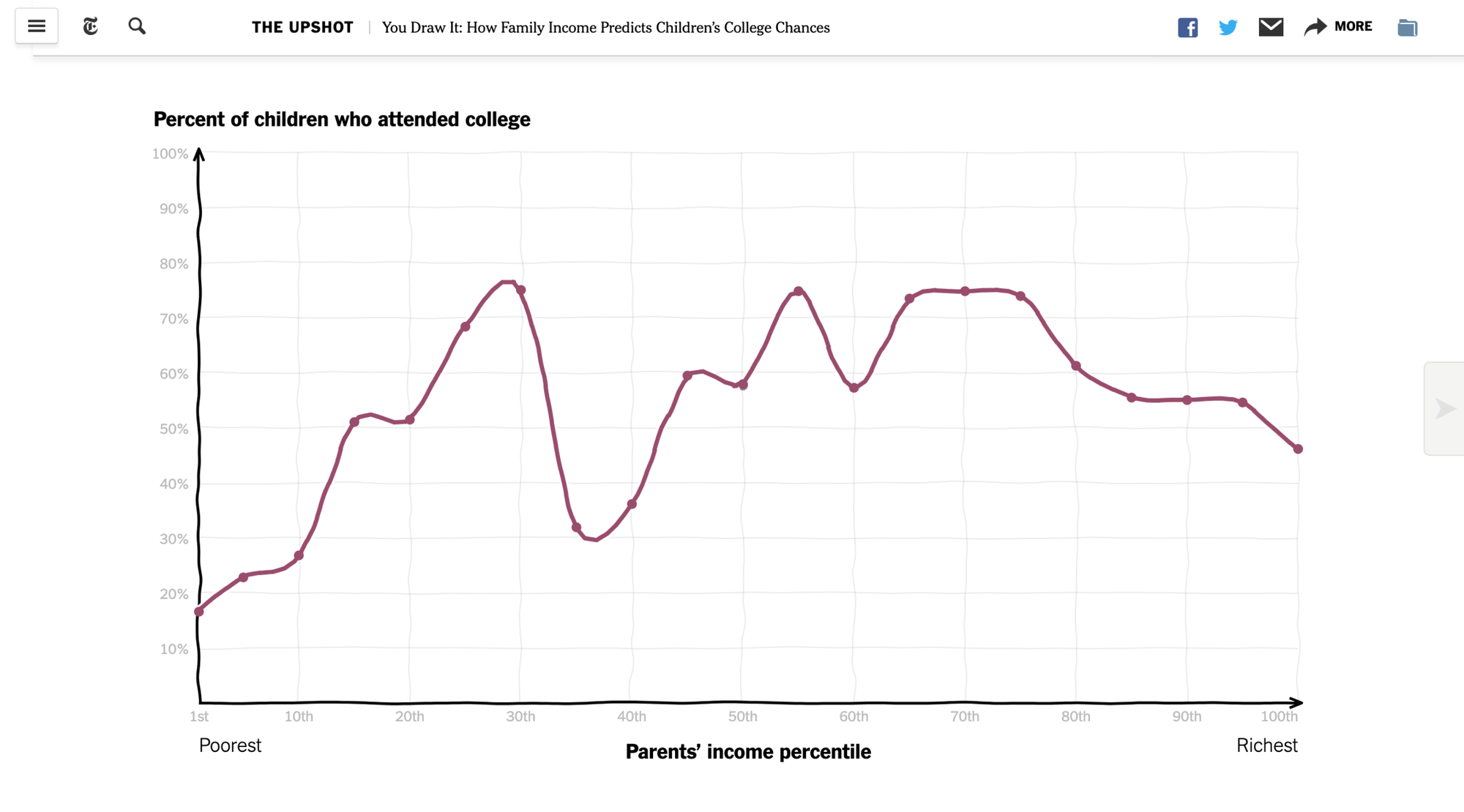
Digital’s dynamism and interactivity foster a reflexive attachment to editorial content, hooking the reader. This connection comes from our brain's natural instincts: a part of the brain called the reticular formation helps us notice movement, which is important for survival. This is why we’re so drawn to web content. On the web, the reader often becomes a co-consumer or even a co-creator. For example, The New York Times’ special project “You Draw It” shifts the reader’s role from passive to active, transforming the experience from reading into play. But not all audiences want this kind of interaction—many still value the simplicity of the classic reading experience.
Ultimately, the question isn’t whether print will replace digital or vice versa, but rather which medium offers the experience that best serves the reader’s needs in a given moment. Is it the tactile pleasure of holding a printed page, feeling its weight, and inhaling its scent that brings a sense of nostalgia? Or is it the instant access, interactivity, and ever-evolving content of the digital world that captivates the reader’s attention and engages their curiosity?
Let’s explore some examples–all made with Readymag
Sites that resemble print
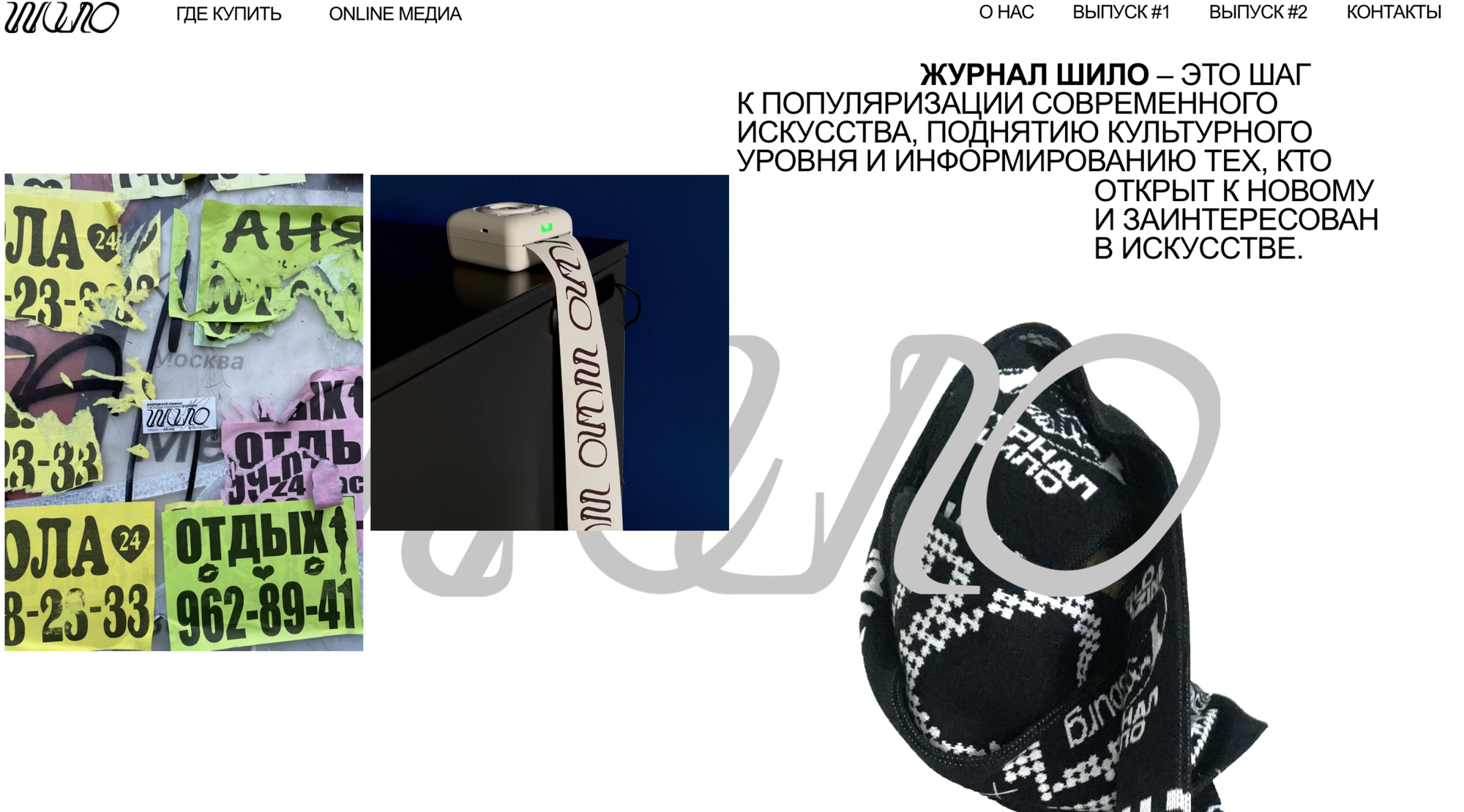
A magazine website with a rebellious, experimental edge. The grid is repeatedly broken, and there are unexpected elements like videos. Still, it respects print design’s typographic hierarchy, blending chaos with coherence.
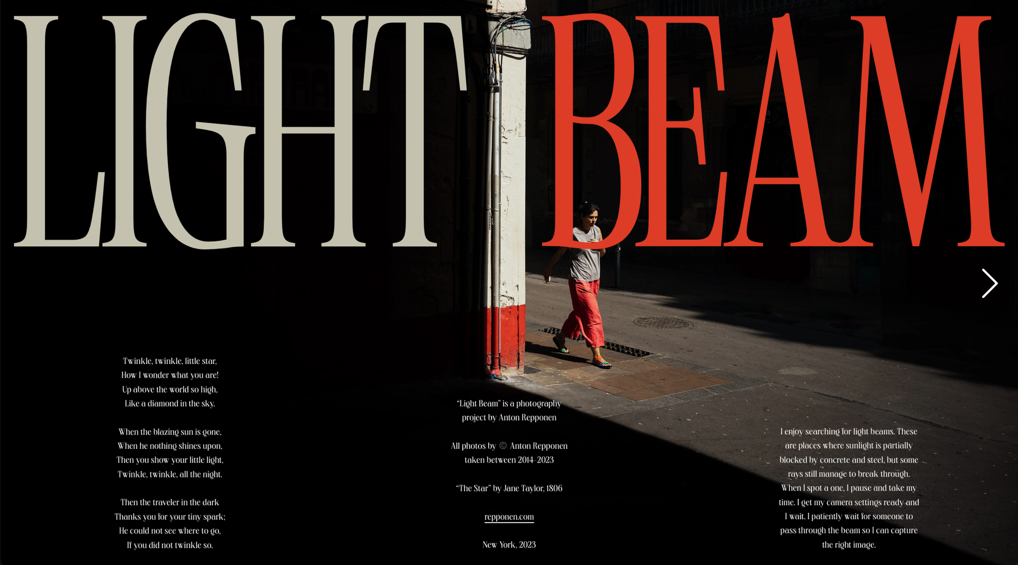
A digital photo book where the spreads flip from right to left like a physical magazine, while the font reinforces its connection to print traditions.
Sites that rethink print
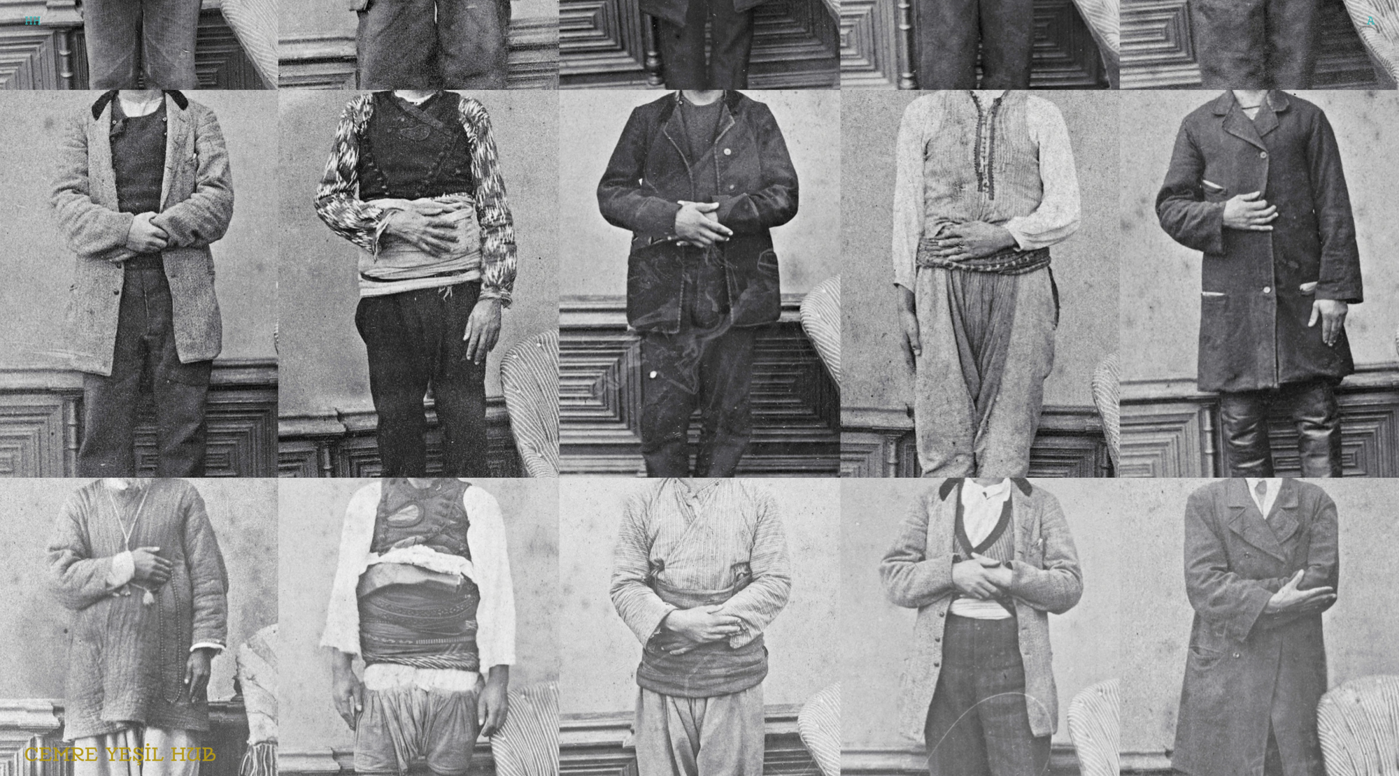
Inspired by books and photographs, this site offers a hybrid experience. Navigation shifts directions—sometimes top-down, sometimes sideways—evoking both magazine spreads and cinematic black-and-white credit sequences.
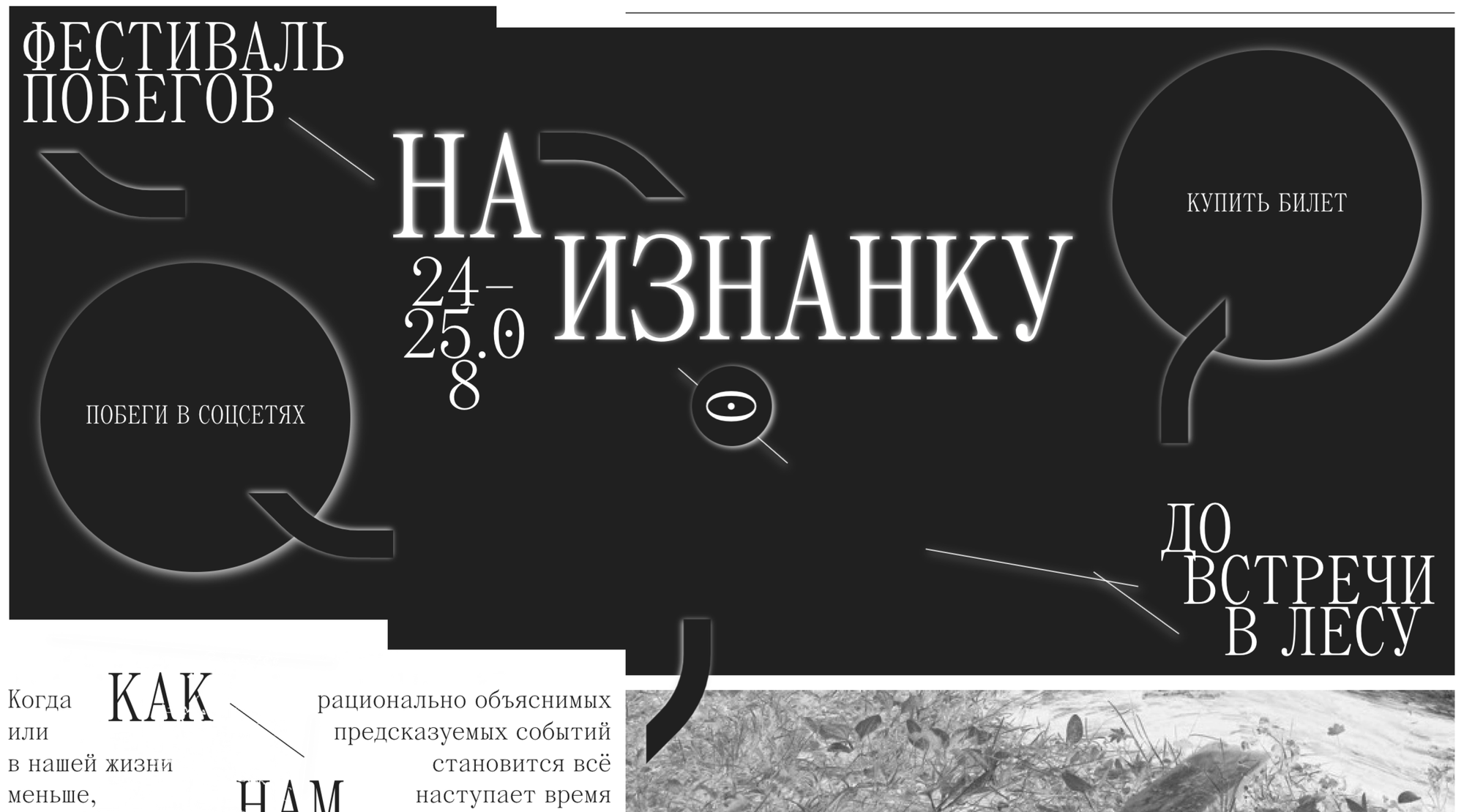
Designed like a newspaper with classic fonts and column layouts, but its logic is distorted by the artist’s imagination. Clicking the central eye reveals a hidden “underside” of the site, a surreal black/white lodge of web design—a twist that blends artistic storytelling with a sense of discovery.
Sites that are uniquely digital
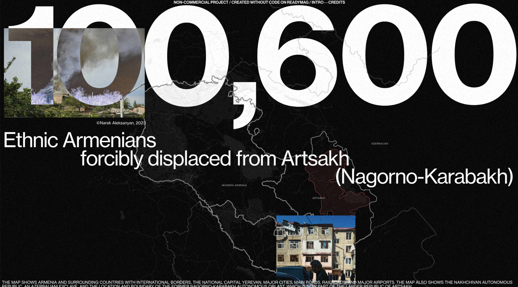

Two immersive multimedia projects that combine video, text, and photography. They follow the “Snow Fall” formula, creating a total-immersion storytelling experience that’s impossible to replicate in print.
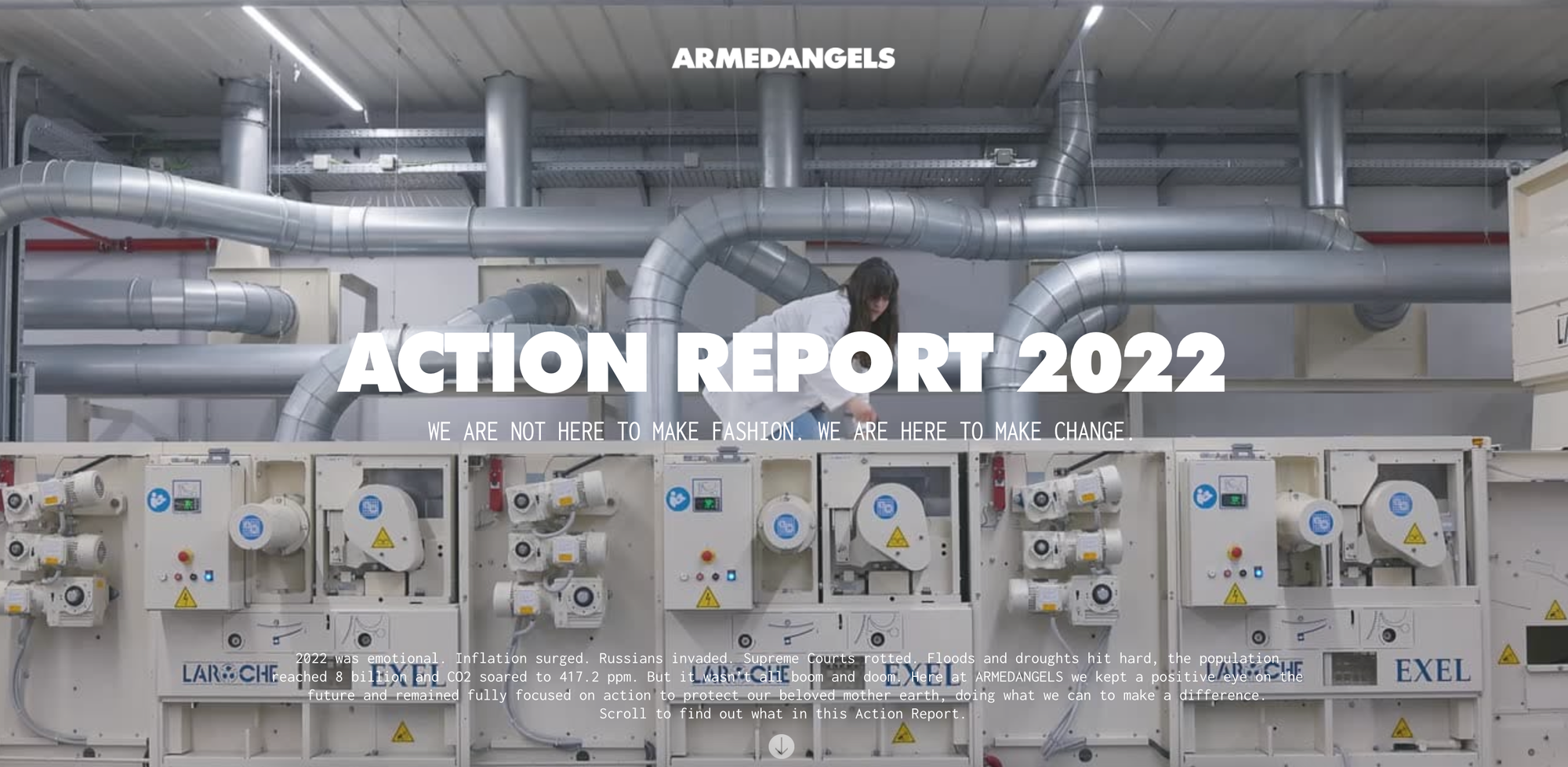
This site combines video, motion, and drag-and-drop elements, turning a static report into an interactive game. At one point, the user can even drag clothing items—blurring the line between reading and play.