6 standout examples of mobile web design made with Readymag
See how even complex desktop sites can be adapted for mobile without losing structure, interaction, or visual quality.
Mobile design isn’t a new topic, but adapting complex, animation-heavy desktop sites for smaller screens isn’t always straightforward. However, with the right approach and tools, even complex sites can be adapted effectively.
The examples below show how desktop sites can be adapted for mobile without losing structure, interaction, or visual quality.
The mobile version of this portfolio closely mirrors the desktop: at first glance, there’s no compromise—everything appears in the same place. In reality, the desktop layout is thoughtfully adapted for mobile. For instance, in the About section, a complex illustration is simplified to highlight only the key elements, and the “Hey it’s me” text, which is left-aligned on desktop, is spread across the full screen width on mobile for better legibility.
Draggables work as smoothly on mobile as on desktop: scanned objects can be grouped and separated easily, with controls remaining convenient even when elements overlap—suggesting precise scaling and thoughtful adaptation. Untraced objects on the second screen, though small, open and close without issue. On the third screen, hover has been replaced with tap, a clear and appropriate shift for mobile.
An animation- and illustration-heavy website whose mobile adaptation is far from straightforward—making its careful execution especially notable. Some animations were simplified—on desktop, interactions occur via hover, but on mobile, where hover isn’t available, elements like the menu open on tap without additional effects. This kind of adjustment is standard to preserve usability. The first-screen animation is well adapted: while it creates an immersive effect on desktop, on mobile the illustration appears to follow the scroll, which is visually engaging. In the Story section, fixed elements on desktop are distributed throughout the text on mobile, enhancing space and readability.
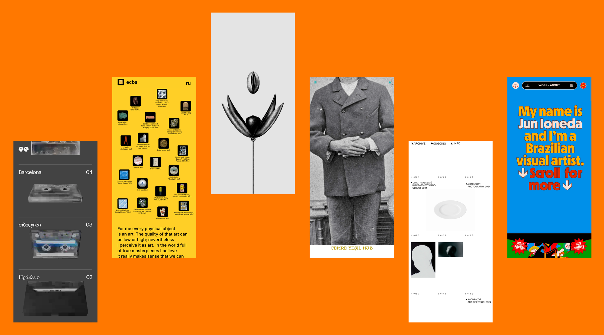
In this portfolio, the desktop hover has been replaced with a scroll-triggered interaction on mobile—a logical choice for maintaining user control. If elements would appear automatically on load, the action wouldn’t be repeatable. The design remains minimal, with no distractions from the photos, which stay at the center of attention.
The desktop storytelling of this website is seamless—it's almost like watching a movie, with a consistent focus on either text or imagery. Despite the complexity of the animation, the mobile version is handled with care, preserving the desktop logic almost entirely without compromising the experience.
Only the Catalog section of the desktop version of this site is adapted for mobile—the rest is left out entirely, which is also a valid choice if most interaction is expected to happen in a given section. The adaptation is highly functional: large fonts make reading on small screens easy, story navigation is smooth, and the desktop’s split-screen language feature is neatly replaced with a toggle.
Designing for mobile with Readymag
Everything starts with the desktop layout as your base. To create specific mobile or tablet versions, click the Devices icon in the left dock and add a layout. You’ll see a phone or tablet frame showing how your content will look on that device.
To quickly stack widgets vertically, use the Single column feature. It works great for a fast setup, but keep in mind that fixed widgets won’t be affected—if needed, unfix them and place them manually.
To arrange individual widgets, select at least two, and the Arrange option will appear in their attributes. From there, you have three automated options:
- Single column, which works as described above.
- Desktop layout, which will keep the original size and position of all widgets.
- Fit to mobile, which will keep their positions but resizes them for mobile screen width.
Other things to keep in mind:
- Changes to the desktop layout apply to mobile and tablet views, but once you make a change in a widget on mobile, it becomes independent.
- Objects in layers can be hidden on mobile and visible on desktop or vice versa.
- Some elements, such as media, texts, or links, always stay synced across layouts.
- The Keep desktop groups option is on by default, so grouped widgets stay grouped across layouts.
- You can use Preview mode to see how things look on different devices.