mirat-masson on design neutrality, identity, and typography
An interview with a queer designer and artist duo who follow the principle of “language as a malleable, fluid, and political tool” in their practice.
mirat-masson is a queer designer and artist duo who strive to follow the principle of “language as a malleable, fluid, and political tool” in their practice. In an interview with Readymag, they discuss whether design can be neutral, how visual language makes identities visible or invisible, and share examples of projects where the visual and the political are intertwined.
From art school to political practice
Our duo emerged from a meeting during our studies at the École des Beaux-Arts in Nantes. At the time, we were determined to pursue individual careers in contemporary art. Yet, we already sensed a real affinity in our visual work: a shared taste for words and language, but also for publishing and screen printing.
In 2020, freshly graduated and suddenly confined, we chose to break the isolation by forming this duo. It quickly became clear that language would be our point of junction, with the ambition of making it a political tool. To seal this union, we wrote in our shared biography that “mirat-masson is a queer duo within which languages become malleable, fluid, and political.”
Since then, the duo has continued to evolve. We moved away from strictly visual art production to establish a screen printing studio, which later transformed into an independent publishing house. In parallel, we developed a graphic design practice that now occupies a central place in our work. Although mirat-masson has never stopped transforming, the phrase above has remained engraved, while others were removed, rewritten, or distorted. Perhaps it’s, above all, a line of conduct: a reminder that our work—whether as authors, artists, screen printers, publishers, or graphic designers—must always remain malleable, fluid, and political.
As an independent publishing house, aime-aime éditions, this rule of conduct is easy to uphold: each of our editions is eminently political. As graphic designers, we continually strive to carry that same identity forward.
Three political projects by mirat-masson
The AmiAmie typeface
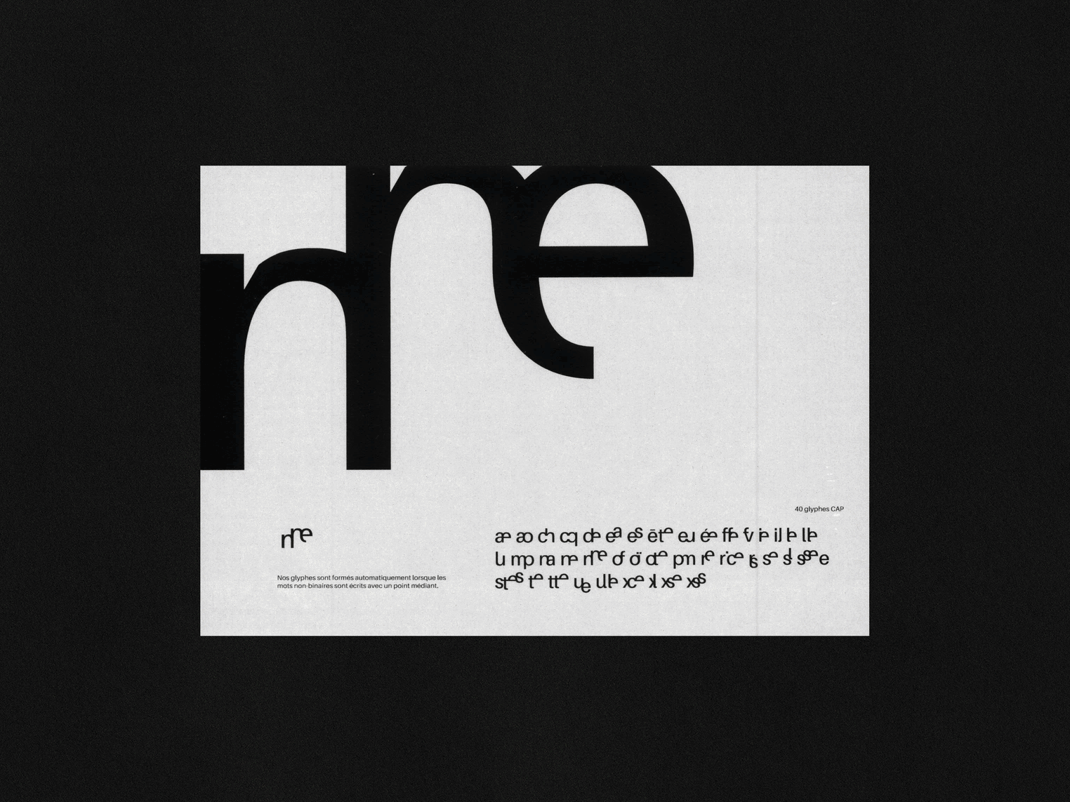
We created AmiAmie in 2022. We’d been thinking about designing our own font for some time; we even considered inventing our own alphabet. But the very essence of a typeface is to be read and shared by as many people as possible. That’s when the idea of an inclusive font became obvious. Drawing on the work and precious resources of the Bye Bye Binary collective, we were able to bring this project to life.
Both the form and the use of AmiAmie are intrinsically political. Its hybrid, non-binary structure is the ultimate nightmare for “anti-woke” currents—and that suits us just fine. While AmiAmie may create friction in certain conservative circles, it’s above all allowed us to meet our audience and has greatly contributed to making us known. Even today, we still receive books at the studio and discover, with surprise, that they were set in AmiAmie.
The font is free, but we’re rewarded each time by the feeling of having accomplished something beautiful and right.
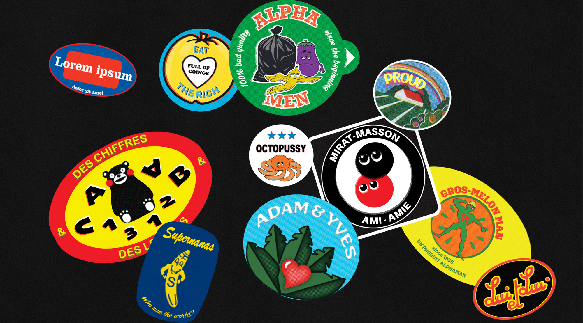
The original creation for Aux Ours
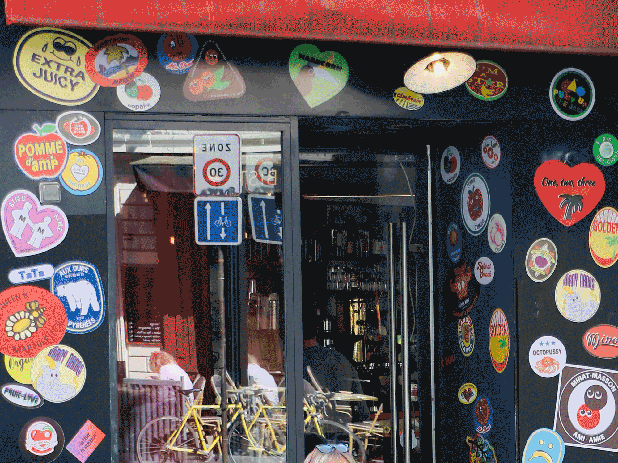
The restaurant Aux Ours in Paris commissioned an original piece for its façade. We had carte blanche. Very quickly, the idea of creating giant fruit stickers came to us—it’s a passion we share as a duo. We drew inspiration from traditional fruit stickers and hijacked them with new messages: some purely aesthetic, others humorous with wordplay, and some openly political.
The stickers measure around 40 cm in diameter. The small fruit label thus becomes a true message carrier, almost like a banner. It was a risky bet—that the restaurant might not embrace our messages—but on the contrary, they were delighted. So were customers and passersby, who began adding their own stickers in turn.
The façade has since become participatory, allowing our work as graphic designers to coexist with that of a locksmith, the demands of a protester, or the promotion of a band or street artist.
The Plates series
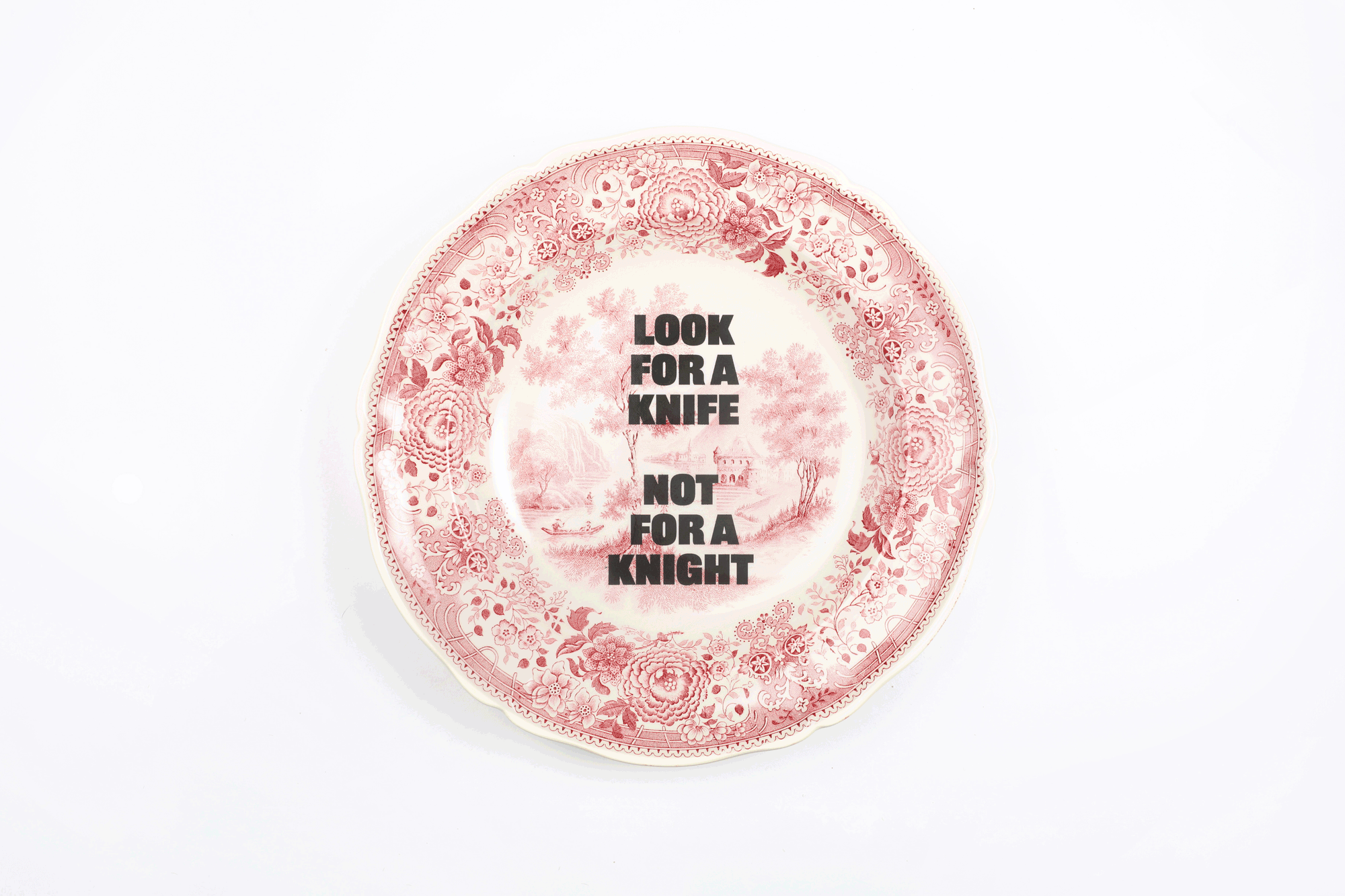
Plates is a series of six transfers on English earthenware. It was created for the group exhibition Plates & creuses (Flat & hollow), where artists were invited to produce one or more plates.
Very quickly, we had the idea of using old, weathered earthenware and applying a bold sans-serif (linéale) typeface to create a striking contrast. Although we’re usually very French-speaking in our work, we chose English for this project. This allowed us to reach a wider audience, but also to confront another language and explore new wordplay and situations.
We wanted to keep a humorous tone while conveying political, queer, and feminist messages, without forgetting the material onto which these words were transferred. Since the exhibition took place in an art school, the plates were sold for €100, half of which went toward student grants.
Relationship between visual language and identity
It’s difficult—if not impossible—to separate the visual language from identity. This relationship is a constant dialogue, a back-and-forth movement in which neither truly precedes the other. On one hand, our identity clearly informs our formal choices; on the other, it’s precisely through the manipulation of visual language—through technical experimentation, the choice of a typeface, or work with color—that our identity becomes clearer, unfolds, and becomes visible.
From a queer perspective, identity isn't fixed—it’s in permanent construction. Visual language is therefore not just a reflection; it’s the ground on which identity invents itself. By making language malleable and fluid, we allow identity to be so as well. Both emerge together: language gives body to identity, and identity gives language its meaning and necessity.
Historically, visual and textual language have often functioned as tools of invisibilization. It’s precisely for this reason that it feels necessary today to work toward making identities visible.
In French, as in other Latin languages, linguistic structures crush the feminine under the masculine. Unlike English, where words are more neutral, French makes gender a central issue. When it became unbearable that “the masculine prevails,” [a French grammar rule where the masculine form prevails in mixed-gender groups] inclusive writing emerged. Through the middle dot (point médian), it allows the integration of the feminine without erasing another identity.
Going further, non-binary typography proposes to move beyond the middle dot by hybridizing the masculine and feminine within a single new character: the non-binary glyph. This work, led notably by the Bye Bye Binary collective, resonated deeply with us. It pushed us to develop our own non-binary typeface, AmiAmie, which is now part of their catalog. For us, this is where visual language truly plays its role: by creating new forms, we allow identities that were previously silenced to become fully legible.
The question of design neutrality
Neutrality is a murky concept. In reality, it’s almost an impossible mission: does a truly neutral image, color, or typeface even exist? Wanting to be neutral is already a stance that, in a way, cancels itself out.
This question challenged us deeply, especially during the creation of AmiAmie. The catalog of fonts offered by the Bye Bye Binary collective is highly expressive, colorful, and formally contemporary. On our side, it felt important to bring this innovation—the non-binary glyph—back toward something more classic. Our goal was for this typeface to function in official, administrative, or institutional contexts.
We wanted to play the game of neutrality to better subvert it.
That’s why we chose Helvetica as a base. We selected it for its universal popularity, which makes it, at least in appearance, the neutral typeface par excellence. We tend to believe that a form used by the greatest number becomes invisible, and therefore neutral. But is that really the case? Choosing Helvetica also means aligning with a specific aesthetic current: Swiss design—rigorous, straight, almost snobbish.
What we perceive as neutral is in fact far more complex and political than it seems. Recent events illustrate this perfectly: the Trump administration decided to ban the Calibri font from official documents and return to Times New Roman. What may seem like a technical detail is in fact a real “war of fonts.” Calibri is judged too informal, associated with a certain modern bureaucracy, and even labeled “woke” by some, while Times New Roman is imposed to restore decorum and traditional authority. This proves that even the most ordinary typography carries symbolic weight.
Neutrality is often just a coat draped over the dominant norm.
Designers or activists?
Ideally, we’d like to say these roles are completely inseparable—and we hope we can fully affirm that one day. For now, as a young duo of self-taught graphic designers, it’s not always possible for us to infuse activism into every project we take on.
We aspire to be called on solely for the aesthetics and values we defend: this idea that languages are malleable, fluid, and political tools. However, to support ourselves, we sometimes accept commissions where this freedom of expression is more limited.
That said, we pay close attention to choosing our clients. We prioritize those who share our ideals, even when their graphic charter restricts our visual field of action. We work, for example, with associations and festivals such as Best of Doc, organized by Documentaire sur grand écran, which promotes documentary cinema in theaters across France throughout the year. If the creations we produce for them don’t always “look like us” visually, we recognize ourselves in our shared commitment.
For us, designing a brochure for a program of engaged and activist films is already a form of activism, even if it’s not spectacularly reflected in the graphics. Supporting the circulation of strong ideas is also part of our role.