Metamodern aesthetics in Readymag websites
What is metamodernism, how it manifests in web design, and ways to use it as a tool.
Design doesn’t have to pick a side anymore—it can be serious and a little silly, sincere but self-aware. This is metamodernism, and it’s changing the look and feel of the web.
What is this thing you call metamodernism
Metamodernism is a cultural movement reacting to postmodernism—but without regressing to modernist basics. It’s a philosophy that embraces contradictory emotions and approaches: irony and sincerity, rationality and intuition, hope and despair. This blend of opposites makes metamodernism elusive, built on the fluidity and intermingling of opposites.
The term “metamodernism” gained traction through the work of Timotheus Vermeulen and Robin van den Akker in their essay Notes on Metamodernism. They describe it as a “structural oscillation” between modern and postmodern poles. Unlike Plato’s dialectics or Derrida’s deconstruction, metamodernism leans toward creating meaning rather than dismantling it.
While acknowledging its modernist and postmodernist roots, metamodernism offers a new paradigm where artists, designers, and creators balance contradictions. This idea of “oscillation”—between feelings, irony, and sincerity—forms the backbone of metamodern visual and conceptual design. Where modernism embraced strict principles and postmodernism challenged them with irony, metamodernism plays with sincerity in its search for meaning.
In very simple terms, metamodernism is the realization that the world isn’t black and white. A purely serious business site is as artificial as one that’s shamelessly ironic. If modernism established rules, and postmodernism tore them down, then metamodernism acknowledges a middle ground. It’s postmodernistically playful, yet genuine—think The Simpsons versus Ted Lasso, Devo versus Billie Eilish, Quentin Tarantino versus Greta Gerwig, Jeff Koons versus Olafur Eliasson, or David Carson versus Jessica Walsh.
How metamodernism manifests in web design
Identifying metamodernism in web design can be tricky. Styles blur, but metamodern design generally features a harmonious blend of irony and sincerity, the sublime and the mundane, minimalism and complex, hyper-realistic elements. In website design, this often translates to:
- Combining flat elements with detailed three-dimensional ones, bright colors with soft pastels, and a mix of both vintage and ultra-modern solutions.
- Using interactive elements that enliven the site and add meaning, creating an experience where users don’t just receive information, but feel something.
- Mixing formats and styles deliberately, with asymmetrical grids, irregular shapes, and animations that balance on the edge between entertaining and annoying.
- Adding ironic or non-standard interface elements, like satirical tooltips, quirky navigation, and buttons with unexpected captions.
- Including context-sensitive animations that change based on user behavior, making the experience feel more personalized and emotionally engaging.
- Choosing unusual typography that may sacrifice cleanliness or traditional readability to express the brand’s character and mood, with fonts that almost seem to live and breathe on the screen.
- Blending digital and analog design, using graphic elements that reference old technologies to create a nostalgic response while complementing modern elements.
These manifestations can be subtle, and often, designers may not explicitly consider their work “metamodern.” Just as many works were later classified as modern or postmodern, metamodernist classification can be retroactive and interpretative. Still, viewing design through this lens lets designers make deliberate visual choices, using contradictions to provoke an authentic emotional response. This metamodern approach appeals to audiences weary of postmodern minimalism and irony. It’s a powerful tool for creating designs that resonate with users seeking empathy, intimacy, and honesty over mere functionality.
Want to go deeper?
Start with the Notes on metamodernism essay and the Manifesto of metamodernism. After that, you may want to explore the eponymous webzine active from 2009 to 2016 and a contemporary academic journal on Metamodern theory and praxis. Finally, you might like our editor-in-chief’s essay on how metamodernism is shaping the future of creative work.
Examples of metamodern websites
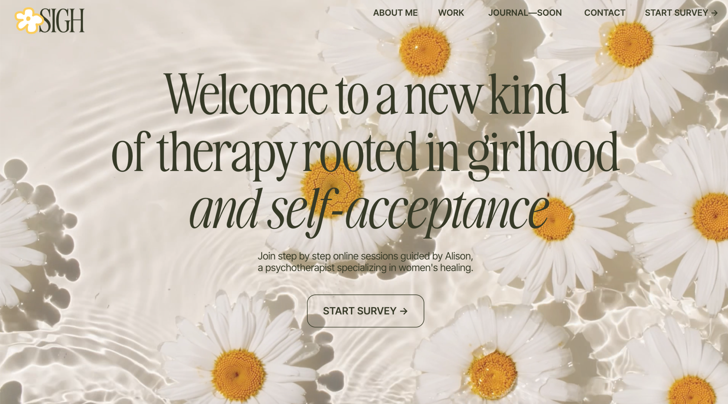
Sigh Journal
A colorful, natural website presenting a psychotherapist. Unconventionally, it includes a meditation exercise that interrupts the usual presentational flow of “Who I am → What I do → How I help.” This pause invites users to self-reflect rather than simply assessing the therapist’s credentials.
Still A Fruit
This designer’s portfolio opens with a casual video selfie, as if plucked straight from a messaging app—showing Ivan somewhere on the go, speaking to us without context. The intro feels sincerely personal, followed by the more typical portfolio sections of professional experience and commercial projects, interspersed with personal works that themselves reflect metamodern concepts.

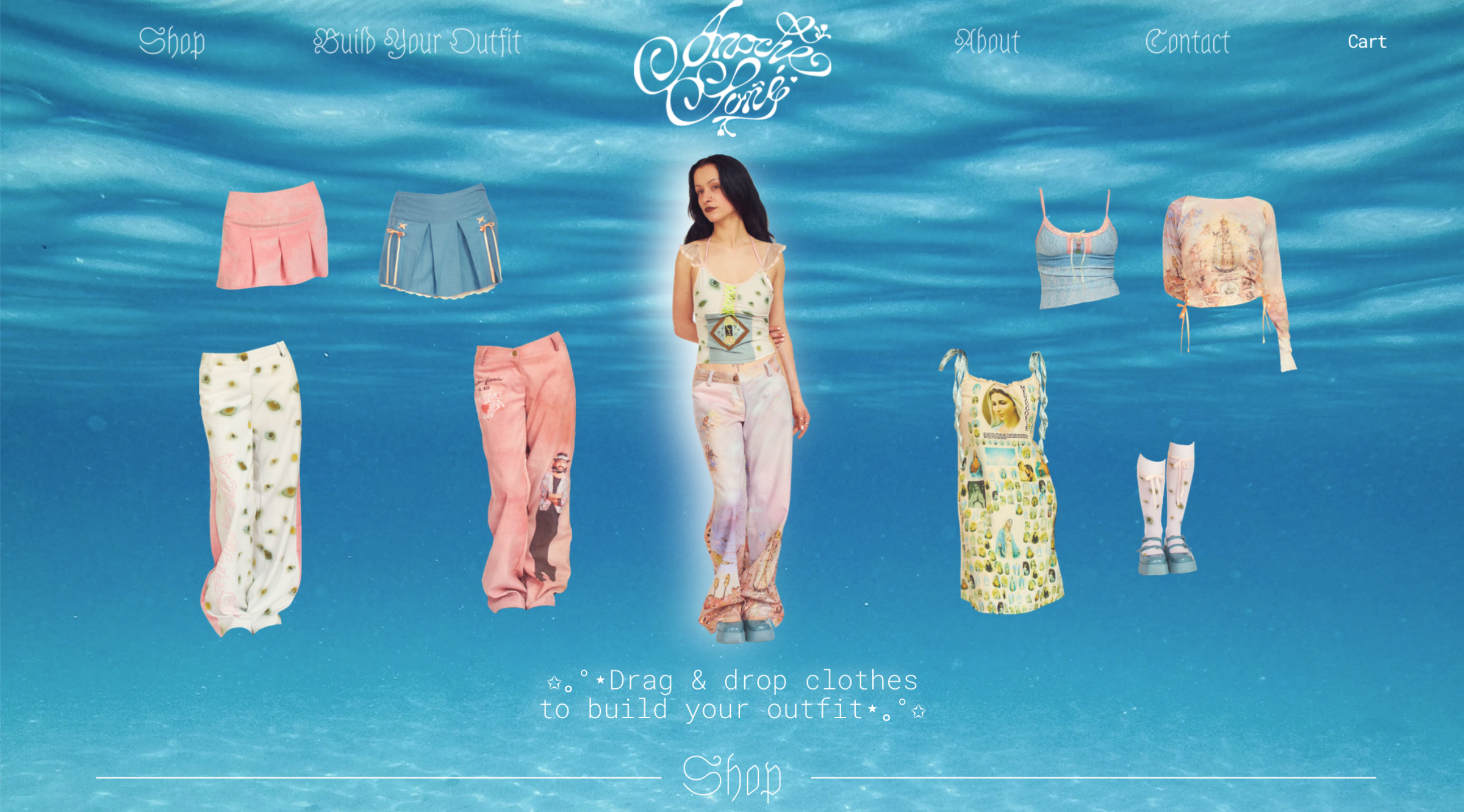
Anoche Soñé
An online store whose nostalgic visual identity harks back to the internet of the 2000s. It turns browsing clothing into a kind of game, with mystical-religious touches that somehow blend with the modern elements, making nothing feel out of place.
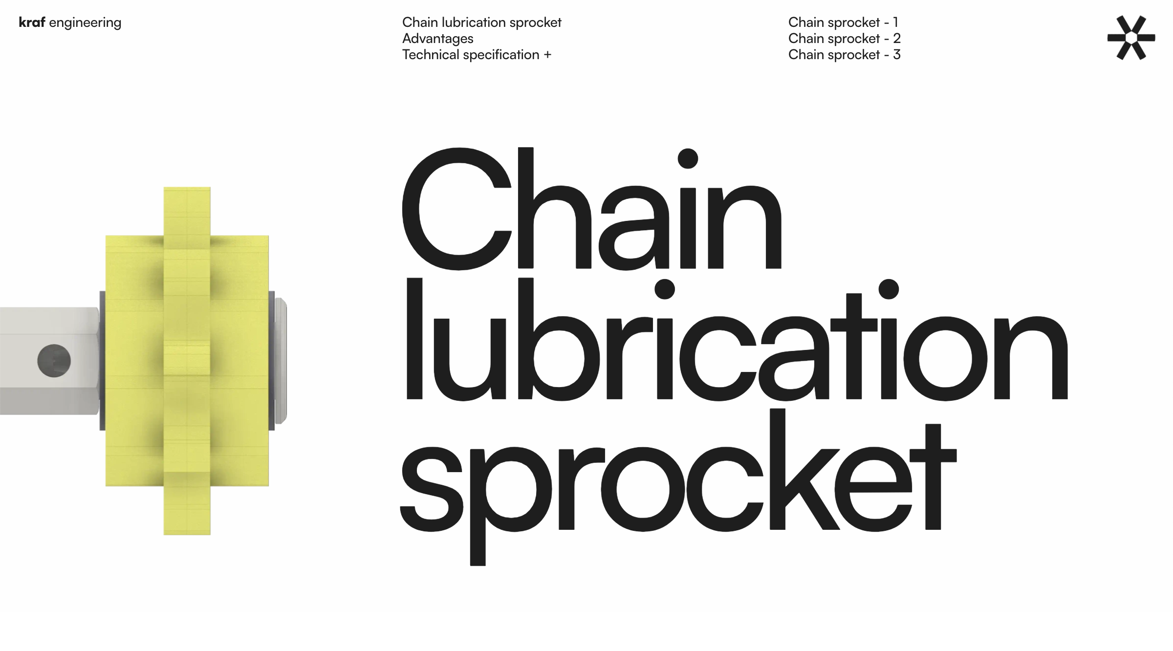
Kraf Engineering
The website for technical industrial products balances the minimalism and textual precision expected in such themes with unexpected playful elements, bright colors, and bold typography. It feels as if you’re browsing either children’s toys or abstract illustrations, challenging assumptions about industrial design.
Tanner Jamieson
This portfolio site starts playfully, with minimalist sketches of quirky, big-eyed creatures; one even skateboards across the screen as you scroll. Instead of an introduction or project list, you’re greeted with a playlist of the designer’s favorite music, followed by his professional work. The tone isn’t confusing or shocking, but reflects a sincere balance of the personal and professional—or, rather, an oscillation between the two.

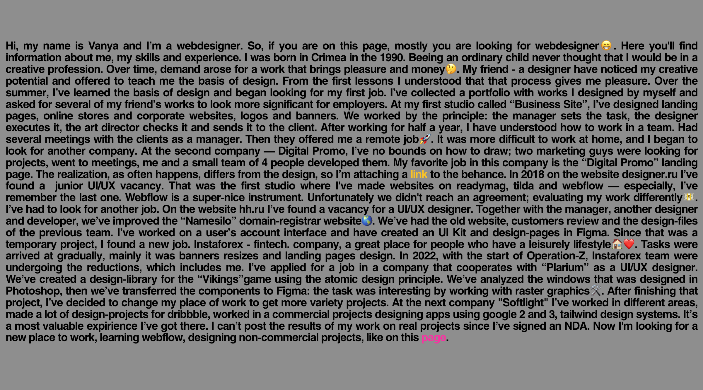
Vanya Olshevskii
This portfolio takes a stream-of-consciousness approach to the designer’s bio. Without a polished design, it presents a blend of professional and personal achievements in a tone that’s sincere and verbose, eschewing irony for an honest narrative style.
Readymag features for metamodern sites
Readymag enables the creation of metamodern websites by offering tools like contrasting typography, interactive animations, custom cursors, draggable elements, and “Shots,” helping designers bring these characteristic elements to life.