Making of Readymag merch
A behind-the-scenes look at our process—for your inspiration.
This summer, we created some new merch: a long-sleeve shirt, a notebook, a sticker set, a keychain, and (hopefully) a beer opener. We’ve always approached our physical representation with great care and attention, and, as always, we’re proud of the results. Now, we’d like to take you behind the scenes, share the process that inspired these items, and show how our approach can inspire your own creative journey.
Meet the heroes of this article:
Francisco Pires, Marketing Designer.
Anna Tsalikova, Marketing Manager.
Background and preparation
Anna: The previous round of Readymag merch was made about three years ago. Since then, the brand has evolved, and we wanted the new merch to reflect those changes—something fresh that represented the current state of Readymag.
Francisco: This was my first project with Readymag, and I’d just come to the company a few weeks earlier. It was a good way to better understand the art direction and identity of Readymag as a whole—not just what we typically see on social media or the website. I come from a background in textile design—not as a producer, but through colleagues who are textile producers and curators. So it was also interesting because I’ve always been connected to fashion through my graphic design experience working with editorial fashion magazines.
Concept and design
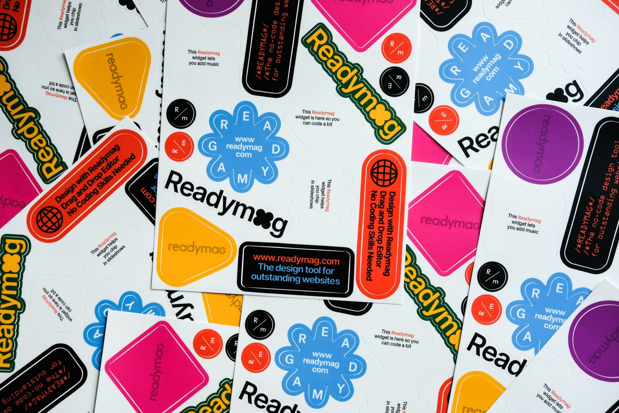
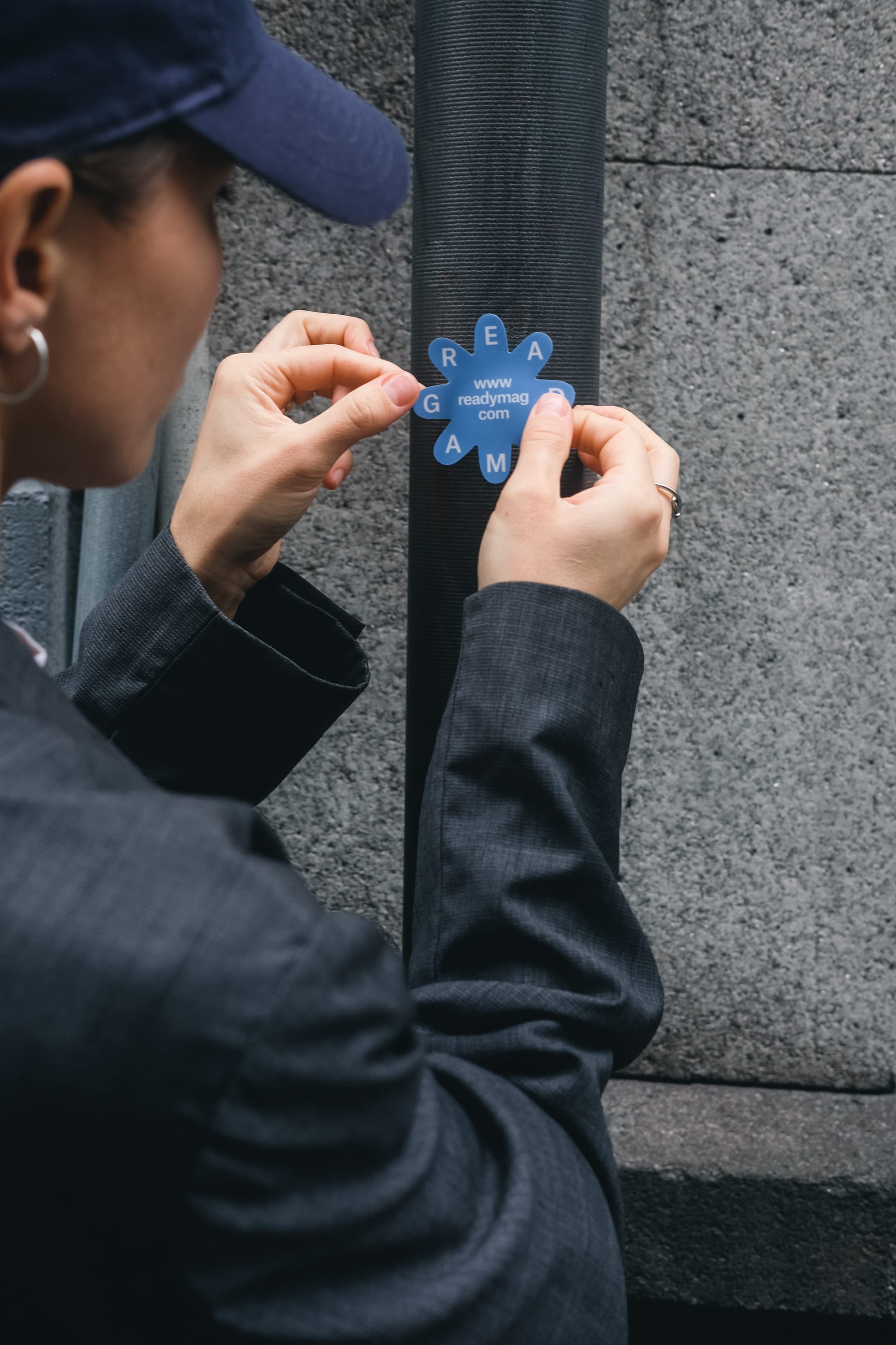
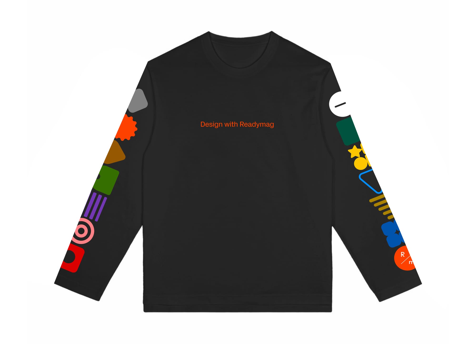
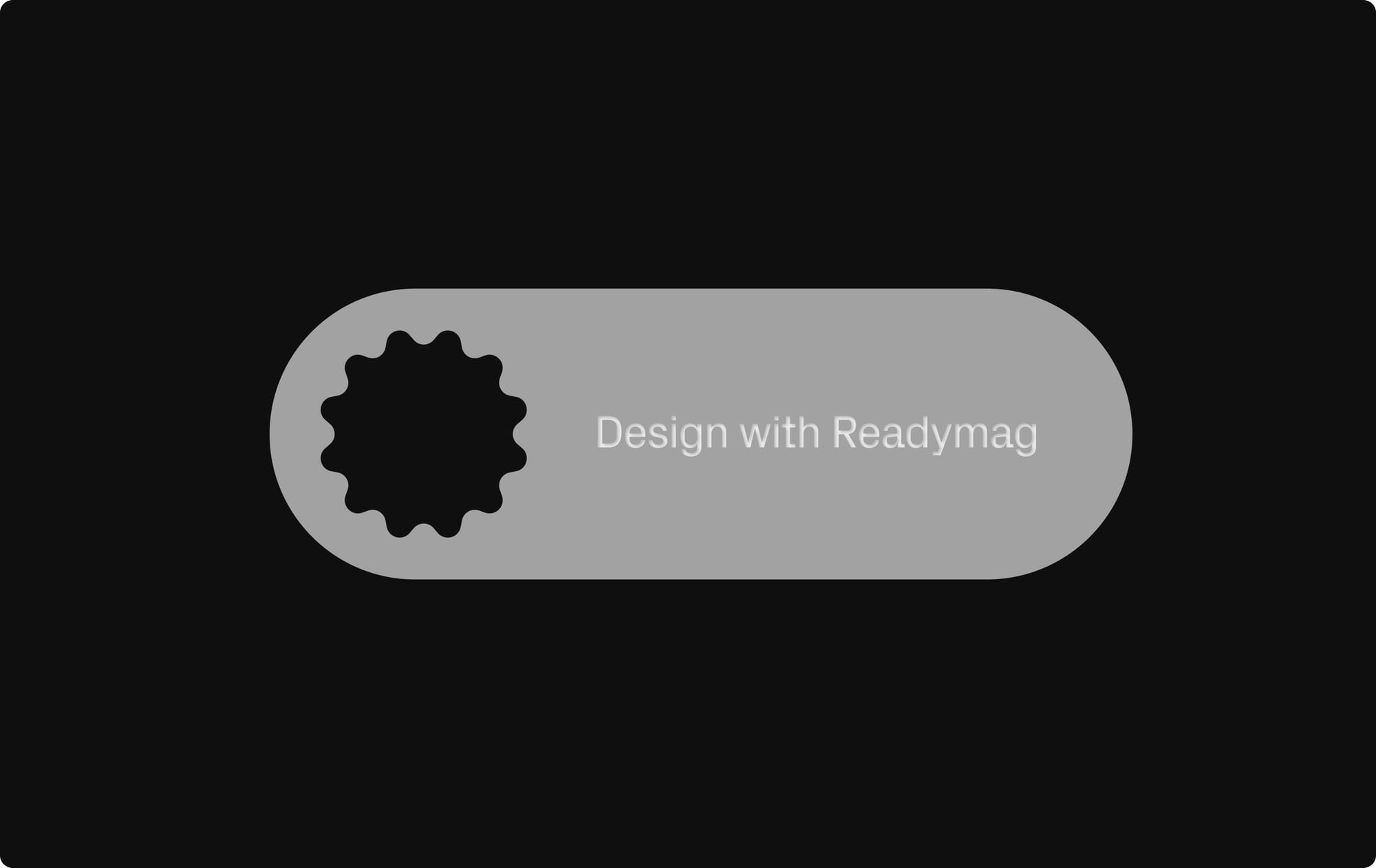
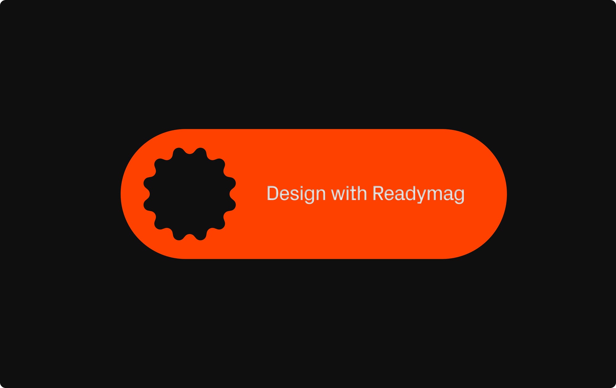
Francisco: The main idea was to make something that looks good in photos, represents the Editor, and promotes Readymag. For me, the most iconic elements of Readymag are the widgets, so we made the notebook with the widgets game, created sticker designs based on widget shapes, and developed the keychain—it’s still in the prototype stage, but it’ll definitely feature the widgets too.
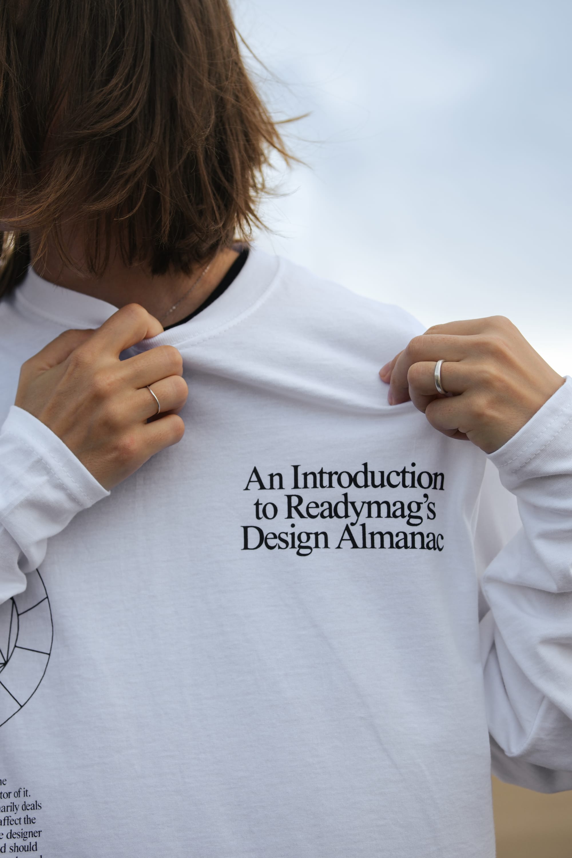
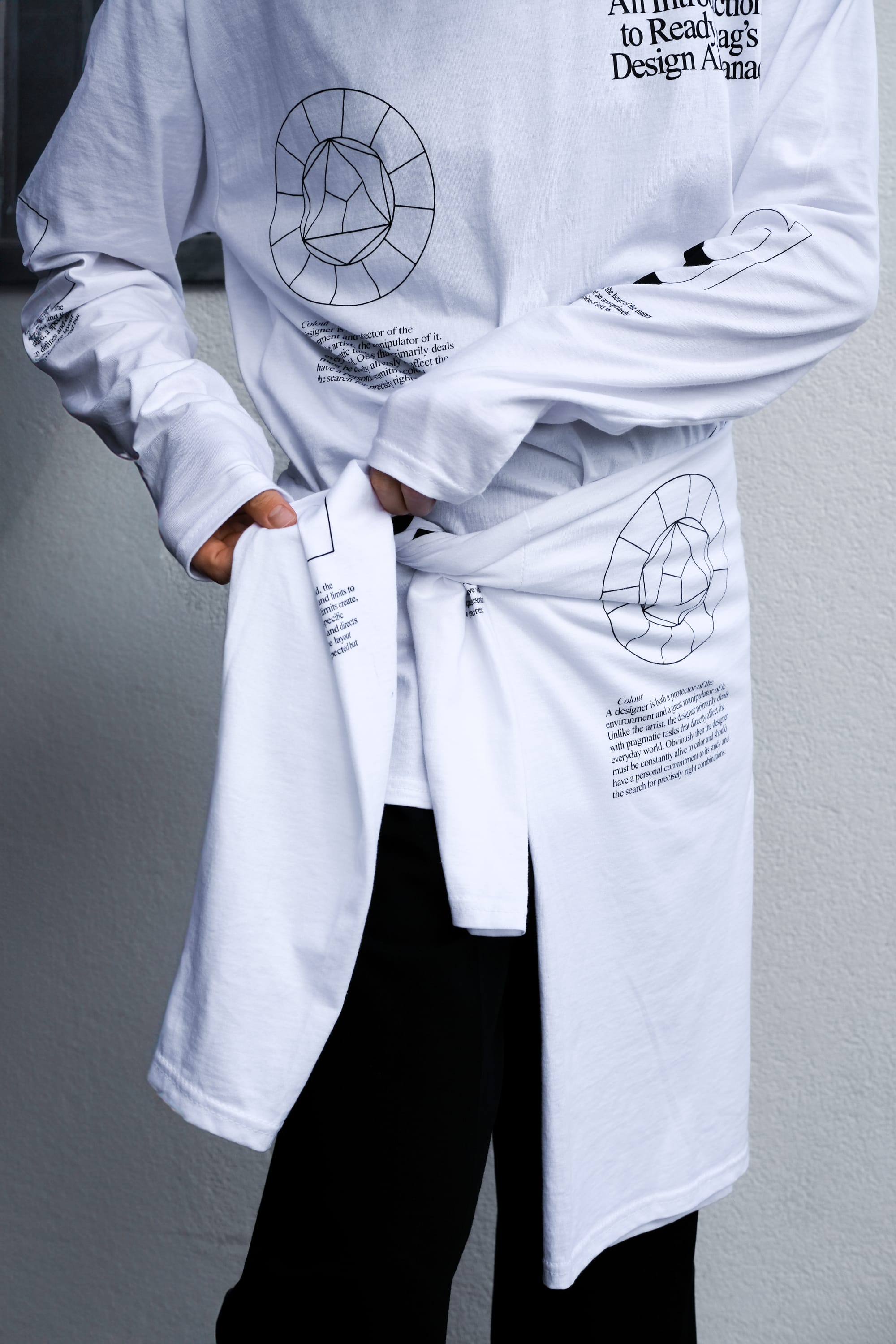
Anna: Each item needed to have a strong connection to Readymag. The previous set of merch was beautiful and cool, but less tied to the brand itself. Now, each item reflects Readymag’s interface and principles. For example, the long-sleeve shirt is based on the Readymag design almanac and includes excerpts from our principles—about grids, animations, and integrations. For me personally, the shirt also looks like a blank white sheet, like when you start working in Readymag.
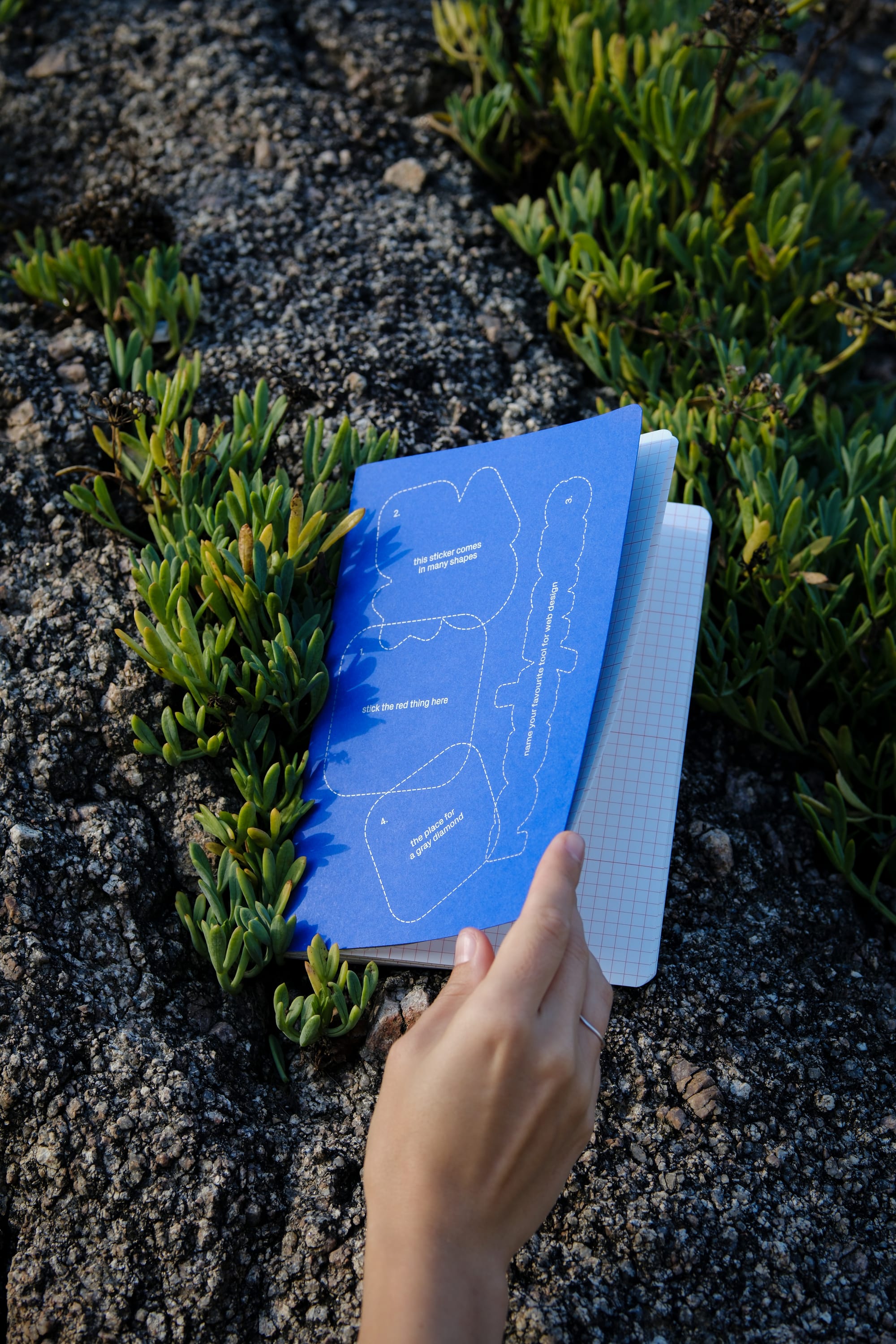
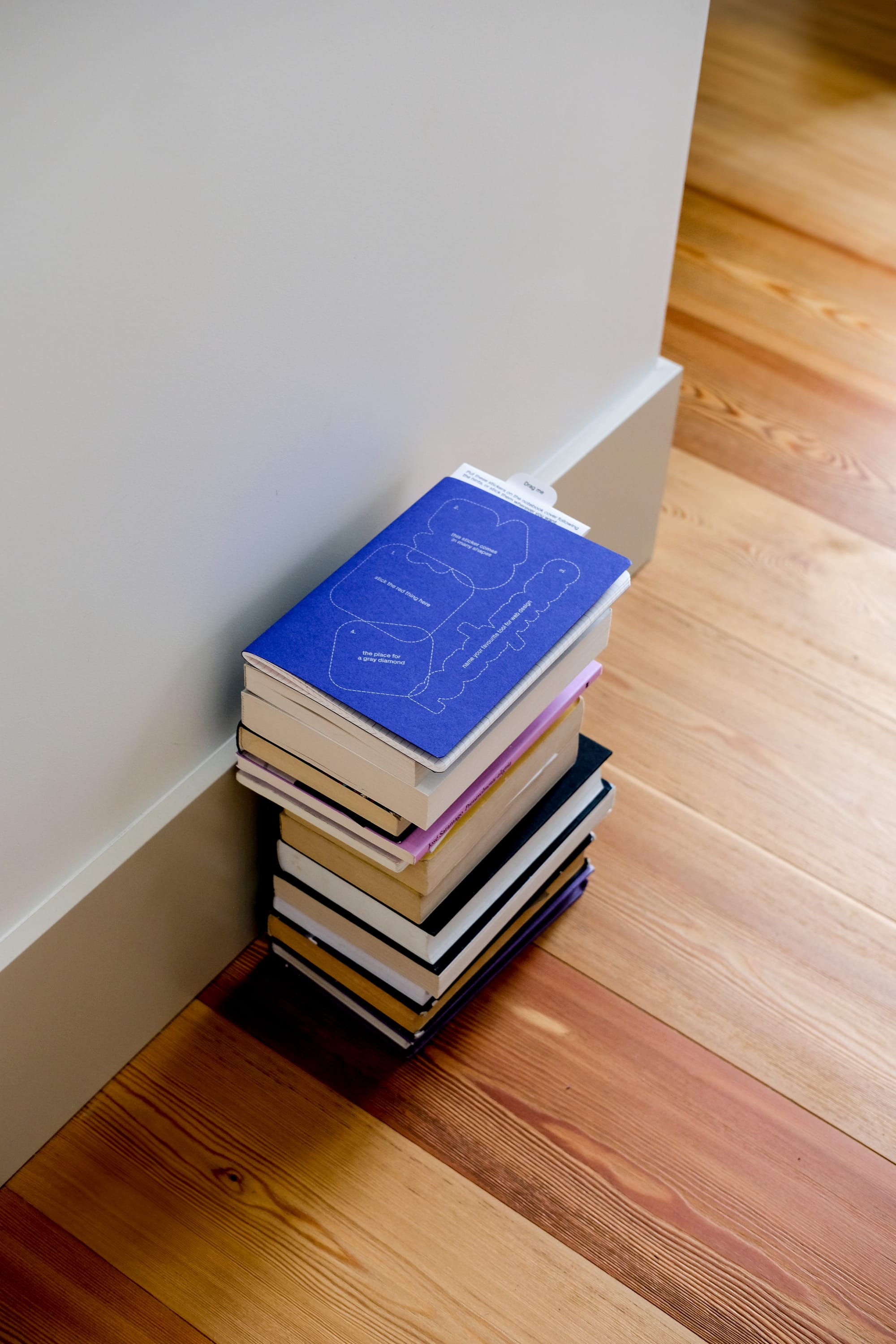
The notebook includes outlines of shapes that you can stick, or not, depending on how you want to use them. They’re designed in the form of widgets, aligning with Readymag’s principles—there’s a grid, guidelines, and pre-made animations, but you can use them however you want or create some chaos.
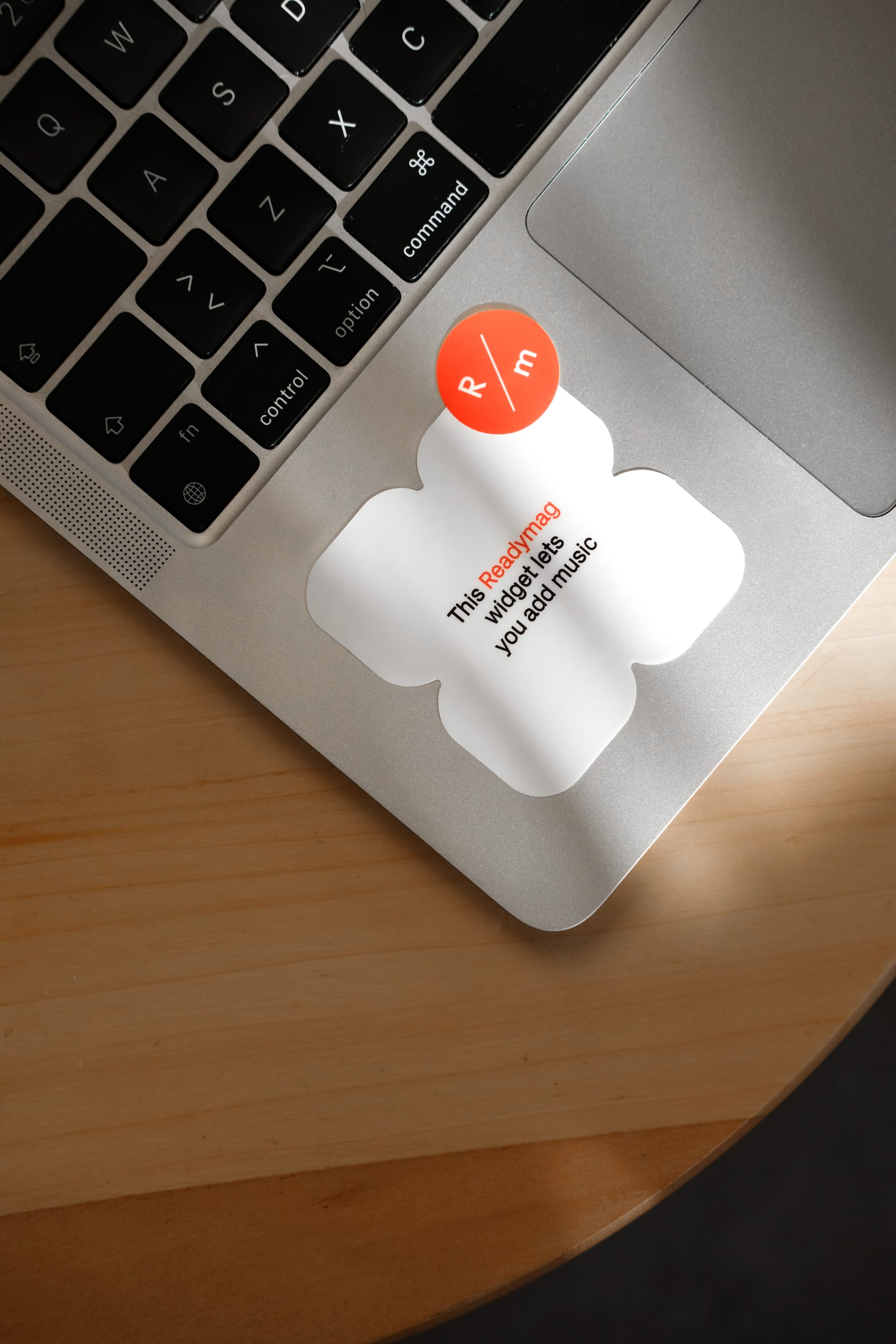
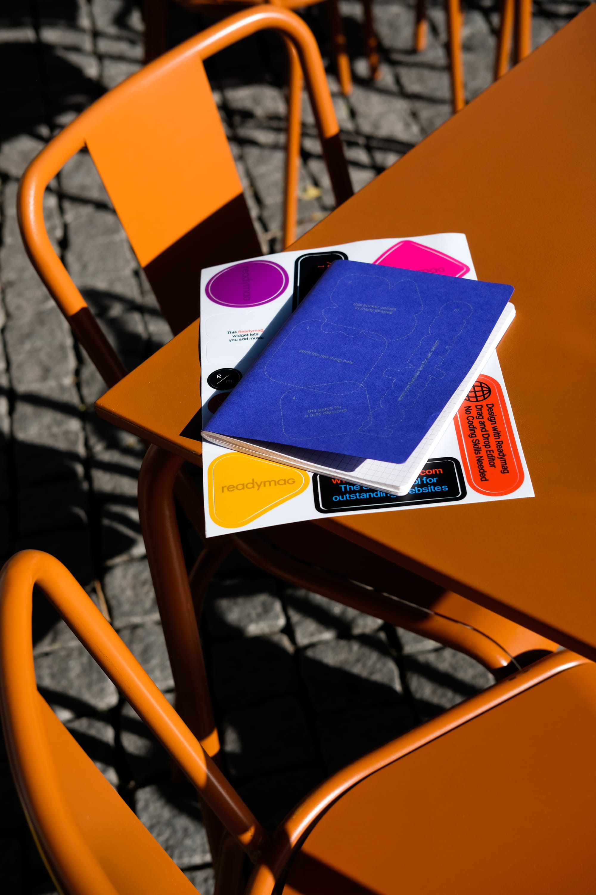
Francisco: We have stickers in Readymag colors with Readymag widgets, and the keychain (currently in production) is made up of shapes/widgets.
Apart from the widgets, we also created stickers with Readymag-related copy, like “Drag-and-drop editor—no coding skills needed.” The whole sticker became a manifestation of this copy, trying to visually represent the sentence in a symbolic way. Another example is “No-code design tool for outstanding websites,” where the sticker uses a cool visual language with bars and a specific star-shaped graphic that connects to Readymag’s identity.
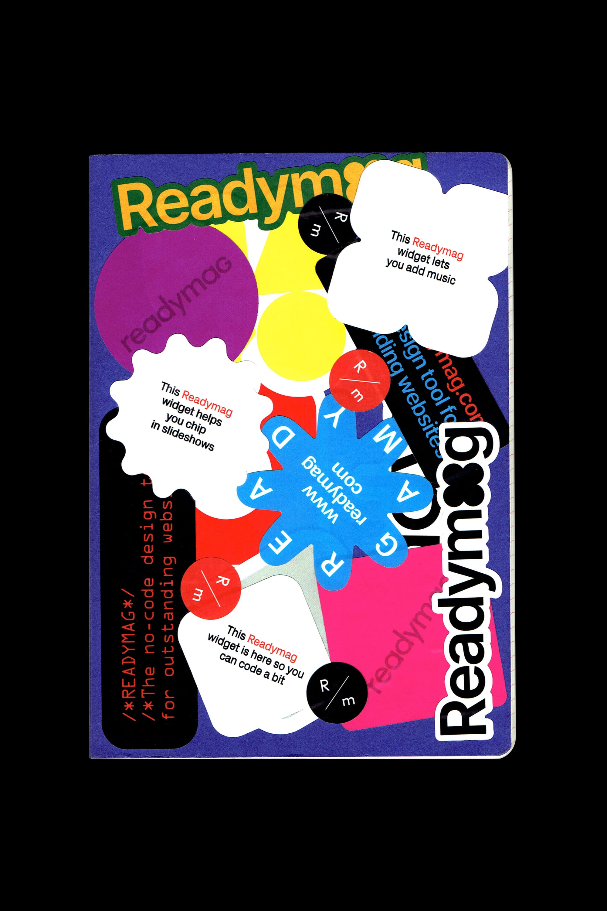
One fun idea was to create a “widget guessing game” where the widget shapes are shown without color and the message inside asks, “Do you know which Readymag widget this is?” This was meant for collaborators, friends, and people already familiar with Readymag—a little inside joke.
It’s worth specially mentioning the Design Almanac long-sleeve shirt, where we tried to incorporate all the chapters of the almanac into a cohesive print. We converted colorful images to black-and-white and reduced the design elements, which gave us a nice, smooth connection between graphics representing animation, typography, color, and grids—all core elements of Readymag’s tool.
Francisco: Of course, in the process we explored other possibilities, like creating a community long-sleeve shirt listing users or contest winners. We even considered a movie-credits-style design as a way of thanking people who have supported us over the past 11 years. Also, we discussed collaborating with award-winning Readymag websites and incorporating their content into the merch, but due to legal and copyright issues, we realized it would be too difficult in the short time we had—it took 1.5 months from the initial concept to the production of the first items.
Different beer opener options
Production
Anna: There were several factors we considered when choosing the items. First, we wanted something practical: items people could use every day, rather than something that would just sit on a table. We also wanted something new that wasn’t available in previous years. It needed to be affordable and not too difficult to produce, but still custom and aligned with what we envisioned. This made finding a production company tricky, as some couldn’t print on sleeves, and others couldn’t do custom keychains or multi-part notebooks—not just simple printed products. Shipping was another factor—we needed items that weren’t fragile, so we avoided things like candles or glassware.
We also tried to work with local producers—small companies that specialize in notebooks and paper products—and separate suppliers for the shirts, aiming to avoid large corporations. Sustainability was an important aspect for us. The notebooks were made in Portugal, the shirts in Berlin, and the keychains are being produced in Spain. Stickers are made locally depending on the event, we make them in different places as needed.
Francisco: Quality control was a big part of the process. My background in working with textile companies made me very aware of small details that needed fixing before production. For example, with the keychain, we tested how the white material would hold up after being used for several days, and we noticed it got dirty quickly, which led us to choose a translucent label instead. Similarly, with the notebook, we had to adjust the logo placement because the margins weren’t correct on the first batch. These little things are crucial for achieving the best quality, and we always pay attention to these details in design.
Anna: One funny challenge was storage. The previous merch was stored with a freelancer in Berlin. But this time, we had 300 shirts in Germany, 500 notebooks in Portugal, and some stickers. I suddenly realized—where do we store all this? The freelancer didn’t have enough space! We eventually found a warehouse in Berlin, so it’s all good now, but it was unexpected.
Reception and feedback
Anna: The merch is intended for Readymag employees, ambassadors, partners, and influencers. Whenever possible, we give it out at events: for example, at our community meetups. So if you want to get the merch, come to our events, participate in contests like Websites of the Year—all winners get sent merch—or attend events where we participate, such as design conferences that we take part in.
Merch in its natural habitat
At a conference in Berlin, we raffled off merch, and some people specifically participated just for the merch. It drew attention, and some people even tried to take it before the raffle—I had to tell them they could only win it! At the community meetup, all the merch was taken, and everyone said it was super cool and beautiful.