Fast doesn’t mean boring: A showcase of websites made with Readymag templates
You don’t have to reinvent everything to make something that works well and feels considered. These sites prove that.
Templates can save time without sacrificing quality. Readymag templates are built for exactly that: helping you build fast while still making something that’s visually distinct. And as the selection below proves, a quick process can still lead to well-crafted results.
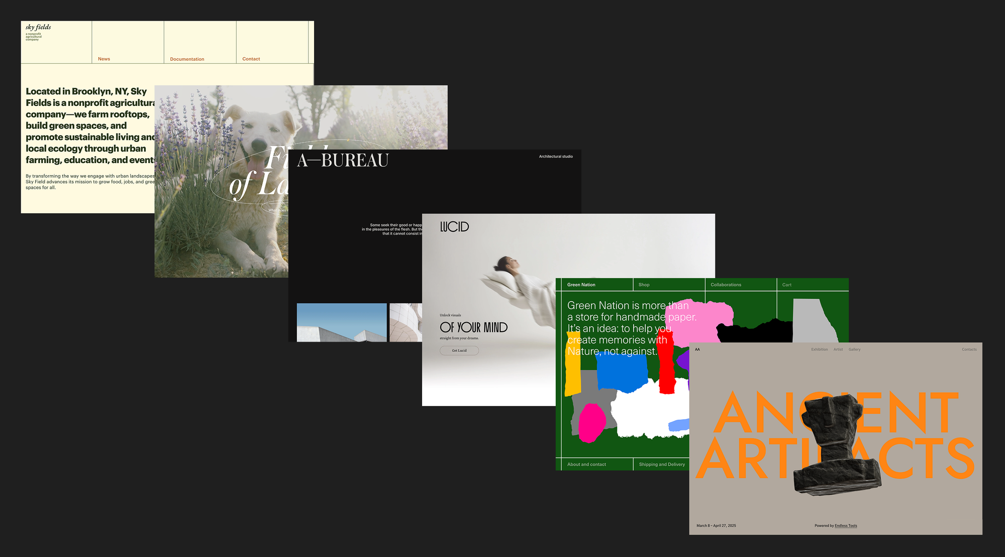
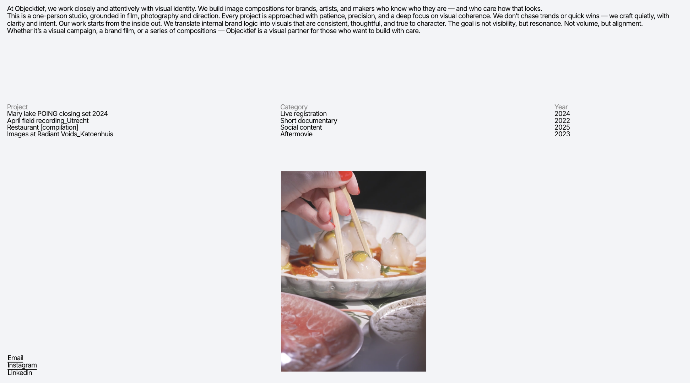
Portfolio Workbench (“On hover index”) → Objecktief
This template from the Portfolio Workbench is an example of minimalist typography, where a strict grid and generous white space set the rhythm. The clean, almost editorial style centers on text, turning each line into a navigation element. Hover animations are concise and functional: changing images enliven the content without breaking the interface’s calm. It works like a gallery on pause—until the user moves the cursor.
The site of the Objektief studio keeps the template structure but fills it with its own content. A custom cursor in the form of a thin circle draws attention: it’s a minimal yet expressive touch that may nod to the name, echoing a camera lens.
Portfolio Workbench (“Gallery linked”) → Kayden Hadley Portfolio
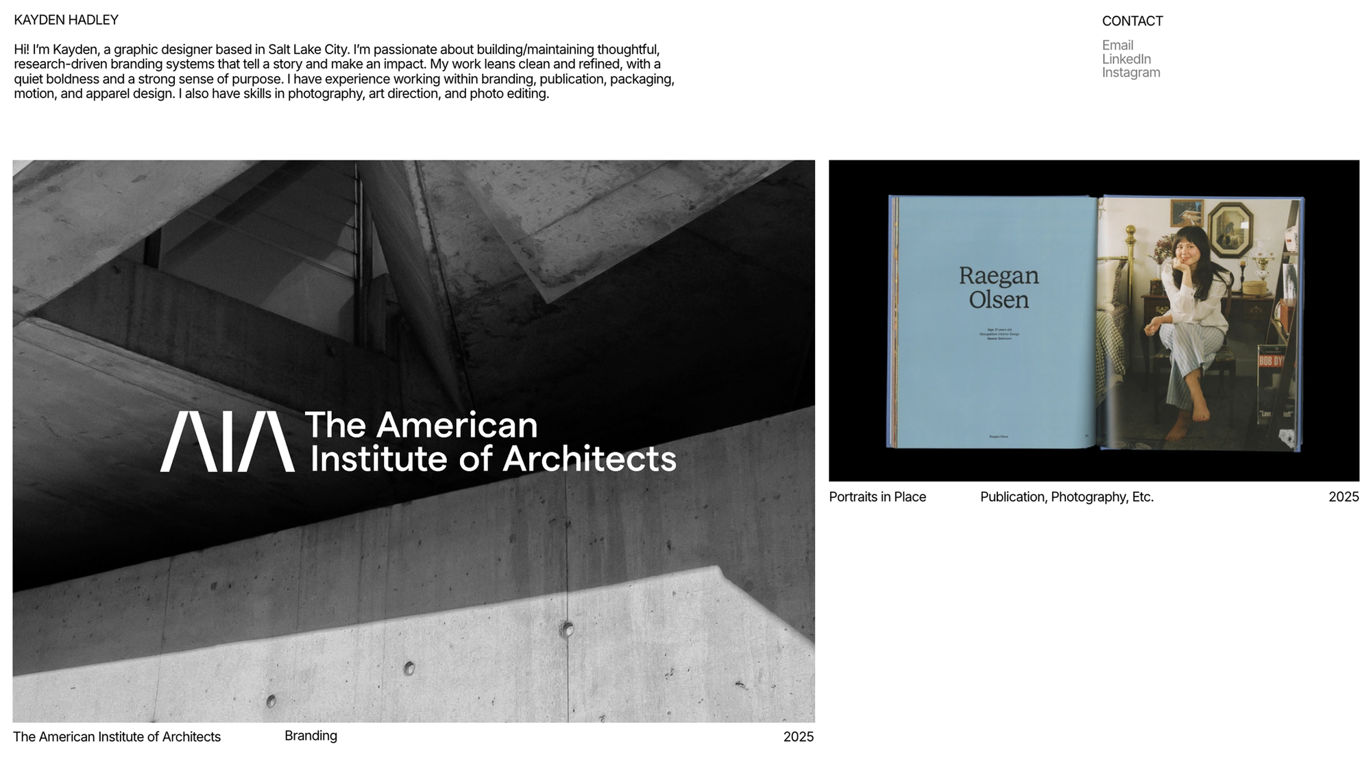
Another option from Portfolio Workbench, this site is built as a neatly structured page with modular logic: each project is a repeating section with a name, an image slider, a description, and a list of contributors. The layout is rigid and symmetrical, with clear verticals and uniform white space.
For her portfolio, Kayden Hadley uses the template structure as a base but shifts to a different navigation logic. Instead of a modular layout with descriptions on the main page, there’s a single introductory text block, and the projects open separately as full-fledged case studies with expanded layouts.
“Just as I was about to start building my website from scratch, I came across the Portfolio Workbench template, which resembled my initial sketches. It felt quicker and more efficient to work from something prebuilt, so I chose the template closest to my vision and customized it to fit,” explains Kayden Hadley. “The process was quick and straightforward. I deleted the pages and elements I didn’t need, then replaced the rest with my own content. I ended up building the entire site in just two work sessions—far faster than starting from zero.”
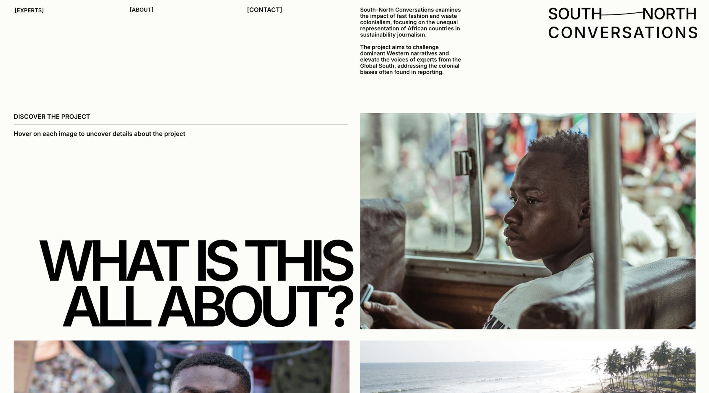
Stolen hearts → South–North Conversations
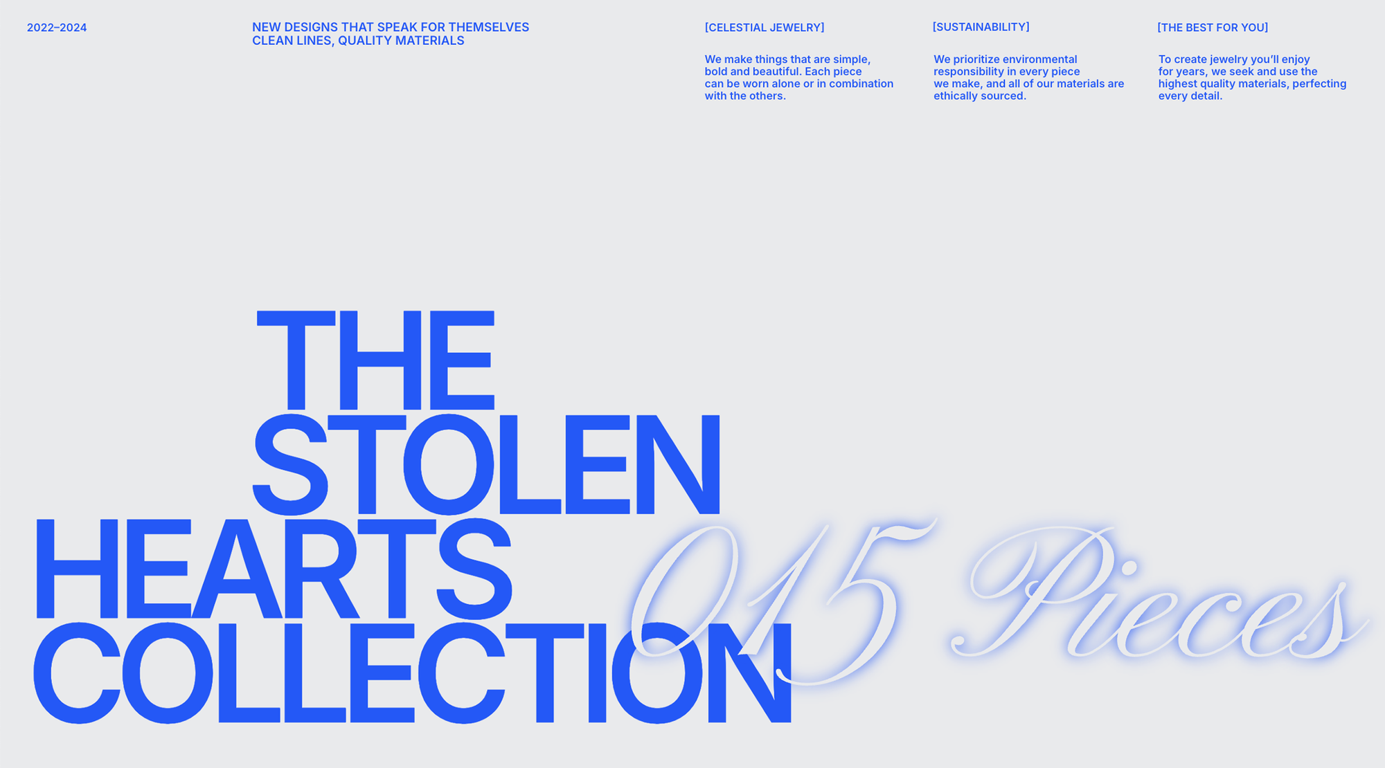
The template is built on contrasting typography and an expressive grid, with bright blue text as a visual anchor and large images as a product showcase. Formally, it echoes a collection catalog but unfolds as a visual narrative with emphasis on text, shifts in rhythm, and transitions. The mix of horizontal and vertical scrolling adds dynamics without losing control. On hover, a concise, well-timed descriptive layer appears over the images.
The South–North Conversations site is built as a research platform, where the visual language serves the content. The core structure is inherited from the template but reworked for an educational purpose. Some elements remain: hovering over images reveals additional content, and horizontal scrolling appears in select sections, but the overall tone shifts from promotional to narrative. Instead of a gallery effect, there’s a steady unfolding of the topic.
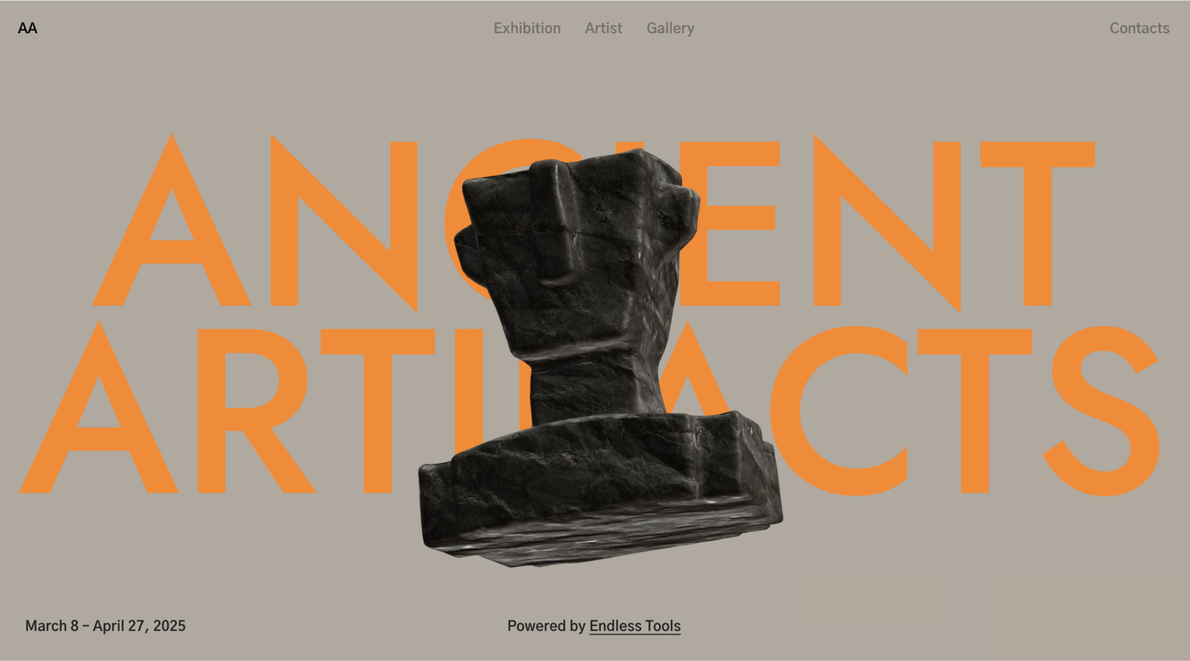
The Ancient Artifacts template is a landing page for an exhibition, featuring a bunch of 3D objects that appear as you scroll. The site features a brown-gray palette, large type, and a serious, museum-like atmosphere. At the end, there are draggable objects, reviews, and info about the artist and gallery.
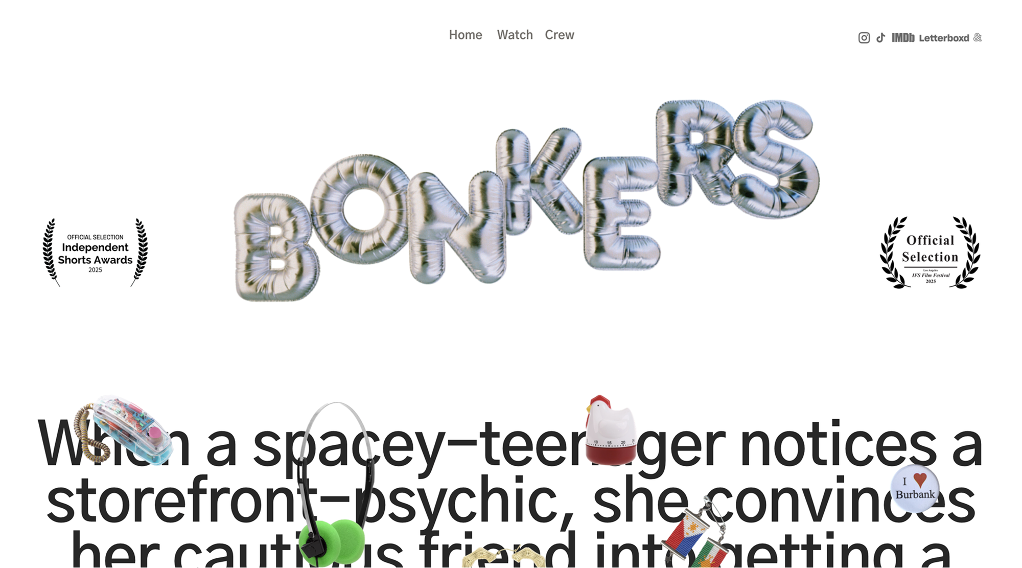
Bonkers is a film site, minimal and almost cinematic by itself. As you scroll, a car moves left to right, then right to left, while the synopsis unfolds. There are pages for the team credits and a way to watch the film (the latter is password-protected). The overall structure and a few techniques carry over from the template, but visually and thematically, it’s an entirely new site.
Sazan Pasori, the creator behind the site, explains: “I created this website to promote my short film. I loved how the template felt simple and seamless, with a museum-like quality that beautifully displays images both in and out of context. I wanted something that felt premium yet accessible, a home base for audiences as the film begins its festival run. I removed and remixed some elements, and added 3D and motion using the Shots feature.”
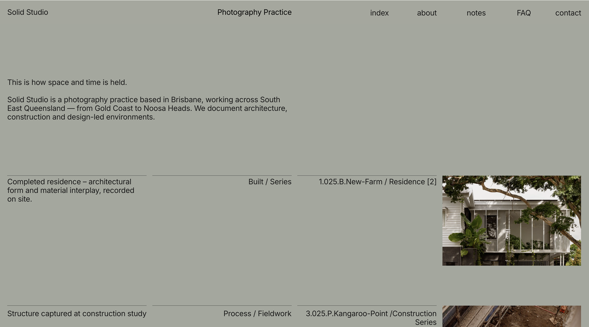
Grid is a minimalist template for an architectural portfolio: black background, white text, a project grid (three across, varying heights), large typography, and photo-first focus.
Solid Studio is a photography practice from Brisbane. They rethink the template, removing the image grid, using a vertical list of projects, and adding more text. Pages keep a similar structure but feel even stricter, almost like a catalog.
As founder Anka Boychev puts it, the goal was clarity and structure: “I chose to use a template because I wanted to build the site quickly, with minimal resources. The goal wasn’t to create a decorative portfolio, but a structured system inspired by the analogue cataloguing method used by architectural photographer Julius Shulman, as described in ‘The Photography of Architecture and Design’.
Even though most archiving is now digital, the core challenge for photographers remains: how to organize, present, and preserve bodies of work in a clear, accessible way. That idea shaped every decision. I used a single font (Inter), one type size, and a background color drawn from the tone of archival folders. The layout follows a strict grid, guided by the principles of Vignelli and Dieter Rams: order, reduction, clarity.
I chose the Grid template for its underlying logic. The process was fast and surprisingly fluid. I treat templates like working sketches: remove what I don’t need, add real content, adjust the structure, and rebuild the final version with only what’s essential.
What I value most about Readymag is its flexibility. Whether I’m building a long-form index or a quick online deck, the tool adapts without imposing a visual identity. It leaves room for systems to emerge.”
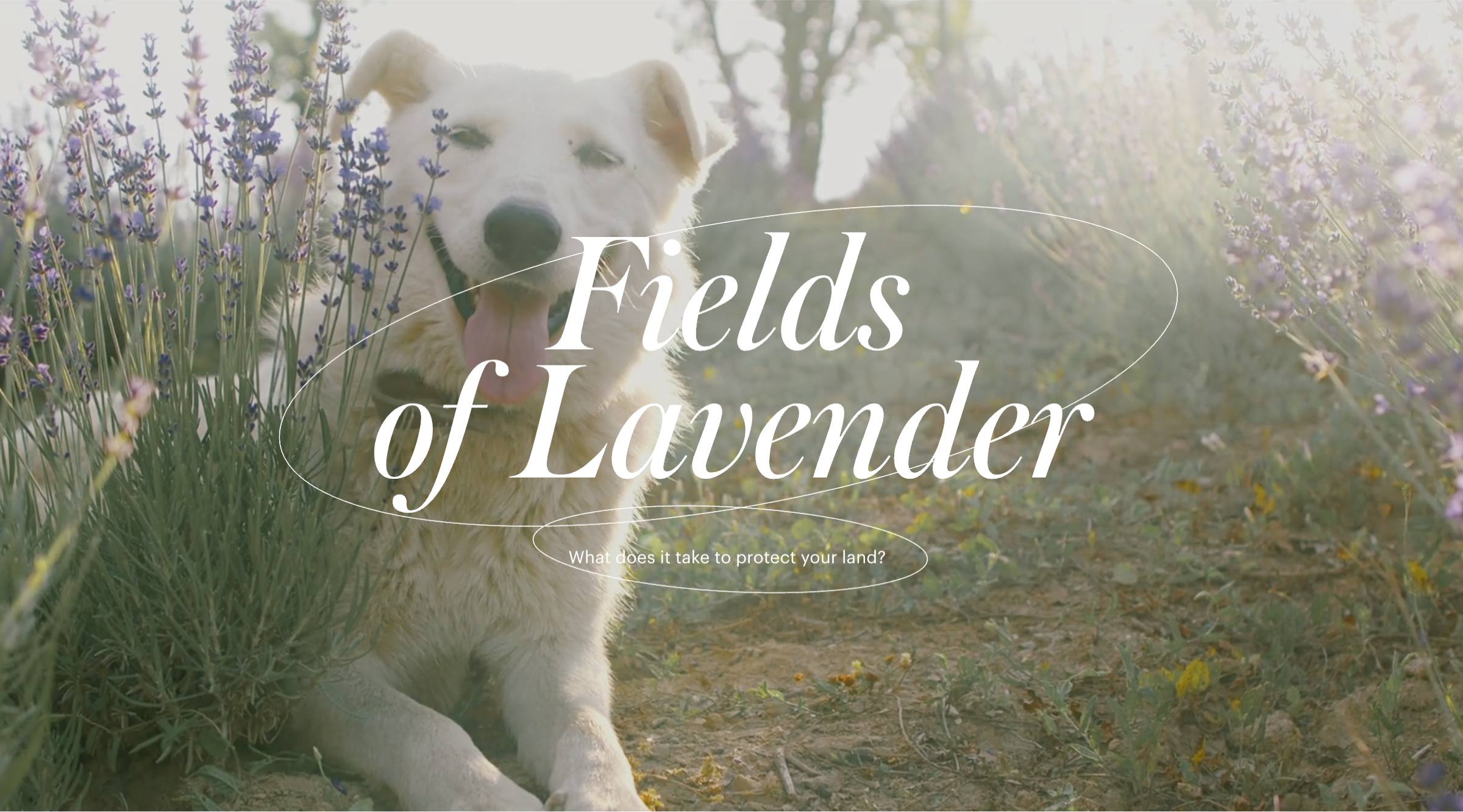
Lavender is a template for a vertical scrolling presentation of a multi-episode film—light, airy, French, and beautifully Norman. Descriptive slides alternate with full-screen video inserts and trailers for each episode.
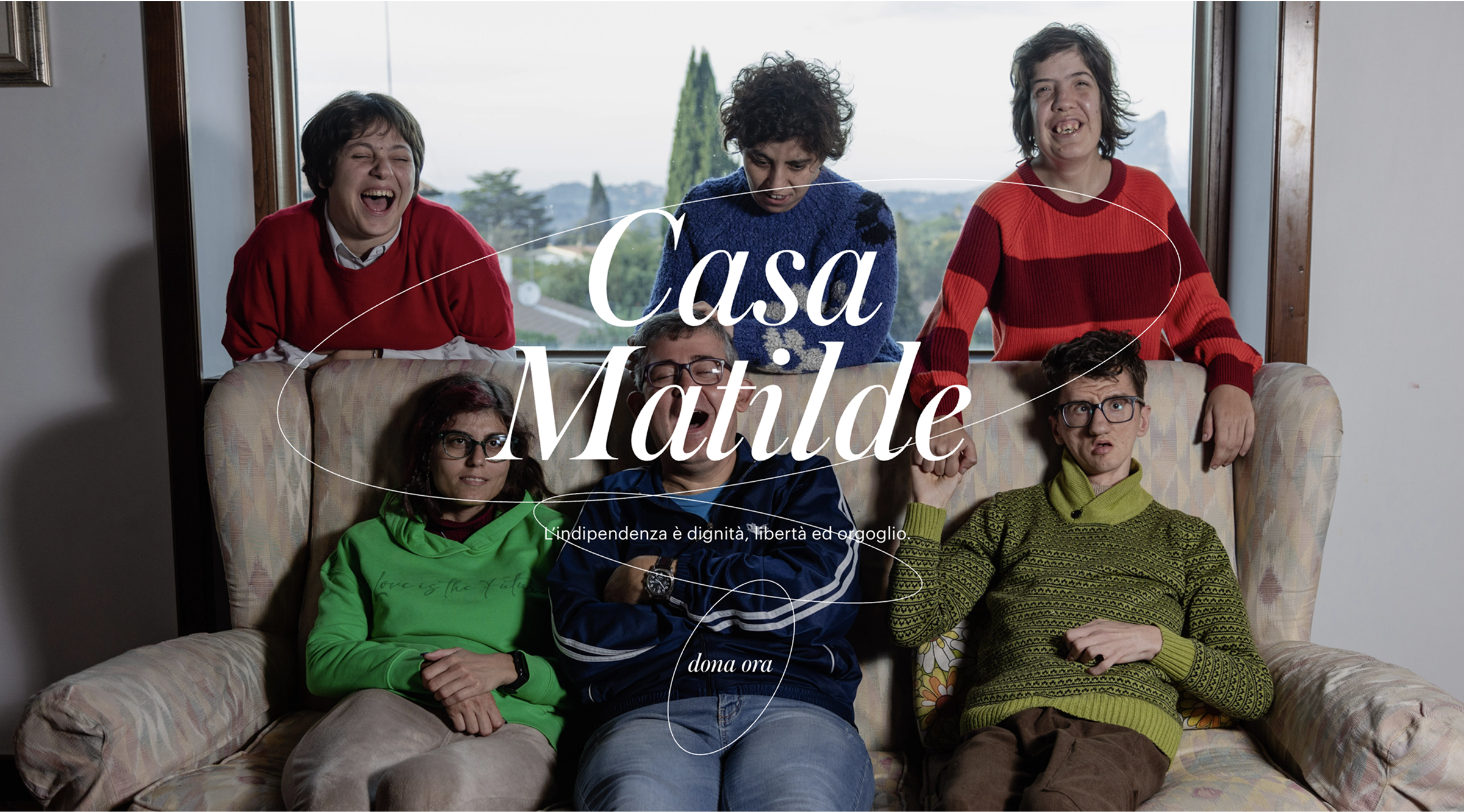
Casa Matilde follows Lavender’s structure and storytelling approach, but puts it to powerful use: telling a real, socially important story about an Italian association that supports children with cognitive disabilities. The same format now carries real emotional and human weight.
As designer Giorgio Secli recalls: “When I was asked to design the website for Casa Matilde, I immediately knew it was a special project. The association was founded by six families with children who have cognitive disabilities, with the goal of creating a safe, welcoming, and autonomous future for them, even when their parents are no longer able to care for them.
The challenge was to build a platform that could express both the warmth and purpose of Casa Matilde and to do it quickly, due to strict public funding deadlines. That’s why I chose Readymag’s Lavender template: it felt calm, elegant, and emotionally aligned with the spirit of the initiative, allowing me to work fast without sacrificing quality.
The template’s structure, with its smooth transitions, scroll-based storytelling, and space for photos and video, helped me build a flowing narrative around the project, introducing the people currently living there. I customized the design with soft circular animations to evoke inclusivity and movement, and used a warm orange accent to reflect Casa Matilde’s caring, inviting soul.”
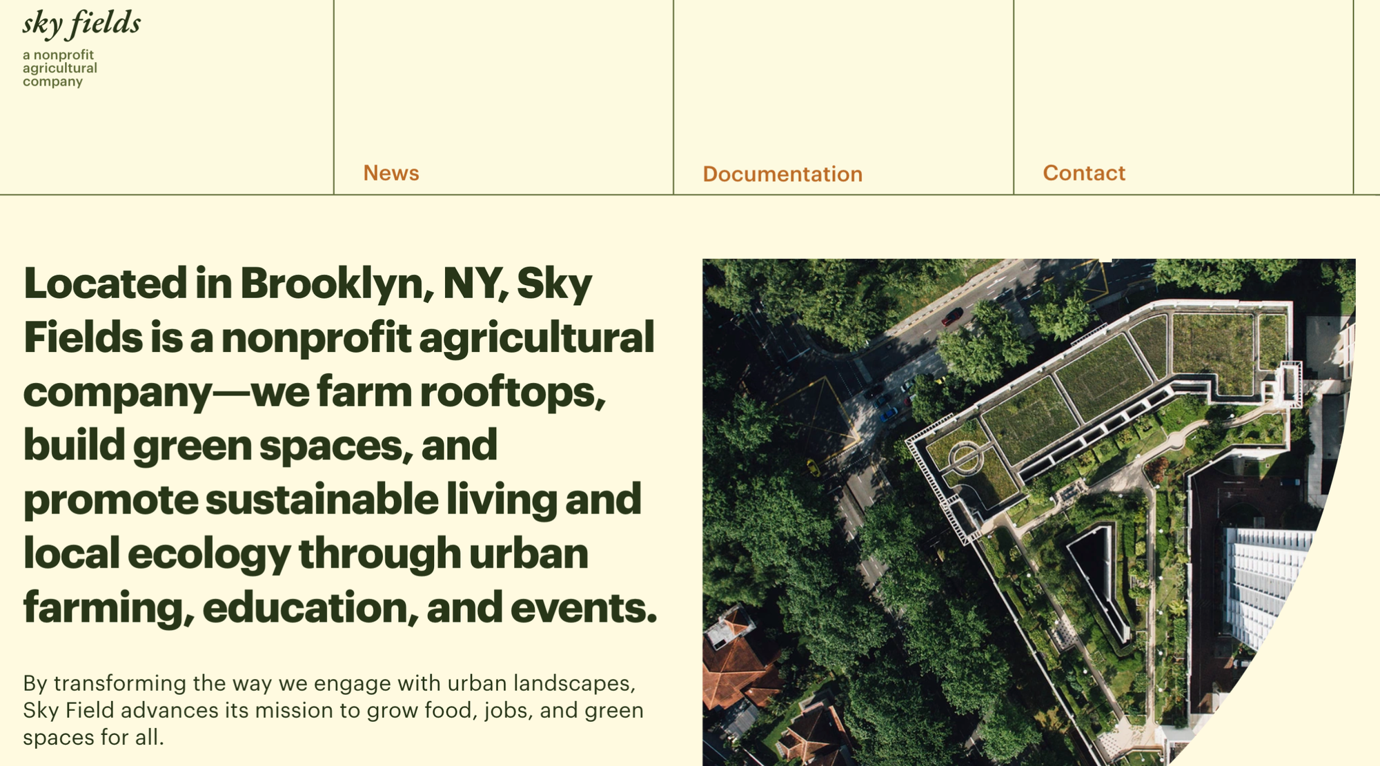
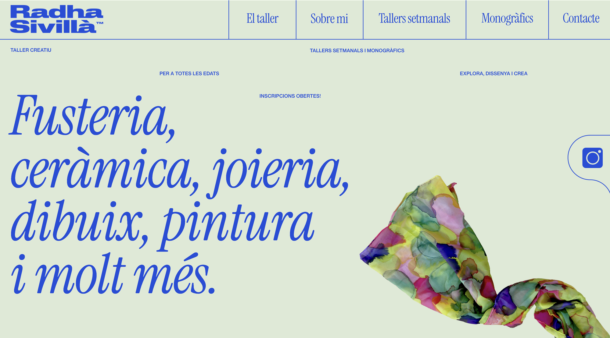
The Highline template is a site for a fictional non-profit company. Everything is calm: pastel earthy tones, a clean grid, a fixed top menu with sections for news, documents, and contacts. At the bottom, there’s a subscription form and links to social media. Overall, it’s restrained, tidy, with a slightly conservative feel.
The Radha Sivilla’s site built on top of it became a landing page for a creative who runs workshops. It’s much livelier: as you scroll, you move smoothly from one section to the next, colors shift from muted to bright, and interactive elements appear—like a draggable handkerchief on the first screen. There’s still a menu, but navigation is possible through plain scrolling too. The template is still recognizable, but now it’s just a foundation: the structure has changed, and the mood even more so.
A few more ways to speed up your work without sacrificing quality
Presets
Presets are pre-assembled widget groups that allow you to quickly add headers, footers, or menus. You can also save your own combinations and reuse them in other projects. They’re handy if you’ve created a universal product card or pop-up and don’t want to rebuild it every time.
Group editing
If you have multiple similar widgets on a page, you don’t need to adjust each one individually. Just select them all and change shared properties in one go. It’s faster, and helps maintain visual consistency.
Auto layout
Auto layout makes it easier to adapt desktop layouts for mobile. It automatically restructures content, preserves groups, and keeps everything aligned. Since it links back to the desktop version, the visual logic stays intact.
Global widgets
If a widget appears on multiple pages, you can make it global. That way, changes made once apply everywhere. You can also hide global widgets on specific pages when needed.
From using templates to creating them
Any designer can use Readymag to turn one of their sites into a template or create a new one from scratch. Why do it? You get extra visibility and promotion (especially if you’re featured in our Template library), new connections, potential clients, and a chance to directly monetize your design by selling templates.
You can learn more about Community templates in this article.