Made in Asian America: use Readymag to build a successful e-commerce business
Black Bean Grocery is an online shop offering apparel, zines, and cosmetic goods evoking the aesthetics of your favorite Asian grocery store or supermarket. It was launched in the fall of 2018 by Brandon Ly and James Bui, designers and engineers who met and studied together at Stanford University.
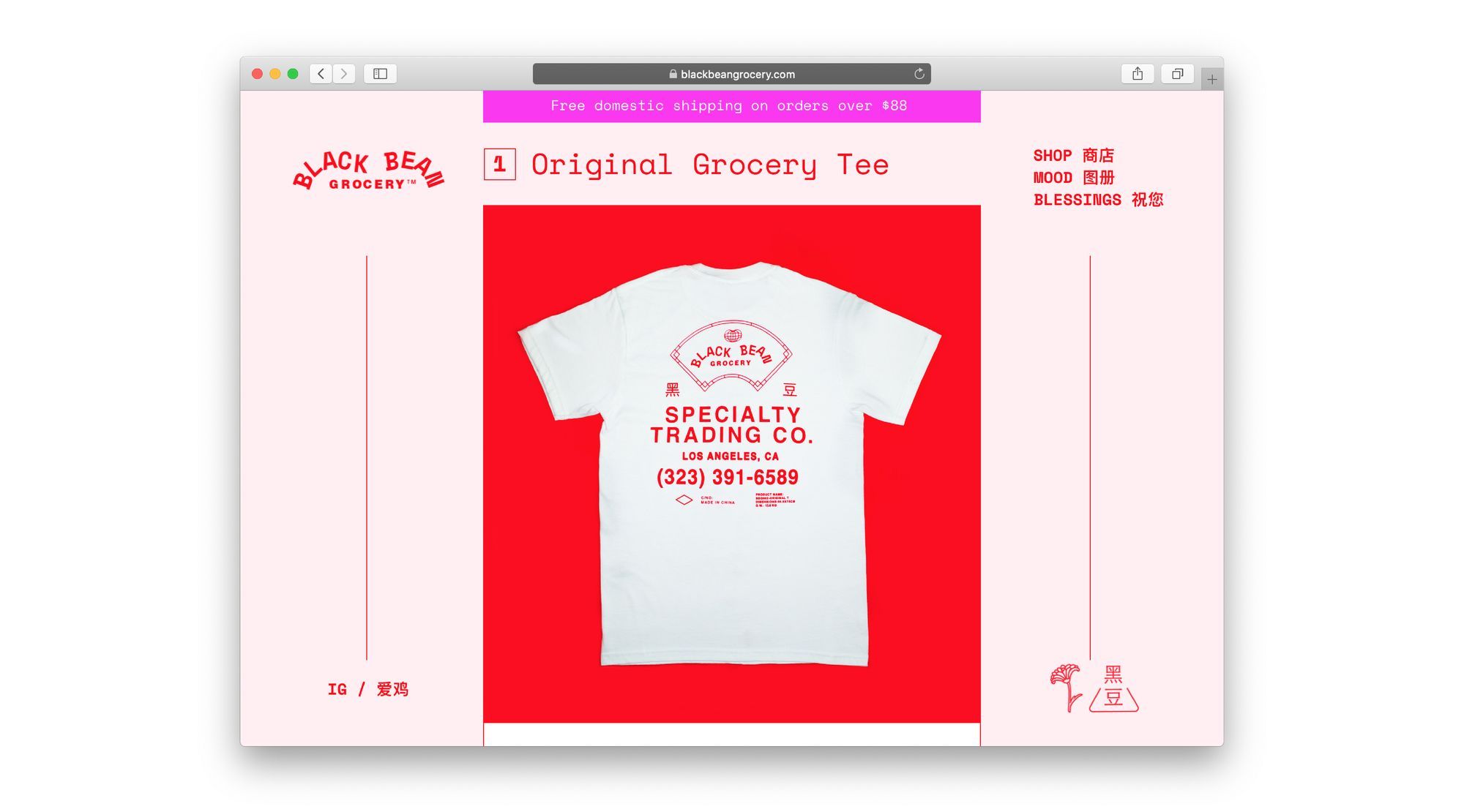
Black Bean Grocery is an online shop offering apparel, zines, and cosmetic goods evoking the aesthetics of your favorite Asian grocery store or supermarket. It was launched in the fall of 2018 by Brandon Ly and James Bui, designers and engineers who met and studied together at Stanford University. Readymag’s editorial team talked to Brandon about their use of Readymag to create a strong digital presence, including intelligent integration of an e-commerce widget.
Made in Asian America
James and I were born respectively to Chinese and Vietnamese families who immigrated to Southern California, and we share an appreciation for the sometimes minimal, sometimes misspelled, but always utilitarian design found on the products of our childhoods (often in a grandparent’s home). I grew up in a family business that was very tied to Chinese markets and restaurants so I developed a personal affinity for the imagery, but a lot of the visual motifs are ubiquitous to the Asian-American experience.
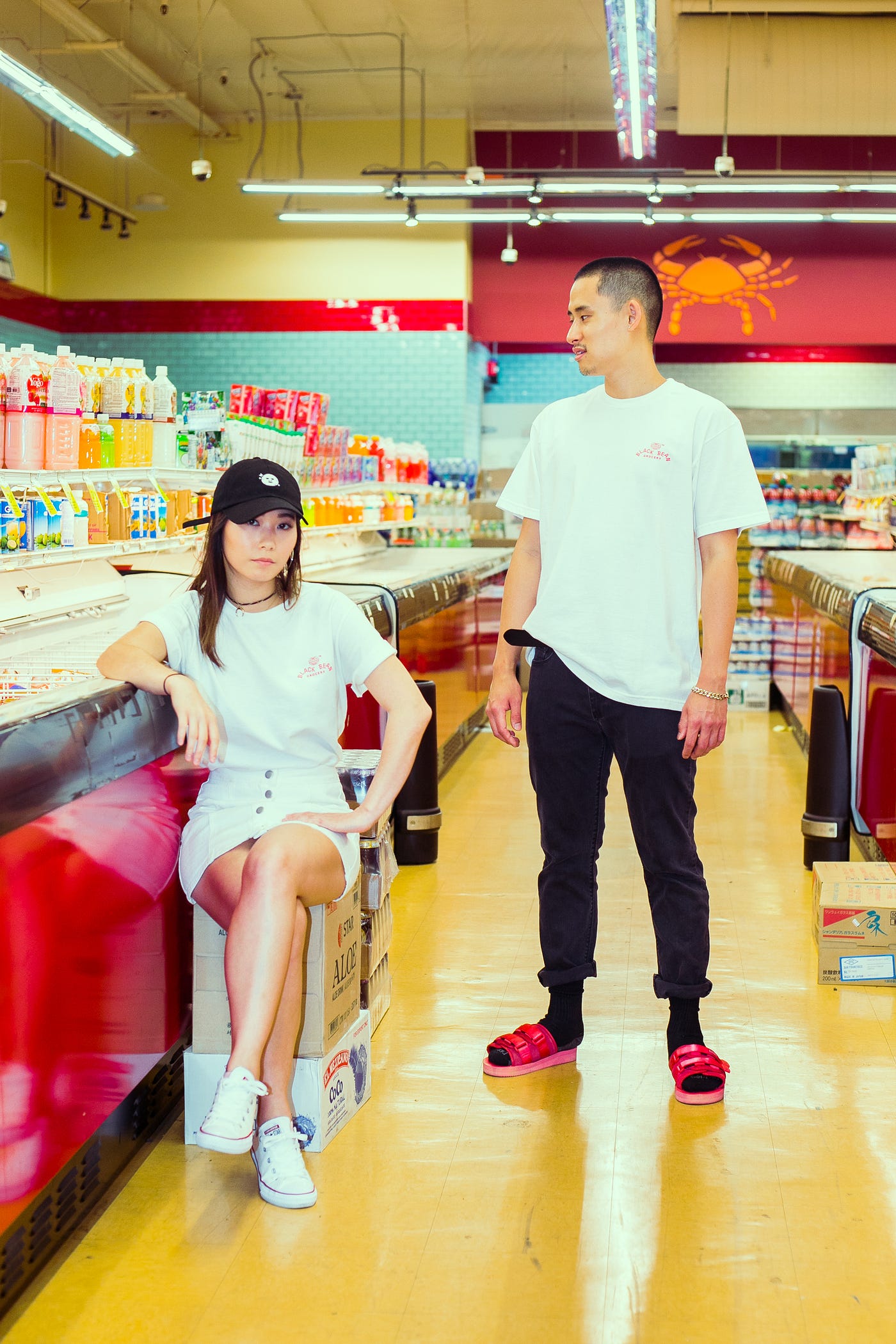
Speak with just about any child of an Asian immigrant and they’ll recognize the oyster sauce bottles found in their pantries, or recall dubiously effective herbal remedies pushed onto them by grandparents. We pay tribute to that in a style we call “Made in Asian America,” where we try and design products that would look right at home on the shelf of a 99 Ranch Market, a Chinatown trinket store, or a local herb shop/acupuncturist.
From a design standpoint, our favorite piece of nostalgic ephemera is the Lee Kum Kee sauce. It’s got three printed areas, gold foil stamping, and an iconic bottle. Anything we design tries to live up to that.

We created Black Bean Grocery with the intent to honor the generations that came before us and designed the iconic products of our collective childhoods. ‘Grocery’ helps to imply that our offerings will always be varied, and we’re open to working in all types of media and collaborating with all types of people. It’s a catch-all name that’s open-ended, so don’t be surprised when we do a pop-up shop one day, or host a community dinner. As far as ‘Black Bean’ goes, it’s just a name that sounded right to us and could believably be a real place in any Chinatown.
The symbols in the corner of our page mean ‘Black Bean’ in Chinese. There’s also a Chrysanthemum flower which represents the Autumn season in Chinese culture.

Shopify widget in red
To create an online store, we integrated Shopify’s Buy Button, which was super easy since we were already using it for everything else e-commerce related. Once you get products in the inventory system, you can specify a few theme options and you’re good to go. And with the Readymag code widget, we were able to just drop the button anywhere we wanted. With barcodes, it’s also nothing fancy — they’re real barcodes purchased online in a batch. We have enough to fill catalogs for years.

For the fonts, we just wanted something simple and functional, as most Asian shops or brands usually just translate their names into English a bit haphazardly, with little attention to the typeface. A mix of Space Mono by Colophon and good ‘ol Arial Bold serves us well for just about everything (both fonts are available from Readymag fonts collection). I love that Space Mono is really blocky and precise, but there’s also a sort of playfulness to it. Once we saw the letters spelling out our logo in that wiggly bean shape, we just knew it was right.
As for Chinese typography, it’s a whole different animal, and I’m curious to learn which fonts carry the impressions we’ve collectively imparted to, say, Helvetica or Comic Sans for Latin characters. For now, we’ve simply used a font that shares the same blocky characteristics of Space Mono, but for anyone looking for a typography lesson I’d encourage reading up on the various Chinese script styles. That’s a fun Wikipedia deep dive.

It’s also important to note that there’s a lot of red on our page. We use it deliberately, as well as maintaining a red color scheme for our Instagram. Always red for good luck :)
Design outstanding web in Readymag. Join now