Llama doing backflips: a journey to make internet different
We spoke with Stockholm-based designer Adam Hunt about his formative years, creating a website for KALLIDA festival and his experience with Readymag.

We spoke with Stockholm-based designer Adam Hunt about his formative years, creating a website for KALLIDA festival and his experience with Readymag.
Putting heads on other people’s bodies
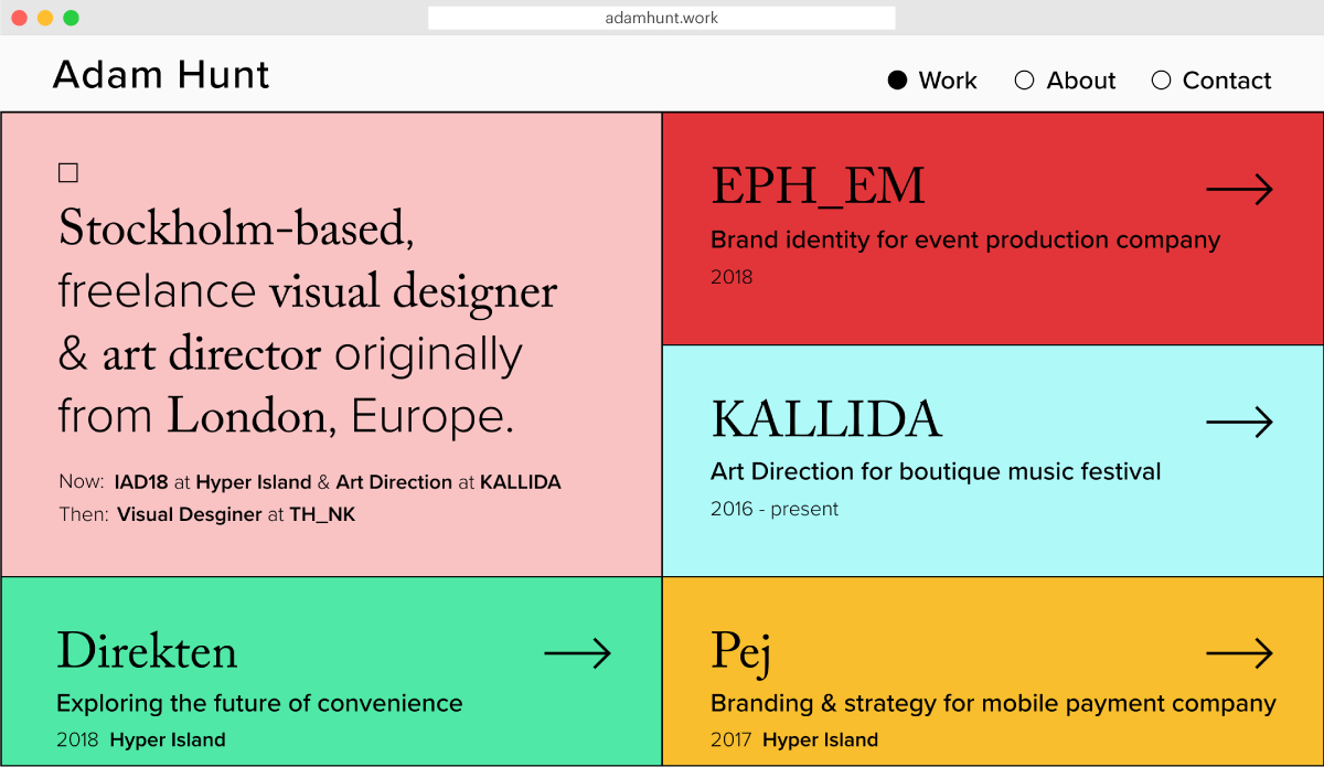
I became a designer almost by accident. When I was a teenager, I encountered Photoshop and used it for what you would imagine at fifteen: putting my friends’ heads on other people’s bodies, doing little flyers for school events. At the same time, I’d also built little websites on Geocities for fun.

However, at the school I attended, if you weren’t really good at drawing, you couldn’t do art. So, after I left school, I was due to study English literature at the University of Leeds but fortunately stumbled upon a course called New Media.
That was probably one of the last courses that had Flash animation and ActionScript at the heart of it. The iPhone had only just emerged, and responsive websites weren’t really a thing yet. So, when I graduated and everyone started asking if designers should be learning to code, I was wondering where the tools were that let designers build?

Because of this, I’ve had this kind of nostalgic longing for when internet seemed more wild and untamed and I’ve always had this urge to try and make the internet look a bit different whenever I can. That’s how I came to Readymag.
Meeting Readymag
My first encounter with the tool was when I saw the Lubalin piece. It prioritised visual design with the form perfectly following the function. I got to the bottom of the page and saw the Readymag logo, piquing my interest.
At first, it just went to the back of my mind. But I started seeing more and more people doing great work with Readymag and decided to try it out.

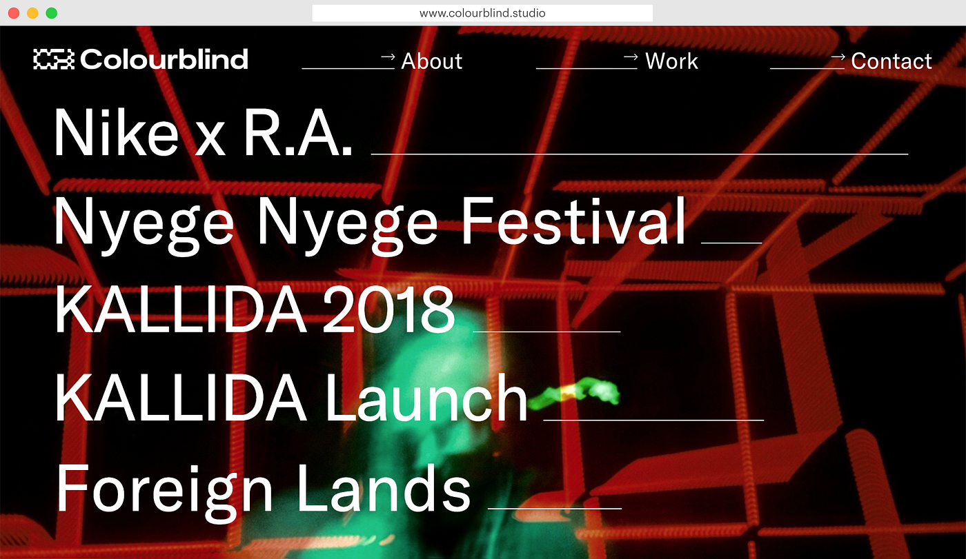
Having done a lot of animation work with Flash, I wanted to use a development tool that was highly visual and animation drive. I’ve previously used it build my own portfolio as well as developing a site for Colourblind, an event installation and production company.
Going off-limits
At Readymag, there hasn’t been anything that I’ve wanted to do but couldn’t. You just hack around, break things and try stuff out. Each time I finish a project I want to redo everything, because by then I’ve found a better way.
My favourite feature of Readymag is on-scroll animations. That’s a really fun way to control stuff. It has that same magic feeling as when I first started making things move in Flash.

Another thing I really like is how you treat mobile. In R/m, you don’t have to behave responsively, you can be adaptive.
With the KALLIDA project, it’s all singing and dancing, with hundreds of things moving at the same time. So instead of having to scale that down to mobile, we can set up a really different mobile experience that’s easy to scroll through and loads quickly.
Doing art direction for KALLIDA festival
KALLIDA is a music festival in Somerset, UK, that I do the art direction for. The name of a festival is a pun: it’s half kaleidoscope, half collider, as in the Large Hadron Collider.
The festival is hosting a lot of UK and European underground dance music by night, with afrobeat and jazz during the daytime. There’s also a really strong focus on the visual arts, with installations throughout the grounds — and all of the stages with music have bespoke light installations as well. It’s an amazing world created in one weekend for a really small crowd of 400 to 500 people.
Figuring speed out
The website for this year is built on Readymag. I designed two versions in Sketch, started building them up, but neither felt right. So I ended up designing the final version right in my browser.

How long did it take? Probably two or three weeks including pauses in between. There was a lot of fine tuning that had to be done. We had to have all the moving bits animated at the same speed, so I ended up spending more time working with a calculator than with Adobe.
Drawing llamas and alpacas
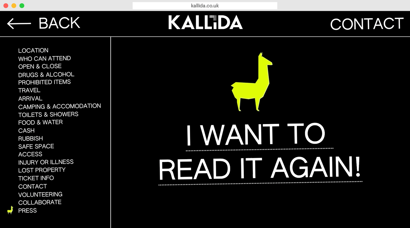
If you go to the FAQs section of the site and scroll down past the questions, there’s a little progress indicator on the left in a shape of llama. Also, when you get to the bottom of the page, there’s a llama doing backflips.
On the site where they’re holding the festival, they’ve got some llamas and alpacas, and when they promoted this on Facebook and Twitter, it got more response than almost anything else. That lead to “We need to include some llamas in there.”
This is the type of feature that most developers would find a way to pronounce it out of scope.
In Readymag, it took me about two hours.

Sharing a piece of advice
Here’s what I understand about creating event and festival websites that I’d like to share with fellow designers.
Don’t try to be frictionless. We spend so much time as designers having to think about making experiences smooth. Often it’s preferable to make things super easy for people to pass through and get on with the rest of their lives — but sometimes you want to try and hold their attention for longer.
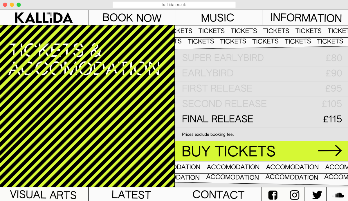
A festival like this takes up one of a punter’s precious weekends — they only get 52 each year. It’s an important time and if you want to sell it honestly, you need to give them a real vision of what they’re buying into. There’s a lot of friction built into the KALLIDA website. There’s a lot of distraction, a lot of things moving, the color’s very loud and abrasive. The whole idea behind that is to make people slow down and get a digital hit of what the festival is all about.

But we also follow the fundamentals. We have a persistent link for tickets on all pages. The FAQ information and other important stuff are easily accessible and legible.
Then just put as much care and love into the design, as goes into the event itself. We pride ourselves on the installations at the event as being as important at the music — and we put trying to communicate this at the forefront of our site.