Landing pages as performance art
Explore the new aesthetic of high-performing conceptual landing pages, where form meets feeling and structure supports expression.
The boundaries between performance and artistic expression are getting softer nowadays. Today’s most inspiring landing pages don’t just look sleek, they also feel alive: telling stories, expressing identity, and inviting participation in a unique experience. At the same time, the shift doesn’t mean that websites’ goad is being sacrificed, since a bold interface might not follow best practices for landing pages in the conventional sense, but still outperform a formulaic one.
This article explores the new aesthetic of high-performing conceptual landing pages, where form meets feeling and structure supports expression. Set yourself up for compelling landing page design examples, web performance fundamentals, and a bit of musing on how to break norms on purpose.
Rethinking the landing page
Landing pages were once strictly utilitarian: think straight lines, clear grids, limited colors, and immediate CTAs. But in today’s web design, the definition of a perfect landing page is shifting.
A new generation of creatives has started approaching landing pages less like functional websites and more like digital stories or interactive playgrounds, forms of art, political statements, and visual performances. Some may draw the entire interface by hand, while others may build experiences that lean heavily into nostalgia, like Windows XP aesthetics, early-internet artifacts, and brutalist layouts with animated GIFs and broken UIs.
The examples at the bottom of this article ignore landing page structure almost absolutely, and thus become art. A website’s popularity isn’t just measured in clicks anymore; it’s also about memorability, emotional impact, and virality. The best landing page practices still apply, but they’re being stretched, especially in personal websites, portfolios, and self-initiated projects—spaces where breaking the rules is even expected.
The anatomy of a landing page design
Even the most unconventional landing pages share a few structural principles that serve as a base for risky creative decisions. Here are the core elements that most high-performing landing pages have in common:
Clear information hierarchy. Even when a site leans into maximalist design, the user’s journey should still be guided. Typography, scale, spacing, and contrast all help shape the flow and direct attention to the main idea. Artistic language can work, but clarity wins.
Focused messaging. When you sell a product or express a point of view, you need a strong and memorable message that immediately shows what the site is about. The message might be pushed through a punchy headline, a compelling intro, a set of imagery, or well-crafted microcopies.
Memorable visual identity. Go anywhere your imagination takes you, but stay consistent. You might come up with retro computer graphics, hand-drawn doodles, cat memes, or AI-generated characters. Still, the whole page will only be effective when every element, from the favicon to the footer, reinforces that style.
Function beneath form. Even artful, expressive pages hide clean structures, logical content groupings, and performance-optimized assets beneath the surface. Every element you add to your page should have a purpose and function: that’s where aesthetics meets best practices for landing page design.
Landing page best practices
While expressive design is on the rise, it works best when paired with classic landing page optimization best practices. Here are a few enduring guidelines that help any landing page, whether it’s rule-breaking or not, work better:
Add actionable CTAs
Great landing pages keep the call to action central and repeat it only where it makes sense. Every CTA should feel native to the page’s tone and flow and lead to an explicit action a user can take.
Limit page length
A landing page should direct users to a special action, show one clear product, or promote a company. Don’t try to put everything on one page, as it will naturally reduce the amount of information people will be patient enough to scroll to.
Add a mobile version
Even the most creative layouts need to be performed on mobile since people tend to read more and more on their phones. Your mobile landing page design shows you can maintain expression and engagement while staying accessible.
Regulate page speed and performance
No matter how beautiful your design is, it won’t convert if it takes an eternity to load. Performance optimization is essential here: use compressed assets, minimize code integration, and rely on smart loading strategies.
Take care of accessibility
Typography, contrast, alt-text, and keyboard navigation aren’t just ethical responsibilities, but part of good design. Artistic doesn’t have to mean exclusive.
Do SEO
To get your desired reach, your page should be findable. The best way to help it grow its reach organically is to take care of meta descriptions, semantic tags, and relevant keywords.
Examples of non-conforming landing pages
We’ve picked several examples of head-bending personal and project landing pages that designers turned into personal experiments, art installations, or genre-bending microsites:
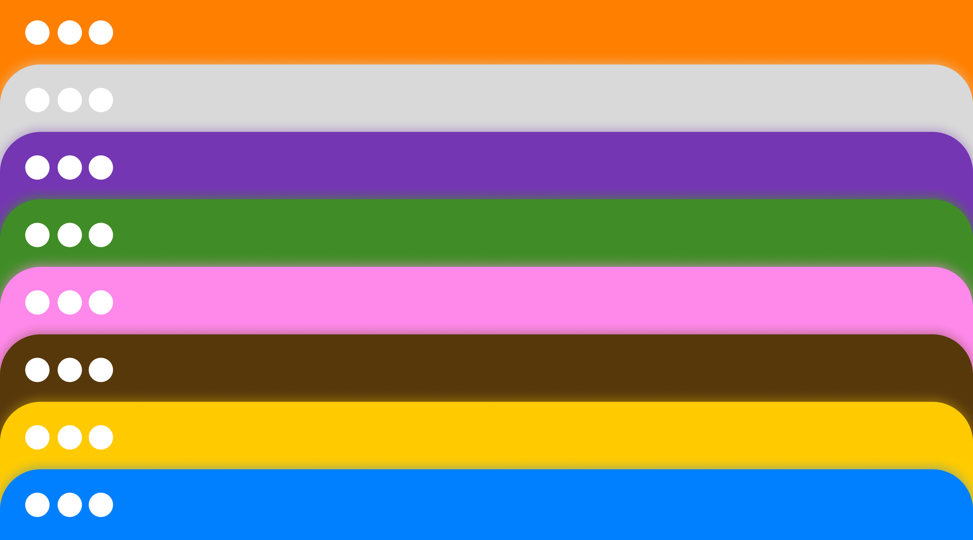
Built to feel like a risograph-printed zine, this landing page uses gritty textures and limited color palettes to great effect. It’s playful and analog-inspired, proving that page design doesn’t need polish to perform.
This is where glitch meets performance. This site is kinetic, chaotic, and confident, with every scroll adding a new layer. Still, it delivers exactly what a portfolio should: identity, range, and mood.
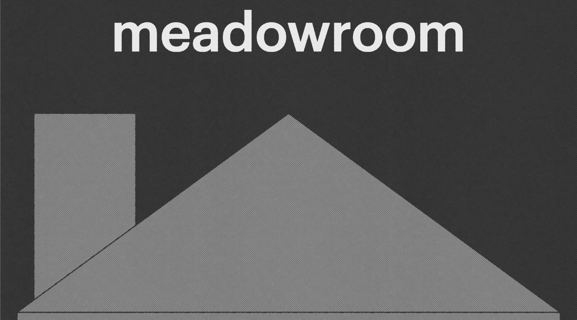
This site leans into retro nostalgia with Windows 98 graphics and a bit pixelated type. It could feel like a gimmick, but instead, it’s structured, efficient, and oddly warm.
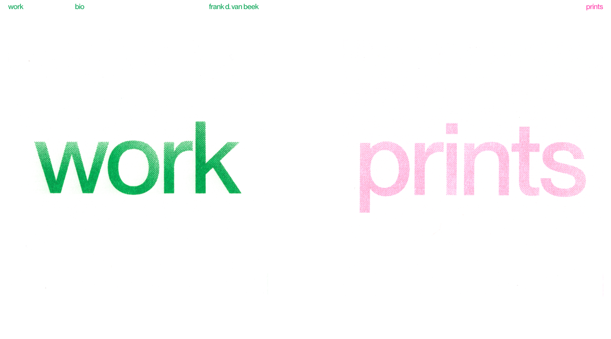
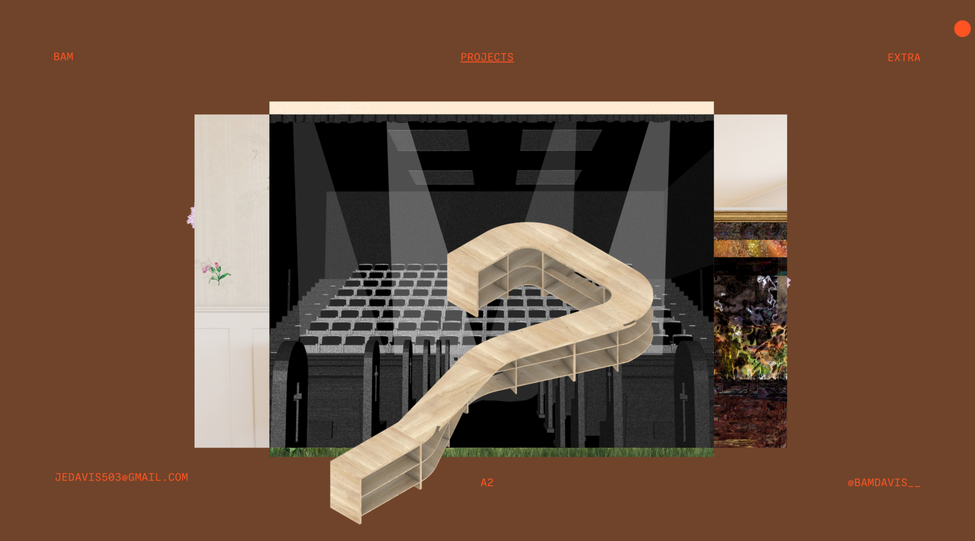
Frank D. Van Beek’s portfolio uses familiar structures in unfamiliar ways, combining the print-like materials with videos, photos, and short statements. Note the color accents!
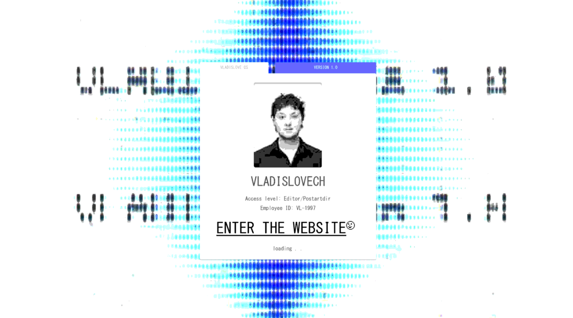
This one reads like a manifesto with its “Enter the website” CTA. It’s a full-screen, dark-mode experience with immersive scroll effects and a huge nod to the design of the 2000s.
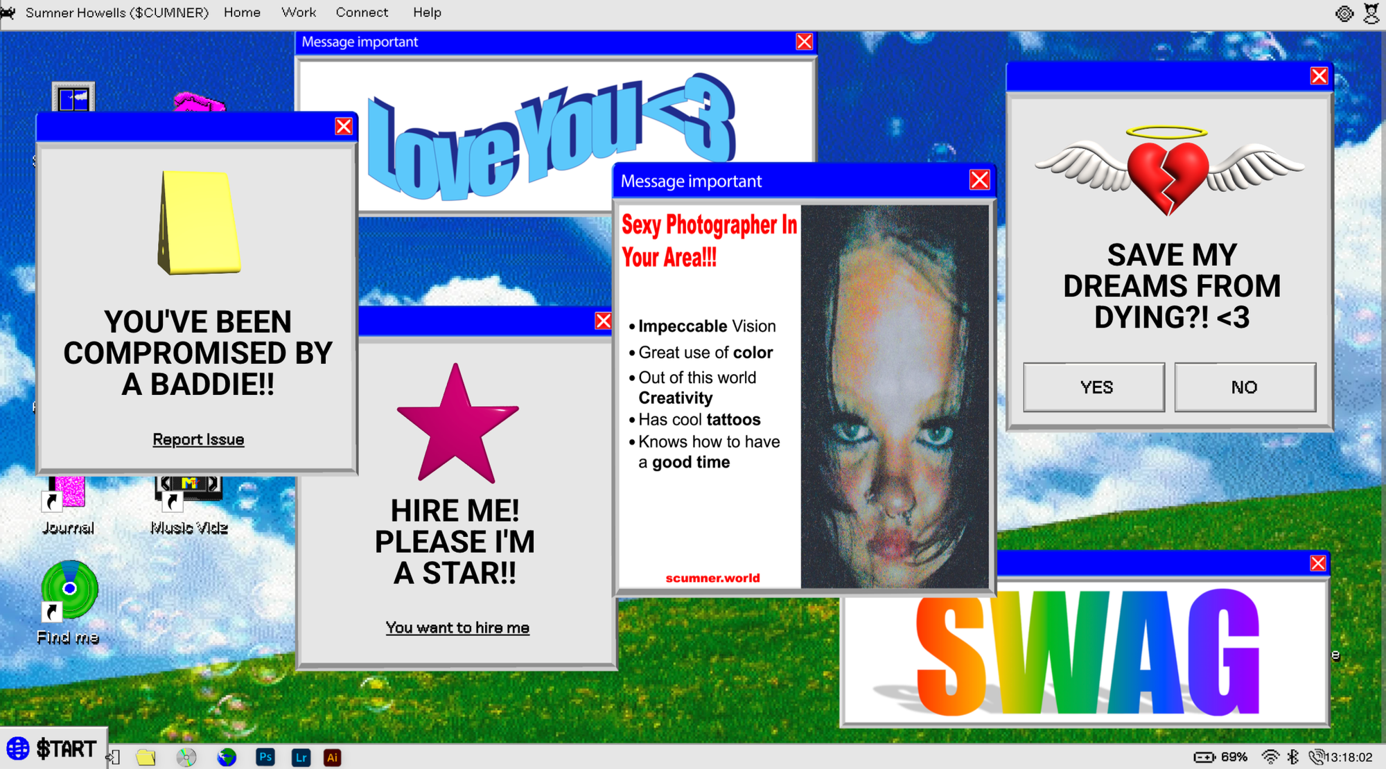
This one is probably the furthest from a “standard” landing page with its bizarre, narrative-driven, wild, nostalgic world of Windows wallpapers, virus alerts, and pixel folders, but it serves a purpose. Fun gesture: the page asks for a password, but you can always use the hint.
FAQ
What are landing pages?
A landing page is a standalone web page designed with a single goal in mind. It’s typically tied to a specific campaign, product, or event, and aims to drive one clear action, such as signing up, downloading, or making a purchase. Unlike multi-page websites, landing pages focus entirely on conversion.
What’s the difference between a landing page, a homepage, and a website?
A landing page is sharply focused and action-oriented. It’s designed to direct users toward one goal, often within a campaign or product launch.
A homepage, on the other hand, serves as the entrance to a website’s “branched tree”, which can hold as much information, products, and ideas as it requires. It offers a broader overview and guides users to different parts of the site.
A website encompasses both and acts as a comprehensive online presence with multiple goals, sections, and user journeys.
What landing page design principles drive engagement?
Strong landing page performance relies on a mix of clarity, visual focus, and a seamless user experience. The most effective landing page design examples prioritize the message, draw attention to a central CTA, and maintain a consistent visual identity. Also, even the most experimental designs work best when they’re intuitive to navigate and quick to load.