Kubrick as a workout: behind the scenes of an award-winning educational editorial
Kubrick is a digital editorial exploring the creative legacy of legendary American film director Stanley Kubrick. Made with Readymag by the Ukrainian design agency Tubik.
Kubrick is a digital editorial exploring the creative legacy of legendary American film director Stanley Kubrick. Made with Readymag by the Ukrainian design agency Tubik, the project began with two goals: to create interesting material that would be noticed at the international design scene and to boost the creative skills of participating designers. We spoke with the art director of the project, Vladyslav Taran.
Obligatory development system for designers
Tubik uses Readymag quite a lot. We believe that a designer needs to be independent from developers. Readymag fits in perfectly. If designers have a good command of the tool, they can quickly implement many things, like animations and compound graphics.
We have a training system that is obligatory for all designers: apart from their main commercial client projects they regularly work in small groups on non-commercial editorials. Then these are sent to various design contests around the world, boosting Tubik’s visibility.
From the beginning we knew that we wanted to explore the life of a hero that would be popular with a creative audience. We were discussing several artists but finally settled on Stanley Kubrick.

The group selected to work on the editorial included concept designer Ksenia Lashko and designer Denys Koloskov. They watched the key Kubrick’s films and wrote accompanying texts for each. Once these were edited by our copywriter, we began our design workout.
Feeling like a movie
Keeping in mind that Kubrick was a great filmmaker, we wanted the whole website to feel like a movie. The structure of the editorial goes like this: first comes an intro with a timeline, which is followed by ten chapters telling about Kubrick’s films in chronological order from Paths of Glory to Eyes Wide Shut. To reach “film effect” we used infinite scroll as the main navigation element that guides us slide by slide.
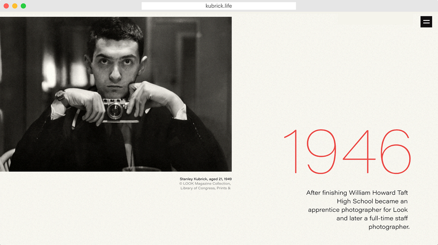
The editorial features lots of images. We actually managed to reach the daughter of one of the photographers who worked with Kubrick, who allowed us to use the archives of her father for free.
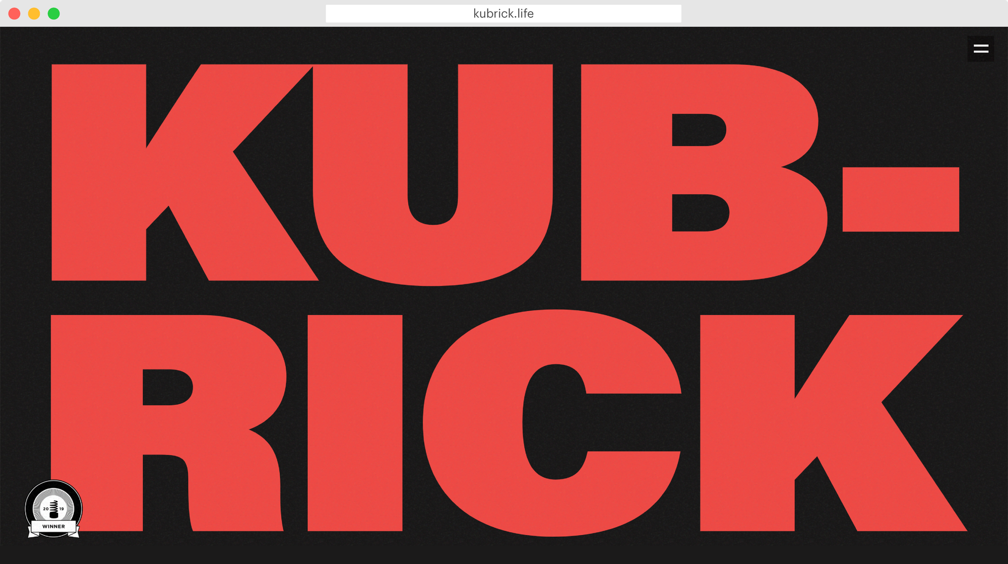
The headpiece features the name Kubrick written in bold red font. When you begin scrolling down the page, the red color is replaced with a photograph of Kubrick, which gradually scales up and fills the screen. That was implemented with a combination of opacity stunts and onscroll animation.
Since the reading is really long, on the right there’s fixed a dropdown menu that helps navigate between chapters. The dark grey background of the project features animated old school film grain. This was implemented with code injection, along with the customized look of the cursor, which looks like a small light grey circle — thanks to this, it is easily recognizable. We did it for a reason: the project is long and most likely readers will turn to the menu many times.
Animation for visual separation
First, we wanted to publish the work chapter-by-chapter (one chapter — one film), but then we understood that the project had become too complex to publish separately . We needed to find a creative way to edit the films and break the static texts and images, so we implemented lots of motion. The head-pieces at the beginning of each chapter include different combinations of animation and opacity stunts and many image galleries have animations applied.
Another user experience aspect is hidden stones like “Escape it” labyrinth (reminiscent of The Shining) that makes the interaction more engaging and fun. For another example, the chapter about Space Odyssey includes a rotating 3D model, implemented with code injection.
In the end, we found out that our project is more than 300K pixels long! We published in March and since then the creative team has been getting more and more recognition: we received the Site of the Day Award on The FWA as well as the Site of the Day and Developer Award on Awwwards.
