From concept to completion: Key principles of presentation design
These design tips will take your presentations from “Meh” to “Wow”

When it comes to presentations, it's not just what you say, but how you say it. Let's break down two key steps and look at some presentation examples and templates to help you create pitch decks, portfolios, business proposals, educational lectures, you name it—from start to finish.
First step: Craft a message that will make your presentation clear and effective
How can you make a good presentation design? Before diving into the design, it's crucial to figure out your key message.
Here's a checklist for how to set your intentions:
- Lay out a clear story. Think of your presentation like a story with a start, middle, and end. This keeps your audience hooked and your info easy to follow.
- Kick off with a bang. Grab attention right off the bat—a cool fact, a quick joke, or an engaging question can really set the stage.
- Keep your words short and sweet. Use just enough text on your slides to back them up, keeping it brief and to the point.
- Use data to make your point. Numbers and examples add weight to your words—they make your pitch more relatable and convincing.
- Create two decks for two purposes. One deck for when you're speaking (think minimal text) and another more detailed one to send out.
Second step: Nail the design, either starting from scratch or using design templates
Here are some design tips that will help make a presentation clear and effective. Think of the points below as your design checklist to ensure your presentation hits all the right notes:
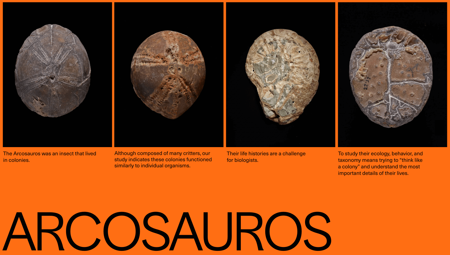
Match visuals to your crowd. Tailor your design to fit who you're talking to. It shows you care and understand your audience. For example, if you're creating a presentation for a photography conference, focus on including high-quality images as the central element of your design, rather than heavy text content.

Spotlight important elements. Play with design elements to make key points stand out—it helps guide your audience's eyes to what matters.
Boost your message with visuals. Break down complex ideas with infographics. Add videos, GIFs, or animations to make your message more engaging and memorable.
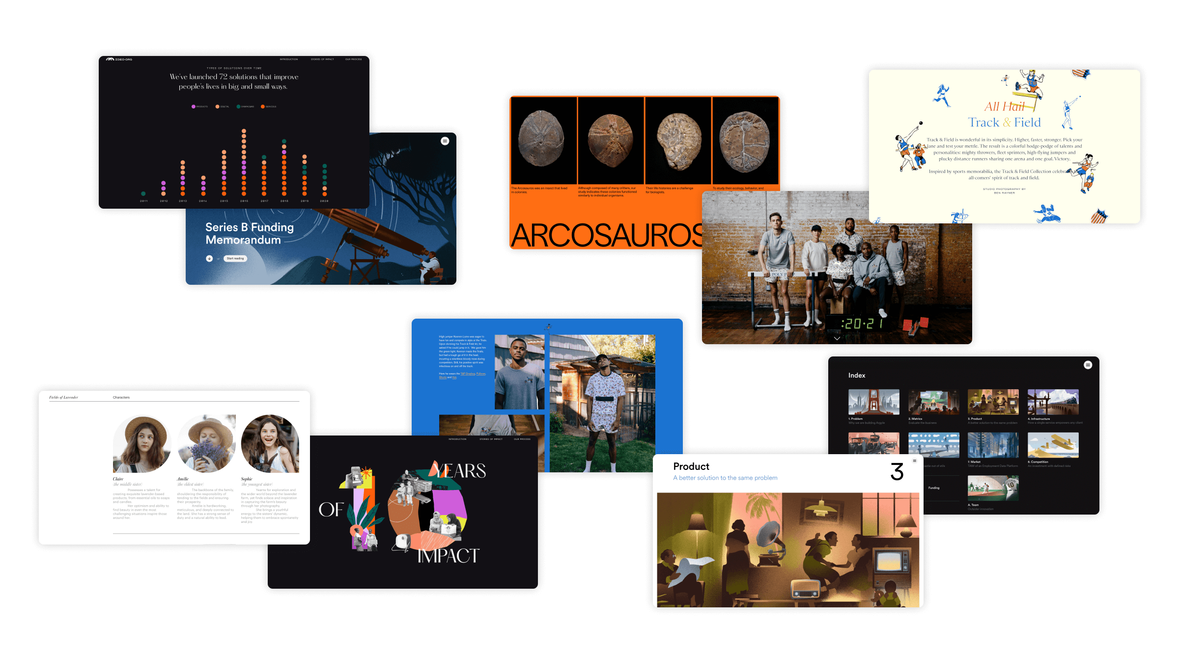
Ready-to-use a presentation template by Readymag
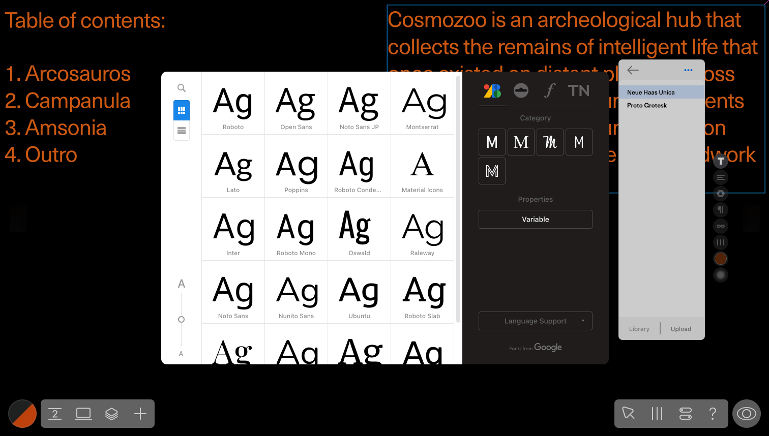
Choose fonts that fit. Pick fonts that are clear and reflect the tone of your presentation. Sometimes a unique font is all it takes to stand out.

Think about phone screens. Make sure your slides look good on mobile too. You never know where your audience will view them.
Give it a final polish. Before you wrap up, take a fresh look at your presentation and cut out anything that doesn't help your message shine.
Using these tips can take your presentations up a notch. And if you're looking for a tool to help you out, give Readymag a whirl. With Readymag, you can create and publish online presentations, bring your slides to life with animations, collaborate with teammates, tweak your content without messing up the design, and seamlessly share slide decks with clients.
For more insights on using Readymag in sales and marketing, have a look at our article. Try ready-to-use presentation templates and watch your ideas come to life with style and ease!