“If you can’t summarize the hook of your pitch in a sentence the pitch isn’t newsworthy”
What it takes for a designer to land media placement and what actually wins journalists’ attention in a pitch.
While dabbling in the world of publicity might be intimidating, it’s always a badge of approval for any creative entrepreneur to get the spotlight. In this interview, we talk to representatives of the leading digital publications in the creative industry — Creative Boom, Communication Arts, and Brand New — about what it takes for a designer to land media placement and what actually wins journalists’ attention in a pitch.
We regularly post web projects made with Readymag on our social media channels, in our Examples section, and give them a bigger voice via our annual Websites of the Year competition. We believe that everybody has the right to present themselves to the world, but when it comes to media there are always special rules to be followed. How can you craft a newsworthy pitch that wins over the media? Which design works are worthy of attention? Are there any peculiar rules of communicating with journalists?
These are some of the questions we put to Katy Cowan, founding editor at Creative Boom; Armin Vit, co-founder of the Brand New publication; Patrick Coyne, Editor&Designer of Communication Arts.
What type of design work is likely to be newsworthy?
Katy Cowan: At Creative Boom newsworthy design pitches tend to be big brand overhaul announcements or inspiring designs from leading studios. However, our audience loves seeing work from emerging names as well. A charity initiative that, perhaps, took over a city for a certain event might also win attention. Newsworthy projects may simply be colorful and fresh, but others that offer inspiration to the creative community are also a good fit.
Great imagery always helps, so make an effort to create vibrant and interesting images and videos to showcase your work.
Armin Vit: Over the years I’ve fine-tuned a set of criteria that provides a consistent framework for deciding what to include in our publication based on the size of our audience. I imagine some of this applies to other design publications.
The first question I ask is if the project is of broad interest. So, in our case, the bigger the design client, the better the chance it has of being posted. We wouldn’t post the redesign of a small, one-location burger restaurant, but we would no doubt post about the redesign of Burger King — because a whole lot more people are going to be interested.
If a client isn’t huge, I’m looking for design work that is interesting and unique. Does it offer something new? Does it do something differently? It doesn’t have to be groundbreaking, because that is very rare. It just has to have enough of a twist to make it post-worthy. For example, the NEXT insurance identity by COLLINS chose a very unexpected style and artist. Although using illustrations is nothing new, offering a new approach to selecting a great style made this project much more newsworthy. Another example would be the monogram created by Champions Design for Carnegie Hall, that featured a reverse italic “CH” that was unlike the vast majority of monograms. So it offered something new and unexpected.
In the end, a lot of it comes down to gut feeling and knowing when something will be of interest to a large swath of people.
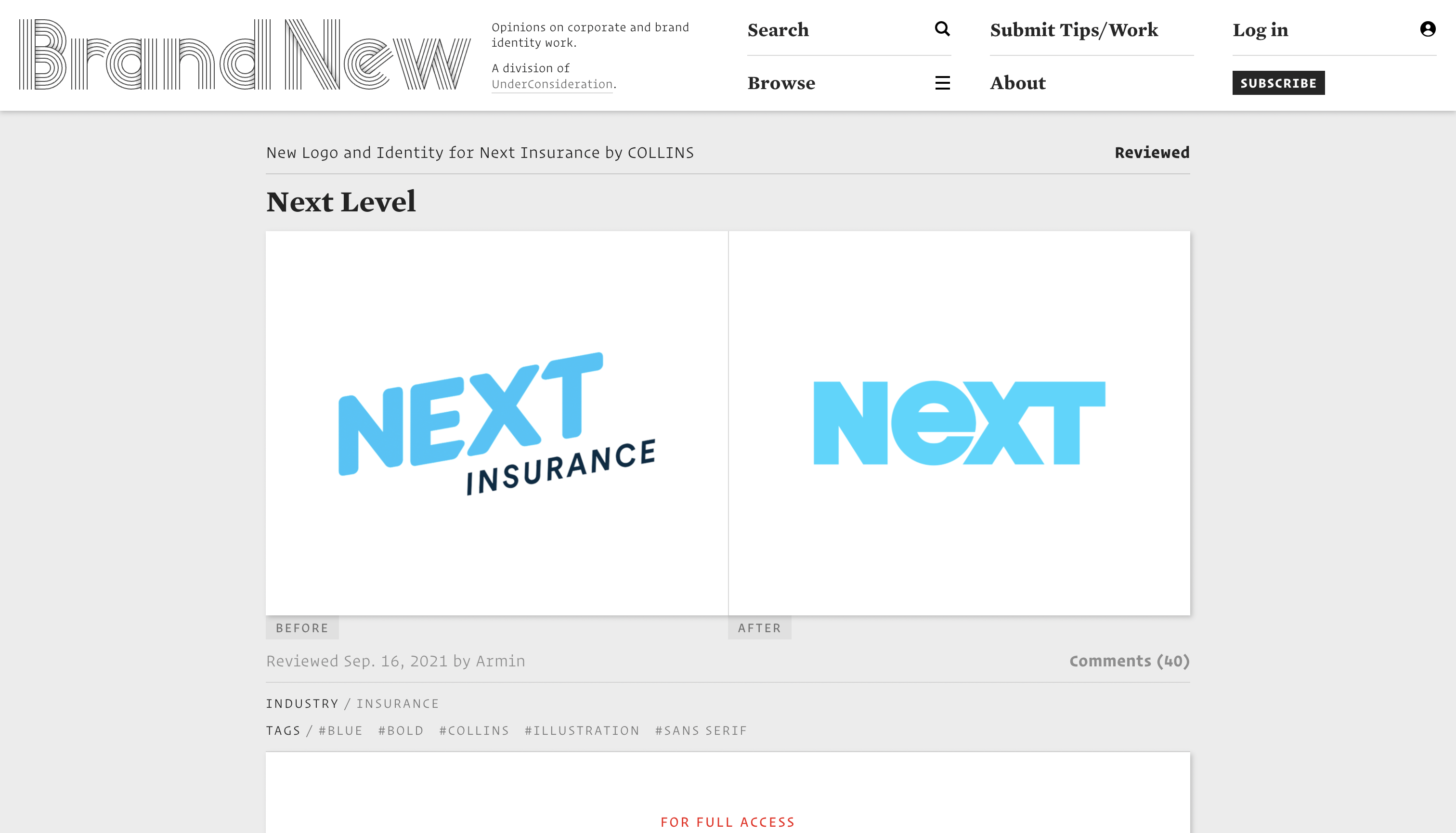
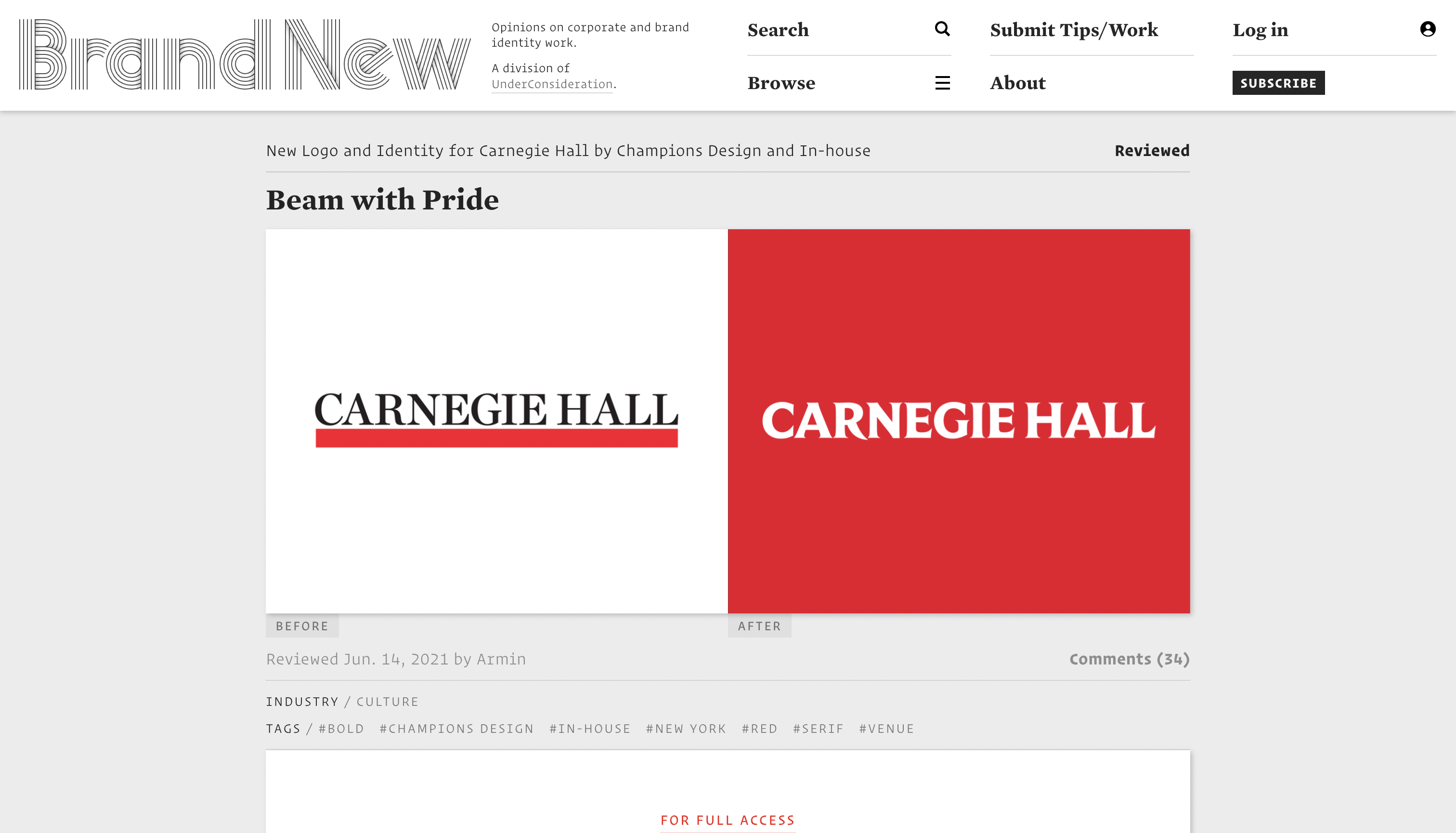
Monogram by Champions Design for Carnegie Hall and NEXT insurance identity by COLLINS
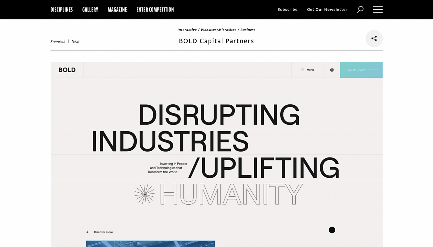
Patrick Coyne: On Communication Arts, identity programs, motion and environmental graphics, and packaging projects tend to receive the most views. Of the recent projects we chose to profile, I’d single out BOLD Capital Partners’ website. This modern, intuitive web page portrays the essence of achievement, ambition and sophistication — encapsulated within the company’s ethos. The strong, design-heavy site is atypical for the venture capital sector.
Scrolling through recent additions to Readymag Examples, two most captured my attention: the Babyn Yar research with a terrific scrolling timeline and NN Coltoy’s entertaining explanation of their updated typeface.
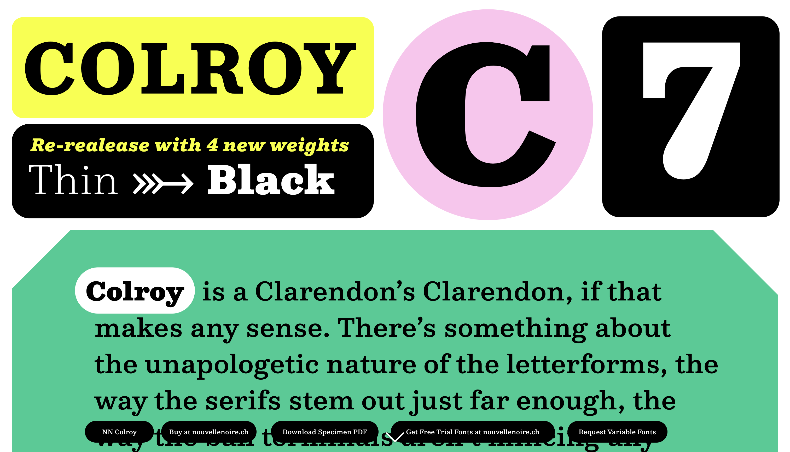

Babyn Yar research and NN Coltoy’s explanation of their updated typeface
What should a creative professional use as the first point of contact when pitching to the media?
Armin Vit: Use whatever email address is listed on their website. Never call. Or, at least, never call me. Maybe other publications like to answer the phone, but a phone conversation doesn’t allow me to absorb what’s being sent and there is an expectation of an answer in that case.
Avoid contacting publications through Instagram DMs. We get such a high volume of messages there that nothing can get the attention it deserves.
Katy Cowan: I’d recommend always checking a magazine or blog’s website for a submission page. You’ll often find bespoke instructions on how to get in touch. If not, don’t be afraid to contact an editor or staff journalists. They might be swamped with emails, but they’ll pick up if your work or story stands out.
Drafting a worthy pitch may feel mostly like a struggle. Could you share some advice on how to write a pitch that journalists can’t ignore?
Patrick Coyne: For design projects, defining the problem for quick comprehension, then describing the solution with interesting background details about the execution — including unexpected challenges, new lessons learned and quality imagery — makes a compelling pitch.
Katy Cowan: I’d recommend to submit the best projects only and go out of your way to provide everything the journalist might need. Don’t make them chase for images or extra information. The more effort you put in, the better it is for us. Sending lazy submissions that simply say, “Here is a link to my portfolio” and nothing more is never the best choice. Journalists don’t have time, sadly. Make their life easier by sending them a thorough pitch.
Tell me in either the subject line or the very first line why, not only I should care, but why others should care as well.
Armin Vit: Tell me in either the subject line or the very first line why, not only I should care, but why others should care as well. If you can’t summarize the hook of your pitch in a sentence the pitch isn’t that newsworthy or the project is too complex and neither is a good thing. It goes back to my premise of things having even a little bit of a twist whereas any quick pitch that lets me know this project deviates from the norm stands a good chance.
What are the most common mistakes a designer makes when submitting their project to the media?
Armin Vit: The most common mistake to me with pitches is where they go “Hey, we did this! If you are interested in seeing it, let us know”. Include the work or a link to the work from the initial point of contact. We get so many submissions and if I have to take an action or extra step to publish your work, that’s something I am not going to bother with following up on. It’s always about making that initial email as comprehensive as possible so that I can make the most informed decision about posting or not posting. A “teaser” is useless.
It’s always about making that initial email as comprehensive as possible so that I can make the most informed decision about posting or not posting.
Patrick Coyne: Submitting image files without adequate explanation makes it hard to evaluate a project. Also, case studies that describe the response (i.e. number of likes, unpaid media coverage, etc.) without actually showing the solution are particularly annoying.
The PR industry has a bit of a cut-throat reputation. Does that mean that designers should be assertive when pitching to the media?
Patrick Coyne: An initial pitch and then a follow-up email a few days later, if there has been no response, is standard practice. I wouldn’t recommend being more aggressive than that.
Armin Vit: If a pitch is too assertive, too confident, or it starts to subjectively define itself — like “XXX Firm creates Groundbreaking New Identity” — I have an immediate adverse reaction. Tell me what you did, in a nice tone, and why it’s interesting. Send an email once, follow up once and that’s it. If the follow-up isn’t answered, that means there is no interest. I do sometimes miss an email or delete an original email by mistake so I do appreciate follow-ups, but a second follow-up is unnecessary. Take the hint, move on and try again.
Katy Cowan: When promoting yourself and your work, don’t take anything personally. Be assertive and know that a decent considered submission to a journalist will stand a good chance of success. But if it doesn’t, it’s not a reflection of you or your work. Competition is fierce. Just keep trying.
Where to submit your design work
Communication Arts. Features innovative graphic design and advertising projects, outstanding websites, as well as cutting-edge work from individuals, firms and agencies that have been working professionally for approximately five years or more. You can send as many projects as you like and as often as you like for any department. Submit your work.
Brand New. Logos and identities for well-known companies have a 100% chance of getting featured. Aslo, each Friday the editorial team selects three projects in a long-standing series called Friday Likes. These tend to be for small clients, one-time events and single products. Read their guidelines.
Creative Boom. A nice platform if you want to showcase your work, share professional insights, and even nominate yourself for a brand podcast or interview. Emerging creative professionals can also head over to the Inspiration section. Check it out.
All options are free. Just take your chance to get featured and keep moving!