“I made every design decision knowing there would be both love and hate”: Interview with Jo Iijima
The Readymag Choice winner at Websites of the Year 2025 shares the emotions he wanted to evoke with his portfolio and how he balanced chaos with structure.
The second in a series of interviews with the Websites of the Year 2025 winners features the Readymag Choice winner Jo Iijima, who stunned everyone with his portfolio (jury testimonials included) and once again proved that showing your work is only part of a portfolio—the second, and no less important, part is showing your personality.
In this interview, Jo shares what emotions he wanted to evoke with his website, how he balanced chaos with structure, and what he plans to change next.
Unapologetic and playful
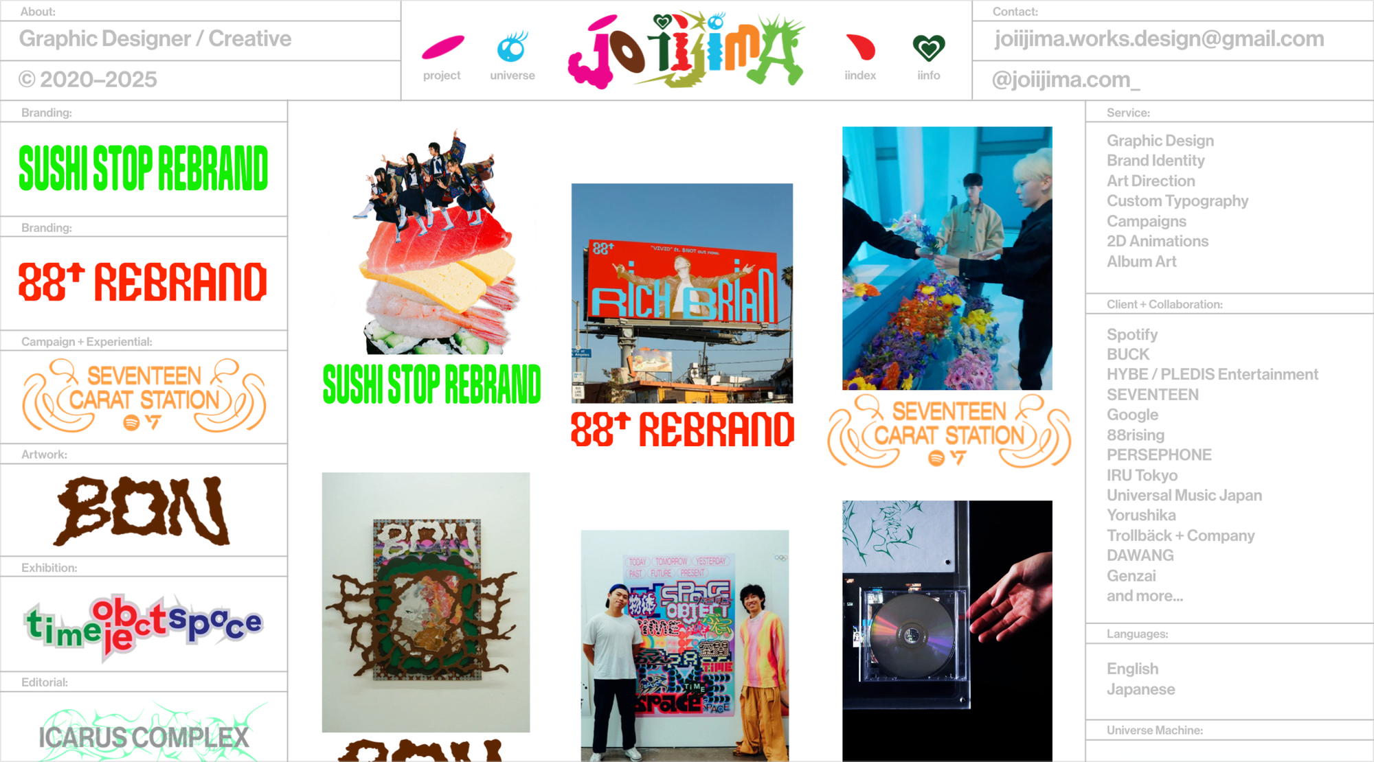
When I made this website, my key words were unapologetic and playful. I wanted it to feel like coming back to a circus or an arcade game. I made every design decision knowing there would be both love and hate. I think a portfolio site is not only about showing your work and skills, but also about expressing your personality.
I could have made the UI simpler, but I didn’t want to hide anything. I wanted to express 200% of my ambition to surprise people. I kept it this way to show who I am. I was genuinely curious about what would happen if I fully expressed myself through the site—embracing the feeling that I didn’t know what would happen next.
That sense of visual surprise is what I hoped would grab people’s attention and make them want to come back, the way you revisit an arcade or a circus for the experience, not just the outcome.
In the end, the website took me about three months. I had to finish it before graduation so I could showcase it when I graduated from college (ArtCenter
College of Design in Pasadena, California). Working under that time pressure pushed me to learn fast, trust my instincts, and experiment without overthinking. Much of the joy of the project came from that energy—new skills and small discoveries immediately made their way into the final work.
From chaos to structure
I kept iterating on the main page because I wanted the very first moment to feel impactful and immediately communicate my personality and how I think about design. The goal was to create a site that feels like a Japanese arcade: visually expressive (vibrant lights and screens happening in many places at once) and something you want to come back to. I went through many versions of the home page, testing different ways to translate that playful energy into a real, usable website. Each iteration brought me closer to an experience that entertains the viewer while still clearly guiding them through the work.
The color switch on hover for each project on the left took quite a while—and many tries—to figure out. I also debated the layout: should each project image be grid-aligned or more freeform? I thought about what could live on the side, like a vending machine, and what information should appear on the first page. It took a lot of thinking about what to place there in a way that feels like me and introduces my personality.
There were moments when it started to feel visually overwhelming, and that’s when I leaned more intentionally into hierarchy. I began treating the left side of the landing page almost like a CD, DVD, or bookshelf—a kind of gate into another world. Each “spine” could carry a lot of personality, while the shelf itself stayed clean and minimal to organize everything.
Since every project has a very different visual language, I used structure as the constant. Lines, grids, and typographic rules—using sans serif type with color and size—helped ground the experience and create contrast with the more vibrant, expressive visuals. The UI can feel dense and complex at first glance, but it has its own systems of type and line that make it visually entertaining.
I designed some parts of the site as more fixed layouts to give the experience a sense of structure and stability. At the same time, I treated scrolling as a storytelling tool. Since Readymag allows many ways to reveal content through scroll, I used that flexibility to let each project unfold in its own way. Rather than applying one rigid system across the entire site, I chose the reveal style based on each project’s story. Some pieces benefit from a clear, fixed presentation, while others feel more engaging when discovered gradually.
The visuals can speak for themselves, but for campaign or brand identity projects, there also needs to be context—what I did and the strategy behind it. Knowing people’s attention spans are short, I added a short sentence to introduce each project. If people want to read further, they can open the project information for the full context from the side. That way, the site stays visual-first while still being thoughtful and clear.
A living website
I love expressing my inner world visually, and I’m very open to hearing how others experience that world once the work is shared. I’m especially interested in what the work makes people feel and what they take away from it, because that shows me how the idea is being communicated beyond my own perspective.
I see my website as a living space rather than a finished object. It will keep changing every year—not just in content, but in format and expression. Even the current version feels very “me,” yet there are already many moments where my thinking has shifted since I released it.
Recently, feedback from my mentors and other creatives inspired me to think more about the channel and volume of my work: how ideas are delivered, and how much loudness or quietness I can push when they need to land clearly. Those two ideas are shaping the next phase of my website.
Tool as playground
I used Readymag for its design flexibility. My mentor at university introduced me to it last year, and once I started experimenting, it immediately clicked. I’d always felt that my previous portfolio sites didn’t fully express my personality through the web experience. Readymag gave me the freedom to combine elements in unexpected ways—designing both on and off the grid—which really shifted how I think about web-making. That flexibility allowed me to treat the site less like a rigid system and more like a design space, where interaction, layout, and surprise could work together to express who I am.
Hover interactions and custom scrolling had the biggest impact. These features gave me a lot of flexibility to present my work in different ways and shape the rhythm of the site. I spent a lot of time just playing with the presets and adjusting them—that sense of play was a huge part of the process, and it directly became the final website. I didn’t use any custom code. Instead, I leaned into Readymag’s built-in tools and customization options. For me, the joy came from seeing how far I could push the system itself—experimenting, combining presets, and letting play evolve into a finished, expressive site.
Next version
I have a page called Universe where I lay out all my personal work. I designed it as a kind of personal library, arranging five years of projects on a horizontal grid so everything could live together in one space. I still really love how it feels, but as my perspective evolves, I’ve been thinking about new ways to present that library.
Rather than changing the work itself, I’m more interested in rethinking how the collection is experienced—how a library of projects might feel more alive, more navigable, or more surprising. I see my site as constantly evolving, so this page is definitely one I’m excited to revisit.