Inspiring examples you can use to create captivating e-commerce sites
A dive into a few great e-commerce templates and ways to create a salient site that is easy to navigate and exciting to engage with.

Marketing and graphic design work in tandem in today’s online marketplace. Let’s dive into a few of our favorite e-commerce templates and then go over a few ways you create a beautifully designed e-commerce site that is easy to navigate and exciting to engage with.
Inspiration for your next project
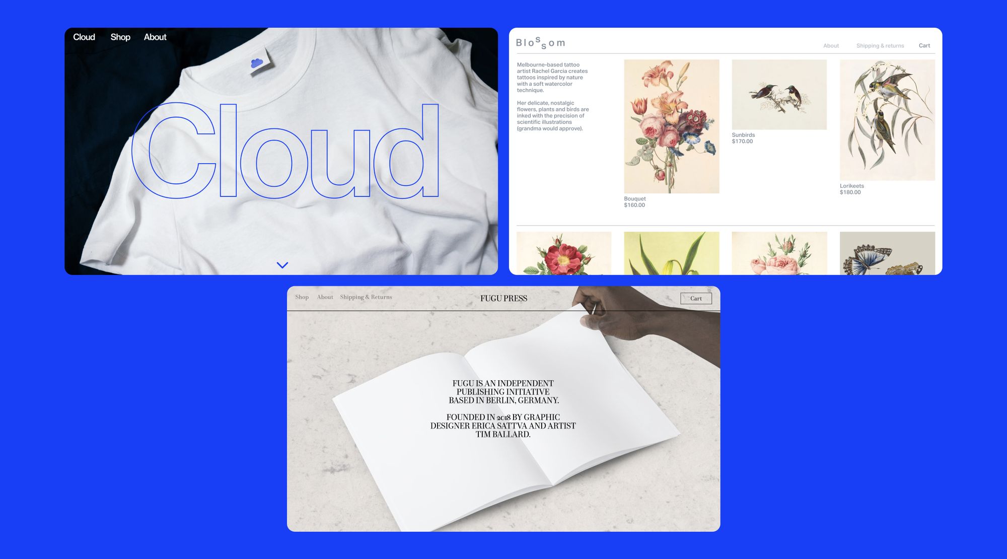
Though templates can sometimes feel restricting, they can also serve as a strong base for further customized projects. Readymag offers a selection of e-commerce templates that can be fully customized with no coding needed. Here are some of our favorites, and then a few tips for customizing them to fit your brand’s identity.
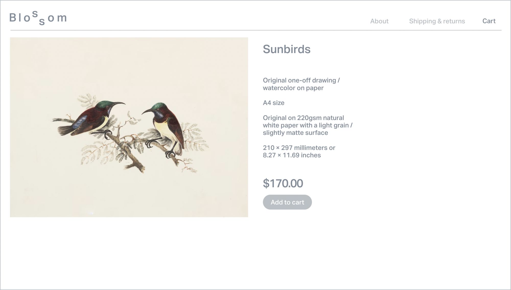
Blossom

Image focused with a simple but elegant grid design, Blossom puts products front and center. The template includes easy to access functional points at the top of the page, though these links can be customized as you see fit. While product description is important, this template keeps things minimal with more room for heavier text on each product page.
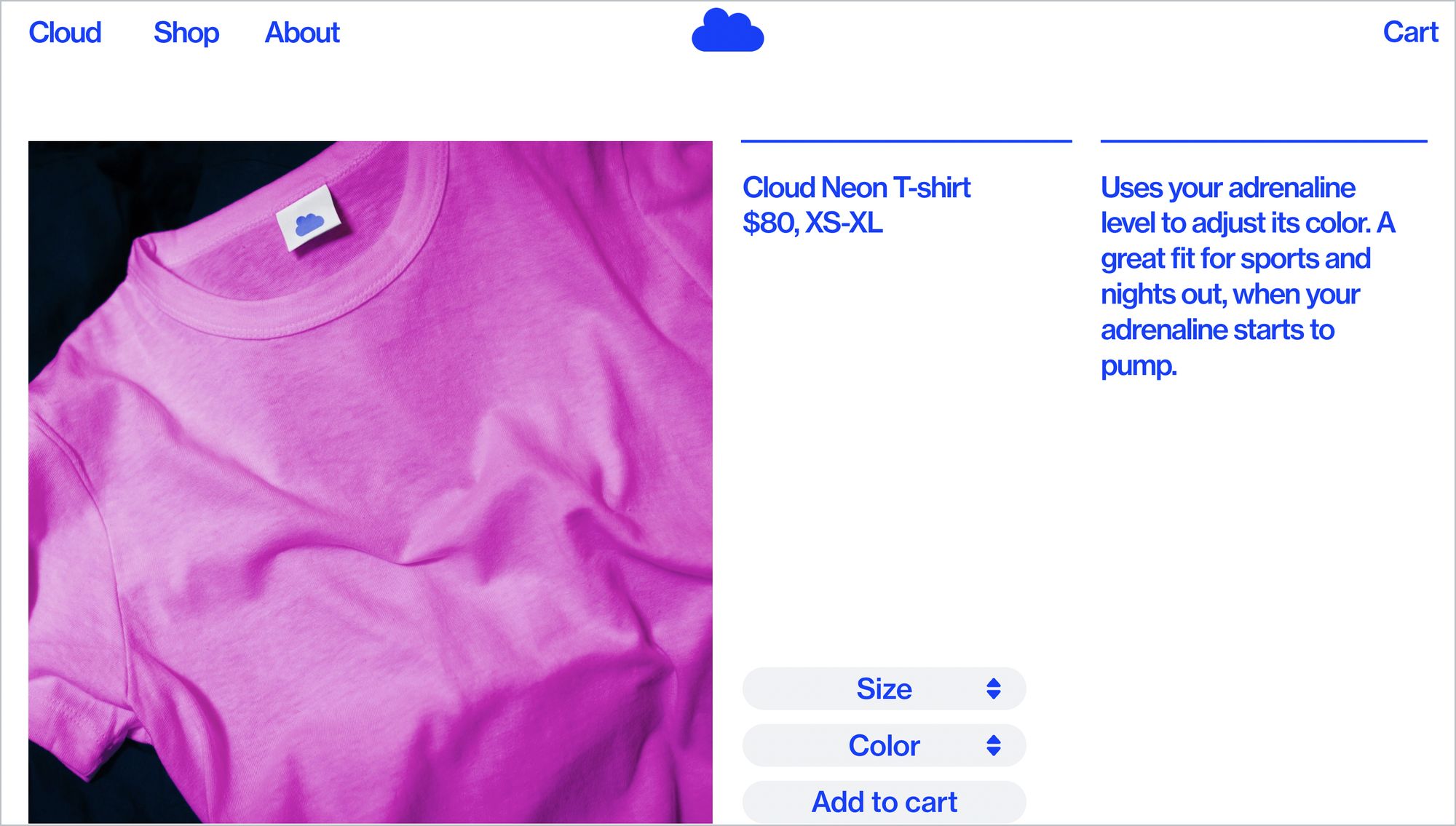
Cloud

Put your product front and center with an image that commands attention. Cloud keeps things minimal, clean, and bold with typography play and color, but opts for minimal text. This site employs subpages to do the heavy lifting from an information-sharing standpoint. All pages use an intuitive endless scroll feature, making navigation extremely simple.
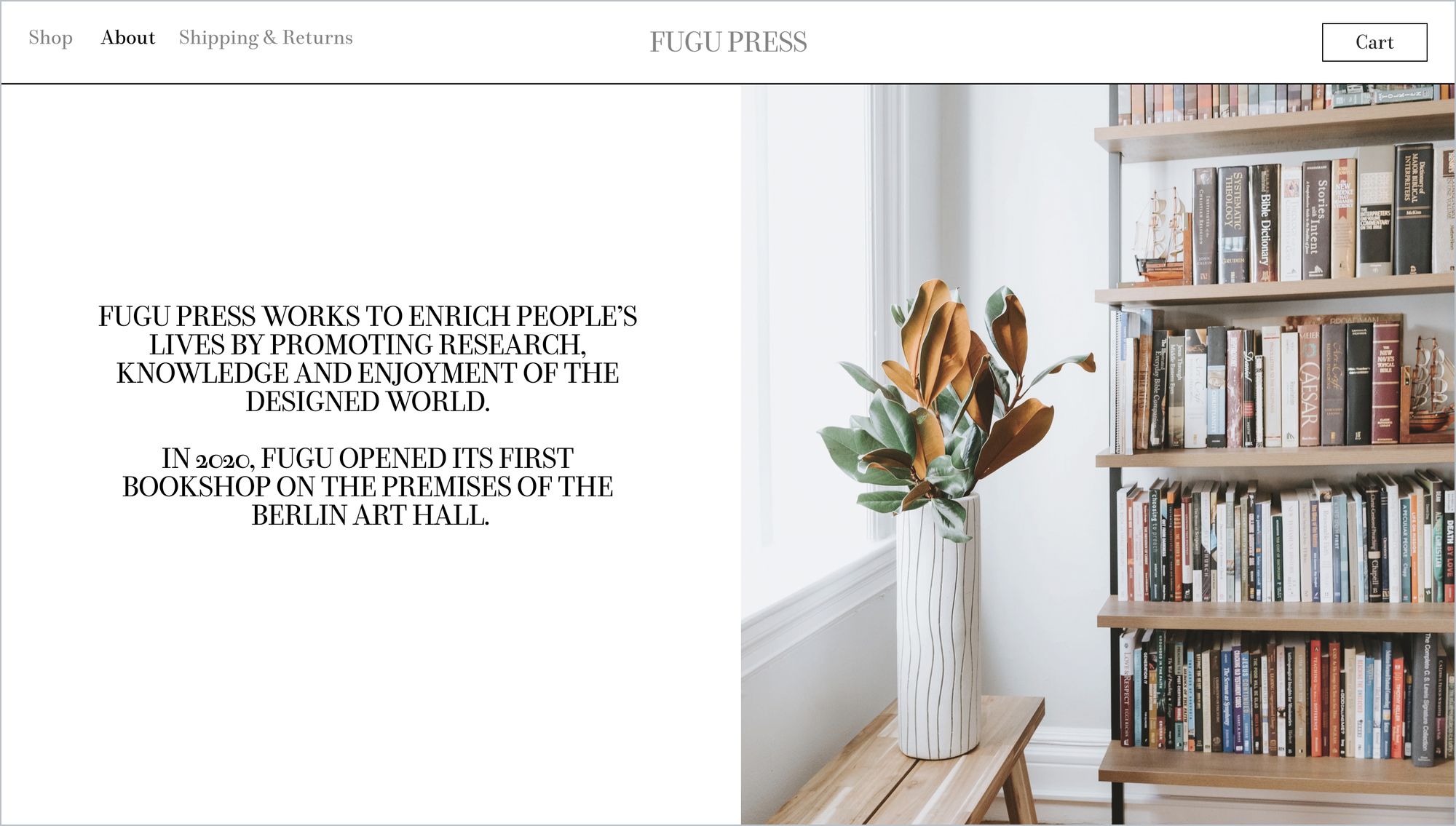
Fugu

Here is the “about” page included in the template Fugu. Pulled up on the right side is the drop menu for the cart, which is accessible from any page. This template is a perfect example of how neutral color schemes can be made exciting with bright text blocks and colorful imagery.
Important considerations when designing an e-commerce site
With a majority of shopping trips starting online, it’s important to create a site that is navigable and informative. Important features like search bars, drop down menus with product features, and customer contact forms are not only functional but make for a more pleasant online retail experience. But, there is more to e-commerce design than just functionality. In fact, aesthetics are especially important for online shoppers. More than 30% of online shoppers leave e-commerce sites that are unattractive, according to recent surveys.
Here are some of our design recommendations for creating an accessible, and eye-catching, e-commerce site.
Color can play important functional and aesthetic roles. From color psychology and color theory principles that help make associations between your e-commerce site and certain emotions, to design choices that make information more accessible, these strategies can be used to create the right color palette for your e-commerce site. Color psychology is widely used to create associations between different branding materials and specific emotions, values, and principles. Some of the most common associations include the following:
- Red is commonly associated with feelings of passion, power, and determination. This color is also the most likely to attract attention.
- Blue is known for its association with relaxation and calm. It’s also becoming more commonly tied to technology and innovation.
- Yellow’s most instant connection is to feelings of joy, but the use of this color can also communicate youth and energy. Overuse of this color can be overstimulating, though, which is important to keep in mind when considering accessibility.
- Green, as to be expected for its associations with nature, is often symbolic of growth and serenity.
Contrast can be a powerful tool. Whether with color or shades, this technique can be strategically used to move shoppers’ eyes in one direction or another. Similarly, it’s fairly simple to create visual hierarchies with color contrast so that you can share more information and product recommendations without overwhelming your site visitors.
Typography plays an important role in setting the tone for written content. Just think about Comic Sans and society’s love-hate relationship with it as proof. So how can typography be used to your advantage when designing an E-commerce site?
When choosing your font, it’s important to be consistent in your selections. While you may opt to use an array of different fonts, sticking with similar schemes can keep things interesting without making your site visually overwhelming.
Whichever font you choose, be mindful of how easy it is to read across both mobile and desktop devices. This is especially important when selecting a font and weight for your product descriptions, which will likely be a smaller font than your other body text.
You can bring your site to life with graphics and animation. It’s an excellent way to cut back on visible text and let your products do the talking for themselves. Animated product graphics or videos can demonstrate the way that products work or look in motion, which can be a major selling point for some of your site visitors. Readymag makes this easy. You can check out our guide on animations for more.
Intuitive navigation is a must. It makes it easier for your shoppers to find what they’re looking for, which translates to increased sales.
Clearly laying out the pages and categories of your shop is easiest with a simple grid, though there is always room for a little bit of play and creativity. You can manipulate scroll features to move horizontally or vertically but added cues to signal how visitors can explore are excellent safeguards to make navigation a breeze. Most readers’ eyes drift and collect information from left to right, so taking advantage of this on your website is a good first step.
The search bar should be usable from any page, as it is what customers will rely on most to search for the products they want. Just as well, always having a shortcut to the cart is a good idea as it reminds customers to follow through with their potential purchases.
Build your e-commerce site with Readymag
With all of your newfound knowledge, building an e-commerce site that drives sales should be a walk in the park, provided you have the right tools to bring your vision to life. Readymag allows you to create a captivating site without the need for complicated coding or extensive program knowledge. Get started on your next project with us today.