In-depth typography with Readymag
Creating a web project that stands out requires a deep understanding of typography and fonts. Our selection of manuals and video tutorials will help you create effective font pairings, make long reads more readable, and fine-tune your text layouts.

Creating a web project that stands out requires a deep understanding of typography and fonts. Our selection of manuals and video tutorials will help you create effective font pairings, make long reads more readable, and fine-tune your text layouts.
Font Pairing Almanac

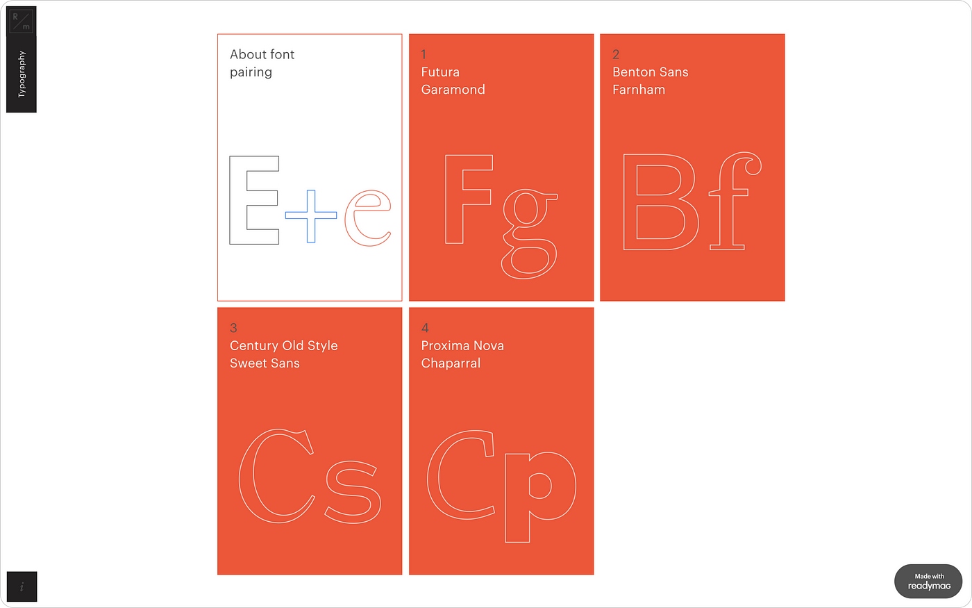
This text will guide you through the reasoning behind combining two different typefaces on one page. The pairs we discuss are Futura + Garamond, Benton Sans + Farnham, Century Old Style + Sweet Sans, and Proxima Nova + Chaparral.
Read Me!

Read Me! is both a template, ready to use for your longreads, and an educational project. Inside you will find a manual on coping with web readability issues.
Stories — Emigre

Check out an archive dedicated to the Emigre duo, an influential design couple that wildly experimented with computer fonts throughout the 80s and 90s. A part of our Design Stories section, Emigre will open up your typographic imagination.
Text Widget tutorial

Let our video tutorial guide you through the details of working with text in Readymag. Learn how to set up text styles, upload custom fonts, align text in different directions, choose a wider range of typographic symbols from the widget panel and use variable fonts. Check this landing page out for more inspiration.