Adapting to women’s needs: How women’s health app Flo builds confidence and trust
We talked to Rachel McConnell, Head of UX Content, and Alex Gavrilenko, Flo Product Designer, to uncover how their designs helped evoke confidence and create positive user experiences.

Any healthcare app must be trustworthy for its users. Flo, a popular women’s health app, seems to understand this challenge well. As of 2021, Flo’s user-base has grown to around 200M with 47M women regularly using the app worldwide. We talked to Rachel McConnell, Head of UX Content, and Alex Gavrilenko, Flo Product Designer, to uncover how their designs helped evoke confidence and create positive user experiences.
Women’s health can be a fairly sensitive topic. At Flo, our goal is for women to feel like the app is a friendly partner in their wellbeing and health. One who they can trust and share intimate information with — so that, in return, we can provide truly expert advice that’s credible and based on evidence. Therefore, we strive to create an atmosphere of safety and confidence within the app. We want Flo to be smart and trustworthy, so that it can empower women to better understand their own bodies and cycles.
An interface tailored to women’s needs
When it comes to building trust and confidence, the user interface has a particularly crucial role. It often creates the first impression of a product and keeps users coming back. The Flo UI is intentionally designed to adapt to women’s needs.
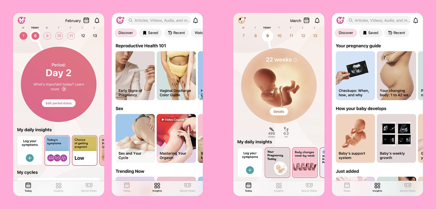
A case in point: in the screenshots below, you can quickly see how different the UI looks in the app’s modes. We hide irrelevant elements for pregnant users in the Track pregnancy mode, and vice versa–providing more cycle-specific content when the Track cycle mode is on.

Cycle-based content as a building block of emotional design
Another part of Flo that relies on emotional design is the content. It should be super-specific to each user on certain days of their cycle. Flo algorithms and user data allow us to predict the start and finish of period cycles, ovulation, and related symptoms. Thanks to these algorithms, we can list various signs that might be relevant for a particular user, suggest logging what the user feels at the moment, and then show relevant content based on those symptoms.

It also goes without saying, the content of any health app must be checked for factual correctness. In addition to our in-house medical experts, we have a medical board of over 100 professors and doctors who ensure our content is accurate and up-to-date. We also collaborate with various medical associations to carry out vital research into much-needed areas of women’s health.
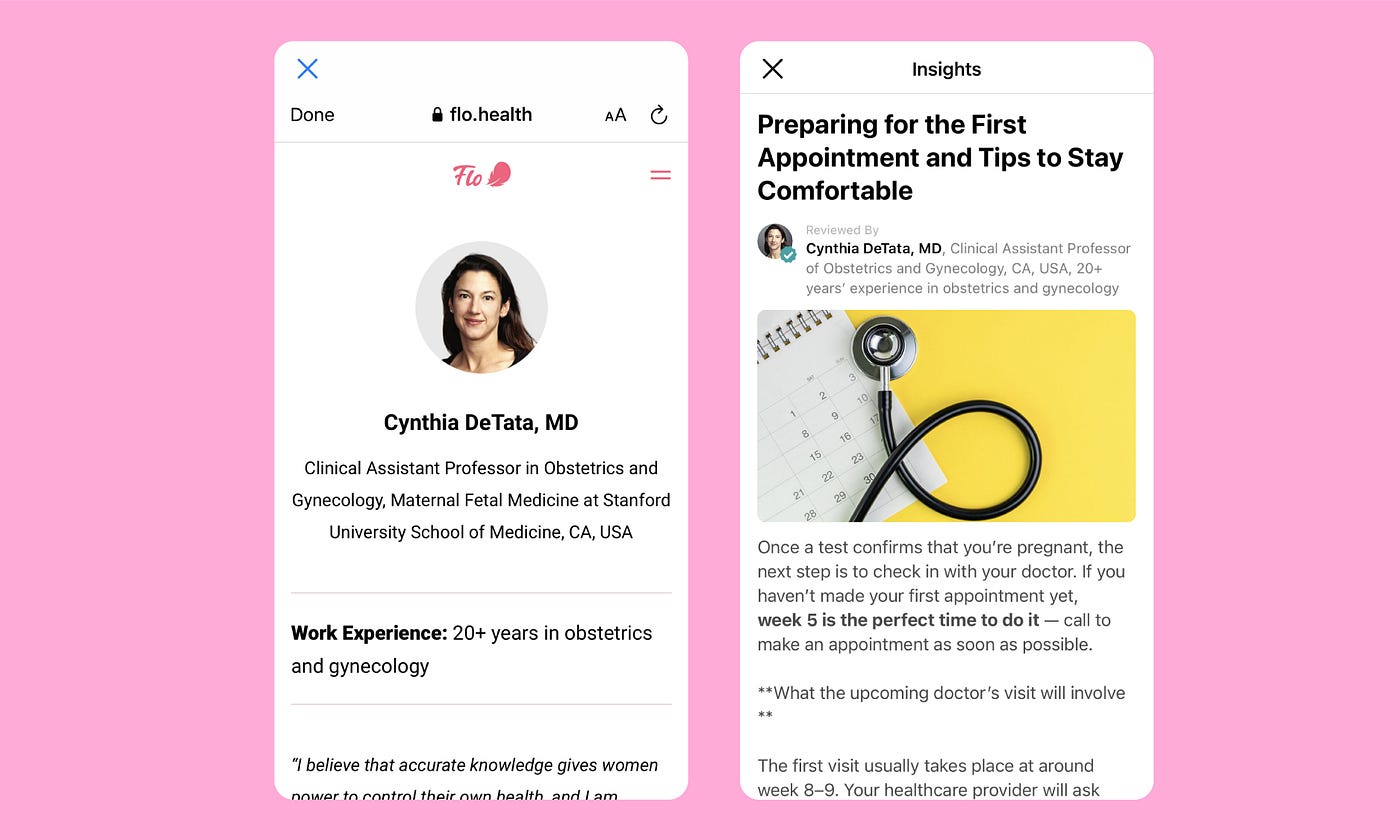
We recognize that many people may not be familiar with some of the major medical associations and universities, or the medical experts we work with — so we do a lot to reassure users of their expertise, such as:
- Provide articles by expert authors.
- Show clear titles below any expert’s name.
- Provide a personal web page with detailed information about each expert and their career, education and publications.

Contextual chat-bots to help earn confidence
In2019, we launched the Flo Health Assistant as a way to help women better understand their bodies and build more close ties with our users. This is a friendly interactive chatbot that users can talk with if they are in need of extra wellbeing support. It provides personalized reports about period and cycle patterns, and shows tailored health information based on guidelines from official healthcare authorities. The Assistant is contextual, triggered by what a user is doing in the app. Particular data logged by the user could be a trigger for starting a chat. This means it’s always timely and relevant.
The Assistant proved to be more reassuring than any other content in the app. While providing positive user experiences for those interacting with it, the chatbot helps build more confidence and keeps users coming back.
Brand voice: like a trusted health partner offering support
AtFlo, we champion a people-centric and proactive approach to female health. We strive to be so much more than a period tracker–we are experts in menstrual and reproductive health. Flo’s language should serve that mission and build a connection with our users by validating their experience, inspiring and empowering them to take control of their health, by understanding and translating the signals of their bodies.
The key pillars of any copy we write for the app are:
- Head: Are we clear, straightforward, and easy-to-understand?
- Heart: Are we warm, relatable, and inclusive?
- Hands: Are we providing tangible benefits and active language so the user knows what to do and why they’re doing it?
We think of our voice as a trusted health partner that offers support our users need, but never shies away from the facts.
The point is that we build trust and confidence through a set of various means like interactive chatbots, cycle-specific content, supportive brand voice and, of course, the user interface that is mostly tailored to the period days–thus that’s the bottom line. At Flo, we address users’ needs through the app’s functionality, but also build connections with the users. On top of the customer journey map, we put another layer–the one with emotional responses. When it comes to product development, we always ask ourselves whether it will help our users to trust us even more. This is how we approach the concept of emotional design.