Type talks: How typography influences emotion, clarity, and concept
Why typography matters and how to use it.
When you read The Atlantic, you’re not just absorbing political insight—you’re experiencing the quiet authority of Adobe Garamond. Catching up with creative news on Designboom? Lato delivers it with clean, modern ease. Typography, with all its strokes, styles, and decoration, isn’t just aesthetic—it has the ability to shape the ideas behind a text before we even read a word.
What is typography
To start a conversation about the importance of typography, let’s take the tried and true Times New Roman as our first case study. For many, it’s the default font for essays, formal letters, and local print newspapers. It evokes seriousness, structure, and old-school academia. That reaction is as much about nostalgia as it is about form. The font’s visual structure—its ascending ds, descending qs, stroke contrast, and finely tuned serifs—all contribute to its classic and authoritative presence. These aren’t arbitrary details; they’re deliberate choices that shape how the typeface is perceived.
To grasp the importance of typography in visual communication, it helps to see a typeface like Times New Roman as a visual system—defined as much by its design as by the cultural context it’s part of.
Why typography is important
In 1929, British typographer Stanley Morison created Times New Roman for The Times of London. His goal: increase legibility and conserve space in tight newspaper columns. It worked—readers found the font easier on the eyes, especially over long-form content.
With the digital boom, Times New Roman was licensed by both Apple and Microsoft, bundled into word processors, and quickly became a default. Its digital dominance made it instantly recognizable—subtly authoritative and deeply embedded in our visual memory. It’s a testament to the importance of typography in web design: the right type choice can define decades of communication.
Typography design tips
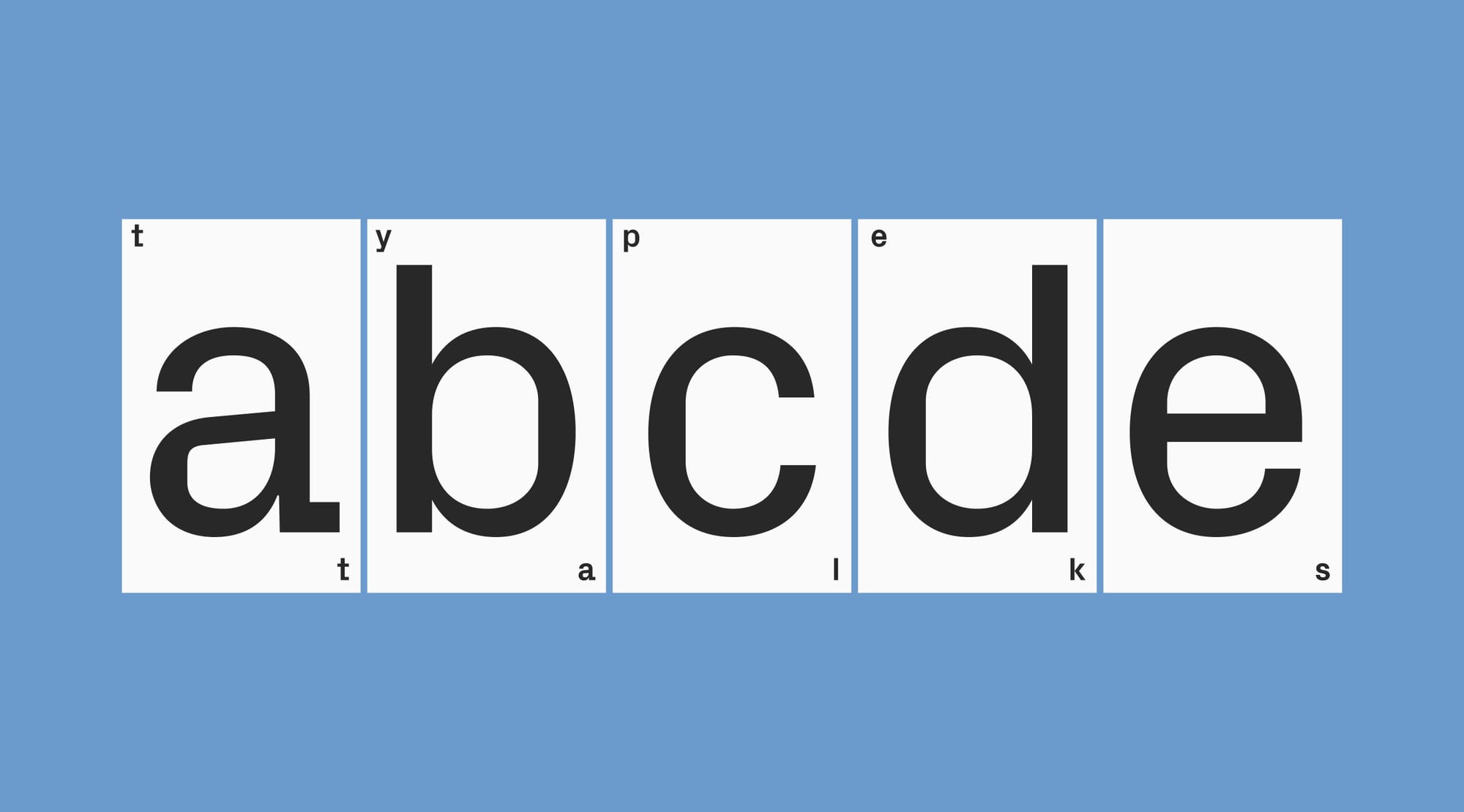
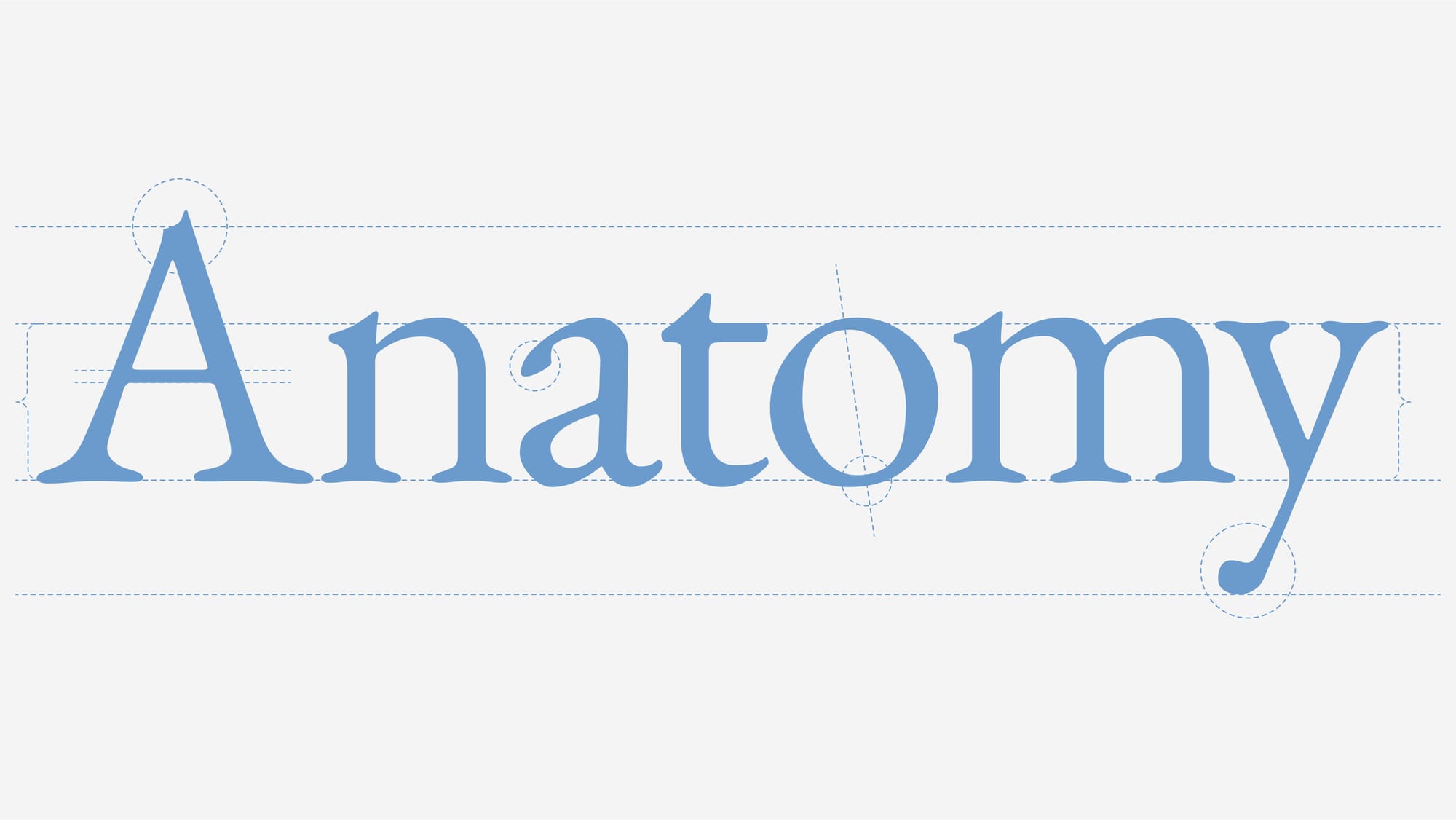
Now, let’s go back to the basics of type anatomy:
- There’s serif (the little feet) and san serif fonts (without little feet)
- Terminals: the end of a strokes
- Extenders: Ascenders (like the upward stroke in d or h) and Descenders (like the tail in q or g)
- Apertures: the openings in letters like e and c
- Leading: the vertical space between lines of text, which affects readability and tone
- X-height: the height of lowercase letters, excluding the extenders
When choosing a typeface, start with readability. This refers to how easily a reader can consume and process the text. À la our case study, Times New Roman is an example of a highly readable font. But remember: typography is both precise and intuitive. Some of it is measurable, but much of it is about feel. The right font can reinforce your message even before the words are read. That’s the subtle power behind the importance of typography.
Choosing and pairing fonts
Pairing fonts well is an art that highlights visual contrast and cohesion. Look at proportions: x-height, extender length, and character width. When fonts align in these areas—or contrast intentionally—they create a more dynamic reading experience.
Think beyond aesthetics. How do your typefaces interact? Do the serifs compete? Is the contrast in stroke weight enhancing or distracting? If in doubt, look to experts: the Readymag Design Almanac breaks down iconic pairings like Farnham and Benton Sans to explain why they work.
Creating contrast
A decorative script paired with a sturdy sans-serif lets each font play a clear role—elegance versus utility. A bold headline font with a lightweight serif body text can organize content effectively. Contrast isn’t just about typefaces. Adjusting a variable font’s scale, weight, outline, and spacing creates structure and emphasis.
This kind of typographic control reinforces the importance of typography in graphic design: it helps readers know where to look, what to read first, and how to interpret meaning. To see this at work, there are plenty of font sites that show inspiring ways designers have mixed and remixed typographic layouts.
Establishing hierarchy
Different types of information will demand different levels of attention - there are titles, subheadings, body text, pull quotes, and captions. Establishing visual hierarchy with type helps readers navigate complexity.
This is where the importance of typography in graphic design really shines. By leveraging different fonts, characters sizes, and styles, typography can clarify even the most intricate layouts and help to communicate complex ideas efficiently.
Setting the tone
Futura’s clean geometry channels the Bauhaus; Courier evokes vintage typewriters. These associations help in understanding the role of typography in branding. A typeface can evoke a whole era, mood, or product category—be it luxury, tech, or something playful and childlike.
Ask yourself: Where have I seen this font before? Whether the answer is a sporting logo or a soda can, it reveals how typography shapes perception. That’s why the importance of typography in branding can’t be overlooked—it helps create emotional recognition.
Readymag as type playground
Variable fonts allow designers to customize styles within a single font file, opening up possibilities for responsive, animated, and highly expressive typography. Readymag’s type tools let you experiment in a flexible space that highlights the importance of typography in web design.
Readymag’s variable type tools are a hands-on way to experiment with the potential of typography in web design. It gives designers access to features like special characters, fractions, small caps, and ligatures. If a font supports variability, Readymag makes it easy to customize and animate it directly within a webpage—no coding required.
FAQ
How can typography influence design decisions?
Typography can evoke a certain mood, make text easier to process, and encourage readers to get to the end of a web page. Strategic choices in typefaces and layout show the importance of typography in visual communication, strengthening both the design’s clarity and its emotional impact across digital and print formats.
What are the golden rules of typography?
While typography doesn't follow strict formulas, there are some golden rules that can help designers craft effective layouts. They include prioritizing readability, creating strategic hierarchies, and choosing fonts that align with your message. These principles help promote clarity and consistent style across visual layouts. But remember, the best typographic choices also respond to the vibe and vision of the project.
How to make website typography stand out with Readymag?
Readymag’s variable fonts and text editing tools can make text bulge, jump, and swirl in response to user interactions. It’s a dynamic way of applying the principles laid out in this article.