How to train your taste as a designer
A conversation with Readymag's designers and Andre do Amaral about what taste means today, how to develop it, and, most importantly, how to use it at work.

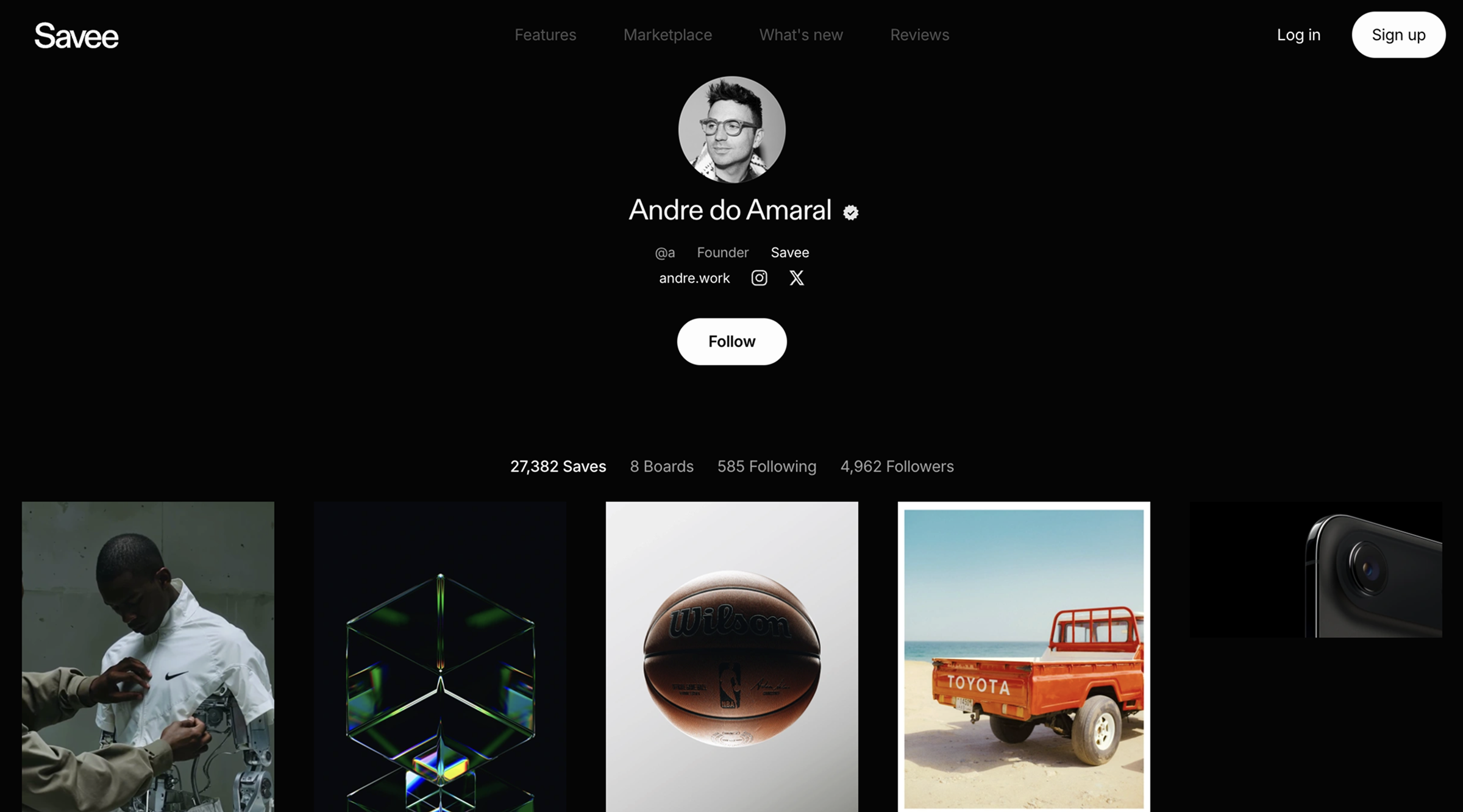
Recently, Andre do Amaral from Savee wrote a wonderful piece about how, with the rise of AI, taste is emerging as the main design skill. We couldn’t agree more—so we asked our designers, and Andre himself, what taste means today, what constitutes “good” or “bad” taste, how to develop it, and, most importantly, how to use it at work.
Speakers:
Andre do Amaral, co-founder of Savee.
Alexandra Golubeva, product designer at Readymag.
Mariia Chupina, marketing designer at Readymag.

The matrix of taste
Andre: Taste is your inner filter, the quiet yes or no that guides what you keep, and what you let go. Style is how that filter shows up on the surface, the pattern of your choices. Visual literacy is the grammar, the part that helps you read what you’re seeing, composition, hierarchy, contrast, pacing.
Taste sits on top of literacy and underneath style. Literacy lets you understand. Taste helps you decide. Style is the trace you leave behind.
Alexandra: Taste is what you like subconsciously, without knowing why—a kind of emotional response. It’s internal and individual, shaped by everything around you. Taste develops within a person, unlike style, which is external, and it remains deeply personal and subjective, unlike visual literacy—though all three are closely connected.
Mariia: Taste is a subjective sense of what feels beautiful, high-quality, or valuable, what we like or dislike. Style is a more objective set of qualities tied to an approach or sequence of techniques, the way an author’s taste is realized in their work. Visual literacy is a skill built on knowledge: the ability to distinguish styles and read context, the way we understand how something works.
By developing literacy, we refine taste, which in turn shapes our ability to create styles.
The good, the bad and the ugly
Alexandra: When I talk about taste, I try not to think in terms of good or bad. I learned this from working with students and beginner designers, who naturally have very specific tastes, especially those in environments with little exposure to high-quality design. When they brought in things I considered bad but they liked, like websites of obscure local shops from 2010, I started digging into what they saw in them and what I could suggest, because here we enter the realm of subjectivity. Once we defined what they liked about a particular design, we could go deeper and find more modern or higher-quality solutions, while keeping what they thought was cool. For me, the key was to stay open and flexible, to improve their visual literacy without changing their taste. Taste is part of individuality, and I can’t call individuality bad.
Like many designers, I’m susceptible to trends. But everything that exists is liked by someone. Someone once looked at it and thought, “Damn, that’s nice.” So I’m even grateful for the things I don’t like now, because they still influenced my taste in one way or another. For example, I was a fan of minimalist Swiss design at the beginning of my career, but I outgrew it, and it doesn’t feel as interesting to me as it once did. It’s cool that a design I once rejected is still with me, and a part of it helped shape me as a designer.
What distinguishes a tasteful solution from a trend is when you can see the personality or team behind a decision—when you feel the individuality, thought, character, and idea.
This often leads to unexpected combinations, or to a new solution, but one where you can’t quite understand how it was made. For example, lately I’ve been into book design, and I researched Studio Hubertus’s archive. When I looked at their books, I could more or less understand how they were made, but I had no idea why they chose certain decisions, or how far they pushed experimentation to create such beautiful work.
Andre: Labels shift with context. Some things are almost universally clumsy: bad kerning, chaotic hierarchy, decorative effects that fight the message. The industry is redefining taste all the time because our inputs change: new tools, new screens, new speeds. What stays constant is integrity, choices that respect users, time, and the problem.
Trendy work ages overnight. Technically correct work can feel lifeless. A tasteful solution feels specific, calm, and inevitable. I look for durability: if we came back in two years, would we still nod yes? I also test it against goals, audience, and constraints. If it’s beautiful and advances the brief, then we’re close.
I used to over-style type to show range—layering textures and clever micro effects just because I could. Now I prefer cleaner routes, better rhythm, better spacing, fewer moves. You can feel the difference between confidence and decoration.
Mariia: Cultural currents change quickly, and what was bad taste yesterday can be excellent taste today. Take trashy ad banners with silly fonts or primitive 3D graphics—20 years ago they were seen as tasteless, because the goal was to “make it good.” Today they’re valued for their casualness, irony, and even for being created without any intention of harmony. Or the opposite: 10–15 years ago the loft style felt trendy and fresh, tied to squatted industrial spaces. Today it’s little more than cheap stylization, a parody of itself.
Something can be technically correct or trendy and still be tasteless. I look at the details and try to understand where such decisions come from. It’s hard to be objective here, but still possible. For example, I find it tasteless when a building is poorly restored: the work may be technically justified, but it destroys valuable qualities. Or when something is styled in a trendy but superficial way—decoration without context.
In general, tastelessness happens when the author doesn’t understand why they’re doing something, or when they pretend to be what they’re not.
How taste is made
Alexandra: If the goal is to build a unique sense of what you like and don’t like, it seems you only need two things: to look and to reflect. That’s how I keep developing my taste—I don’t just look. That helps you become more discerning, sure, but it’s just as important to ask whether you like something and why. You won’t always find an answer, but it matters to notice those moments when you see something and think, “Wow, that’s so cool.” At that point, it’s already stored in your personal taste bank.
Andre: I trained my taste by collecting, curating, and editing for years. I saved what pulled me in, lived with it, then pruned it. Moodboards weren’t decoration, they were my thinking tool. The rule was simple: if it moves the idea forward, it stays; if it’s just loud, it goes. Over time you get faster, your eye sharpens, and your library becomes a compass.
Mariia: I pay attention to subtle details and analyze them. In design, I try to rationalize every decision, but some things inevitably come out intuitively, guided by instinct. I try to trust that more, because I know those sensations aren’t groundless, they just need a little time to reveal their cause.
Taste at work
Andre: Taste is what keeps the work honest. It helps me choose momentum over noise, clarity over novelty, and it keeps me from chasing tricks when the problem needs truth. In practice, taste helps me pick the right reference, the right type family, the right level of restraint. It keeps the team focused on what serves the story, not what fills the slide.
To defend your taste with clients or a team, translate it into reasons. I avoid saying “I prefer”, and say “Here’s why this choice serves the objective”, “Here’s the behavior it invites”, or “Here’s the risk it removes”. I pair comps with a short rationale. I show two paths, both viable, and explain tradeoffs.
When people see the logic, taste becomes leadership, not preference.
Alexandra: Taste is a deeply individual and emotional thing—it’s hard to explain. But designers find ways to rationalize their choices, explaining why something was done a certain way through data or comparisons. The latter is often the best way to defend a decision to a stakeholder: show references where others have already done it, and it works.
I often try to make sure my taste doesn’t influence my decisions. When working with interfaces, the main thing is functionality and usefulness, not the designer’s taste. Sometimes I have to stop myself: yes, I like it and it looks beautiful, but it’s not always convenient, so I simplify it. I feel it when I add illustrations, animations, or graphics—often, the simple choice is enough. Extra visuals can overcomplicate things and cause cognitive overload.
Taste, however, helps shape the initial picture of what I want to do at the start of a task, when looking at direct and indirect references. And of course, it’s invaluable when giving feedback to teammates—sharing different ideas for solving the same problem. Since everyone has their own taste and sense of what’s cool, many different lines of thought emerge, making the process creative and fruitful.
The reference filter
Andre: I keep a simple test: spark, strength, service.
- Spark—does it wake me up?
- Strength—does it hold up after a week in the board?
- Service—does it move this specific project forward?
If it passes all three, it stays. I also watch my ratios: not all work from the same studio, not only glossy campaigns, but a mix of timeless, timely, and odd. The odd piece often unlocks the route.
At Savee we treat moodboards like instruments. You learn scales, you play daily, record ideas, remix references, get your ear in tune. Taste grows with practice. Build, edit, repeat. The work gets cleaner, your voice gets clearer, and decisions get faster.
Mariia: When I look for references, it can be anything—not necessarily smart, ethical, tasteful, or even from the world of design. I often find useful principles in architecture, street signs, or old ads. Some unexpected phenomenon can spark an idea or association, and that’s something I really enjoy in my work.
Alexandra: I pay close attention to myself and try not to over-rationalize my emotional response, it takes away the magic. So if I think, “Oh, that’s cool,” it goes into my collection of references.