How to quickly create a landing page for your typeface
BlkBlkLtr is a typeface project that currently offers two grotesque typefaces: Mica and Lethia. All of BlkBlkLtr’s web pages are skilfully created with Readymag. We talked about the project with its creator, Neha Hattangdi.

BlkBlkLtr is a typeface project that currently offers two grotesque typefaces: Mica and Lethia. All of BlkBlkLtr’s web pages are skilfully created with Readymag. We talked about the project with its creator, Neha Hattangdi.
I am originally from Mumbai. I also did my bachelor studies in design there. However, wanting more exposure to design, I moved to San Francisco eleven years ago for the graduate program at Academy of Art University. Now I work as Lead Designer at Astro Studios, a design and branding agency.

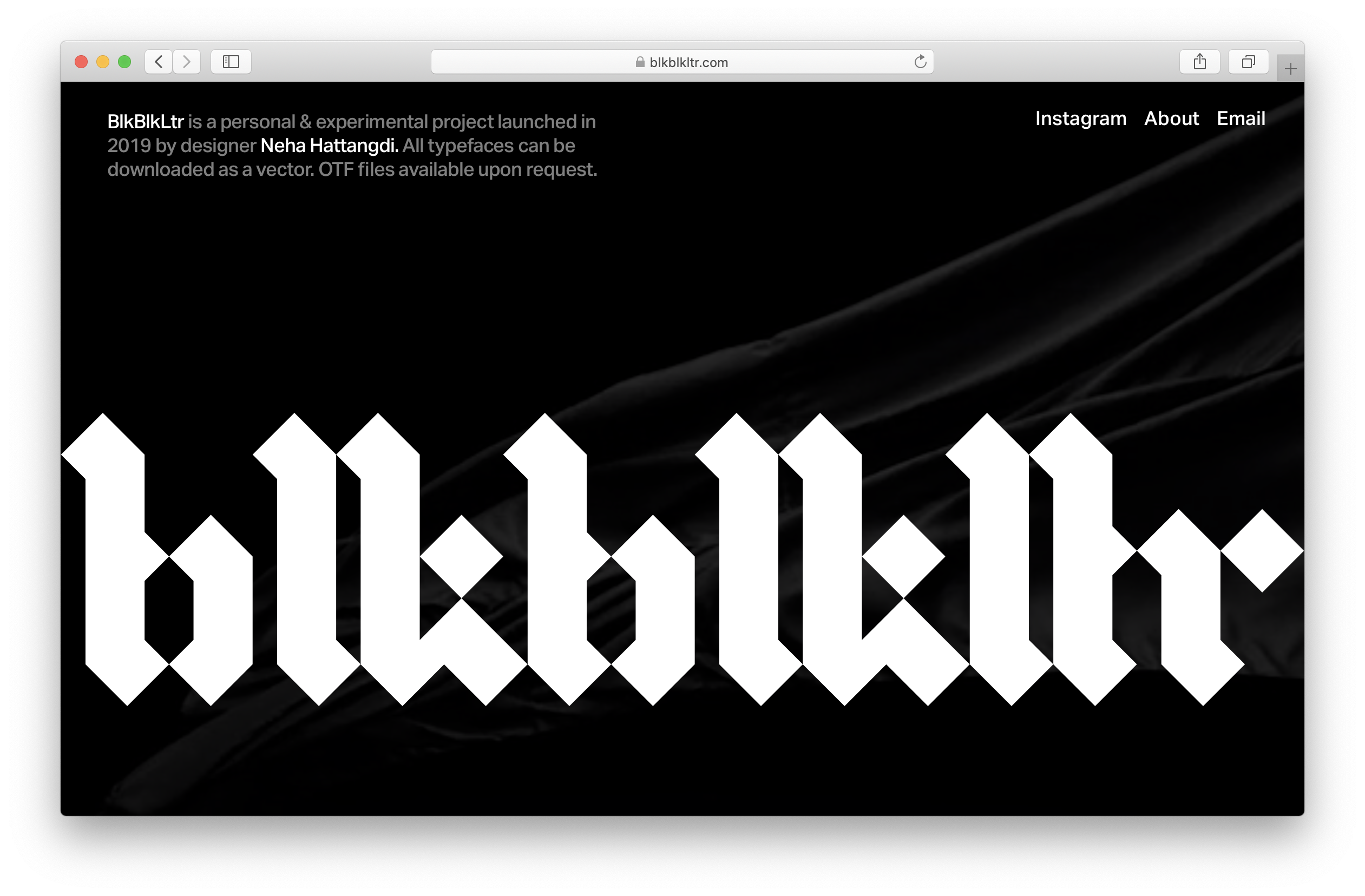
Typography was my major at school, but I have to admit I haven’t studied at a proper type school. However, I’ve always been a type fanatic, and I love to do anything that involves typography. BlkBlkLtr is basically me making typefaces for fun. BlkBlkLtr stands for Black Black Letter: I like Blackletter typefaces, so I planned on making nothing else. I changed my mind later, but the name stuck.
For now, there are only two uploaded, but four others are ready that I hope to add soon. At first, these were accidental fonts. However, I realized that I would like them to be used broadly, so I planned to license the fonts as typefaces.

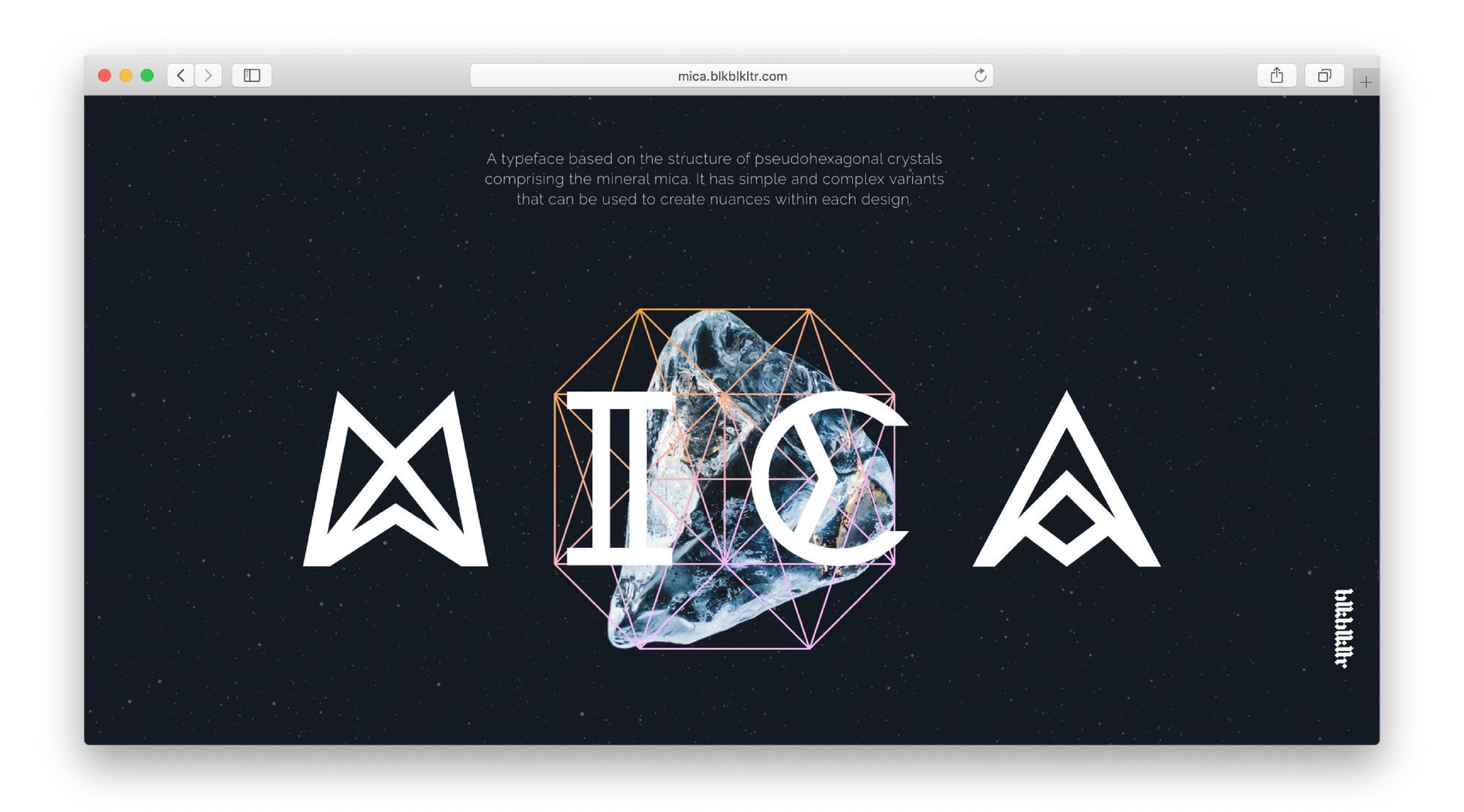
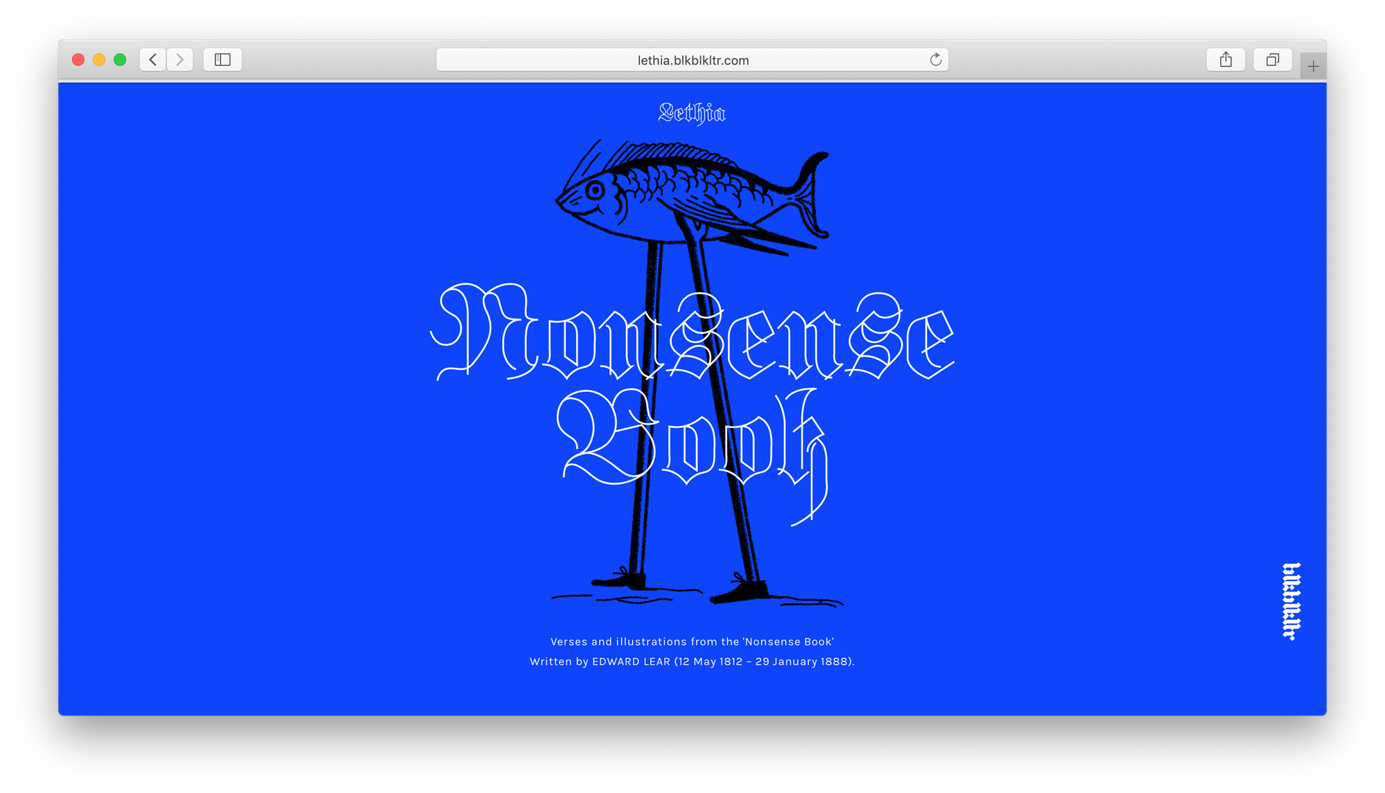
I’d like to make all of the BlkBlkLtr fonts as different from each other as possible. For example, my Mica font is very geometric and inspired by a mineral structure. I was looking at the structure of crystals, of a Mica stone in particular. Then I took it as an inspiration to create a grid and a font based on that grid. Another is Lethia, which is a modern-minimalist take on a classic blackletter typeface.
I came across Readymag in a curious way: I stumbled across a website that I really liked and tried to figure out how it was created, reading its source code. I saw a readymag.com link there and that’s how I got interested.
From there, it only took four hours to assemble the Mica page. That includes adding images, figuring out animations, and making the page adapt differently to phone and tablet. I definitely expected it to take a lot longer — that’s what I really liked about the tool.
Another thing I like about Readymag is WYSIWYG — things that you design look exactly the same when you publish them.
I would also like to share a link to a page that inspired me a lot, called Readyset. It is a great collection of experiments that can help you understand just how much is possible with Readymag.