How to make your Readymag project load quicker
There are certain tricks that help a project load more quickly and efficiently even when internet connectivity is weak. Here are some useful tips.

There are certain tricks that help a project load more quickly and efficiently even when internet connectivity is weak. Here are some useful tips.
1. Audit your project
Before tackling performance issues, you’ll need to find out their source.
We recommend Lighthouse, an audit system embedded in Google Chrome. Lighthouse allows users to test project performance across a range of different devices. Full Lighthouse instructions are located here.
2. Don’t use GIFs unless they’re essential
As a general rule, GIFs are best avoided except when there’s a specific aesthetic need for them. GIF files use more memory than almost any other image format—Google developers even recommend converting GIFs to .mp4 videos for the sake of performance. If your project would benefit from having elements in motion, try using Readymag animations.
That said, Readymag does support GIF files. So when they are necessary for a particular project (for instance, to recreate the visual feel of a 1990’s website), they’re embeddable via image widget.
3. Use just enough widgets
We recommend keeping track of the total widget number in a project rather than hiding those that aren’t needed.
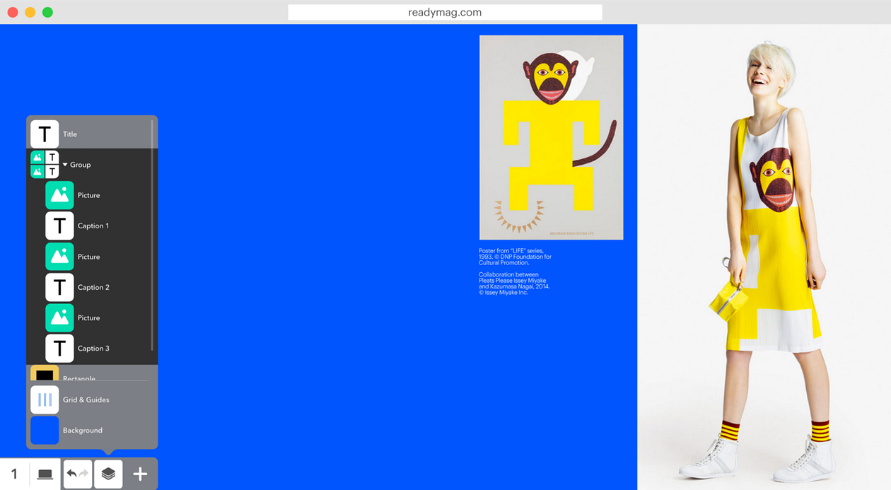
It’s also a wise idea to organize in groups widgets that belong together — it speeds up workflow and helps keep widgets under control. To create a group, select the widgets and press Cmd+G/Ctrl+G. Rename groups as you like; just click once on the group name. Widgets can also be dragged and dropped to a group via the Layers bar.

Remember that the key factor that influences performance is the number of widgets per page (as opposed to the overall number of widgets in the entire project). So splitting a project into multiple pages will generally accelerate the speed at which it loads and processes.
If a project is extra widget-heavy, try using a preloader. A preloader is a custom image or animation that fills the screen until the project has uploaded completely. To create a preloader, we suggest using opacity animation with delay. Add a preloader as a front layer and then animate its opacity to zero, setting the delay long enough to allow the website to upload. An excellent example of a preloader created on Readymag can be found here.
Also, consider using slide-in transitions. For certain projects, it will help speed things up (see details here).
4. Use images of proper resolution
Using images that are either too big or too small negatively affects both performance and appearance. When an image is too small it looks pixelated on hi-res screens, while images that are too large slow a project down.
After adjusting all images, check if a project looks as intended on multiple devices, including a display with the best resolution available to you. We also advise testing projects on a mobile device.
5. A mobile version can be simpler than a desktop version
Since mobile internet is often erratic, the mobile aspect might be the source of performance issues. To resolve them, consider creating a simplified version.

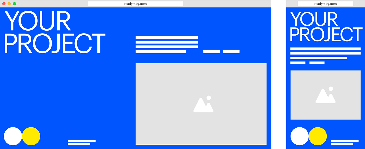
To begin, enable Mobile layout and view the automatically created Mobile auto-layout. If elements or their positions aren’t to your liking, revise as desired.
Remember, too, that altering some settings in mobile changes them in desktop as well, while other settings may be changed separately. More details can be found here.
Note: some of screenshots and videos in this post reference our old user interface, so the current Readymag workflow may not look identical. Check out all of our changes here.
If you have additional questions regarding project performance, please email us at [email protected]
Love this story? Explore other pieces from Readymag
Design digital publications and websites with Readymag