How to make an online portfolio: 6 basic rules + 5 bonus tips
Every day we look through dozens of portfolios created using Readymag. These are the works of web and graphic designers, art directors, photographers — people of all kinds of creative disciplines.
Every day we look through dozens of portfolios created using Readymag. These are the works of web and graphic designers, art directors, photographers — people of all kinds of creative disciplines. But when it comes to presenting yourself online, the rules of what works best apply the same to everyone. We have selected 11 R/m-based examples to demonstrate the basic rules for creating a good design portfolio. Plus some quick bonus tips:
1. Choose quality over quantity
Showcase only the best of your work, those projects in which you are 100% sure, and that represent the direction in which you want to continue to work. And keep in mind the eternal “less is more” — it is preferable that the amount of the best works is between 8–10.
2. Design your portfolio, but don’t overdo it
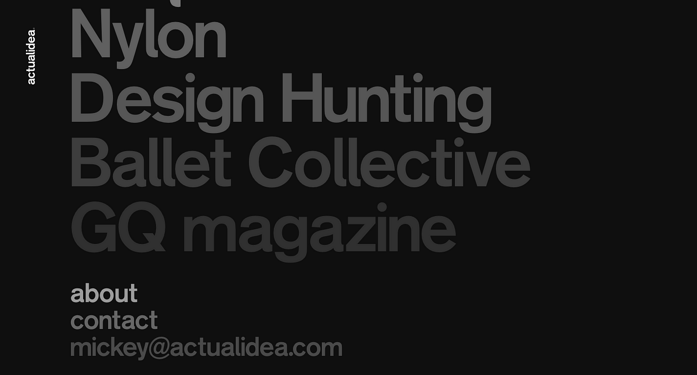
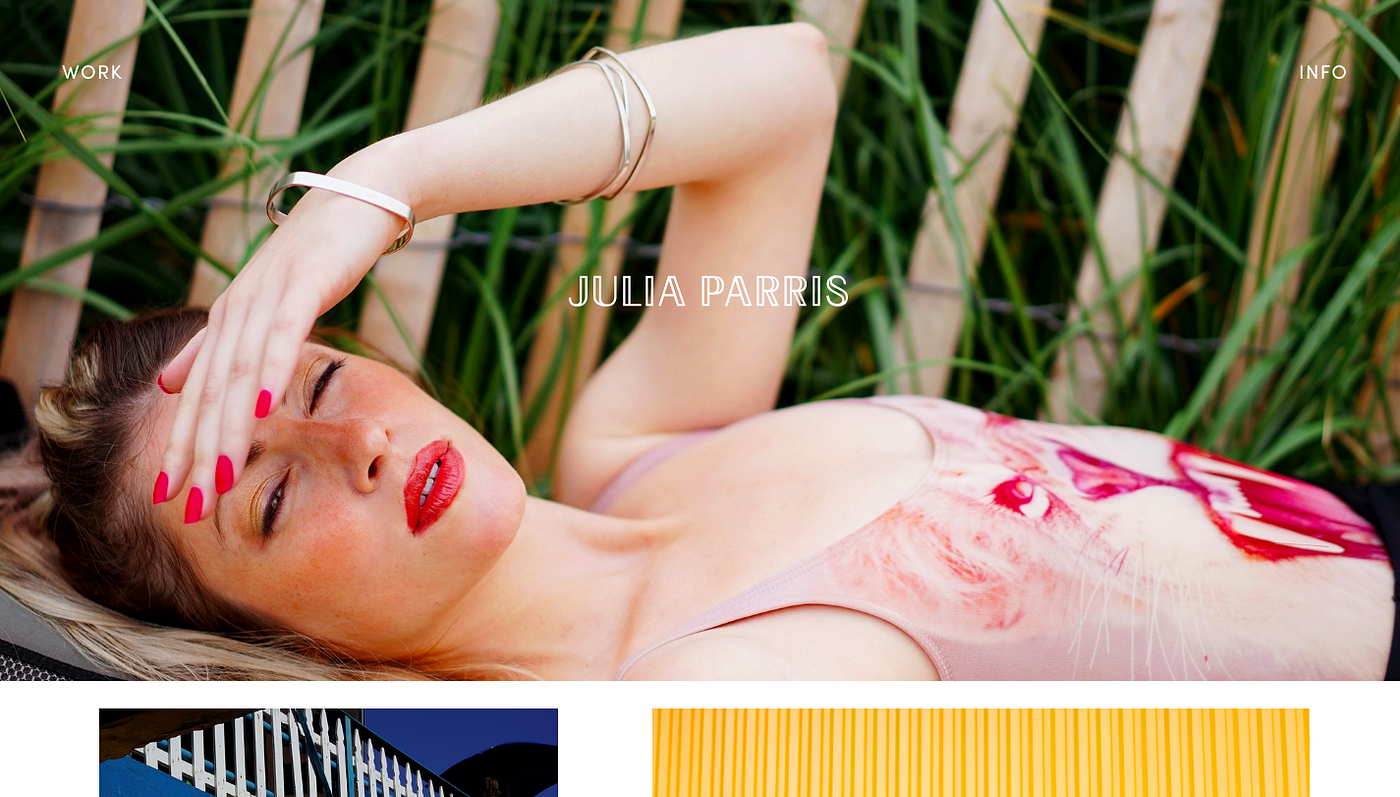
The design of the portfolio demonstrates your taste, presentation skills and reflects your personality. It shows what you can do and who you are before the client gets to your projects and the about page. The best advice here — treat your portfolio as the latest self-initiated project. Design it well, but try not to overshadow your projects.
3. Think responsive
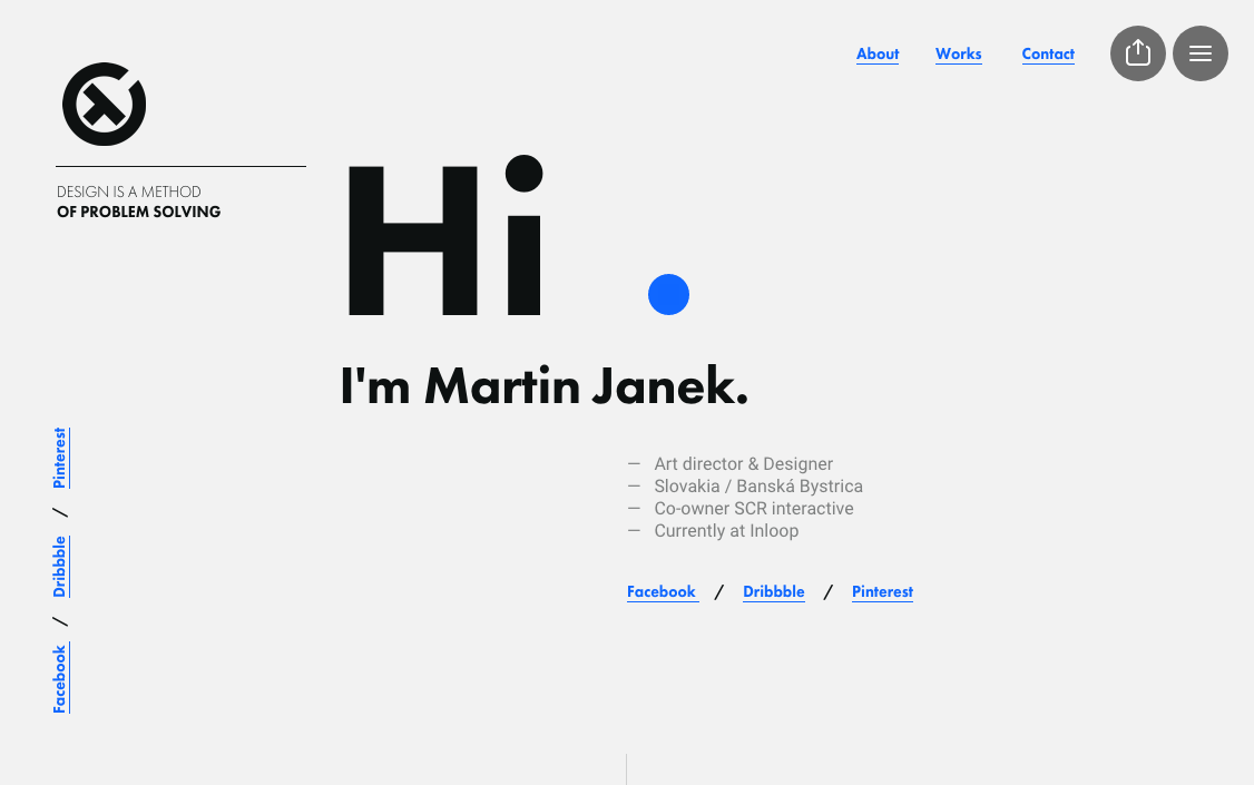
Responsive design is a great advantage in creating an online portfolio. It is a good way to showcase your works big on small screens, hiding the information that is unnecessary on mobile displays. Plus, you give your potential clients the opportunity to look through your portfolio anywhere and from any device. This detail is especially indicative if you’re a UX designer, it will show you as a thoughtful professional.

4. Reveal the process
Demonstrating how you approach the brief, sharing the thinking process behind your project, and providing a reasoning for your final solution is a good indicator of your skills and expertise. But, of course, some genius solutions may come as a sudden fling of design. So 1–2 case studies, just to give an idea of your creative process, will work too.
5. Use consistent navigation
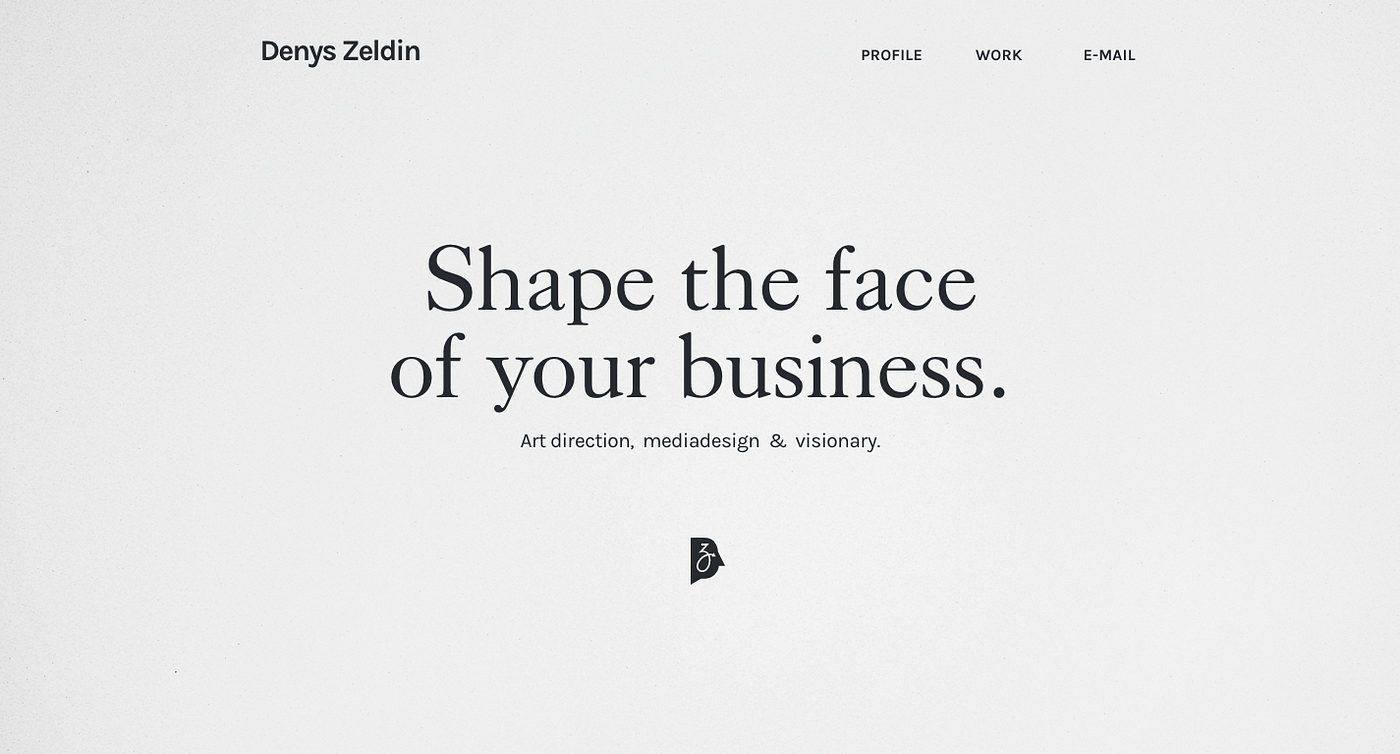
This is not where much creativity is expected, but logic is a must. Keep the navigation in your portfolio simple and obvious, so the client could quickly find your work and contact details.
6. Put your work in a context
Use photos of your work if it was designed to be printed, like posters, business cards and magazine layouts. If you are designing products or stationary, present it on actual objects. Don’t use complicated angle shots of the phonedisplay to present the application, no need to photograph a laptop to demonstrate a website design — think naturally and simpler — a big picture of your design on a front view mock-up will always work better.
Additional tips
- Use social buttons, let people easily spread the word about your talents.
- Avoid school projects and works that are older than 3 years.
- Including some testimonials from the satisfied clients might be a good idea.
- What must be on your about page: your name, where you are based, what you specialize in.
- Keep your portfolio constantly updated and keep up!