How storytelling techniques can help you create better design
Learn to harness the power of the Narrative Arc, The Hero's Journey, and other approaches to structure and present information in your projects more engagingly
You either love the concept of “storytelling” with all your heart or hate it with all your guts. But it’s hard to deny that people remember stories better than isolated facts—and, it’s a fundamental cognitive bias that most people are exposed to.
This tendency is central to Ellen Lupton's “Design is Storytelling”, where she explores narrative concepts and their application in design. We've selected a few of these concepts and brought them to life with examples from websites created using Readymag, as well as through scenarios from the tool itself.
Narrative Arc
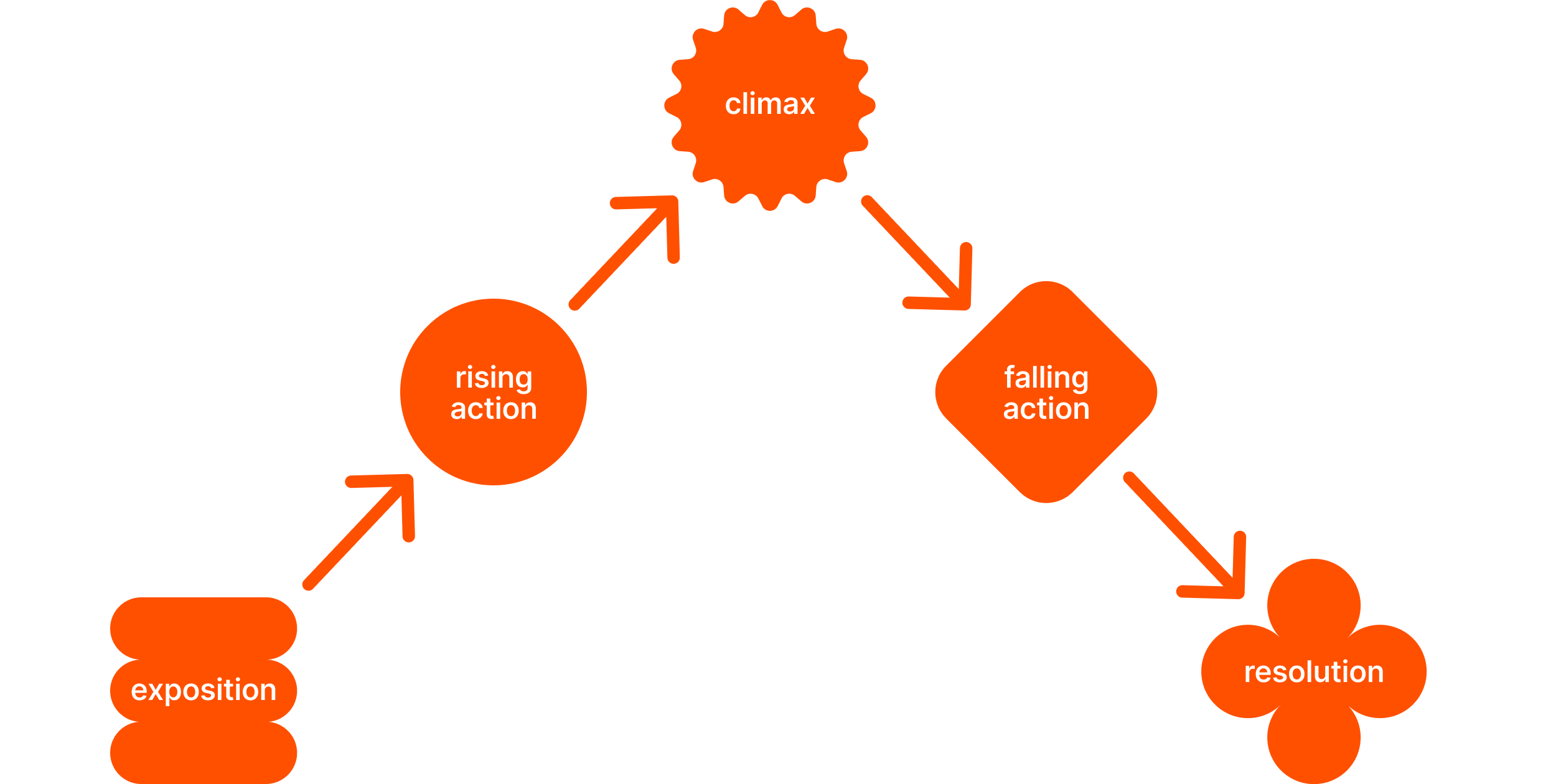
The concept of the Narrative Arc has its origins in classical literature and fairy tales. It’s a fundamental structure of storytelling that consists of several key components: exposition, rising action, climax, falling action, and resolution. The structure guides the development of the plot and creates suspense and interest. The invention of Narrative Arc is credited to Gustav Freitag, a nineteenth century German playwright and novelist. He developed the concept by analyzing ancient Greek and Shakespearean drama and described a five-part plot structure that has since become a staple of storytelling in various mediums.
Designers can use Narrative Arc to create engaging and consistent user journeys, ensuring that digital interactions are not only functional but also memorable. This approach aims to create a smooth journey, similar to a compelling story, enhancing the user experience and connection to the brand or product.
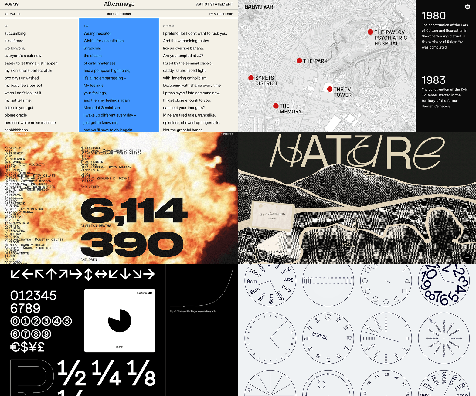
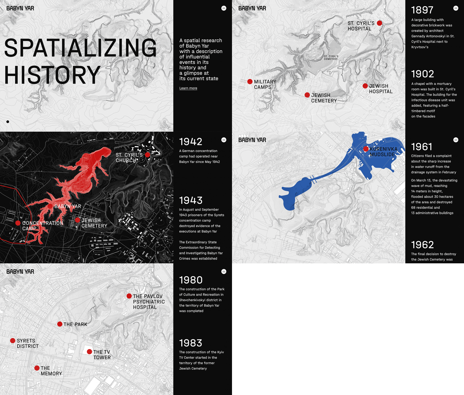
Take “Spatializing History” by BYHMC as an example. It’s a project about Babyn Yar, and the first screen is just that—an exposition that shows and tells what the project will be about. We start scrolling and dive into the history of the place and learn about the key events that occurred there, gradually moving up to the key period of World War II. Then, climax follows: the tragic events that took place between 1941 and 1945. In a way, the whole project was made for the sake of preserving the memory of these events. Scroll on, and the tension begins to drop—life went on, and the place took on a life of its own. The last event in the timeline— the installation of a memorial at the site of the tragedy—can be considered a resolution. Further on, the story of the war years is discussed in more detail, and it too has its own separate narrative arc.
The Hero’s Journey
This concept has its origins in the works of the American mythologist Joseph Campbell. In his 1949 work, “The Hero with a Thousand Faces”, he discovered a pattern universal across cultures that he called the “monomyth”. Campbell’s Hero’s Journey begins when the hero, while in their ordinary world, receives a call to adventure. Indecisive at first, the hero eventually takes a step into the unknown, often encouraged by a mentor. This departure leads to an initiation phase in which the hero faces trials, gains allies and confronts enemies, and culminates in a major test: the pinnacle of the quest. Finally, the hero returns, transformed by the journey, with new wisdom or abilities.
In design, especially in UX and UI, the application of the Hero’s Journey offers a framework for creating an engaging and interesting user experience. Designers can use this narrative structure to create journeys that position the user as a hero. This approach not only resonates deeply with the audience, but also fosters an emotional connection.
You don't have to go far to find examples of the hero's journey in web design—its influence, conscious or intuitive, can be found in almost any application and website. Even Readymag itself can be broken down into stages of the Hero’s Journey. First, you get to the main page of the product. You don't know anything about it yet, but after scrolling a bit and familiarizing yourself with its features, you (hopefully) become interested. Then the journey itself begins: you sign up and find yourself on an account page, which you now have to explore and accomplish initial tasks, whatever they may be (while perhaps even getting distracted by a couple of side missions). The final stage, which is characterized by a sense of satisfaction and accomplishment, is the published project. This is the transformation of the protagonist and their return home, potentially setting the stage for another adventure.
The Rule of Threes
This principle has its origins in the way humans process information. We tend to believe that concepts and ideas presented in three ways are more appealing, memorable, and effective. This pattern is deeply rooted in human psychology and culture, and is evident in everything from fairy tales (“The Three Little Pigs”) to public speaking (“Veni, vidi, vici”).
In the context of design, the rule of three becomes a powerful tool for organizing and presenting content in a way that’s natural and easy to understand. Applying this principle requires a balance between simplicity and completeness.
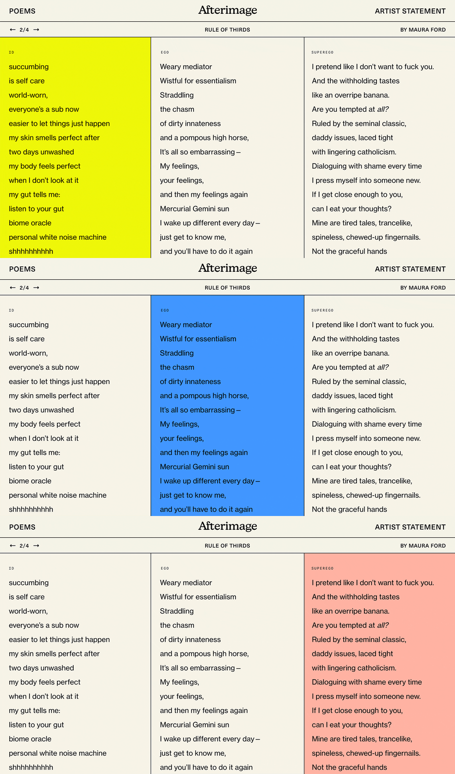
The Rule of Threes is so ubiquitous that it’s often used on an intuitive level, though there are also examples of its conscious use: in the “Afterimage” project by Maura Ford and Bekah Malover, one of the poems is literally called Rule of Thirds. It’s organized logically in three columns, which correspond to another trio from the field of psychoanalysis: Id, Ego and Superego. Another good use of the Rule of Threes in UX refers to situations where it’s necessary to show the simplicity of the process or to not overload the user with options.
Design Fiction
This term emerged in the early twenty-first century and is associated with the intersection of design, narrative and speculative futures. It’s an approach used in design and futurism to explore and critique possible futures by creating hypothetical products, services or scenarios. The concept goes beyond mere prediction or forecasting; it’s about creating stories and artifacts that provoke discussion and reflection on the social, cultural, and ethical implications of new technologies and behaviors.
In UX design, fiction serves as a tool to create and test ideas about the future—or alternative versions of the present. It’s a way to explore and communicate potential outcomes and experiences in tangible form.
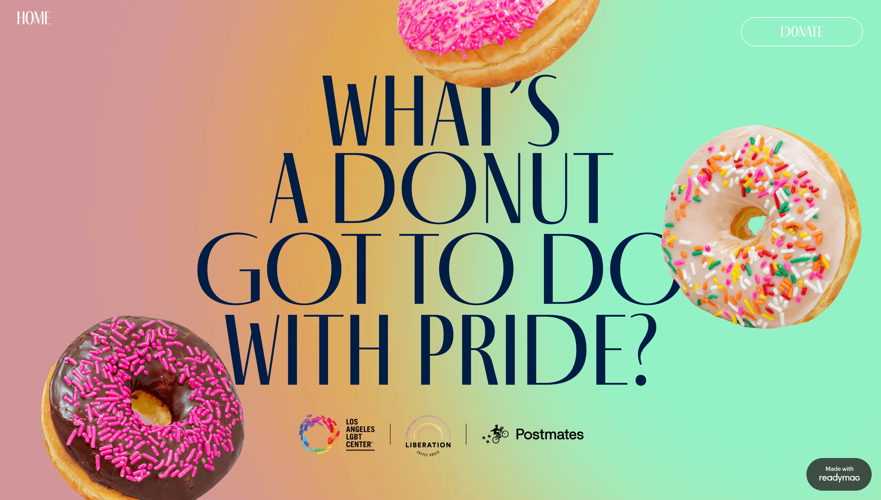
In the “Cooper Pride” made by joint efforts of Los Angeles LGBT Center, Liberation Coffee House and Postmates, the authors propose to explore an unexpected combination: donuts and Pride. This approach is intriguing and motivates users to find out what unites these very different things. A donut café as a safe place for the LGBTQ+ community may seem curious at first, but the story as a whole is harrowing and inspiring, giving the company's image a humanistic quality. Another example is Readymag's Editor window, where the division of docks mimics right and left hands. This brings together what has long been disconnected: working at a computer and working with your hands, giving them a mental connection back to each other. The uniqueness of the approach was met with delight from users.
Emotional Journey
This concept is concerned with creating experiences that evoke a range of emotions in the user. They play a crucial role in how people interact with and perceive products, services and brands. Elements such as color, imagery, typography, and even tone of voice in written content can evoke certain feelings.
The emotional journey in design, like a story, can have highs and lows. This dynamic flow keeps the user engaged and makes the experience more memorable.
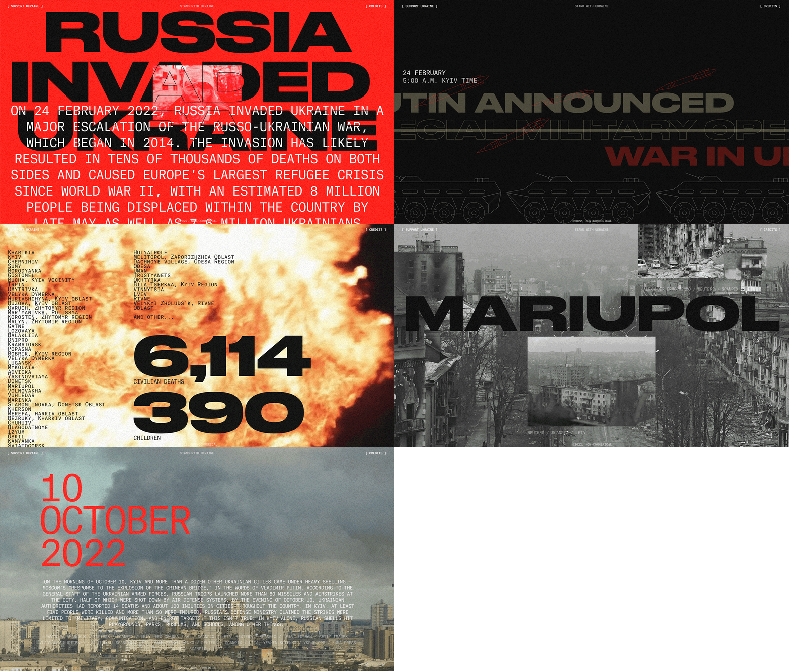
The emotional tone of “War in Ukraine” by Artem Militonian seems neutral at first, but quickly changes to one of alarm and tragedy. Even the background emphasizes this, quickly changing to red—then to yellow and blue, expressing support for one of the parties of the conflict. In the main part, gloomy emotions continue to build up, including visual methods: flashes of fire, with plenty of red or, on the contrary, black and white elements. However, everything ends on an optimistic note: the message of world support, which gives some hope for the end of the conflict, is again in yellow and blue. Another great example is Brickit’s approach to creating customer journeys with emotional challenges in mind.
The Gaze
The concept of “gaze” in design refers to how designers perceive and represent their users, objects or audiences in their work. This principle is based on the philosophical and psychoanalytic idea of how humans see and perceive other humans. The concept has been widely explored in fields such as art theory, film studies and gender studies.
In the context of design, “gaze” can be understood as the perspective through which designers see their audience. This perspective has a significant impact on how products, interfaces, and visuals are created. A crucial aspect of the “gaze” in contemporary design is the emphasis on inclusivity and diversity. Designers are increasingly aware of the need to consider multiple perspectives and represent different user groups in their work. This means moving away from stereotypical or one-dimensional representations to more nuanced and authentic ones.
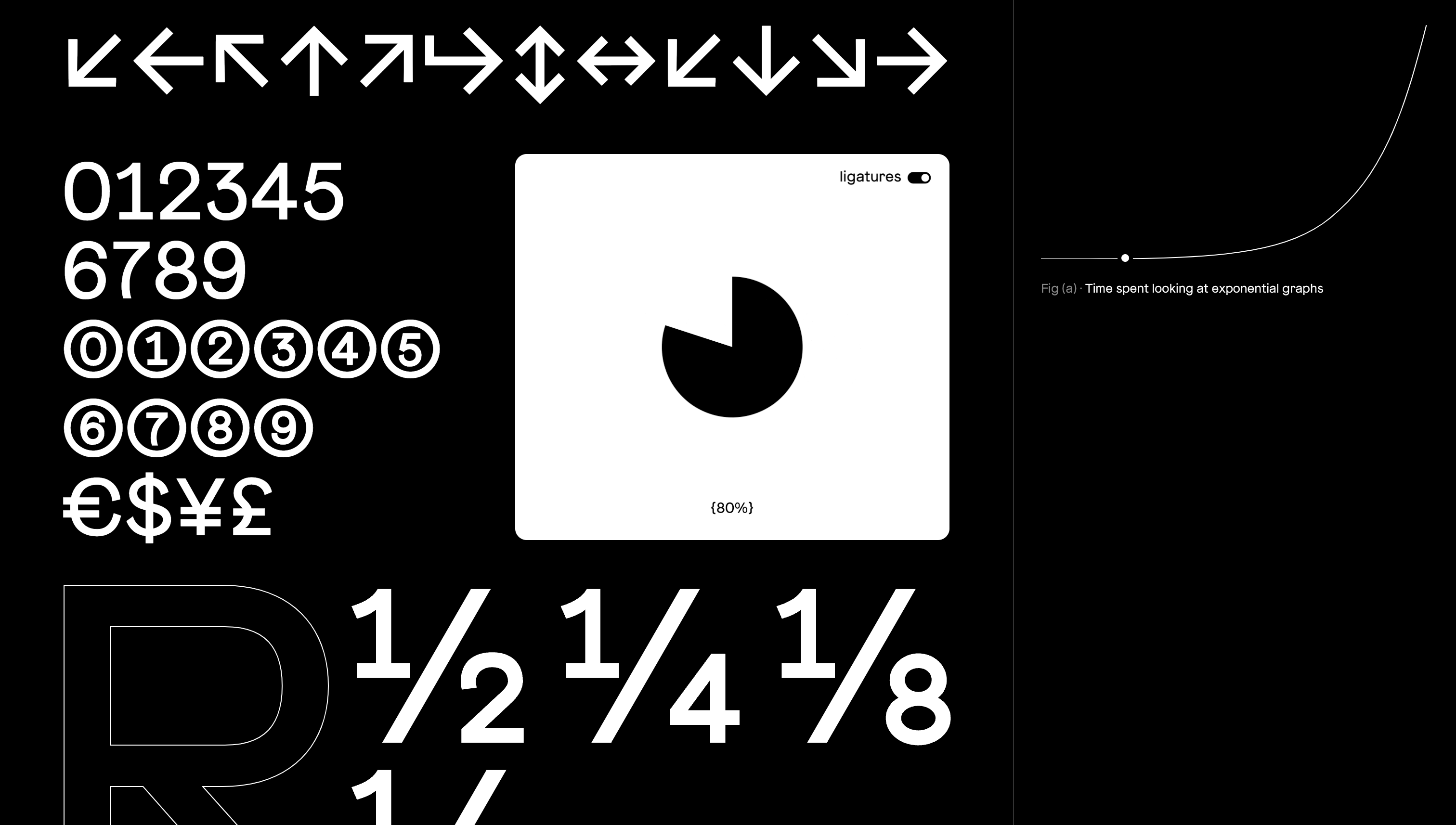
A great example of how design can be influenced by the designer's perception of the audience is “Isolation Grotesque” by Elias Tinchon—a project about a typeface. It’s obviously made with typographers in mind, and contains a lot of specific elements that would be incomprehensible to an outsider. A professional typographer, on the other hand, will understand everything necessary after barely glancing at the page.
Gestalt Principles
Gestalt principles are a set of theories developed by German psychologists in the 1920s to explain how humans perceive visual elements as a unified whole, or “gestalt”, rather than simply as a collection of individual parts. There are a lot of principles, and some of the most crucial are similarity, continuation, closure, proximity, figure-ground, and symmetry. These principles help organize content in a way that’s intuitive and aesthetically pleasing to the user.
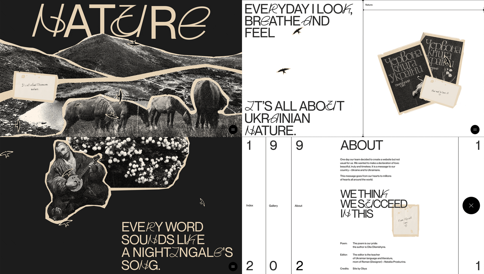
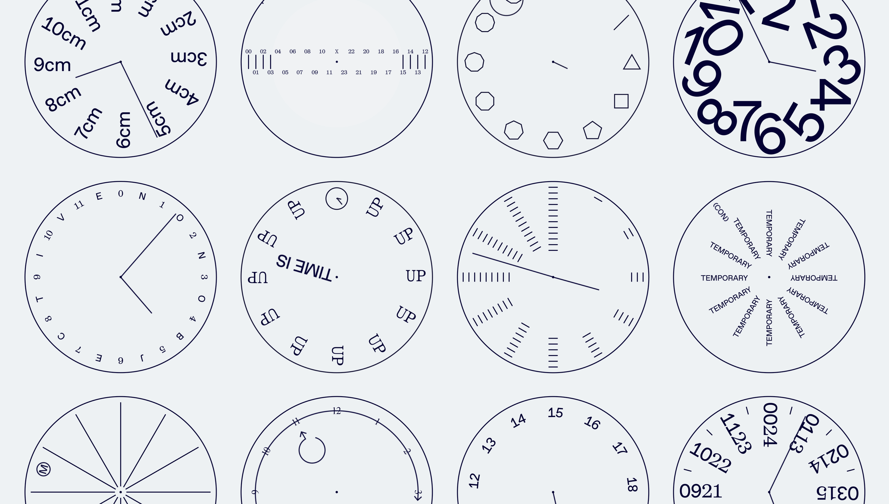
Gestalt principles are so deeply embedded in the human brain that they sometimes work imperceptibly and unconsciously. Traces of them can be found almost everywhere: in “The Message to Ukraine” by Obys, photographs and drawings turn out to be a set of lines and dots when enlarged (or vice versa, where sets of lines and dots at a distance are perceived as images of living beings or nature). Meanwhile, “Non-Objective”, by the studio of the same name, visually explores how the brain recognizes familiar objects (in this case, a clock face), no matter how many elements are missing or altered.
