How design encodes gender bias
Visual language, default settings, and interaction patterns that perpetuate inequality—and what designers can do about them.
When it comes to gender bias in tech, the conversation often turns to employment patterns or algorithmic biases. However, much of the inequality people experience online is shaped through design decisions: visual interface elements, default settings, onboarding processes, and interaction patterns.
Below are UX professionals and researchers' thoughts on how exclusion can occur at a structural level and what can be done about it, along with real-world examples.
Speakers:
Alexandra Golubeva, product designer at Readymag.
Alexandra Voronina, product designer at Readymag.
Margaret Burnett, computer scientist and distinguished professor at Oregon State University. Her research on gender inclusiveness in software produced the GenderMag method, now in use in 32 countries.
Visuals
Design signals belonging even before a user clicks. In one experiment, researchers at Stanford University and Brown University created two versions of the same website (a computer science course) with identical content and layout. They differed only in visual accents: one version used neutral elements without rigid gender associations, while the other used stereotypically masculine elements (darker colors, sci-fi imagery, terminal-style fonts).
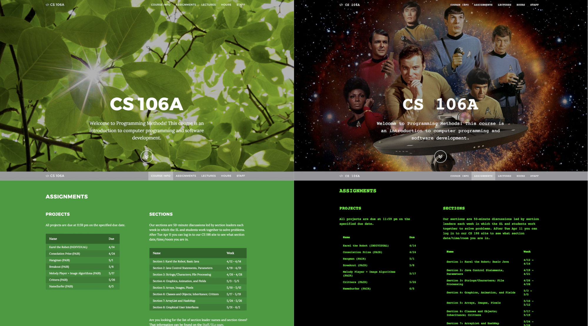
Women who viewed the masculine version reported decreased self-confidence, a weaker sense of belonging, and less interest in exploring the site and engaging with its offerings. Men, however, were unaffected by the difference. Most participants did not directly comment on the design differences, but their reactions nevertheless varied. No particular aesthetic is wrong per se—however, such studies highlight that design also carries social significance, and interfaces, even at the level of appearance, communicate who the space is intended for even if there's no explicit exclusion.
Alexandra Golubeva points out that health tech is one of the first things that comes to mind when talking about gender-signaling UI. “Any product dedicated to “women’s” health is almost sure to use pastel or pink tones (even though it’s not only women who need such apps—trans people, for example, do too). Fitness apps are often divided by gender as well: dark colors and brutal visuals for men, pink and florals for women,” says Alexandra.
Gender signaling can also be used deliberately to communicate inclusivity. For Alexandra Voronina, the most obvious example is outdoor advertising for dating apps—she sees it as part of an app’s onboarding. “Hinge’s outdoor advertising is a good case: the image of the audience it addresses is conveyed through stories that feel universal regardless of gender identity. This shows the brand’s clear intention to communicate inclusivity to its audience as a key, explicitly respected value. I also see the use of pink as a signal of gender inclusivity, perhaps because it reclaims a “girly” color,” shares Alexandra.

The myth of the “average user”
Similar patterns can be observed in everyday digital products. Early versions of Apple Health tracked everything from sodium intake to blood alcohol levels but didn't include menstrual cycle tracking. Voice assistants like Alexa and Siri almost always launched with female voices by default because the stereotypical role of a secretary or assistant was traditionally assigned to women. It's not hard to find examples from the pre-digital era—for example, car safety systems were developed for decades using predominantly male crash test dummies. Though none of these options were presented as gender-specific, they all arose from what designers and engineers considered a normal, literally "average person": a male.
Similar patterns are periodically discussed in the broader design literature. In her book "Invisible Women," journalist and researcher Caroline Criado Perez shows how infrastructure and products are often built based on data that portrays men as the default user. In the field of digital products, Sara Wachter-Boettcher, author of "Technically Wrong," develops similar ideas. In the book, she shows how seemingly small decisions—from registration forms to profile settings—can reinforce social assumptions about users and their behavior. In one example, she describes a small experiment that revealed that, among the 50 most popular endless runner games in the iTunes Store at the time, 40 offered male characters by default. Female characters were often either available for purchase or absent entirely.
Defaults
Other research repeatedly shows that default settings are incredibly powerful. Most people don't customize apps and interfaces; users accept the templates, presets, and recommended settings provided by interface designers. So when digital services come with binary gender fields or images that dominate certain body types or roles, these default assumptions quickly spread. Over time, they begin to shape expectations about who products are designed for and how users should behave.
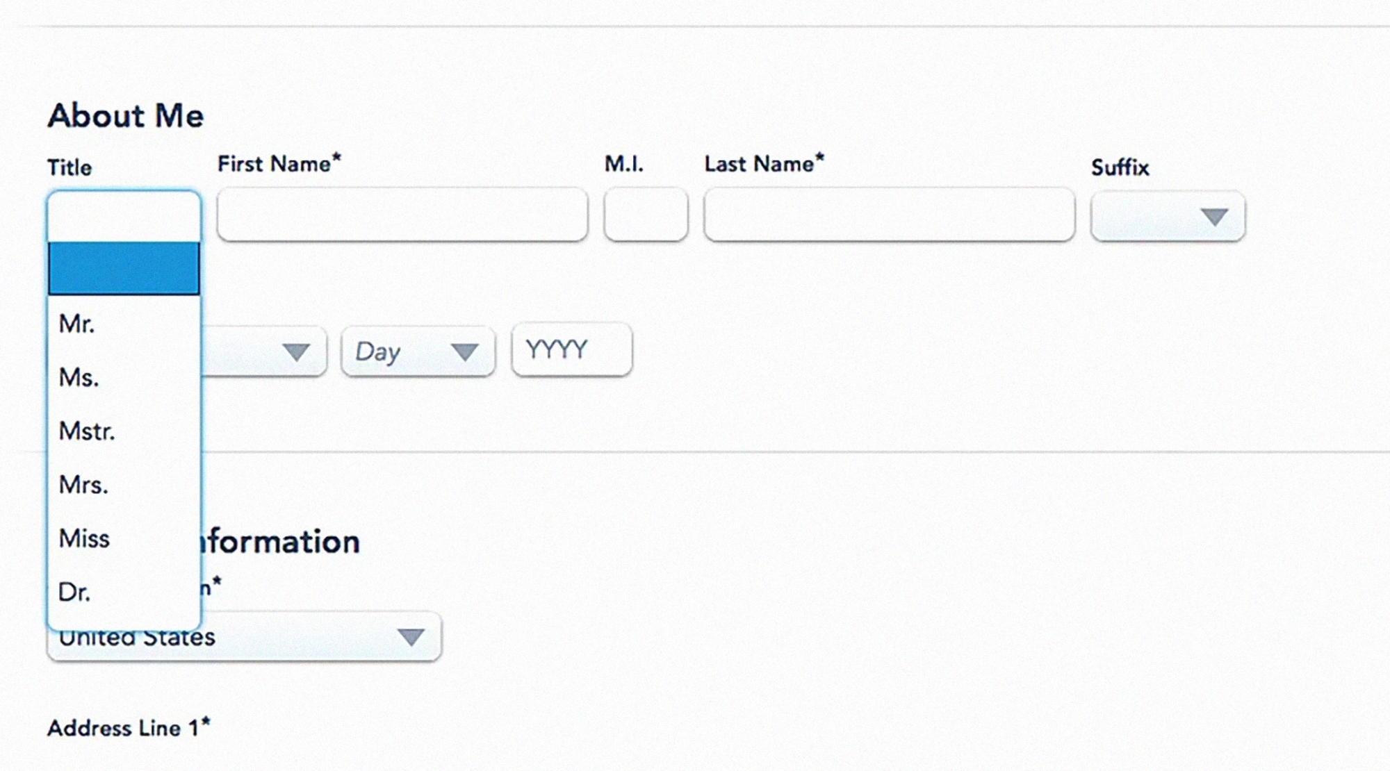
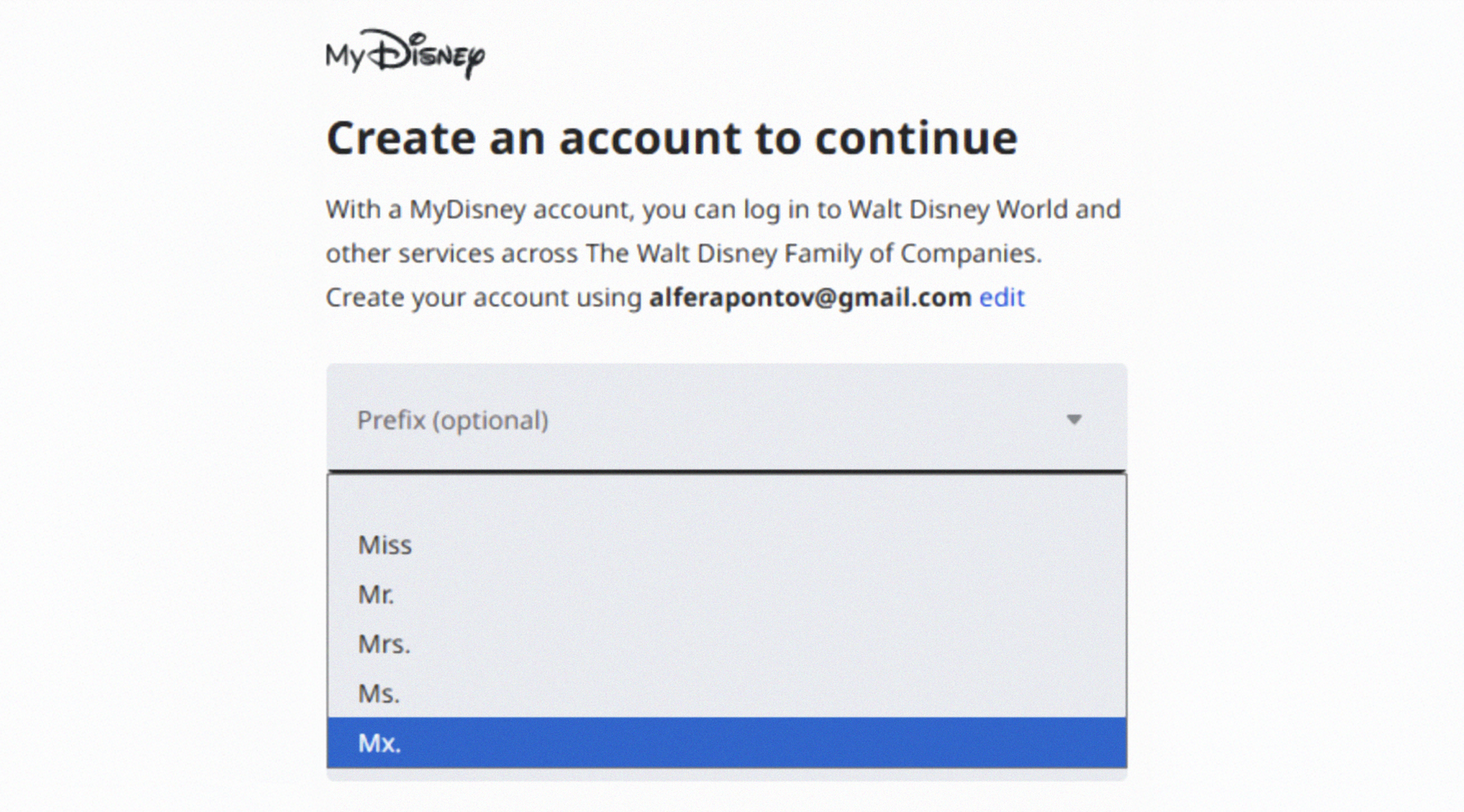
“Whenever a question like ‘Please indicate your gender’ is asked during onboarding, registration, or any other first-time experience, there should be a clear reason for it—evidence that this information matters and will actually be used in some reasonable way,” shares Alexandra Voronina.
At the same time, it's encouraging that websites and apps are gradually becoming more inclusive and addressing their own biases. In her 2019 article “Did this website just assume my gender?”, content designer Milena Abrosimova provided examples of non-inclusive gender forms on different websites. Seven years later, most of the services cited have either removed the gender question or included answer options for non-binary individuals.
Remedy
Very few designers or product teams set out to exclude anyone. Most work within constraints, optimizing for clarity, speed, and adoption. Gender bias manifests as a side effect of this pressure, through default settings and assumptions about how users think and learn. That's why it's difficult to spot—the mechanisms are subtle, incremental, and spread across hundreds of small decisions.
To start solving the problem, design and product teams should start with the structure of what they’re building:
- Checking default settings and presets—who are they focusing on?
- Expanding representation in visual design, layouts, and tone.
- To what extent is what you’re building inclusive and mindful of other potential biases?
Without general accessibility and inclusivity, design is rarely gender-inclusive.There are several ways to check this, such as following the Web Content Accessibility Guidelines (WCAG). There are also more gender-focused approaches, such as GenderMag, developed in 2016 by a research team at Oregon State University. It’s a method that helps product teams identify interface issues that may make the product harder for some people to use. Over time, GenderMag has expanded to include other biases as well, evolving into InclusiveMag and reinforcing the idea that biases are intersectional.
Research shows that even small interface changes can mitigate or even eliminate gender differences. It’s not necessarily a long process too, especially if you employ it early. Margaret Burnett shares that “one team we worked with spent only 2 days creating a slides-only ‘prototype.’ When they used GenderMag to walk through a user's experience using those slides, they found so many biases and problems, they realized they needed to scrap that design and start over. If they’d instead implemented the interface first, they would have wasted months of effort on a system that would never succeed with users.”
“Bias most often gets baked in at the research stage, when in-depth user research isn’t conducted," adds Alexandra Golubeva. “It’s important to not stick to a single user profile—all users are different, and their needs vary. This is worth remembering even when developing a highly specialized product.”