Gestalt principles of design
In this read, we break down some Gestalt principles, explore where they come from, and how to apply them to your design work.
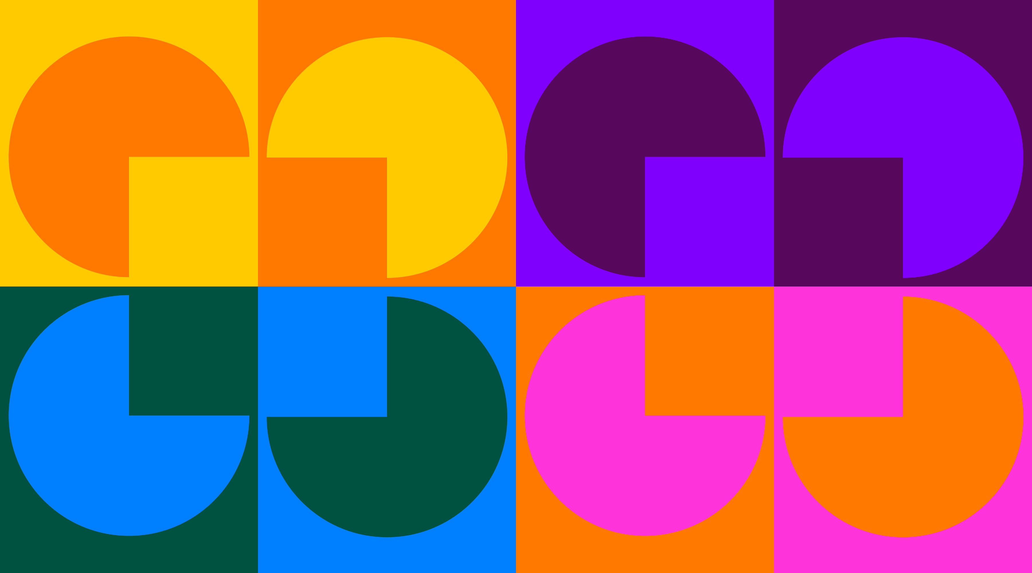
Have you ever felt that some designs "just make sense" at first glance? Gestalt principles of design may explain why you feel this way. They describe how our minds organize visual elements into patterns we can easily understand.
In this read, we break down some of these principles, explore where they come from, and show you how to apply them to your own work.
What Gestalt psychology is
Gestalt psychology (also known as configurationism) is a school of thought within cognitive and perceptual psychology. It suggests that people naturally perceive visual and sensory information as whole patterns instead of focusing on individual components.
History of the gestalt principles
Gestalt principles come from early theories in visual perception by Max Wertheimer, Kurt Koffka, and Wolfgang Köhler. Their ideas made their way into the world of design, starting with the Bauhaus school in Germany. Artists from this art school began using Gestalt principles to create work that felt logical. Thanks to them, these ideas started to gain popularity.
Later on, books like "Language of Vision" by György Kepes and "Art and Visual Perception" by Rudolf Arnheim helped bring Gestalt ideas into modern design education.
Why Gestalt principles matter
Gestalt principles explain why we instantly recognize familiar structures in our everyday lives. When you look at a piece of artwork for the first time, you don’t process each brush stroke individually. Instead, you experience the painting as a whole.
The same principle applies in design. A well-done contact form on a website doesn’t need extra cues to be understood. When you arrange elements thoughtfully, users immediately perceive them as a single unit.
This is why Gestalt principles matter. They allow designers to communicate clearly and create experiences that just feel right from the very first glance.
Now it’s time to start exploring Gestalt principles of design one by one.
Principle of proximity
The principle of proximity states that elements placed close together are perceived as related. It means that our brains group nearby objects on a subconscious level.
Think of a product page with an image, price, and “Add to Cart” button. These elements are placed close together with consistent spacing. Thanks to this, users feel that these elements relate to the same product.
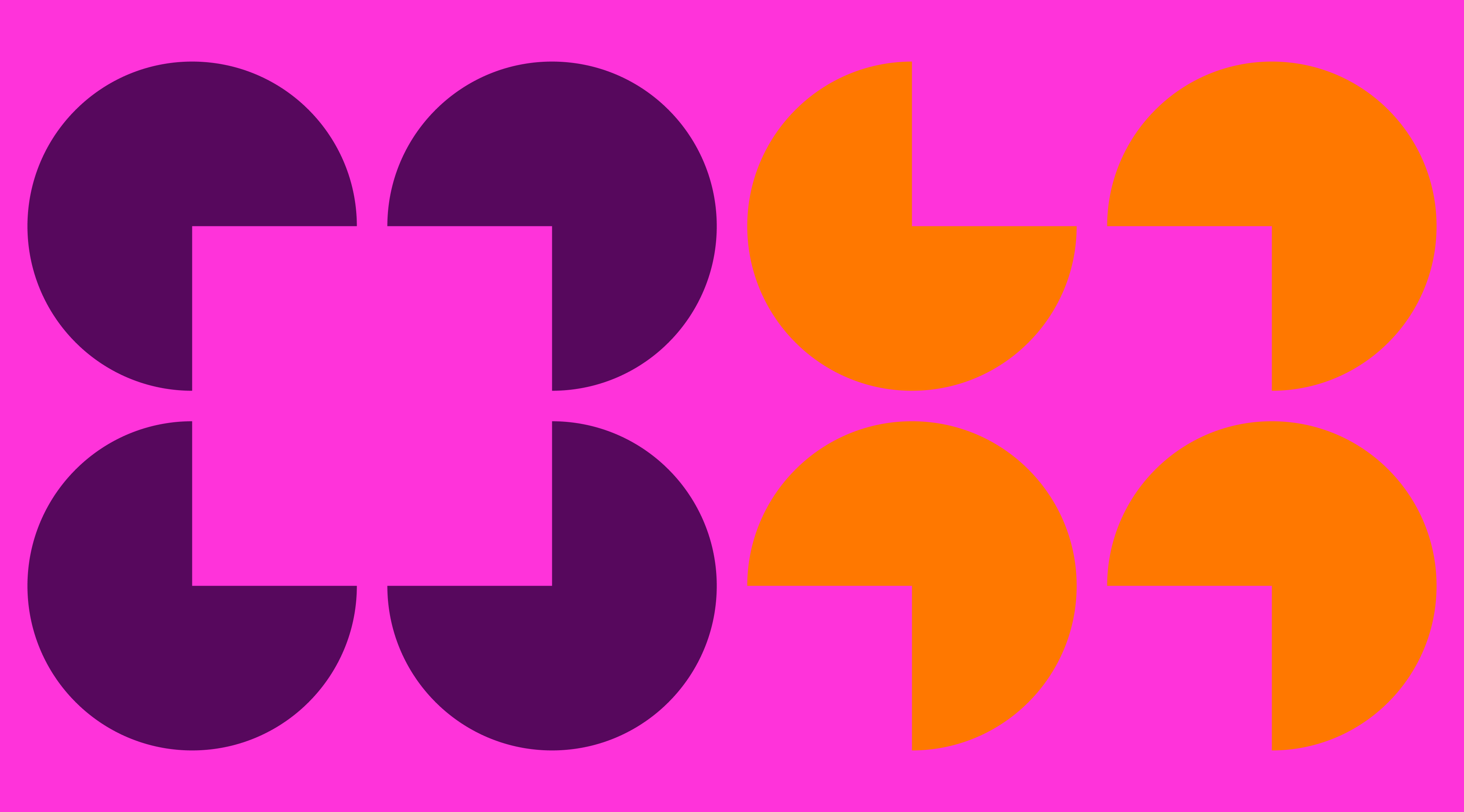
Principle of similarity
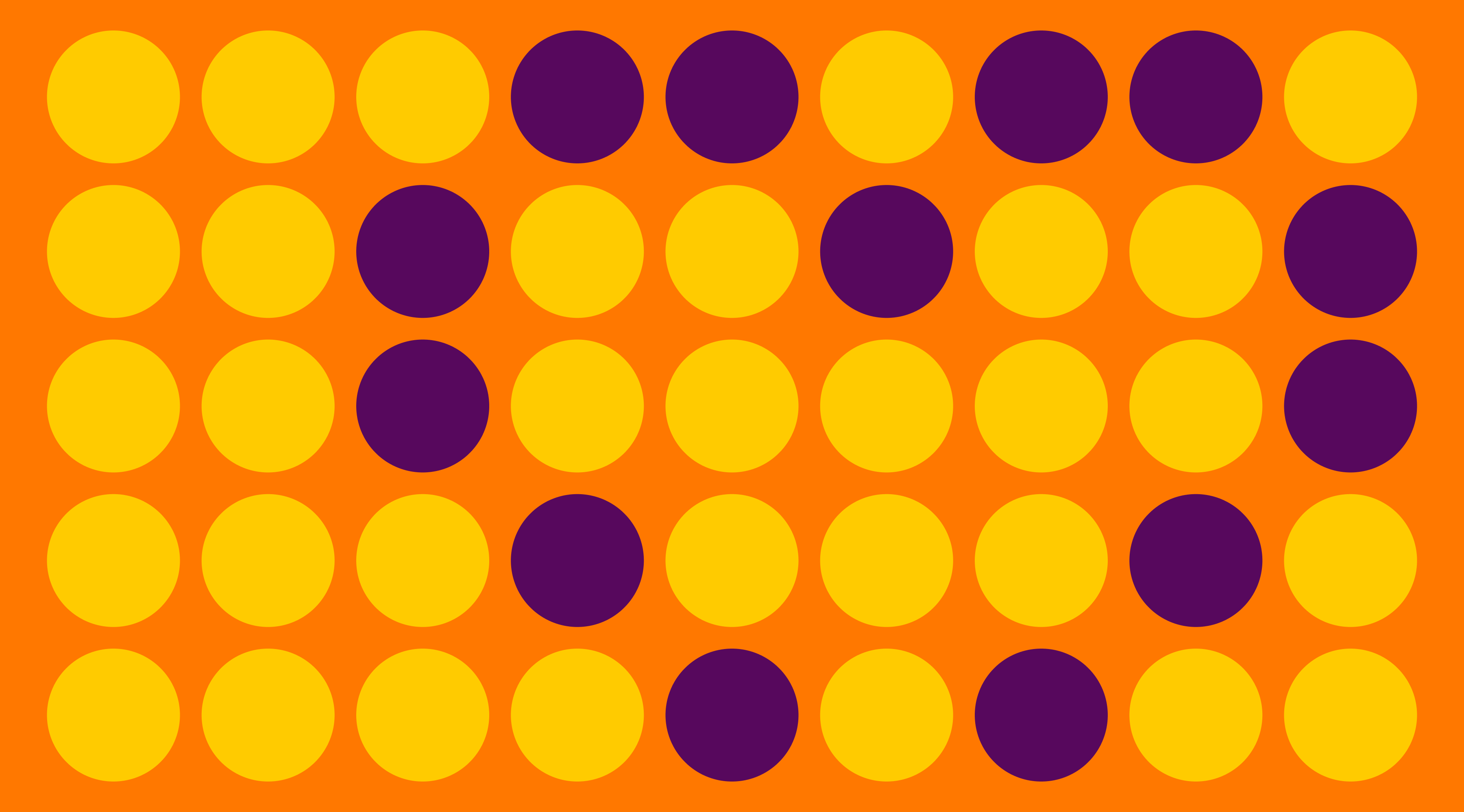
The principle of similarity says that we group elements that look alike by color, shape, size, or style. When things share visual traits, our minds assume they belong together.
In web design, this shows up in things like navigation menus where all the links use the same font, color, and shape. For example, a row of blue, underlined links in a website’s footer instantly reads as a group of related actions.
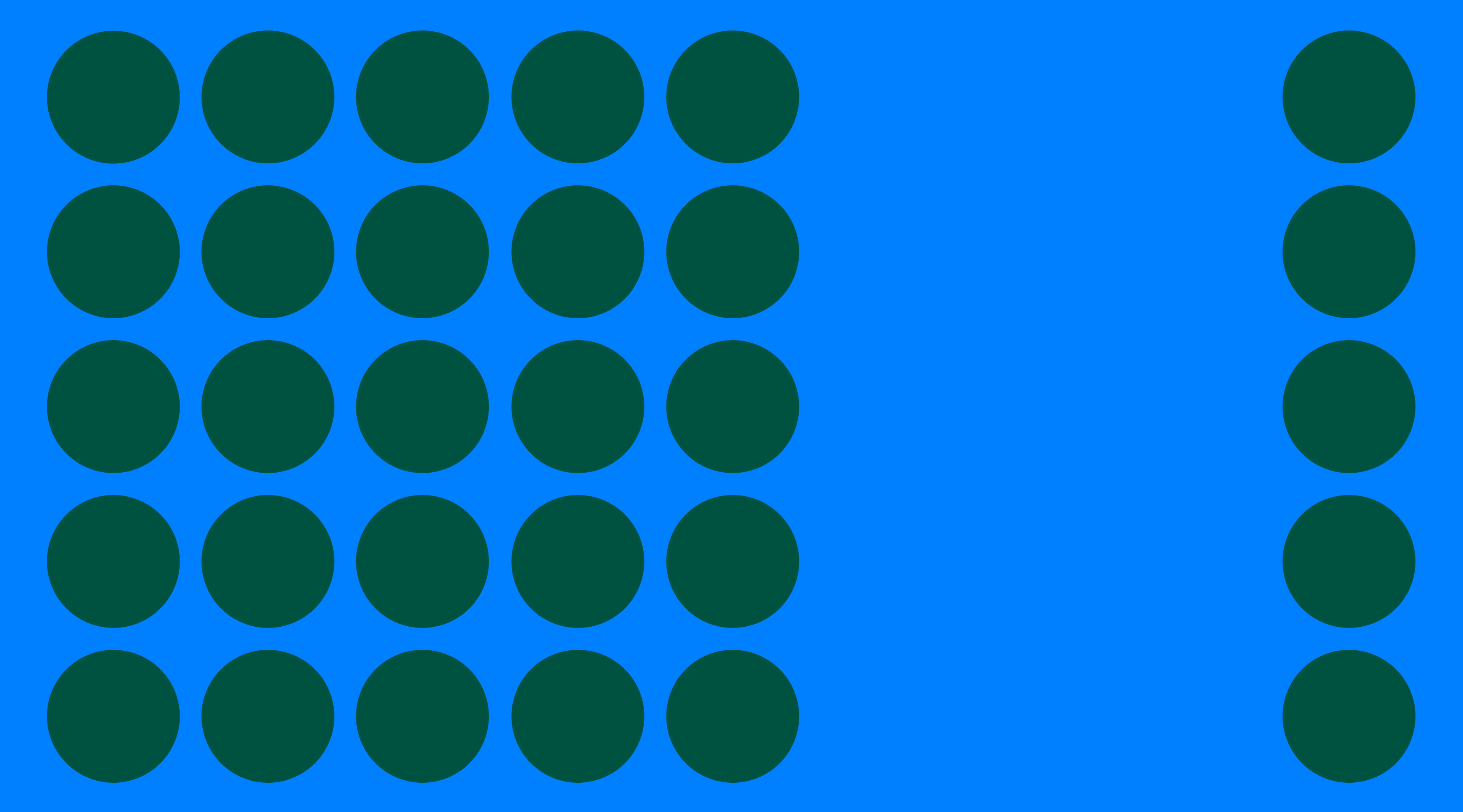
Principle of continuity
The principle of continuity suggests that our eyes naturally follow lines, curves, or paths in a design. We tend to see elements as connected when they align along a smooth direction, rather than viewing them as interrupted.
In web design, this often shows up in step-by-step progress bars. For example, a multi-step checkout page that uses a horizontal progress tracker helps guide users through the process.
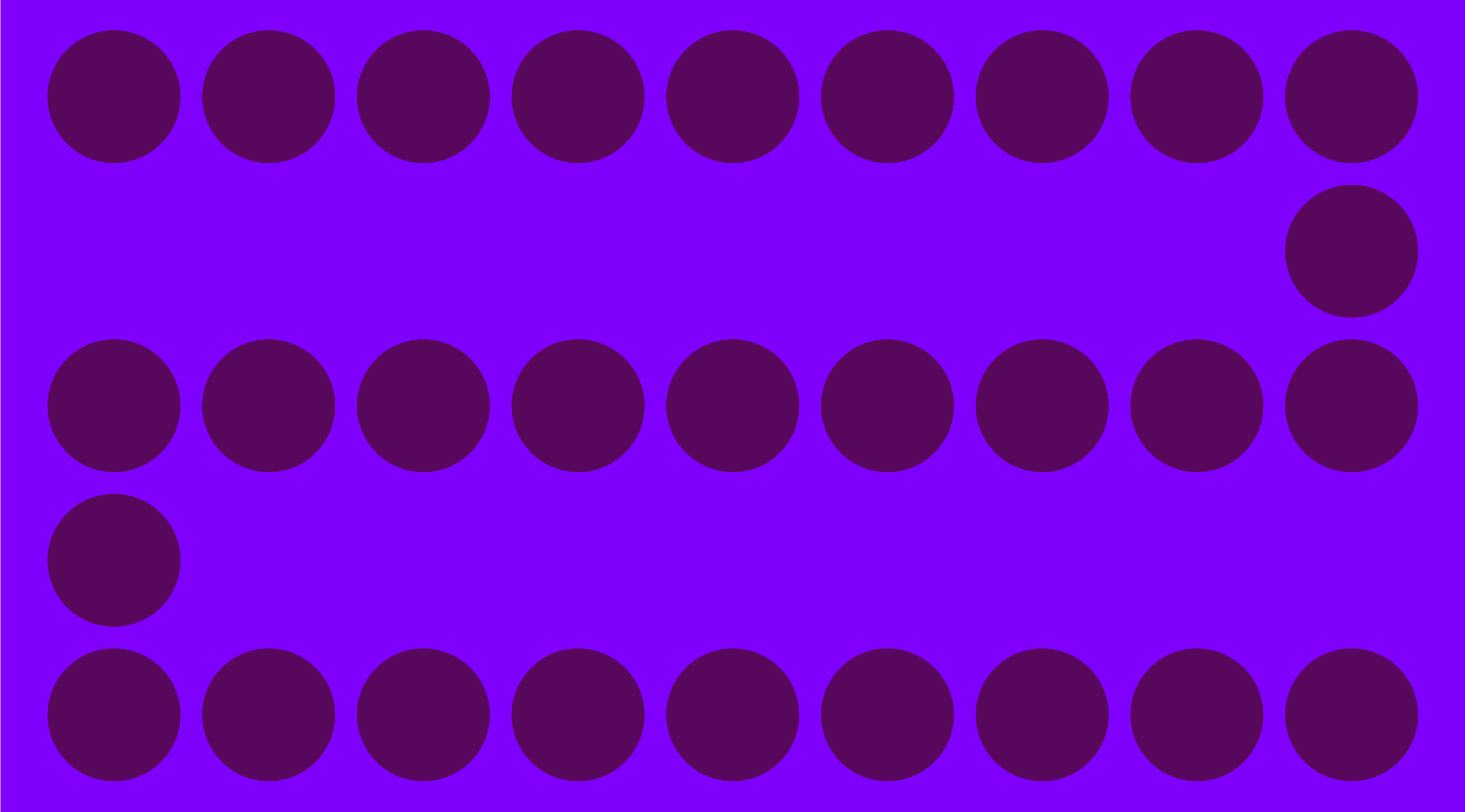
Principle of closure
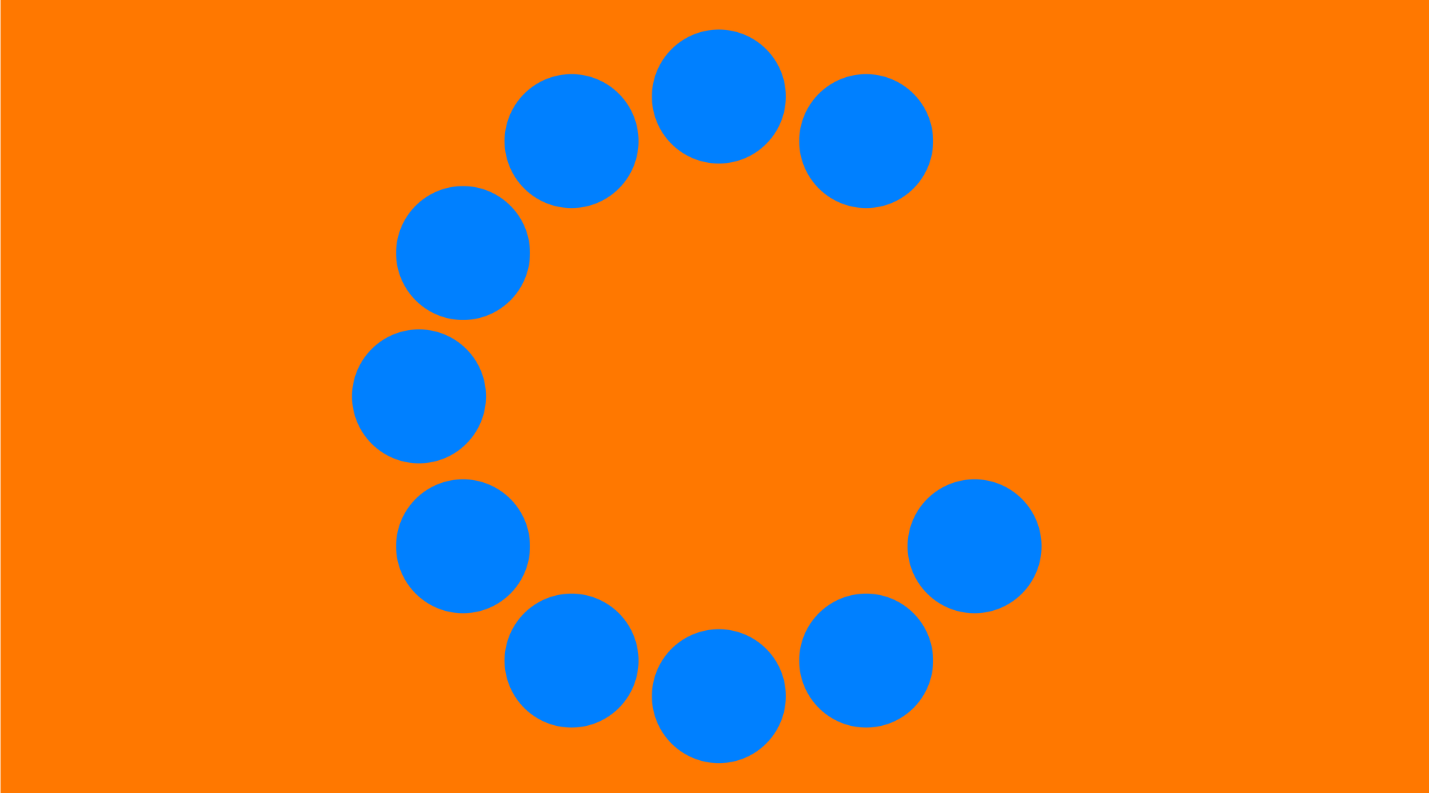
When we see incomplete shapes or fragmented visuals, we tend to mentally complete them to form a whole. This is what the principle of closure is about.
In web design, it’s often used in icons or logos that imply a form without fully outlining it. For example, preloaders often feel visually complete, even though the shape isn’t fully drawn.
Principle of connectedness
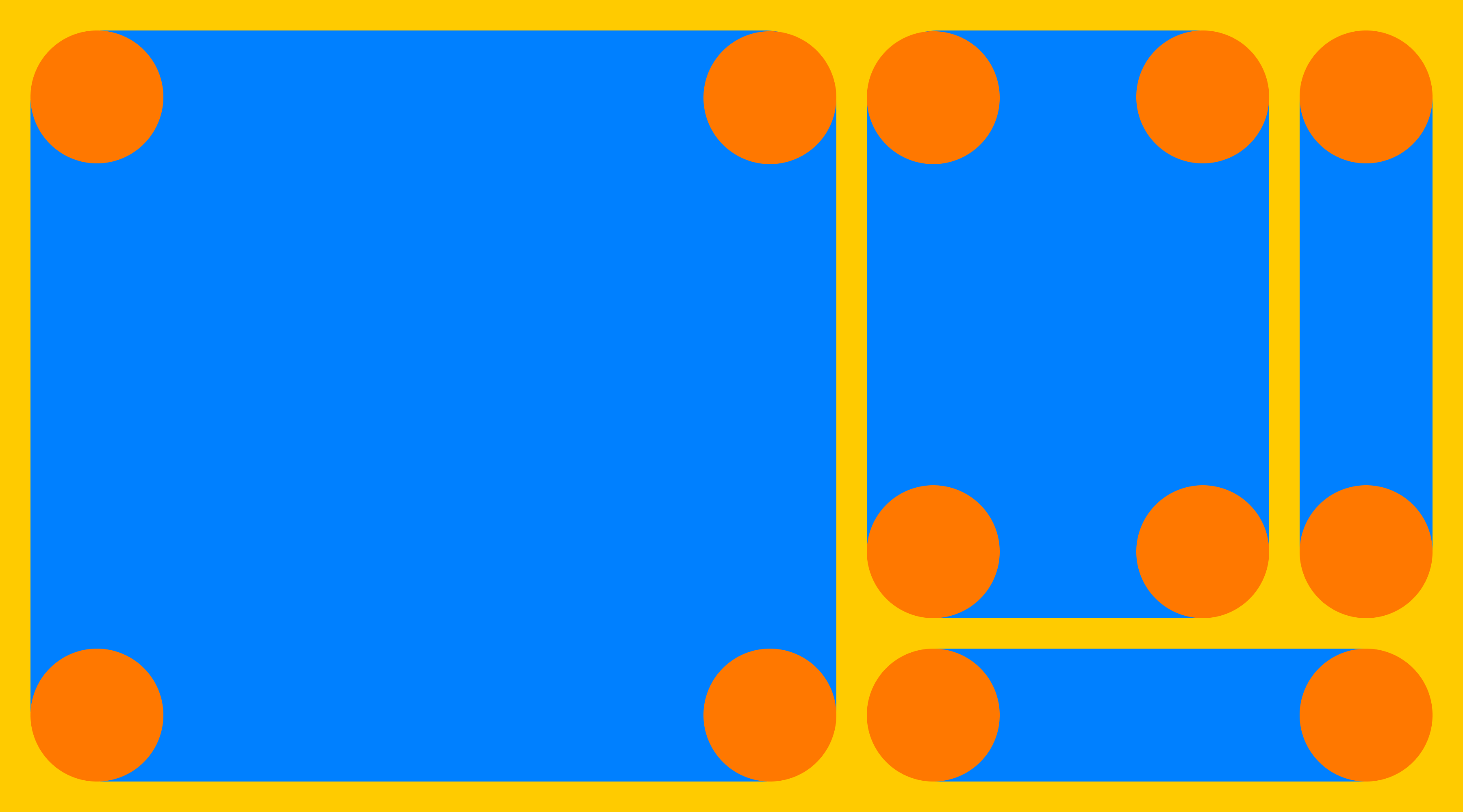
The principle of connectedness means that when elements are visually linked (like when they’re inside the same box), we see them as part of the same group, even if they aren’t close together. This visual connection overrides other cues like distance or similarity.
A good web example is a pricing table. When each pricing option is placed inside its own box with a consistent border and background, users instantly understand that the features, price, and button within that box all belong together.
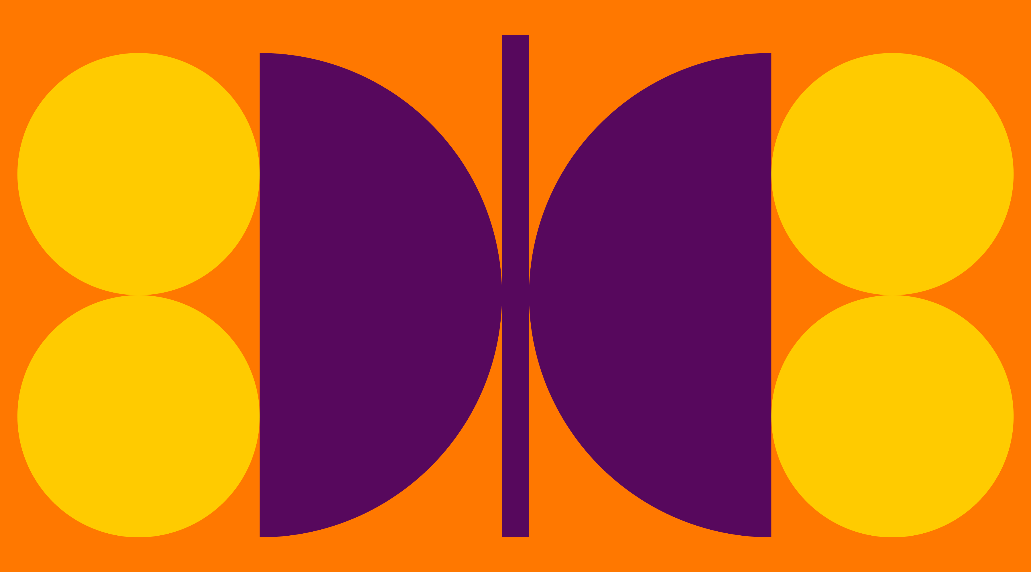
Principle of figure/ground
The figure-ground principle explains how our perception separates elements into the figure (the focal element) and the ground (the background). We incline towards focusing on what stands out and push everything else into the background.
In web design, this shows up in things like bold headlines against a light background or in high-contrast buttons that guide user action.
Principle of symmetry
According to the Gestalt law of symmetry, we tend to group elements together when they’re evenly aligned or mirrored across an axis. This principle helps users quickly understand structure, even when elements aren’t explicitly connected.
For example, a grid of product cards with the same image size and spacing uses translational symmetry to create consistency across the page. Even if the content varies, the repeated structure helps users quickly recognize patterns and understand how to interact with each item.
How to use the Gestalt principles in web design
Here are some tips about applying Gestalt principles in web design:
- Group related elements close together to show they belong to the same task.
- Use consistent colors, shapes, or fonts to signal which elements function in the same way (like buttons or links).
- Align content along clear lines or flows, such as progress trackers, to guide the user’s attention.
- Use minimal, incomplete shapes or icons that users can easily "complete" in their minds. This keeps interfaces clean and clear.
- Place related content inside boxes or cards to visually link them, even if they’re spaced apart.
- Create contrast between key content (like CTAs) and the background to make important elements stand out.
- Use balanced layouts (like grids) to help users understand structure quickly.
Design tools like Readymag make it easy to experiment with Gestalt principles by giving you the flexibility to adjust layout, spacing, alignment, and visual hierarchy, all without writing code. This lets you quickly test how different design decisions affect user perception.
FAQ
What is Gestalt in simple terms?
A Gestalt is a whole image or experience that our minds recognize instantly. The word comes from German and roughly translates to "form," "shape," or "organized whole." In psychology, Gestalt is the idea that our minds group things together to make sense of what we see. We see the bigger picture first.
What are the six key Gestalt principles in design?
The six key Gestalt principles in design are proximity, similarity, continuity, closure, connectedness, and figure-ground. Many designers also include symmetry as a seventh principle.
What is the Gestalt color theory?
According to the Gestalt theory, our minds group similar colors together, while contrasting colors are perceived as separate elements.