Five ideas for innovative navigation with practical tips
Inspirational concepts for offbeat website navigation from on-hover animation to sandwich menus, plus video how-tos on them.
There are numerous ways to make a navigation menu — and since almost all websites have some form of navigation — designers have to push their creative limits to make one that’s both remarkable and functional. In this piece, you’ll find a showcase of outstanding, unconventional, and stylish navigation menus in projects of Readymag users accompanied by video tutorials explaining how to recreate them.
Mitchell Haydn/Clements
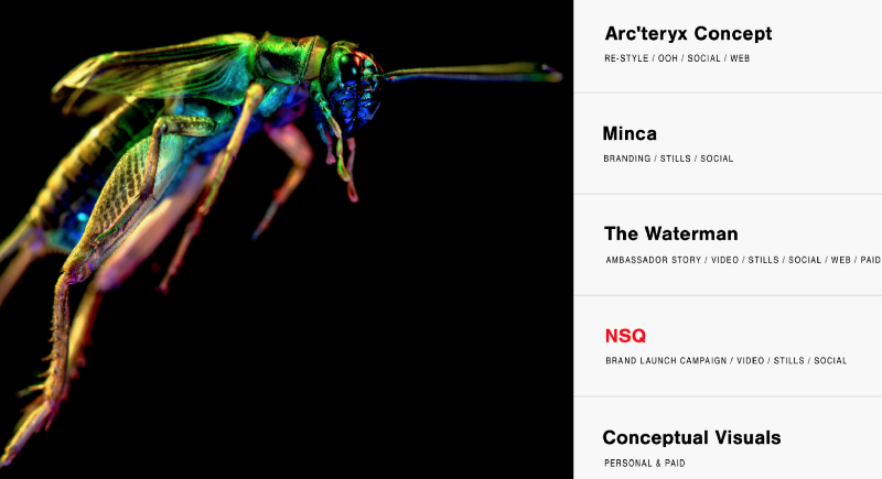
One popular style of menu navigation uses on-hover changes on the main screen. This portfolio by Mitchell Clements pushes this idea to its limits.
Hello, I’m Panna
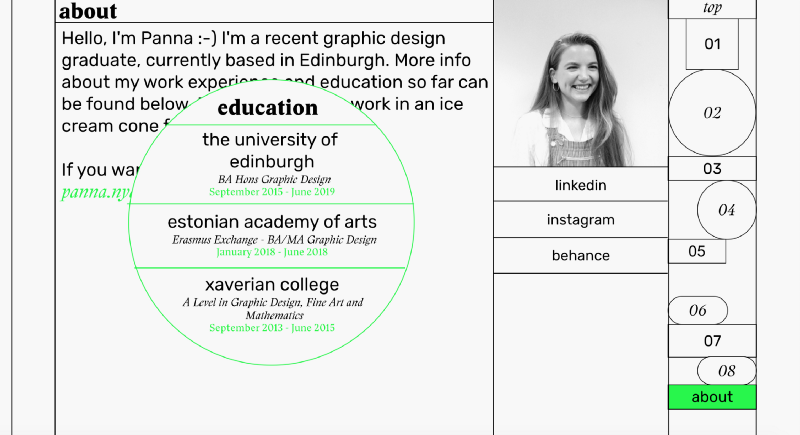
This sparse yet inventive portfolio makes great use of sketch aesthetics, creating a sense of intimacy.
Light For Our Freedom

“Light For Our Freedom” is a project highlighting the fundraising campaign to illuminate the Latvian Monument of Freedom. The project offers thorough left-side navigation utilizing a scrollbar combined with a menu.
Actualidea

A simple and well-structured sandwich menu adds a lot of strong visual presence to this portfolio.
Innovation Made Tangible

The landing page for this prognostic survey by a Copenhagen creative agency comes as close to browser tabs as a webpage can get.
Note: some of screenshots and videos in this post reference our old user interface, so the current Readymag workflow may not look identical.
Find more tips from Readymag.