First-hand experience: how to design, prototype and animate, while being reluctant to code
Pavel Kedich is a design director and Readymag power user. Here’s how he manages to create stunning visual narratives and complex interactive prototypes without using code.

Replace a frontend engineer
I made the leap into Readymag in 2015. My initial goal was to see if it could replace a frontend engineer. There are some ingenious, rare birds who can implement a design with pixel-to-pixel accuracy — but I’d only met a couple of those during my 13-year practice. Mainly, it’s a ping pong of sorts: you send in the layout, you receive an implemented version and start going through your list of problems. For example, there is always a font size or indent that is wrong. This was the most tiresome process — inevitably, some flaws survived all scrutiny. I just had to put up with it.
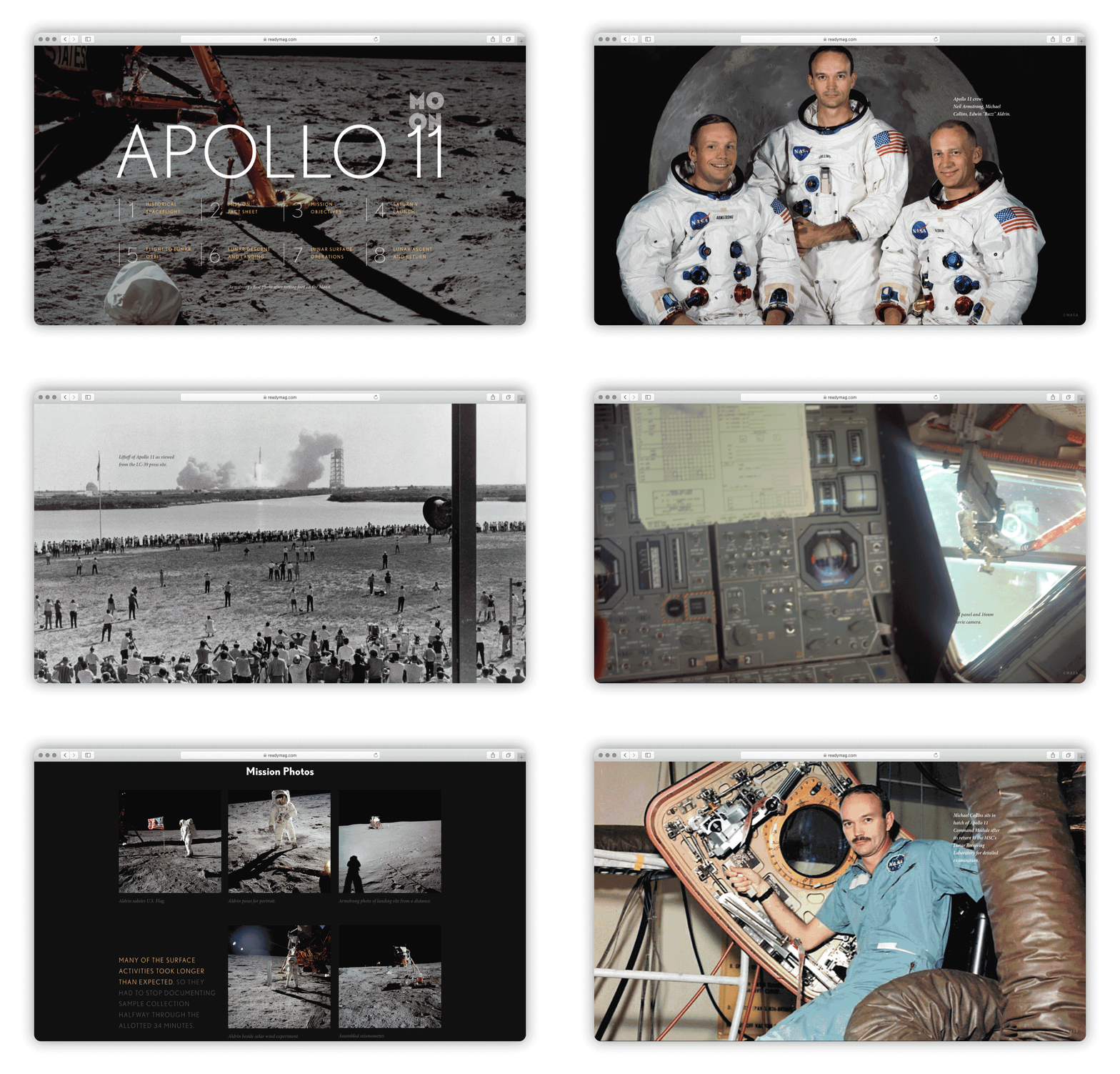
For my first Readymag project, I thought what could be better than to open Wikipedia and find a content-rich article — something I could use without asking for permission. The first thing I came across was the article about NASA, who distribute most of their content under Creative Commons licenses. I made a fact sheet about the Moon, which initially was not intended for publication. My goal was to try all the widgets available at that time — and the workflow proved to be outstandingly simple, but very precise.

For a while, making editorial projects with Readymag felt like an inner emigration, given that I was not able to pursue this passion at my day job. It was important to see how a layout feels in the browser, to try and marry graphics with typography, and make it all interactive.
A handy tool for making animations
I hope I have matured since then. I’ve never had formal design training, which I probably regret — it would have helped me get through naive experimentation and all sorts of strange projects faster. In that sense, Readymag was my sandbox. As for changes to the tool itself, the biggest has been the expansion of the type tool. With it, typography became more flexible, fun and relevant to a contemporary designer — especially the one that is fascinated with how type lives on the screen.
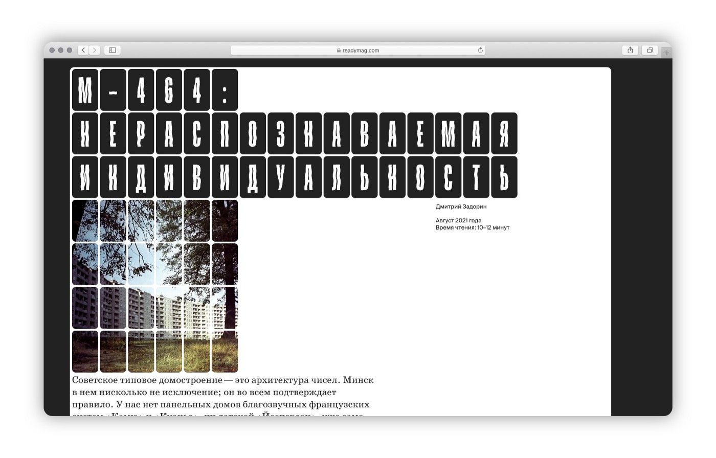
These days, my personal refuge is Leta.today, a web zine about the architecture of Minsk, Belarus, edited by architect Dmitry Zadorin. I dig into the archives, meet with architects, historians and critics, and that results in a new issue every year or so. The latest issue was M464, an editorial about a Soviet housing project.

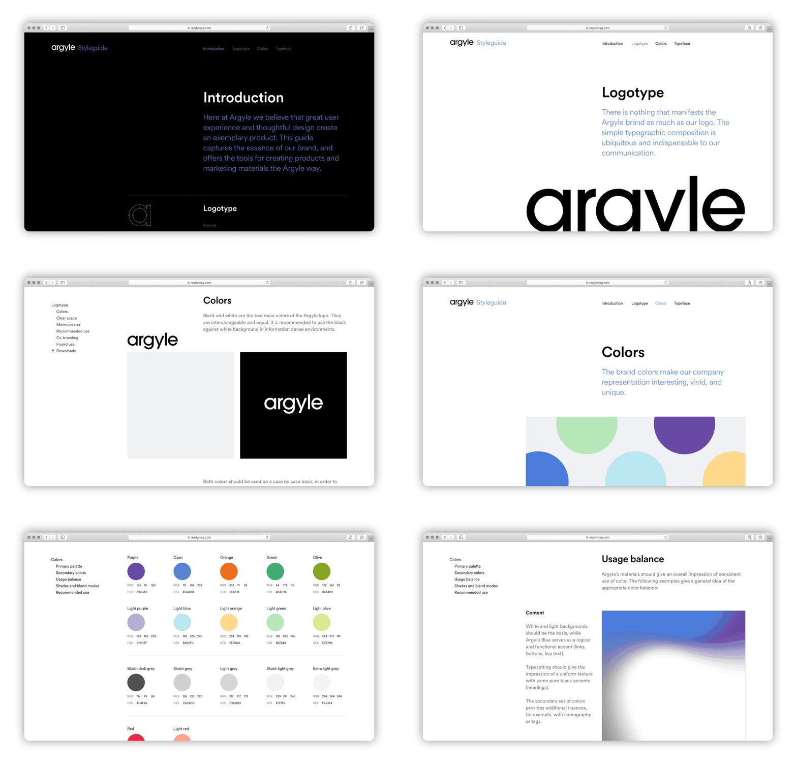
Apart from my personal projects, I use Readymag for my work at Argyle. It turned out to be a handy tool for designing animations. If I need to show an engineer how a transition should work or how a pop-up should appear, I just create it with Readymag. For me, it works better than anything — I had tried several offline animation tools, but ended up confused each time. Sometimes, my animation prototype ends up being exported and reverse-engineered: front-enders go under the hood, disassemble the code and recreate the animation from scratch.

Readymag is also often the tool of choice for presentations. I still make quite a lot of PDFs for this purpose, but Readymag is so much better at making an impression. That was the case even in the earliest versions, with their great page-change transitions. I start with a structure, a narrative, which is then reinforced and glued together with animations. Importantly for presentations, every Readymag project has a URL that you can share with your audience.
Carte blanche, with no presets
The main thing about Readymag is everything happens right in your browser window. You have carte blanche, with no preset elements (if we are not talking templates). You only have yourself, your browser window and one tool — with which you set pixel-exact indents, design animation sequences and work through any narrow spots yourself.