Estrangement revisited: W1D1 and the quest to rediscover the world around us
CEO of W1D1 dwells on the concept of estrangement and explains how defamiliarization fuels the drive to rediscover the world.
When we treat the commonplace as something unfamiliar, we have a chance to see the world as new and awaken dormant emotions — a basic function of art. In this piece, Alexey Ivanovsky, CEO at W1D1, describes defamiliarization in life and design and explains how it fuels W1D1’s drive to rediscover the world around us.
Strangeness as a star to navigate by
There is a quote from Viktor Shklovsky, literary theorist, critic, and writer, that I repeat endlessly, “Art exists that one may recover the sensation of life; it exists to make one feel things, to make the stone stony.”
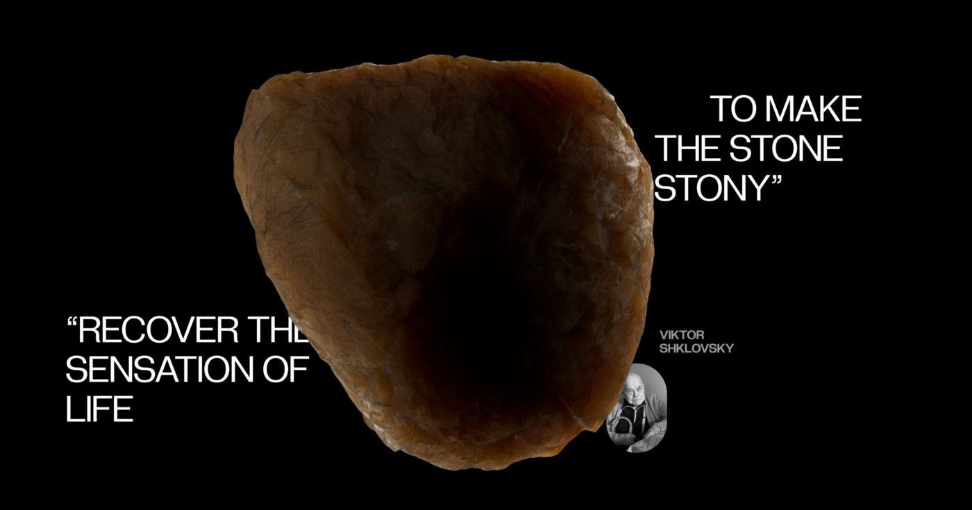
Viktor Shklovsky thought of this process, which he called “estrangement”, as one of the key mechanisms of art. The core idea is very simple: as we go through our everyday life, it is continuously covered by a veil of mundanity. While going down the same street for the umpteenth time, we fail to see the street itself; it ceases to exist in our perception. The routine has devoured it, becoming just a blurry image of the original activity. That’s where art comes in: its job, according to Shklovsky, is to lift this veil, to help us see the world as new and strange. As if we were seeing it for the first time.
This idea is not a new one. Carlo Ginzburg found traces in Marcus Aurelius, who encouraged us to “efface imagination… isolate the present” — that is, try and deal with reality as it is, without any preconceived notions. The same principle could be also found in Tolstoy’s Kholstomer, Voltaire’s Candide, in Proust’s opus “In search of lost time” and other prominent works.
However, this line of reasoning is not restricted to literature. A similar idea was conveyed by the great designer Kenya Hara, who coined the term ex-formation — the opposite of information — a way of interacting with an object to know less about it, instead of more. The genius physicist Richard Feynman promoted a similar perspective in his lectures and public speeches.
Recovering sensation in a desensitized world
When thinking about emotions, it’s also helpful to think about their absence and how this unemotional state is created. If we look at the design profession we can see a connection of many design systems to the idea of desensitization, and here’s why.
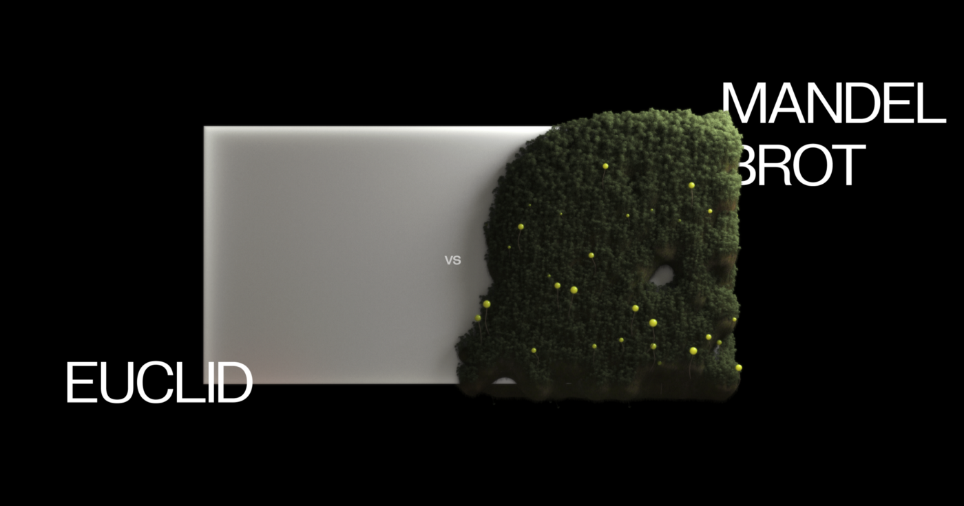
Much of modern European design stems from World War I. The event was so traumatic, it required a new structural approach in response. Walter Gropius, the founder of Bauhaus, was a student of Peter Behrens, along with Ludwig Mies van der Rohe and Le Corbusier — that’s when his design approach originated. But Gropius volunteered to join the army in 1914, and was wounded and nearly killed in four years of battles. Most of us would struggle to imagine how traumatic that should have been. However, the dream of a more orderly world, guided by simpler math (Euclid, not Mandelbrot one), also arose from the crisis. In many ways, this new world was a desensitized one. The unobtrusive strain of ‘elevator music’ design that emerged in the aftermath of the war is still all around us — trying to blend in, disappear and never provoke. It must always be predictable and straightforward.
To be clear, I don’t argue against the usefulness of this kind of design. Undoubtedly, it helps us buy airline tickets, book hotels, shorten meetings, doctors see vital signs, and keeps planes in the air. My goal is to remind you that there is always more than one option. Design can help us engage with emotions in a much more tactile way, awaken our senses rather than desensitize us. Make us see more, rather than shunting us off into another set of dark patterns and basic interface solutions.
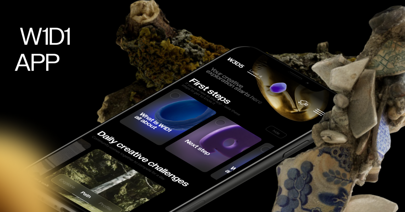
So, can the century-old idea of estrangement lend a hand with our present endeavor? Our sense is it can help various styles and practices co-exist harmoniously. My team and I even developed the W1D1 app to test this hypothesis. The concept is pretty simple. We provide users with daily challenges that help them rediscover the world around them and reconnect with their creative energy. Challenges usually take around 15 minutes to complete, and vary from taking pictures of shadows to creating compositions out of everyday objects. You might even dive into art history to fish out an obscure image of a medieval infant.
Design that changes perception
I am writing this essay amidst an all out war in Europe, when even thinking about such ephemeral and poetic things seems almost off limits. Nevertheless, I strongly believe that poetic design remains as important as ever.
The great Vladimir Nabokov, a strict moralist, wrote, “Where there is beauty there is pity for the simple reason that beauty must die.” This could be a litmus test for an emotional type of design. We know that design can entertain us. But can it make us feel the fragility of the world, can it make our heart skip a beat, can it make us slow down and feel deep sadness or loss? That’s what we want to figure out with W1D1, though I hope that the answer is a resounding yes. By “design” here I mean not the shifting of pixels around Figma, but the way we structure data flows and assign visual languages. Can we make that kind of design more poetic?
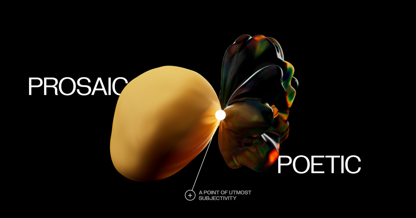
If we stick to this metaphor, the prose in design is something very clear; with its robust and predictable workflow of banking apps and incessant clicks of messengers. But what does the poetry of design look like? Something built on a fleeting feeling of interconnectedness of the world, of the chaotic dance of metaphors and the dangling webs of sense — far away from logical realms.
A place for poetic design
There has long been a sanctuary for such subjective design expressions: cultural institutions. We know that a museum catalog can look striking, or the branding of an exhibition can provoke. Like in the great debate of Jan Van Toorn and Wim Crowel (both designed catalogs for the Stedelijk museum) we are inclined to see such a space as a space for exploration. But it can sometimes seem removed from everyday life. Just as a walk to the museum is not a part of most daily routines, so too is truly idiosyncratic design. Can we change that and make poetic design more prevalent in everyday life?
That’s one of the big questions we’ve asked ourselves while making the W1D1 app. Can we create a subjective space that triggers our non-logical, emotional responses to the world, and then turn it into a daily habit? At W1D1, we help people look at the world through a myriad of new lenses; like seeing the embedded sadness in forgotten objects, or focusing on silhouettes, colors, or reflections; and getting a new emotional response from each perspective. To do that, we are creating a kind of new language. One that combines the way we make videos, the music we write for them, and associated interface and visual solutions we cook up.
However, we still exist in a cut-throat world of digital economies. So, it’s an open question if there’s a place for something like that out there. While we all crave this shift from design prose towards design poetry, our team tends to their meadows in the W1D1 app; a place to explore and reconnect, rather than disconnect and desensitize.
Reinventing Emotions is a series of articles initiated by Readymag — a digital design tool that helps create websites without coding. Readymag values creative freedom, appreciates the trust of its users, and aims to support the development of the global design community. Continue exploring Readymag and our other resources here.