Readymag website of 2022: Running educational initiatives as part of design activism
Ukrainian designer Andreas Smolyarson contemplates the whys and hows behind his training set to teach students the basics of web design in Readymag.

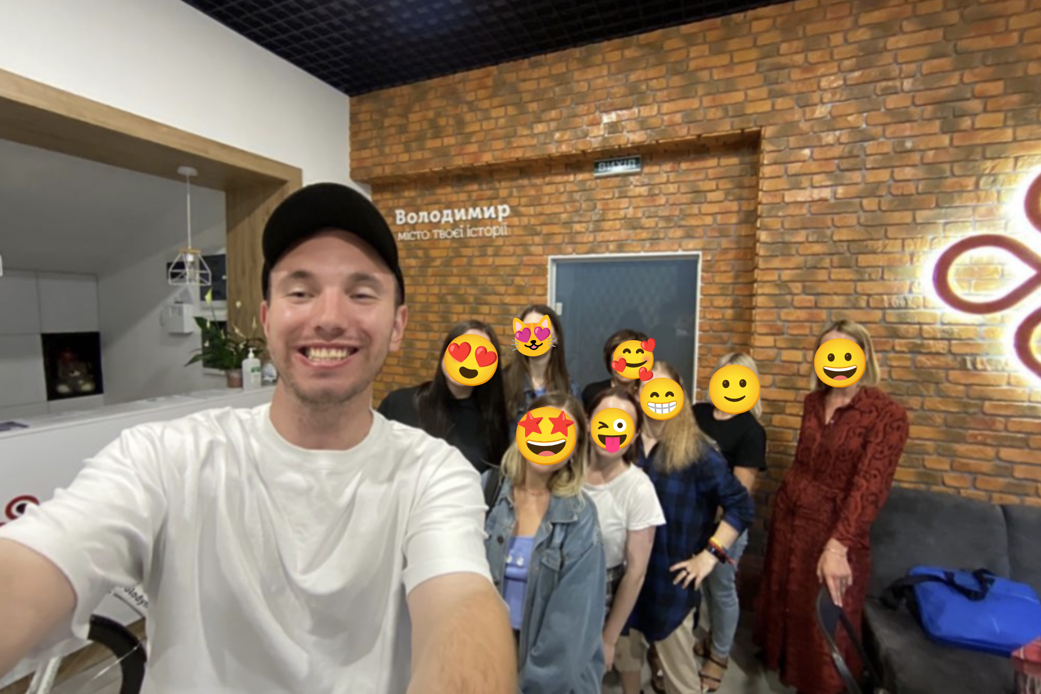
As the war in Ukraine began, the first endeavor Ukrainian designer Andreas Smolyarson felt drawn to involved helping people in need find a job or step into a new field like web design. In September 2022, he held a two-week design training in Volodymyr, Ukraine. The pro bono course was set to teach students the basics of web design in Readymag.
Now Andreas Smolyarson, one of Readymag’s Website of The Year 2022 winners, contemplates his path to design, the whys and hows behind the training, and shares his principles for growing as a designer.

A non-linear path to design
My route to design started in 2018 when I lived in Warsaw, Poland. One day I found a mobile app to create simple designs fast and I tried to make a business card with it. Then I had sporadic help with some professional design tools, took up more comprehensive design assignments and grew my client base.
The first website I created was my online store with t-shirts. I even managed to spice it up with some web effects I was learning at that time. It was kind of a pen test for my past self. The whole design process took approximately six months, which paid off surprisingly well–the e-store attracted many leads at the time.
Generosity generating generosity
Things changed a lot and obviously took a twist after the 24th of February. As the war in Ukraine unfolded, many people lost their jobs. They struggled to make something for a living, looked for job opportunities and some of them considered design as a field to step into. In Ukraine, there is one saying: to receive something, you need to share something first. So I always share design tips on social media for free. If I have knowledge that might help others, I share it. That’s what I preach and pitch and that’s the reason behind my decision to run a free design course for Ukrainians in September 2022.

It took me about a month to prepare the outline of the course. It was divided into two parts, with the first week focused on the basic principles of web design and the second one set to get hands-on knowledge. Participants were given an assignment to lay out a simple webpage in Readymag and publish it to the web. Although all was properly set, during the training I was constantly worrying about the safety of all 35 participants. The rising and falling pitch of air raid sirens was sounding quite often in the city at that time. Fortunately, the course ended well for people. Personally, I was impressed by how fast and eagerly people accepted the assignments and used them to grow.
In Ukraine, there is one saying: to receive something, you need to share something first. So I always share design tips on social media for free.—Andreas Smolyarson
Simplicity: the golden rule for the web
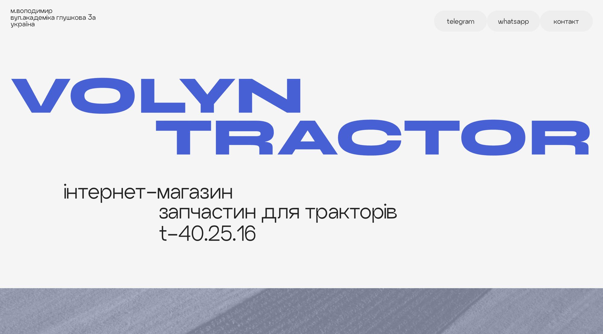
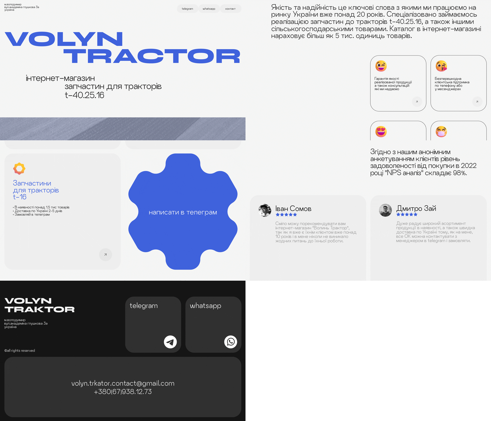
Reflecting on my first design, I admit it was overwhelmed with unnecessary visual niceties. I think that the main principle of the web today is simplicity. There’s no need to be funny all the time or unfold everything the viewer might be interested in at once. If you take a look at the website of the Volyn tractor (the one Andreas submitted to the Readymag website of 2022 award—Readymag), you’ll see that it’s quite concise. It includes only essential information, just an offer, pricing, and contact details. That’s the principle I follow in design: the simpler, the better.
There’s no need to be funny all the time or unfold everything the viewer might be interested in at once.—Andreas Smolyarson

The Volyn Tractor website was designed in four days and I created all the content, including text, on my own. I did some research and discovered that the target audience of the website was males in their 40–50s, like my parents or older children who might help their relatives. So, I guessed the majority of the website visitors wouldn’t want to see a lot of creative elements and amusing stunts on the page; all they wanted was to grasp the main info easily. Then I checked a few similar websites with the same products in Ukraine–and decided to craft a simple alternative. The intention was to make a page that would appeal to both audiences with its simplicity. Fortunately, my client and I were on the same page.
A few months later, I won the Readymag Website of The Year award with this project. In my mind, this kind of design competitions can help gain clients and strengthen your expertise in their eyes. It’s like a Grammy in the music industry. If you’ve won one, you’ve reached a different level of professional recognition. It lets you raise the bar when it comes to clients and rates of pay.
Principles for growing as a designer
My path into design has not been linear and is still in progress. However, on the way, I’ve formulated some valuable principles to further my skill set and grow as a designer. The first is continuous education. Design is not a solid substance. It develops, so you should too. I spend at least one hour a day learning something new. You don’t necessarily have to reinvent the wheel or earn a new degree, but you should stay curious and take advantage of time-tested resources.
The second principle is to rely on practice and experimentation. Have you ever wanted to redesign a website of your favorite brand? Go for it. Dreamt of designing album artwork for a band? Why not? Give it a whirl—fortis fortuna adiuvat.
Last but not the least, just stop comparing yourself with other designers–find your path and follow it.
Design is not a solid substance. It develops, so you should too.—Andreas Smolyarson