Designing Stories: behind the scenes of Readymag’s editorial series
In November 2018 Readymag issued the 12th installment of Stories — our in-house series of multimedia editorials exploring the creative legacy of prominent 20-century designers. In this piece we explain how this series came to be.
In November 2018 Readymag issued the 12th installment of Stories — our in-house series of multimedia editorials exploring the creative legacy of prominent 20-century designers. With this project, we aimed to pay tribute to visionaries who shaped modern design culture. Today we explain how this series came to be.
Digital archive of lesser-known influencers
Readymag CEO Diana Kasay conceived the idea for the series in the summer of 2017: “I thought of creating a digital archive of 20th-century designers who have had a strong influence on the formation of design culture, but remained lesser known.”
Readymag Creative Consultant Zhdan Philippov assumed the role of editor and drew up a list of several dozen potential names, including Bruno Monguzzi, Dan Friedman, and April Greiman, among others.

“I believe it’s important to speak not only about renowned top-tier figures (the so-called high-end private NY white men design club — listen to April Greiman discuss it in this podcast) but also less recognized designers. Most of them are people of thorny destiny, uncompromising, people with a particular life and artistic standpoint,” explains Zhdan.

“Also, I wanted to shed light not only on the peak of modernism (the 50’s) and its afterglow (the 60’s) — but on the epochs before and after. The 40’s, the 80’s, and the 90’s were times of searching for new meanings and forms, and these vague years are a source of a great interest,” he adds. “We’re not trying to romanticise the past. Our goal is to make great things now.”
Text structure
From the beginning we aimed to maintain a steady workflow and publish new installments regularly. To accelerate the work of our designers and writers, we decided to introduce a flexible template and a unified narrative structure for all issues.


“I thought the format should be brief and concise, like a summary. In condensed form we present the most interesting and vivid facts. If this inspires a desire to learn more — that’s great, do it yourself,” says Zhdan. He devised the narrative structure, which includes a brief introduction followed by a timeline, quotes, and key life facts.
This arrangement did not come together instantaneously. “We could have restricted ourselves solely to quotes and images — that’s enough to make you understand whether you’re interested or not,” Zhdan says. “But along with this we wanted to showcase the individual style of our subjects and share not only facts but also the historical context that influenced their lives and style,” Diana adds.
Modular grid
Readymag product designer Stas Aki became the project’s art director and created the flexible template layout. It utilizes the principles of the so-called modular grid — a method of organizing visual space that was birthed during the Swiss design movement of the 1950’s, also known as the International Style.
The modular grid serves to anchor all layout elements to a common rhythm and structure the page horizontally and vertically. Text columns and the spaces between them divide the page into vertical units. Pictures can span the entire screen, one half of it, or a quarter of it, but never one third — the layout does not stipulate that. This way the overall look of the page always seems different depending on the size of the images, but preserves a visual integrity.


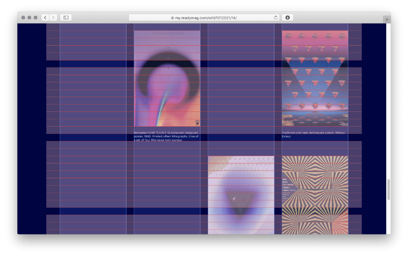


When it comes to horizontal division in Stories, the baseline (an invisible horizontal line upon which a line of text rests) is the measure of things: the parameters of all content blocks and the spacings between them are consonant with it. To achieve this, Stas first set the size of the baseline and then made the size of all other spacings between content blocks multiples of it. As a result, each line in each block fits into the layout. This comes in handy when aligning the bottom edges of various content blocks, be they headlines, text paragraphs, images, or image credits.
Magazine allusions
The principles of horizontal division stipulate high contrast between the headings and the texts. That’s just what we need: chunky headings present a recognizable reference to magazine aesthetic, which was one of our sources of inspiration for this project.

References to the International Style determined the choice of fonts. This period carries strong associations with Helvetica. Its success set a decades-long trend for Grotesque fonts. That’s why for Stories we chose Graphik, which was created by Christian Schwartz with an eye to Swiss posters. Graphik joined the Readymag font collection in 2017. “In my view it works perfectly both as a display font and typeface,” Stas says.

Also, we often place images so they touch the edges of the page. To achieve this, we switch on Scalable Layout for our Stories. Without this feature we couldn’t keep the images stuck to the edges of the browser’s window.

Our template offers other allusions to magazine aesthetics. For instance, we often place credits away from the images or anglewise to them — this way we turn small pieces of text into full-fledged composition elements. This maneuver is atypical for the web, but common in print. Among others, in this project we wanted to show what happens when principles and work practices common for graphic design are translated to the web.
“Proceeding to Stories, we knew that this would be an extensive project — long-running and complex from a production viewpoint. Currently, there are no similar archives so we always have to find information from scratch. That’s why we do our best to ease the production process, without affecting quality. Now we can say that the chosen format and structure have completely proven their value — they help us develop an important educational project on a regular basis. Without Readymag, the implementation of such a massive digital archive would have been impossible,” Diana sums up.
