More flexible auto-layouting options for mobile
Automatically set positions and sizes for widgets, preserve widget groups and tweak individual widgets together.
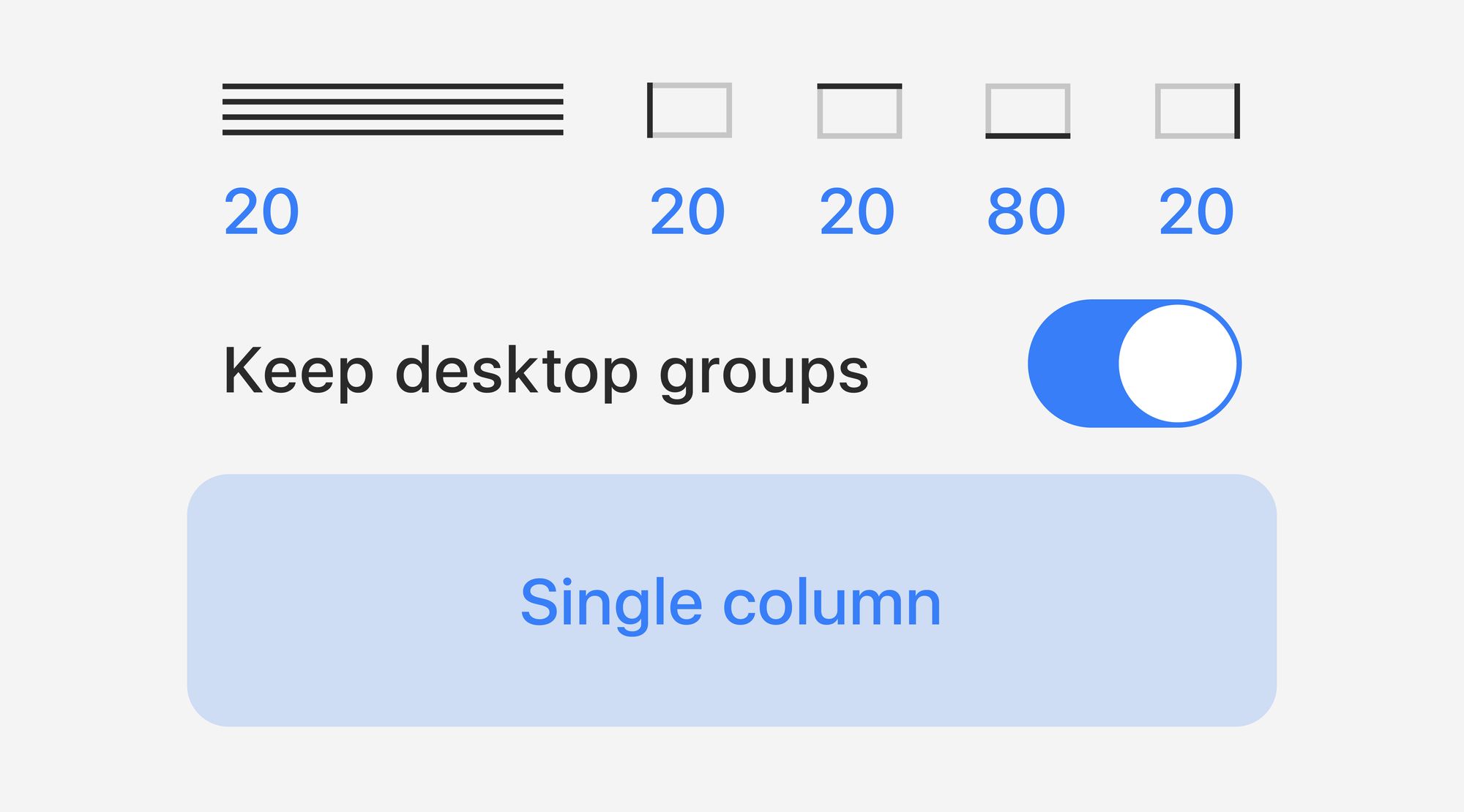
With our new auto-layouting options for mobile, you can choose several widgets and set their positioning and sizes all at once, without affecting basic layout. These steps can be combined with the overall automatic creation of mobile layouts, which we’ve also refined.
General flow: Desktop layout and Single column
Now you can choose between two automated options to create a general mobile layout:
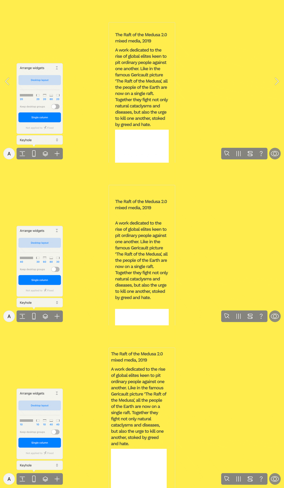
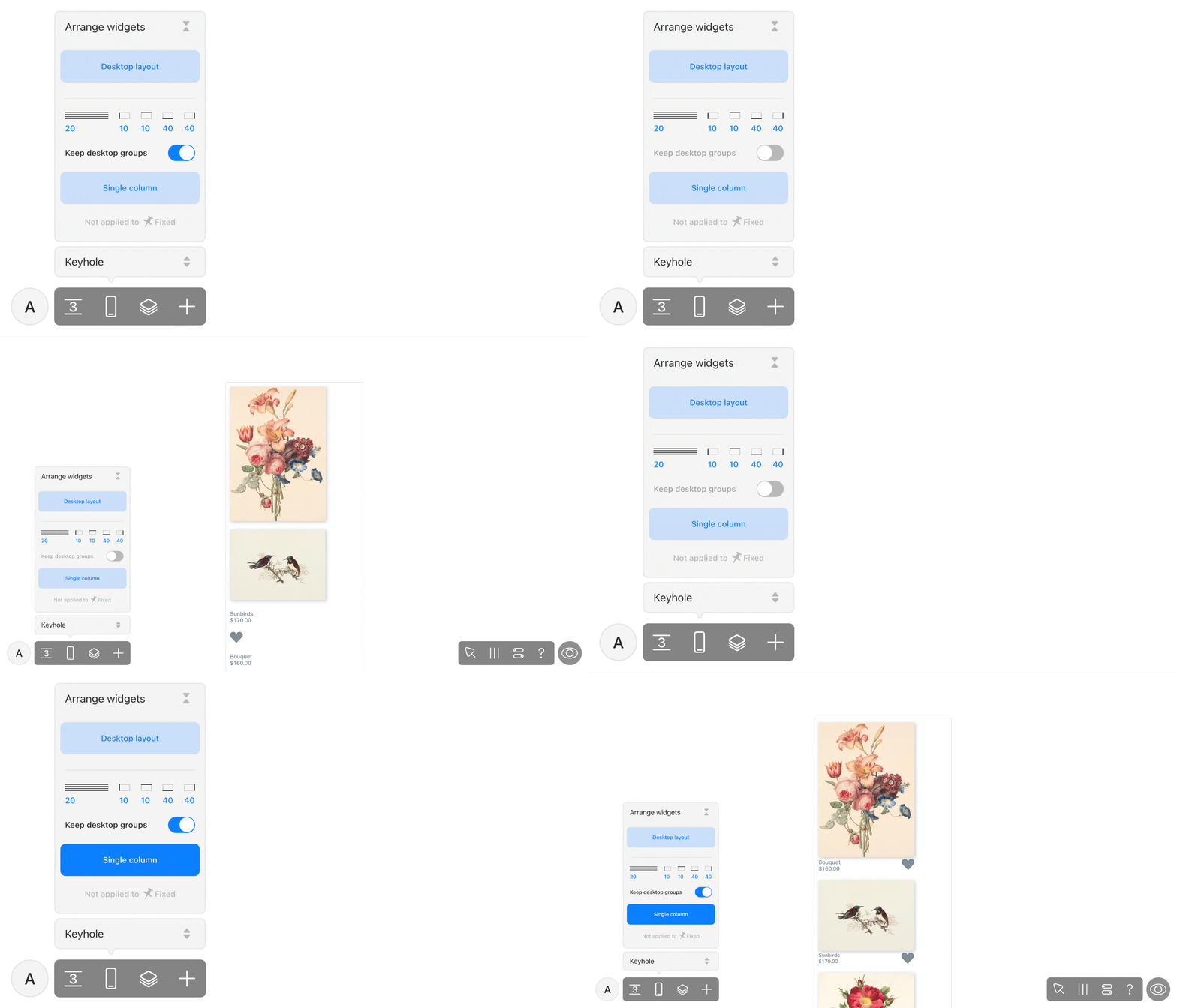
Single column resizes widgets to fit into the mobile viewport and positions them in a column, one after the other. You can set up the margins and padding between widgets right in the UI: everything renders automatically. To restart, click Single column again. This option doesn’t apply to fixed widgets and widgets with on-all-pages positioning.
The UI for Single column comes with a new toggle, Keep desktop groups, enabled by default. When active, all original desktop groups act as groups in the mobile view: the widgets in them stick together and are placed next to each other inside the frame.
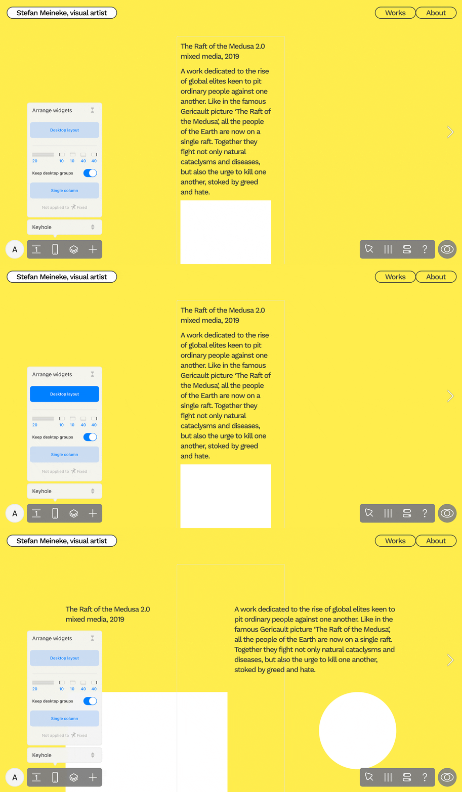
Desktop layout recreates the positioning and sizes of all of the widgets just like in the desktop version, but does so within the gray frame, which represents the borders of your mobile layout. You can move the widgets and manually resize and re-adjust them to find the perfect composition. For restart, click Desktop layout once again.
Working with individual widgets
When you select at least two widgets in the mobile layout of your project, Arrange controls will appear in their attributes on the right side of your screen. When you work with them, you can adjust the chosen widgets without the risk of damaging the rest of the mobile layout. If the selected widgets have regular positioning, there will be three option buttons.
Desktop composition: this will recreate the initial proportions and positioning of the widgets in the Desktop layout.
Fit Desktop to Mobile: this will keep the widgets in the same positions as in the Desktop layout, but will resize them to fit the width of the mobile layout.
Single column: this will rearrange the widgets one after another and position them in a vertical column. In this panel, you can set margins and line spacing, as well as decide if you want to keep widgets grouped together like on the desktop.
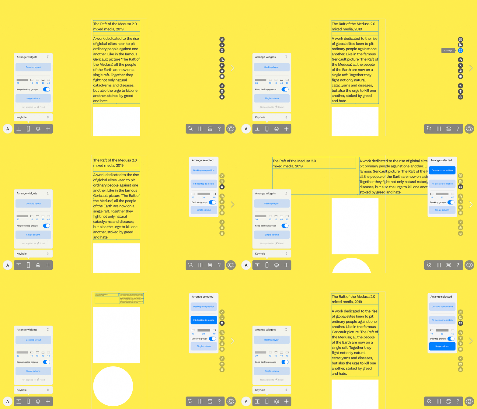
After you apply any of these auto-layouting options, you can adjust the widgets manually.
If you select widgets that include one with a fixed position, you can opt for Desktop composition.
Automated mobile layout arrangements don’t apply if at least one of the widgets that you select has the on all pages and above all widgets positioning. This was done to prevent the overall composition of the mobile layout from breaking.