Design ideas: e-menu for a food spot
Grab 7 tips on designing an unconventional e-menu for a restaurant or a cafe.

A dining experience is a multidisciplinary art: it consists not only of great food and a matching ambiance but also of small yet powerful details. Menu design is one of them. Here‘s some advice from the Readymag design team on styling an e-menu, exemplified by ravishing made-with-Readymag websites.
Limit the palette
Check what the place uses for colors and pick the main ones, then stick to them across the menu to reinforce the brand message.
This menu has just three colors, and they blend into a juicy summer mix, just like the food served there. All of that is powered by a horizontal scroll, just like you’re flipping through a physical menu.
Show the meal
We love with our eyes, right? You can enhance the visual appeal with big images of the dishes, drinks, and ambiance, making everyone immediately see and love what they’ll get.
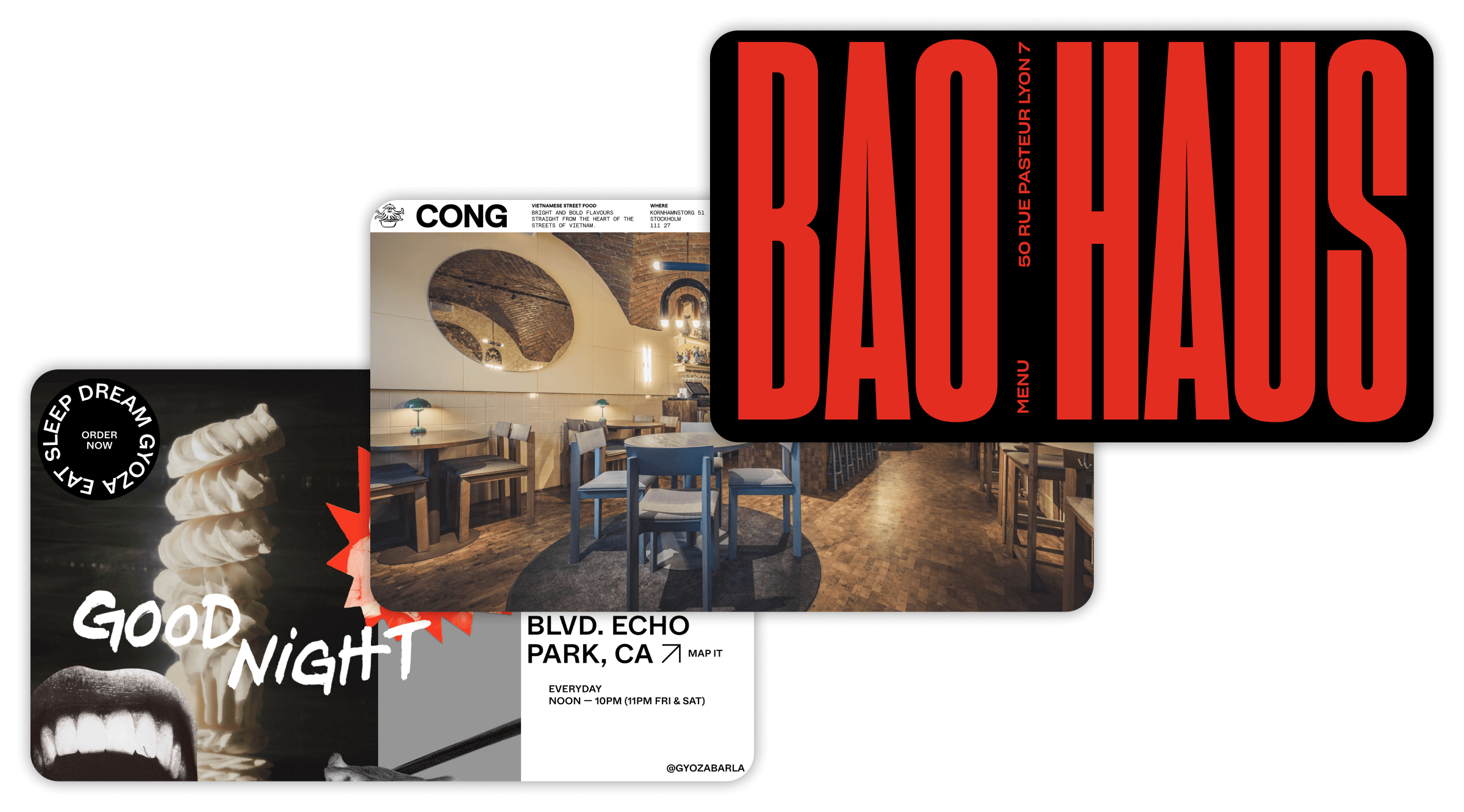
This Vietnamese restaurant literally puts its best food forward and straight into your eye. The designer said ‘no’ to vague descriptions and a total ‘yeah’ to mouth-watering food photos well-aligned to the grid.
Break formal layouts
Who said restaurant menus should be a dull, two-columned bunch of lines? You can gracefully break the rules and create a unique experience while keeping the menu user-friendly.
This animated layout looks typical, but interactive elements give the whole thing a layered feeling. When choosing a dish, you follow a cute custom cursor—a gyoza dumpling—and can play a bit with elements animated on hover. Also, integrated Google Maps makes sure no one gets lost on the way to the deliciousness.
Design for mobile
Most people scan menu QR codes on their mobile phones. If you design with this nuance in mind or adapt the essential parts of a desktop menu to mobile, you’ll clearly win customers’ appreciation.
Here’s an example of a readable menu with a distinct spirit. Its mobile version keeps the same stories, but is slightly more concise. The menu appears as you scroll, revealing subtly animated illustrations, and lets you book a table with a few clicks via an integration.
Match other deliverables
Give the digital menu an additional brand feel by visually tying it with the physical menu, promo materials, and merch, if any.
The menu is neatly organized around red, black, and white colors in the interior, decor, and other items, while the website is more intricate: it greets you with an animated preloader, handy integrations, and a hidden funny detail you can unlock on hover at the very bottom.
Add extra info
Since the menu is digital, you can add a bit more of the place’s life to it: include the restaurant’s history, events, booking calendar, or even profiles of the cooks—it’s up to what the owners might find relevant.
This website lets you see the menu, book a table, find out who’s performing, and get an overview of the venue—a great way to take care of clients. Photos are seemingly freely beaded on the grid, supporting animated text that goes above all pages.
Dare to dare
If the place calls for it, be bold. Gather references no one’s used before in menus, such as youth culture, memes, and movies, and see if they resonate with the place’s spirit. If they do, why not use them to spice up the menu?
This menu’s visual abundance echoes that of Thai cities, welcoming guests with all the colors and flavors straight away. It has tons of animated pictures moving back and forth against a colorful background and lines of dancing ornaments.