With ears and eyes: design experience behind nailing music culture projects
Designers share the processes of creating visuals for music, from album covers to merch.
These days, popular music isn’t something you hear on your player, home sound system, and radio: it’s a whole new dimension you see, feel, explore, discuss, and share. Design is what bridges sound and look, and goes beyond those two: visuals can shape artists’ identities, carry messages, create narratives, and add extra value to the listener’s experience.
This article brings together three designers with diverse backgrounds—from freelancing to running an award-winning studio. What unites them is a deep connection to music culture. Here, they share their early influences, approaches to collaboration, and thoughts on why design has become just as vital to music as the sound itself.
Meet the speakers:
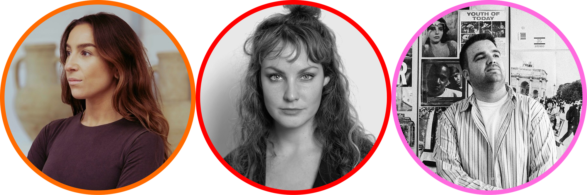
Caterina Bianchini, graphic designer, co-founder, and creative director at Studio NARI. She developed her high-energy style working at top London studios and leading the creative team at Boiler Room, before launching her own practice. Her studio has since collaborated with clients like Nike, Apple Music, and Vogue.
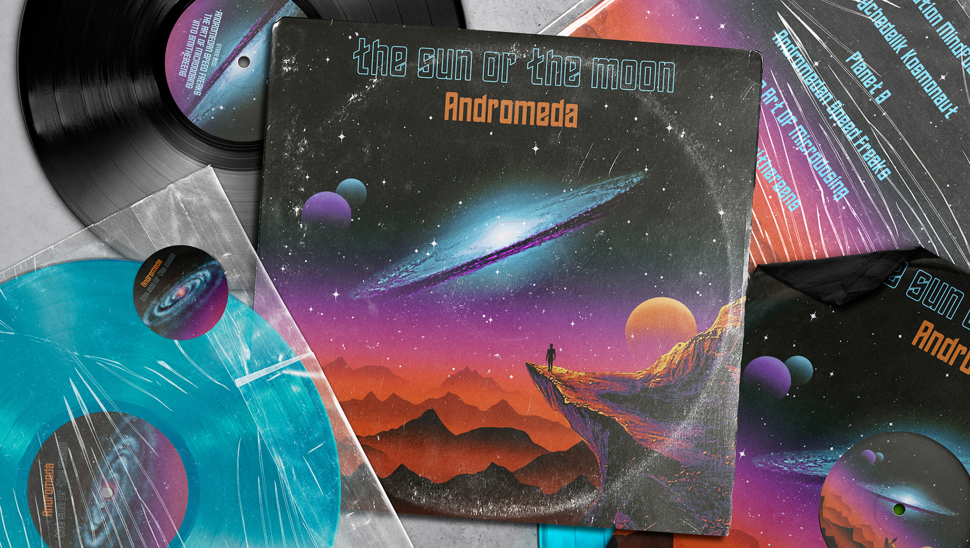
Nibera, freelance artist with a master’s degree in visual communication design. She creates album covers, festival visuals, animations, and fine art photography influenced by pop art, surrealism, Bauhaus, and retrofuturism.
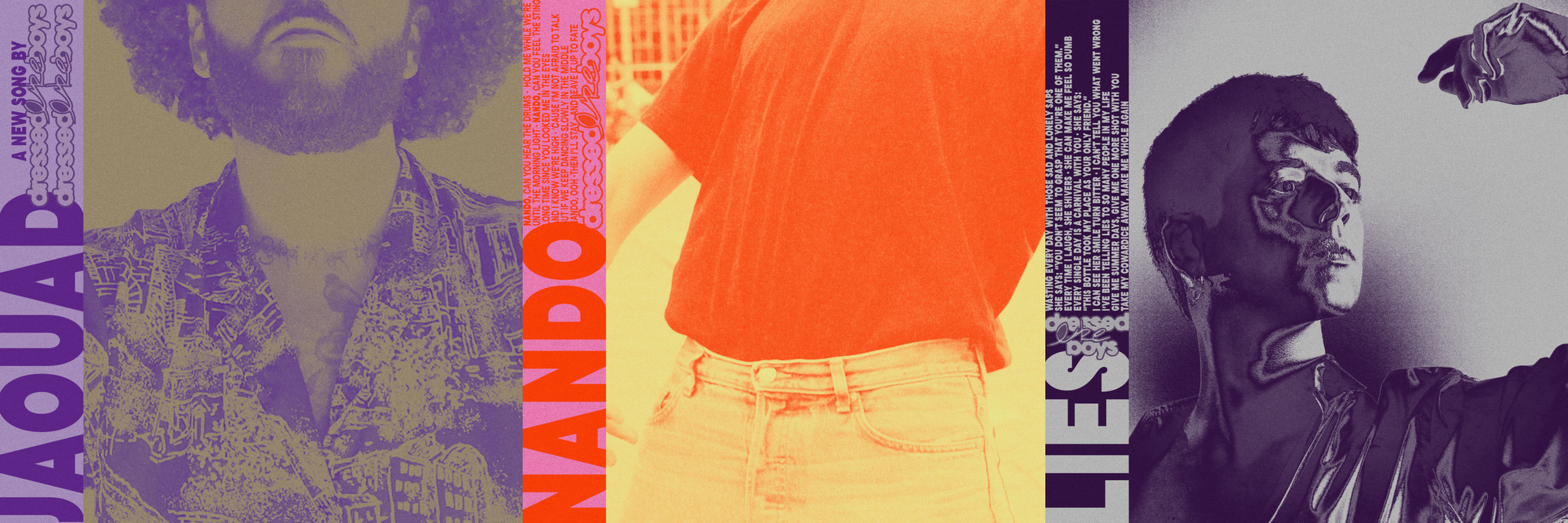
Davy Denduyver, independent creative director and graphic designer. With a background in graphic design since the age of 14, he builds visual worlds for music projects shaped by his early influences in skateboarding and music.
Born this way: Early influences as a guiding star
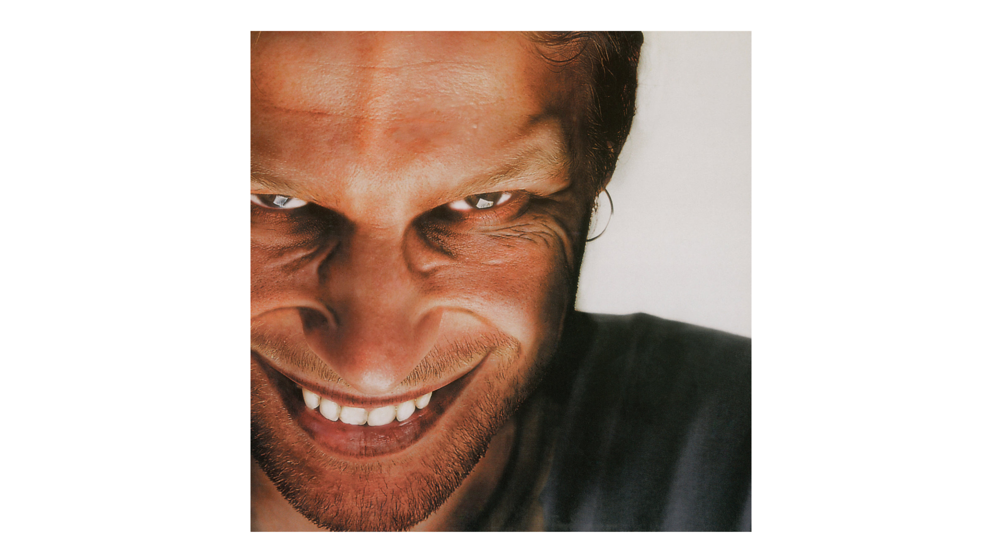
One of the first iconic designs that stuck with Caterina Bianchini was Aphex Twin’s Richard D. James Album. “That warped grin—so unsettling and magnetic—made me realise a cover doesn’t need to be beautiful in the conventional sense to be powerful. It can unsettle you and still become iconic.” But her touchstones don’t end there. “A Tribe Called Quest’s Low End Theory showed me how rhythm can live visually, while Ol’ Dirty Bastard’s Return to the 36 Chambers was so raw and unpolished it felt like a statement in itself, so lo-fi and ahead of its time. Later, FKA Twigs’ LP1 expanded my sense of what an image could be in the digital era. All of these moments taught me that visuals are not just decoration, they are what set the stage for culture.”
Caterina Bianchini recalls that her path into design began with fine art and photography, but it was always fueled by a fascination with beautiful objects. “As a child, it was Italian sweet wrappers or interesting pieces of packaging. I also loved the design of Neapolitan playing cards.”
My dad was an antique dealer, so I grew up surrounded by objects with history and detail. That taught me composition and balance without me realising it.—Caterina Bianchini
Later, at university, she would pull down club posters she loved and keep them almost like a personal archive. “There was one that was pure colour with ‘LIEBE’ in calligraphic writing at the top—I was obsessed with how simple it was. I hadn’t really seen music posters explore such a reductive aesthetic. Colour, type, and form always caught me first. For me, design was never about the discipline; it was about the emotional pull.”
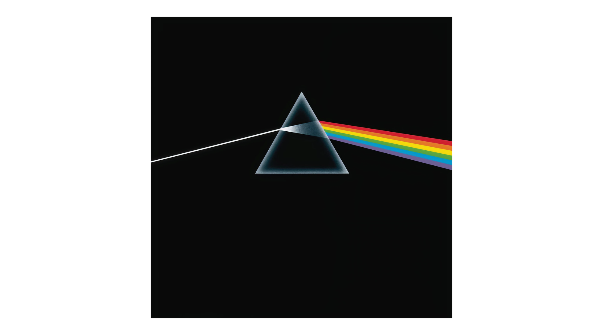
One of the earliest covers that fascinated Nibera was Pink Floyd’s The Dark Side of the Moon. “It’s minimal but powerful, the way a prism and light beam could hold such symbolic weight. Later, I was drawn to the boldness of pop and retrofuturistic aesthetics, where visuals became immersive cultural statements. That combination of clarity, symbolism, and imagination is something I still strive for in my own work.”
Nibera shares, “The vinyl era of the 1960s, 1970s, and 1980s shaped how we think of music visuals. Covers became artworks in their own right. Psychedelic posters, punk DIY zines, and the visual explosion of the MTV generation were equally influential. Each of these moments showed how powerful design is in shaping cultural identity and how inseparable visuals are from music history”. She mentions that Bauhaus design principles inspire her for their clarity and structure, pop art for its bold cultural energy, surrealism for its dream logic, and retrofuturism for its optimism about tomorrow.
I look to the analog visual languages of the ‘70s, ‘80s, and ‘90s, from record sleeve art to sci-fi cinema. These references allow me to move fluidly between nostalgia and the future.—Nibera
Davy Denduyver came into graphic design at the age of 14 thanks to skateboarding and music.
The style of 90s hardcore punk and the DIY movement that comes with it have deeply influenced my personal life, my style in graphic design, and my approach to anything.—Davy Denduyver
I started making zines at 16 in the local hardcore punk scene, and that marked some of my first “real” steps into graphic design, besides studying it later. Hardcore is very hands-on and on the “anything is possible” mentality. You don’t need to be a good guitar player or singer to start a band; you just need the passion. It’s a state of mind I apply to pretty much everything in life, and I’m very grateful to have discovered such powerful music at an early age.
Besides that, I also found inspiration in hip-hop and the ’90s. Think stretched out type, strong color blocking, etc—that’s what I love most in graphic design. Not as obvious in my work, Pen & Pixel’s hip-hop albums and mixtape covers will always have a special place in my heart, too. They are objectively ugly, but still really drag you in and are synonymous with an era and sound in hip-hop that is irreparable.”
A matter of trust: From negotiations to results
Caterina Bianchini reveals her approach to starting a project: “My rituals are less about mood boards and more about creating space to wander.”
I do loose research, take notes, and test ideas that might feel wrong at first. I love that period when everything is still possible before the idea hardens.—Caterina Bianchini
She continues, “The best projects are fully collaborative. We invite clients right into the process, whether workshops, sprint sessions, or reviewing work at early stages. Musicians and their teams live inside their ideas far longer than we ever could, so their intuition is a key part of the work. The art is channelling that intuition into something visually sharp, not diluting it. If they’re plugged into the process, the work resonates more because it feels like a shared creation.”
“We start with strategic foundations, then we build out provocations. That becomes the lens for all creativity. From there, we map territories and different visual directions, each testing how far we can stretch the concept without breaking it. Once those are in place, we start thinking about how they can translate into a visual feeling. The interesting part is moving from language into image.”
She notes that timelines shift depending on the client, but her approach remains the same: “I always give the front end more time. Often, we’ll have multiple variations inside a single territory, so the conversation isn’t ‘this or that’—it’s ‘how far we want to push?’ It’s a mix of logic and intuition, always grounded in the strategic foundations.”
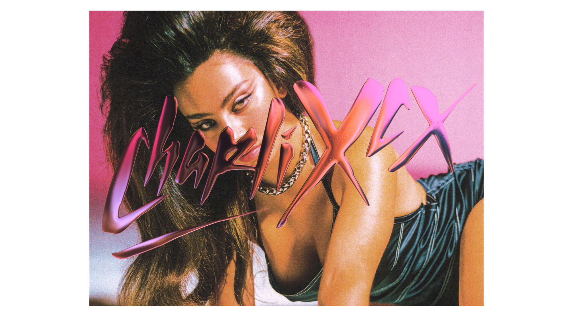
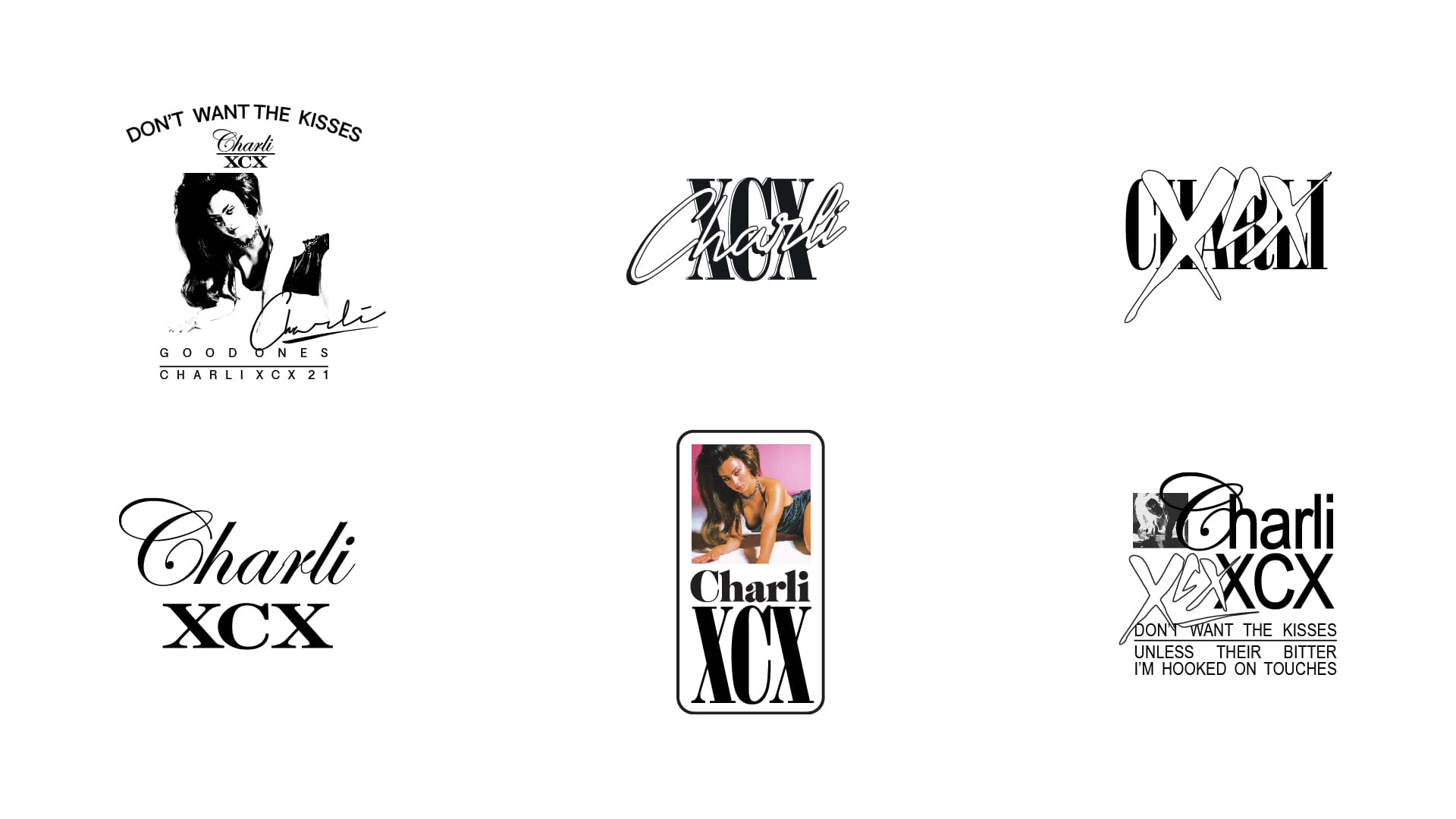
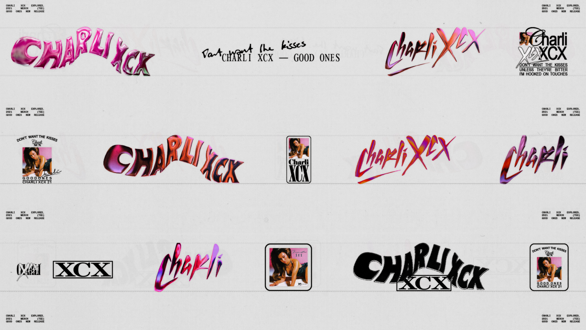
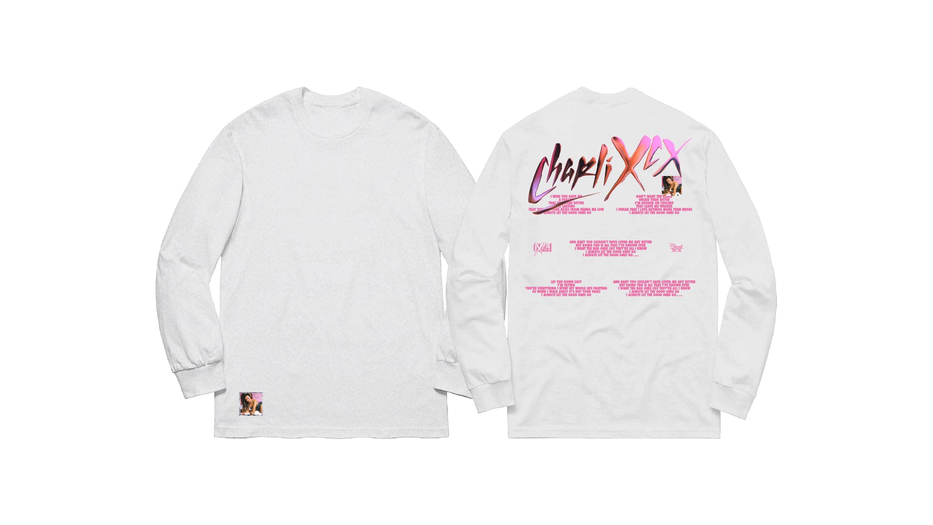
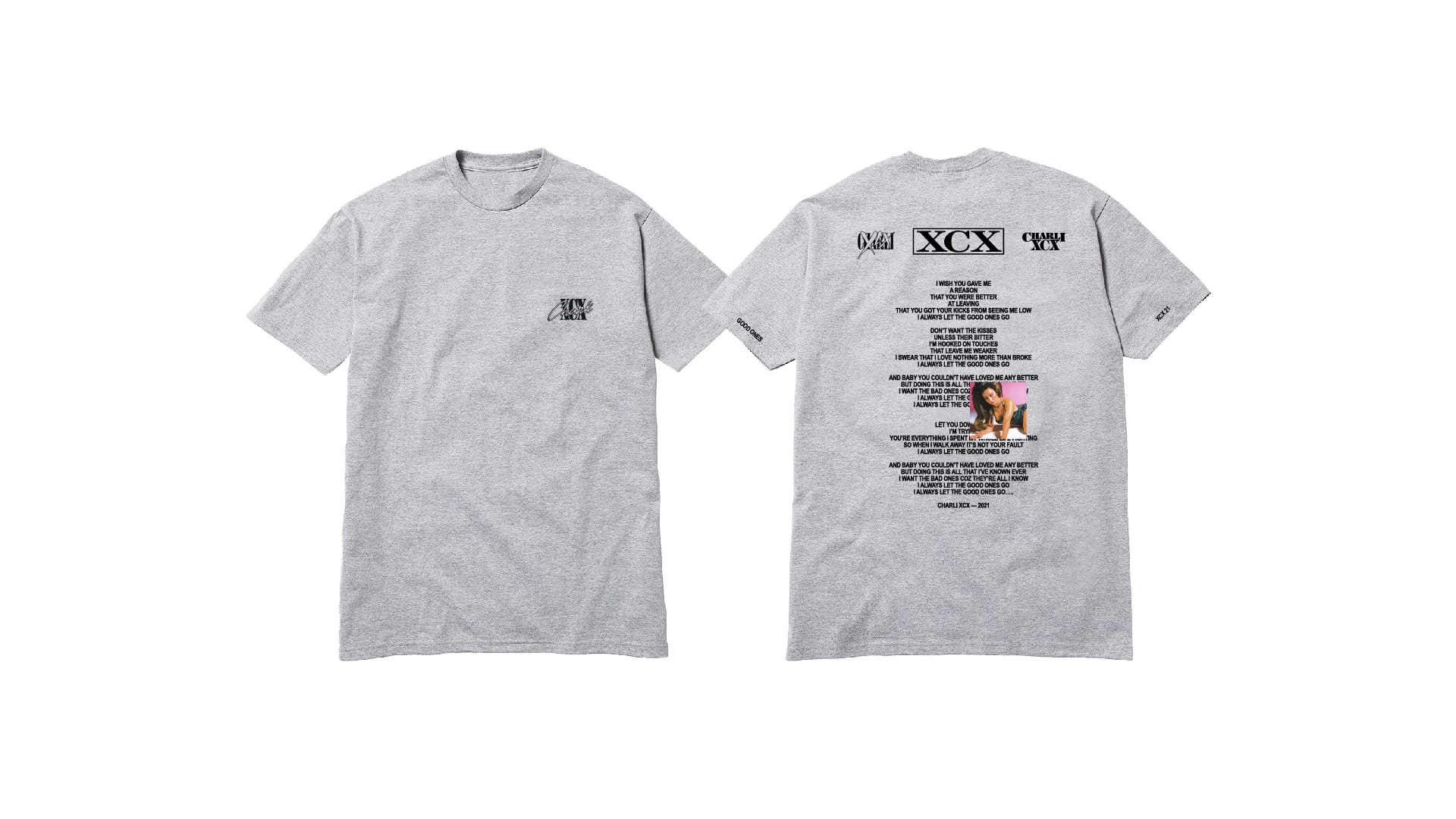
When Studio Nari worked with Charli XCX on her merch, it stayed involved right through production. “That is important because merch is not just about putting a logo on a T-shirt. It is about building an extension of her world that fans actually want to wear and keep. The inspiration was pulled from her universe, her attitude, and her energy, and translated into physical objects.”
“Most of the time it starts by meeting with the artists and their team, preferably in person,” says Davy Denduyver. “I like them to come to my studio, browse through books and records, so they can step into my world. When that’s impossible, we jump on a video call where they walk me through their project. That alignment is the most important phase for me: I need to get in their head as much as possible so I can visually translate their sound.”
From there, nothing looks the same twice. “Some artists have a really clear idea, but most of the time they don’t—and then I try to marry my vision with theirs. My one non-negotiable in work is that I get creative input. If it’s just execution, I’m not the guy to come to. However, sometimes I get on board, and it all feels a bit more defined and businesslike, but that’s still a nice change of pace and a versatility.”
“What’s always most important to me at the start of any project is listening to the music on repeat. After a while, certain elements start making sense in the general idea, and then it’s important to cut things down and narrow it to the strongest elements to see what I can work with.”
It might sound corny, but it’s true: the best ideas hit you when you’re doing something completely different, and mostly when you’re not at work.—Davy Denduyver
He doesn’t deliver just a minimum. “My job isn’t limited to an album cover—I build a whole visual language. So I’ll always show a bit more: a cover, a vinyl packaging, three singles, a tour poster, and some merchandise. I treat every project like branding. It’s less about deliverables and more about creating a world with its own elements and language”. Davy Denduyver stresses that physical releases now demand greater care: “A lot of people collect records now, but the prices of vinyl are outrageous at the moment. If someone pays 40 euros for a record, they expect more than a print of the digital artwork. You need to create an experience and make it something special.”
Nibera works in a similar spirit. “We often start with a discussion about the mood, themes, or symbolic elements of the music. Then, I play the music on repeat and let it transport me—it’s almost like entering a different dimension. I sketch or play with textures, colors, and abstract forms to catch the feeling before touching anything digital. I also research cultural references or visual languages that resonate with the project and dig into my archive of analog photos or sketch abstract forms to capture a mood. Then I propose directions or sketches, and we’ll refine from there”.
My ritual is letting the music set the emotional atmosphere before any design decisions happen.—Nibera
Nibera also says the collaboration can go either way. “Some musicians arrive with clear ideas, others give me full freedom. Even with creative freedom, I treat the process as a dialogue. Usually it’s back-and-forth: I share concepts, they give feedback, and we refine until it feels like a real extension of the music.”
The scope depends on the project, too. Nibera usually prepares the cover artwork, plus social media assets, and Spotify Canvas animations. For festivals or tours, the work expands into stage visuals, motion loops, posters, digital promo graphics, and sometimes merchandise. A single artwork or Spotify Canvas might take just a few days. But a whole album package can stretch into weeks or months. “Each visuals pack is tailored to the project, but the goal is always the same: to build a cohesive universe that extends the sound visually.”
Video killed the radio star: Designing in the digital-first music industry
Nibera believes that visuals are now growing more and more crucial. “In a digital-first world, where music is seen, visuals are not just accessories; they’re an essential part of an experience. A strong cover, an animation loop, or stage visuals define an artist’s identity online, with visuals doing the storytelling and branding that carry music into wider culture.”
My work aims to open portals into sound before people even press play, reminding them that music culture is as much about imagination and identity as it is about sound.—Nibera
She emphasizes that music visuals can amplify voices that might otherwise be overlooked. “Through symbolism, representation, and storytelling, design can highlight underrepresented communities, question cultural norms, and give a platform to urgent issues. A strong visual identity makes music a form of art and a cultural statement.”
Denduyver agrees, stating that “Visuals are as important as the music. It’s about building worlds, whatever the format. I don’t mean labels should create an entire brand and persona around an artist.”
I believe the visual world should just be an extension of the artist as a person. There’s no need to change, but rather amplify what’s already there.—Davy Denduyver
He also stresses the design’s activist potential. “People are visual and observe a lot, so anything we see can influence our thinking. Thus, design and activism go hand in hand. I recently worked with Belgian hip-hop duo blackwave. on their single Nothing 2 Lose, which abruptly cuts to a black screen in the middle of the video and song, showing a minute-long message about what’s happening in Gaza. We did the same for their show at Pukkelpop, Belgium’s biggest festival, dedicating every visual of the set to the ongoing war: from sharing hard numbers to encouraging people to take action. Design for activism is a perfect example of how design can matter, and honestly, it’s an honor to work on projects like this in a field that sometimes feels a bit superficial.’
Caterina Bianchini defines visuals as the connective tissue. “Music is more digital than ever, but visuals give it shape, texture, and something to hold on to. They create memory in a world that is increasingly fleeting.”
A track drops on Spotify and can be forgotten in days, but an iconic visual can lodge it into culture for years.—Caterina Bianchini
“In some ways, visuals are more important now, because they are the anchor in an intangible industry. They are how fans recognise the moment, and how artists claim their place in culture.”