Creating website for your design studio? Readymag publishers offer advice
Design agencies can turn their websites into powerful promotional tools that tell potential clients about their style, values, and demonstrate exactly what they can do.
Design agencies can turn their websites into powerful promotional tools that tell potential clients about their style, values, and demonstrate exactly what they can do.
In this piece, we bring together insights from four design studio websites made with Readymag. Their creative directors describe how it’s possible to infuse a site with a sense of personality that can show what your studio is all about.
Funken: Let your vision be reflected in your identity
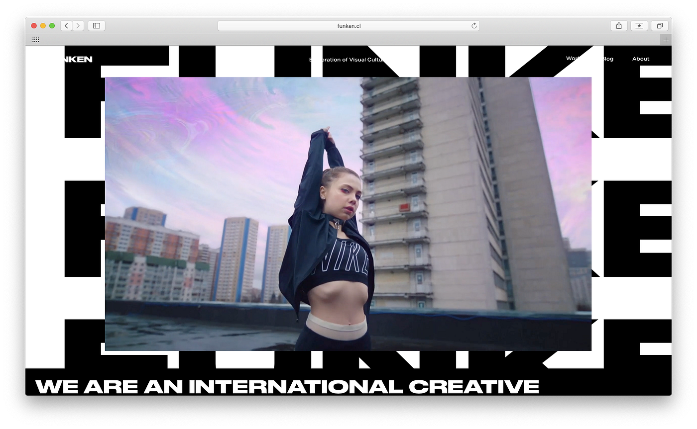
Established in 2011, Funken is an international creative studio that operates across design, film, installations, and visual arts. With offices in Santiago and New York, Funken unites a team of six, all obsessed with music, art, and quality. Their clients include Nike, Adidas, Matte Projects, and artists Javiera Mena and Breakbot.
Voice your opinion
Funken team: “The first thing you see on the website needs to catch your attention and keep you navigating through the rest of the site. Our studio works across many fields and for that reason it was very difficult to restrict ourselves to only one thing. Instead, we made the whole project epitomize our design vision and showcase how we approach the broad areas we can work with. In our opinion, it is more valuable to show your approach or a particular point of view or area rather than offer a service. Voice your opinion.”
Keep it simple
“In short, our ideal is to stay away from fixed roles because after seeing many identical websites everything is boring. We really don’t care that much about formal design aspects in websites, many of our favorite design studios have plain, white websites. Our branding is pretty simple, but we offer quite sophisticated videos and animations — it was a challenge to keep the project balanced. Too much going on can be a disaster if you aren’t careful enough, so the key was iteration.”
ADL: Make your work speak for itself
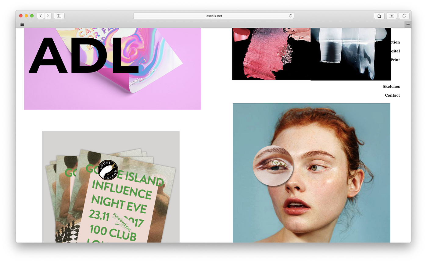
ADL is a design bureau based in London, started by creative director Anna Lascsik. ADL focuses on art direction, print, and digital.
Compose everything together & don’t get lost in details
Anna Lascsik: “The work should come first and talk for itself. When making the website for ADL, I bore in mind that I want something really simple and minimal to let the work shine, but still original. I also have soft feelings for Bauhaus and architecture, which influenced the look of website. I will be extremely honest with you — it has no layout. I have a background in fine art that gave me the skill to see portions almost pixel perfect without any measurement or grid. In terms of artistic direction I was looking for bigger pictures — what makes things look best overall, together. Back in time, a designer of a graphic magazine’s website told me that she aimed to make the work look like a big poster. I proceeded from the same idea: compose everything together and do not get lost in details.
Choose fonts that correspond with your values
“For me, It was a long journey to pick the font: back when I started, I used Bodoni, but around 2012 I realized that Sans Serif reflects way more values that I stand for in design. I do like simplicity. Any element should stand in a website for a reason, otherwise let’s remove it. But aside from simplicity I also value originality in a settled way. This is how I came to Montserrat — at first, it seems to be a fairly basic Sans Serif but if you give it a closer look you will notice its special character.”
Esh: Have a plan, but be ready to go off track
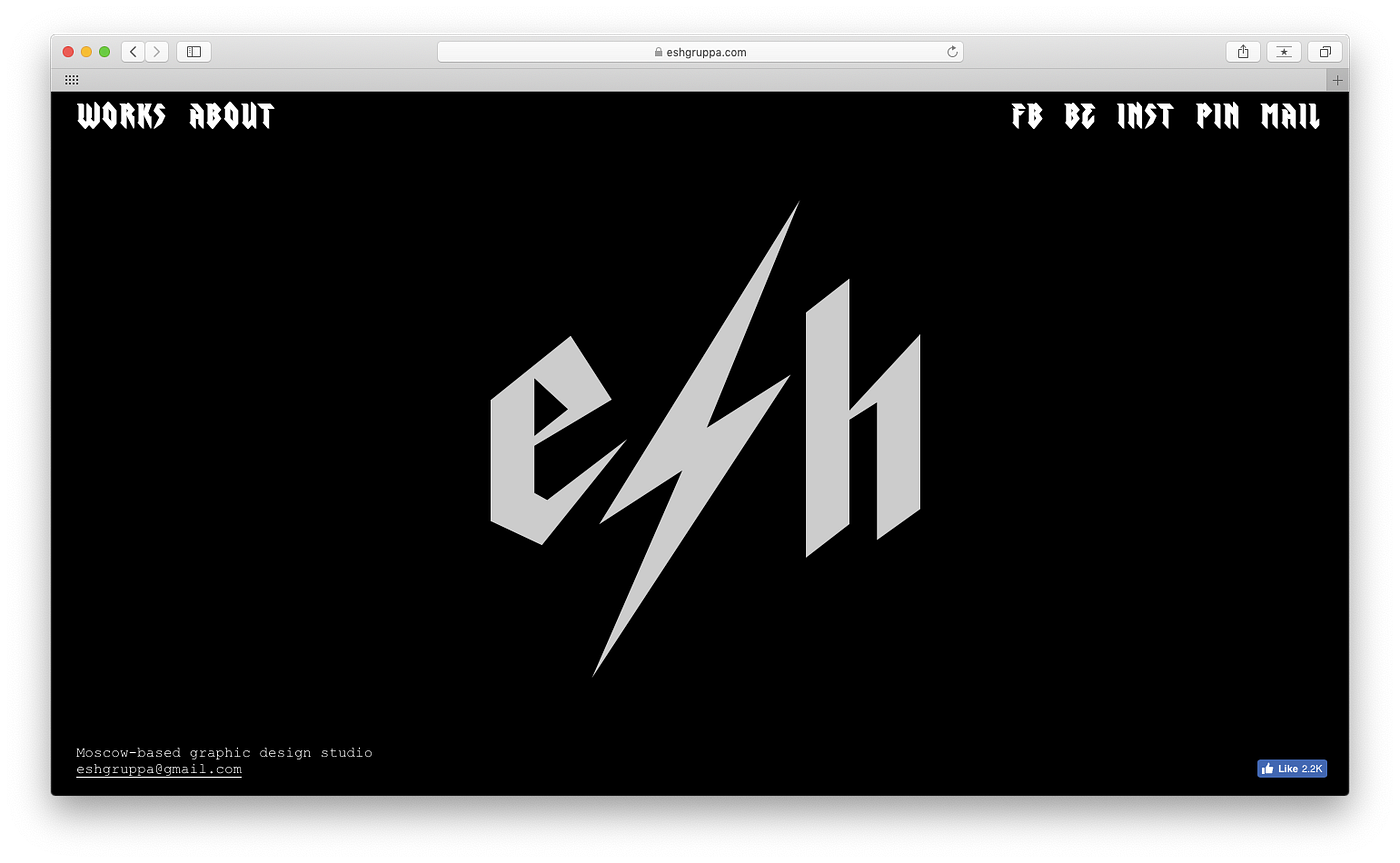
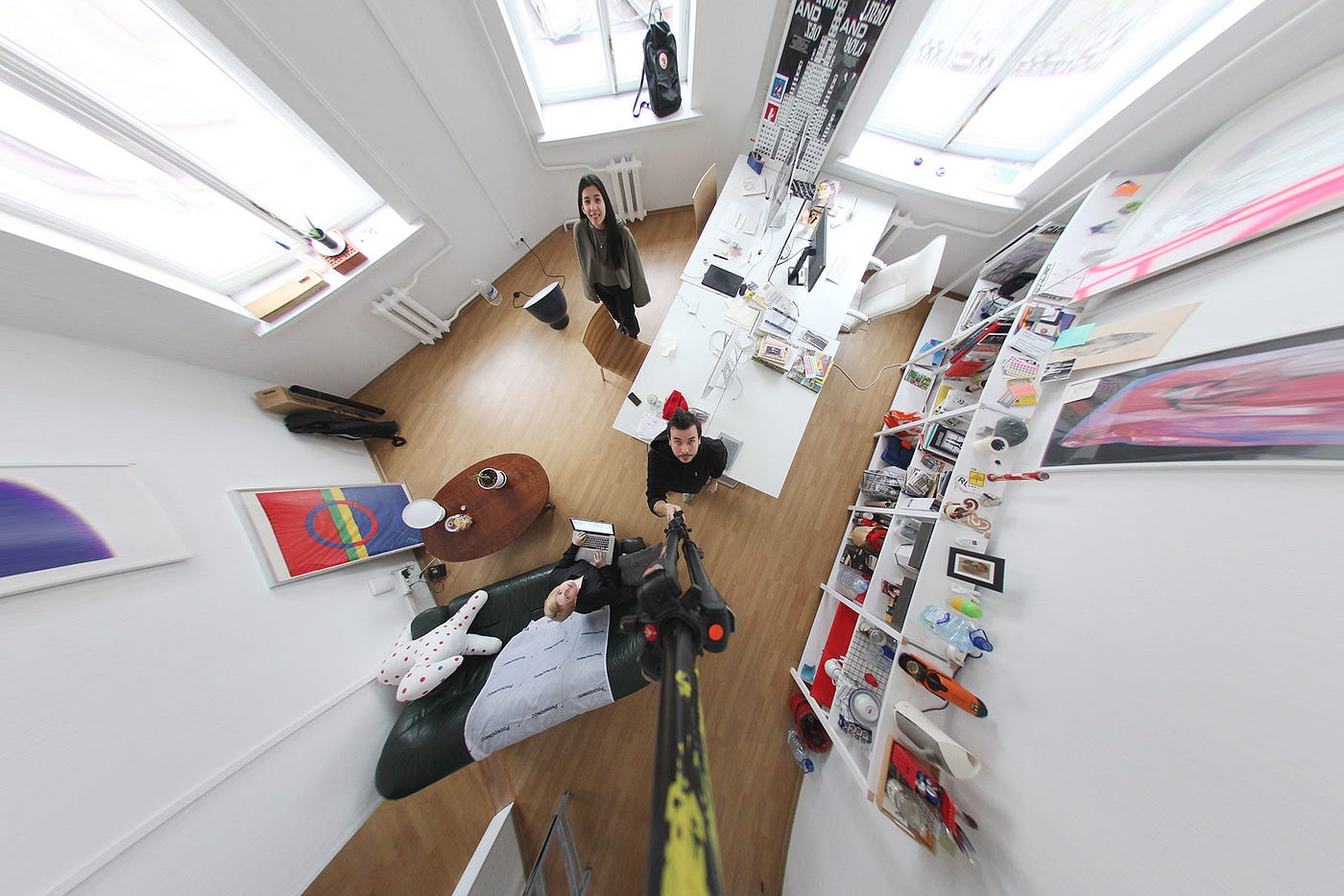
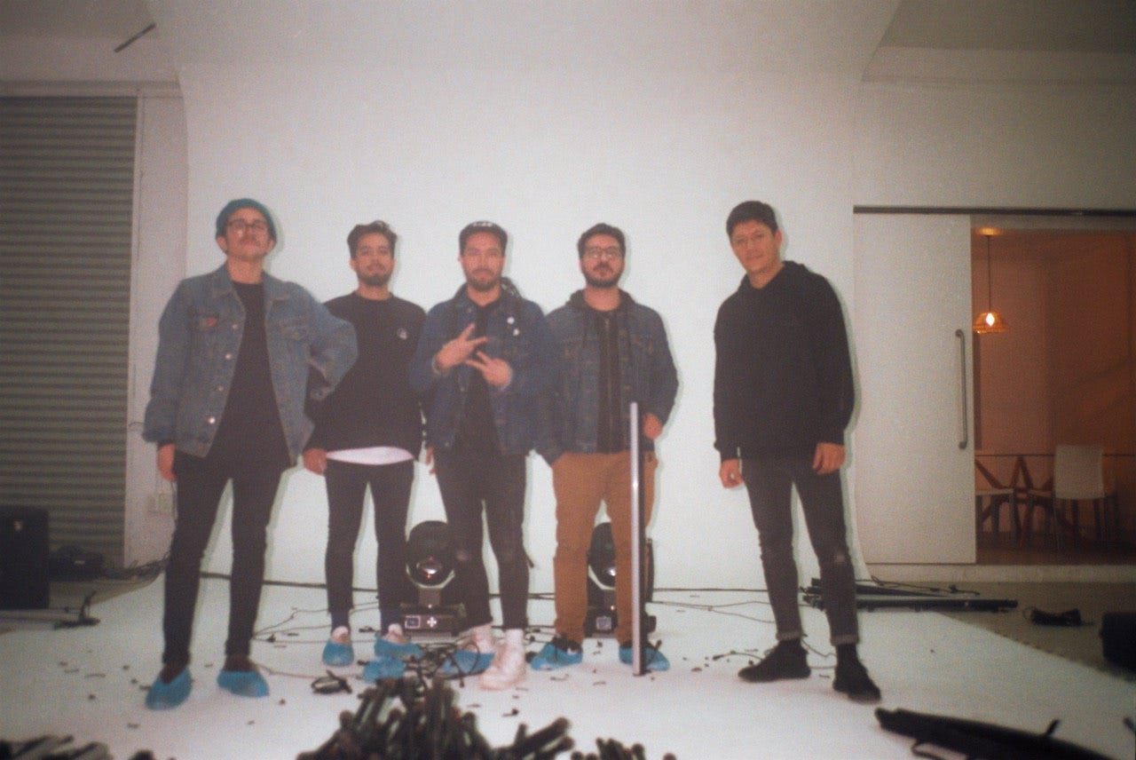
The winners of 2016 Readymag Project of The Year award, Esh is a small collective of young professionals who met at a design college in Moscow in 2014 and have been working together since then.
Create own visual identity
Esh team: “When we were starting out, we had an idea to create a new visual identity for our collective every year. As we are not only doing design but also playing music, we decided to start with an identity embracing the look of an archetypical rock band. We drew our typographical sign, made a simple black and white website and placed a photo of our team, in which we were looking as if we were playing rock. Everything was done with the utmost possible irony. For the next year, we had planned to make an identity inspired by basketball teams. But then we started working and taking more and more commercial projects — at a certain point, we understood that our very first identity had become recognizable and works perfectly.”
Showcase the process
“Now we understand, that the time is ripe to shift the focus from our personalities and provide a more in-depth and cohesive explanation of the projects we develop. We left the Esh sign, removed the photoshoot and now we are in the process of creating an updated version of the website. It will be made with Readymag, as its predecessor — we appreciate that the instrument doesn’t “show through” and the whole project looks as if it was coded from scratch. The core role in the updated website will be dedicated to our projects: we aim to focus not only on the results, but also showcase the whole creative process from the beginning to the end. Even explain how we reached certain decisions, since this comes in handy when you need to convince a client.”
INSTID: Find what makes you stand out
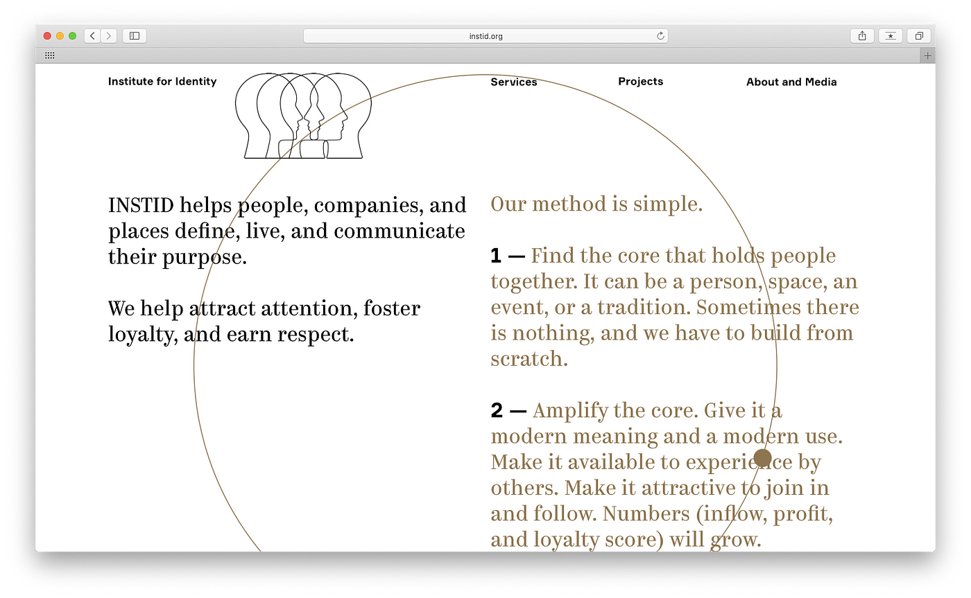
INSTID (Institute for Identity) helps companies and places find a shared meaning and purpose for their communities.
Create your own visual style
INSTID team: “The logo with the human profiles came up as a metaphor for our life and work. It tells about the complex composition of each personality, about the reflection of one in others, and an external perspective, where we belong and where we don’t, communication, and love. There are only four heads in it, but they seem like many.
Our website balances three different emotions. The first is the clean, brutalist, décor-less graphics. This shows our clients that we work in the here and now, and give our work all we have. The second is the rather traditional calmness and harmony, to assure clients that we have the knowledge to give them the right solutions. The third aspires to show our own personality, because clients are also people and they want to know the people behind the organization. These three themes inform the graphics, with its modern Antiqua, large type, slow movement, thin precise lines, core archetypal shapes, and the light.”