Boost your Instagram with DIY link hub in bio
Since Instagram allows only one active link in bio, brand influencers, marketers, online creatives, and entrepreneurs are always on the search for ways to make content live longer than feed and optimise traffic.

Since Instagram allows only one active link in bio, brand influencers, marketers, online creatives, and entrepreneurs are always on the search for ways to make content live longer than feed and optimise traffic. Like many others, we had been using a third-party solution — but recently replaced it with a custom link hub made with Readymag, which now houses all of our important content.

There were several reasons for that. Firstly, Readymag enables full control of how the page looks; secondly, Professional and Creator plans allow a custom URL and enable some analytics tools to track page performance. Readymag Free plan will suit Instagram bloggers developing a non-commercial account — it allows one published project at a time and offers full editing capabilities. All in all, we believe that being in control and self-hosting our own content is always the way to go.
Below, Readymag designer Tanya Egoshina shares some ideas on what to focus on when creating a link hub for Instagram.
Easy-to-grasp visual hierarchy
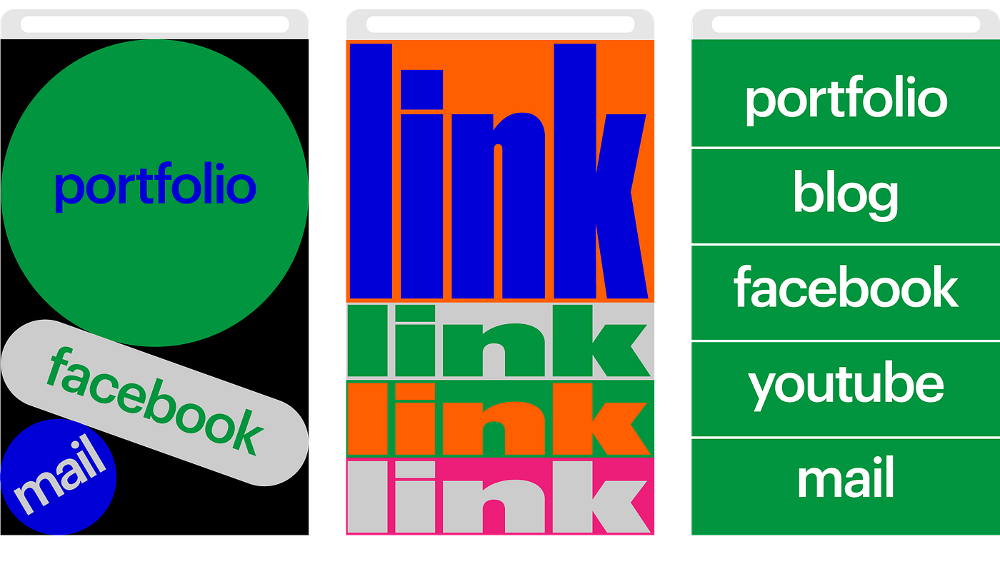
Our hub presents a simple full-screen menu with rectangular colored buttons stacked in a vertical column. Every button has on-hover animation, to help viewers indicate it’s clickable. “For the first time I shifted my traditional Readymag workflow and made the mobile version of the project first — just because it will be used much more often than the desktop one”, explains Tanya. Both versions must fulfil several simple requirements: be clear, easy-to-grasp, and easily clickable, she adds.
Visual hierarchy is reached just by the order of button placement and their sizes. “As for color, it reflects the hierarchy of the link only to some extent. I picked certain colors mostly because they look nice together”, Tanya says.

Play with the less is more principle
“The perfect layout of such hub places all links on one screen and does not include any additional scrolling. Yet, it is not always possible to follow this perfect scenario”, Tanya says. In case you are a content-rich company and have more to share, clever layout and some design tricks will come to help.
Our hub contains eleven links — over the years we’ve made a bunch of inspirational and educational projects, of which we are proud and want to spread the word. “I devised the layout, so that the first screen shows one of the buttons only partly — that’s a deliberate decision aimed to give a visual clue that there’s something below. You can add an arrow or think up something else”, Tanya says.
“Pick whatever good font (or bad, as you wish), just ensure that it is readable. We use Graphic in 28 size both for desktop and mobile. I believe that bigger is better, but of course that needs testing in any particular case”, she adds.

Analyze it
In case your personal website or portfolio is created with Readymag, we recommend making the link hub a part of this project (which means that the both should be mapped to one domain) — Google Analytics is built into Readymag paid plans by default, so you can specify a unique tracking ID for the whole project and track the performance of its parts.
For instance, most links in our Instagram hub — Stories, R/m masters, Explore, Sandbox, Educational discounts, Affiliate — are a part of the readymag.com website. In the hub, we included UTM parameters to all that links and track the pageviews (including unique ones) for each of them, as well as the average time users spent viewing a specific page or set of pages.
Also, you can measure the performance of the whole link hub campaign. For this, go to your Google Analytics cabinet > Acquisition > Campaigns > and enter the name you’ve attributed when building your campaign’s url. On this page you’ll see how many users you’ve acquired by your link hub campaign as well as their behavior — bounce rate, pages per sessions, and average session duration.
If your hub includes links to pages that are not a part of your website (e.g. a YouTube channel, social media accounts or other websites) you can also include UTM parameters to these links and track the number of clicks on them. To see this information go to Google analytics > Behavior > Events > Event Category: Project Actions > Event action: External Link. The link, you’re interested in will contain the UTM parameter you’ve added.
Now you know how to make a fresh and beautiful link hub for your Instagram bio. Feel free to experiment and send us examples of such pages you’ve made.