Awesome event pages created with Readymag
Your landing page can be a big part of the success or failure of an event. Be it a music festival or design conference, a good website can convince your future visitors to buy tickets and participate online.

Your landing page can be a big part of the success or failure of an event. Be it a music festival or design conference, a good website can convince your future visitors to buy tickets and participate online.
To inspire you, we’ve put together a collection of powerful examples, demonstrating how useful Readymag is for events.
LADFEST

LADFEST is a design festival taking place in Lima, Peru. Their website offers strong, poster-style layout and typography.
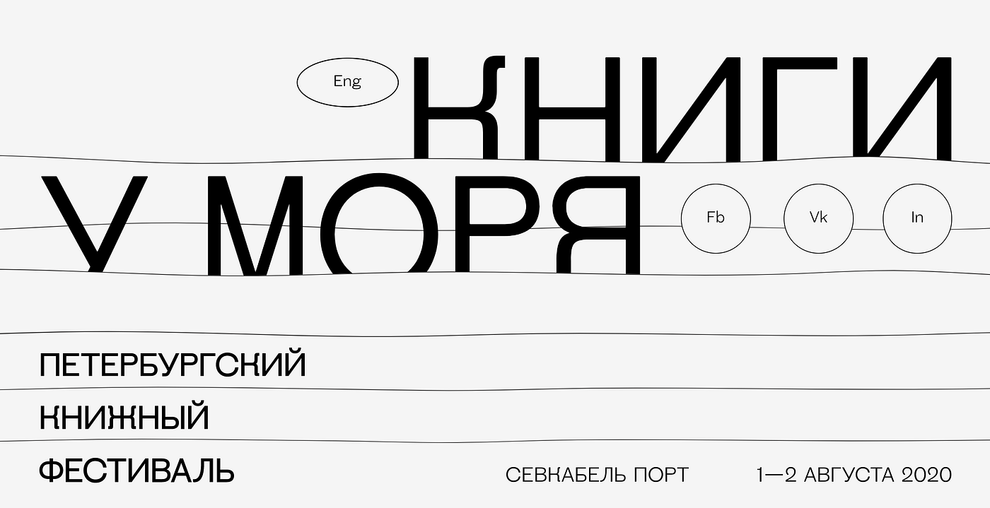
Books and Sea

The Books and Sea’ festival page proves that it’s possible to achieve a great layout using only horizontal dividers.
PRISMA

PRISMA, a design festival with a great promo page, will be hosted in Madrid at the beginning of February 2020.
Kallida

Kallida is an independent music event that has been taking place in Somerset, England, for several years. Recently we discussed the smart design of Kallida’s website with creator Adam Hunt in detail.
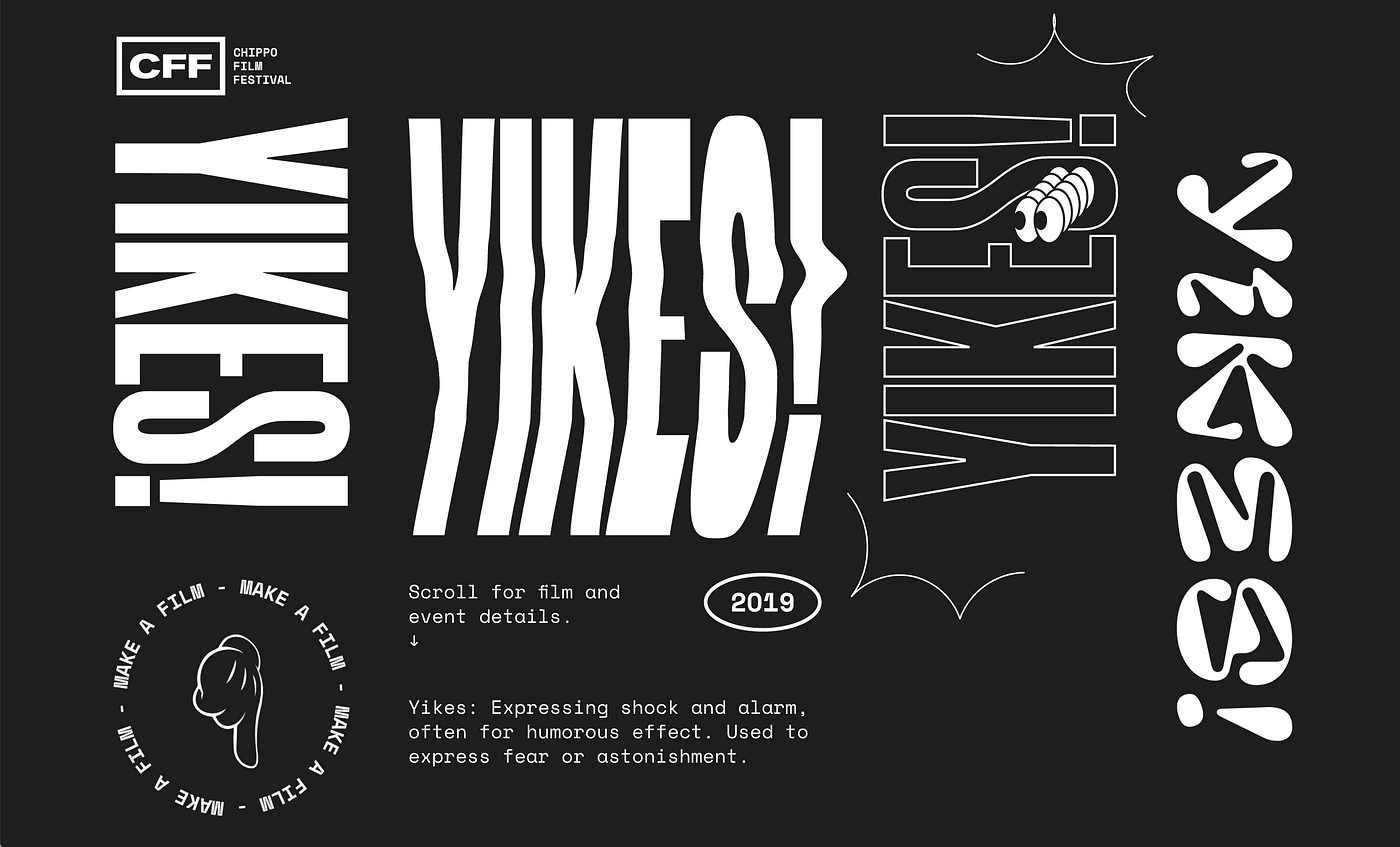
ChippoFF

The promo page for a film screening that took place in Sydney, ChippoFF makes use of poster aesthetics in a way that’s reminiscent of pre-web methods for event advertising.
Inversia

Inversia is a music festival taking place in Murmansk, Russia. Their website uses a simple block layout and contrasting colors, contributing to the overall idea of mixing darkness and light during the polar night.
To wrap things up, here’s some quick advice on how to make your event page effective and memorable.
- Offer the most important information up front. This usually includes the dates and the venue for your event, as well as action buttons. Your visitors should be able to buy tickets (you might consider using our E-commerce widget for that!) and engage with your social media from the very first page.
- Create an FAQ, so that people won’t feel lost when thinking of practical questions: how should I plan my overnight accommodations? Can attendants bring their children? How do I get to the venue? To add new questions and answers to your list more quickly, you can make use of Readymag’s Blocks feature.
- Use images to create feelings. The emotional mood of an event is a crucial element when one decides to participate or not. Use Unsplash or Flickr image library, accessible from Readymag, or plug in your own images.
- Give potential visitors a way to reach out: some people want to ask a lot of questions before they commit. It can be something as simple as an email address or a phone number. For more interactive features, you can even add a live chat using Code Injection.