Apps to boost your creativity
Tools that help spark ideas, gather inspiration, and experiment with different creative approaches—as selected by Readymag team members.
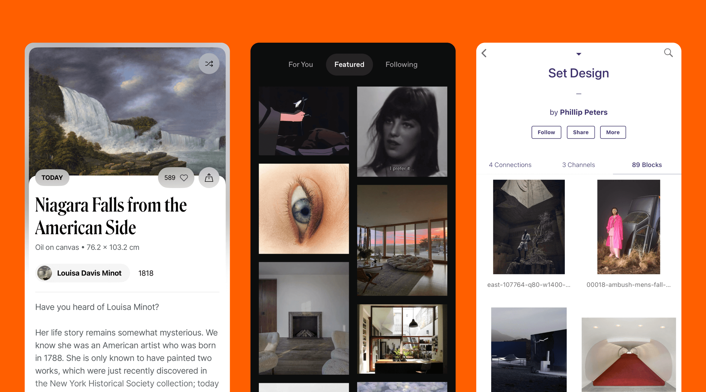
Creative tools on your phone or computer have long become an extension of a designer’s workflow. In this review, we’ll explore apps that help spark ideas, gather inspiration, and experiment with different creative approaches—as selected by Readymag team members.
Recommendations by (in alphabetical order):
Varya Fomicheva, Marketing Designer.
Sasha Golubeva, Product Designer.
Tatyana Kovalchuk, Editor-in-Chief.
Alexander Moskovskiy, Product Designer.
Francisco Pires, Marketing Designer.
DailyArt
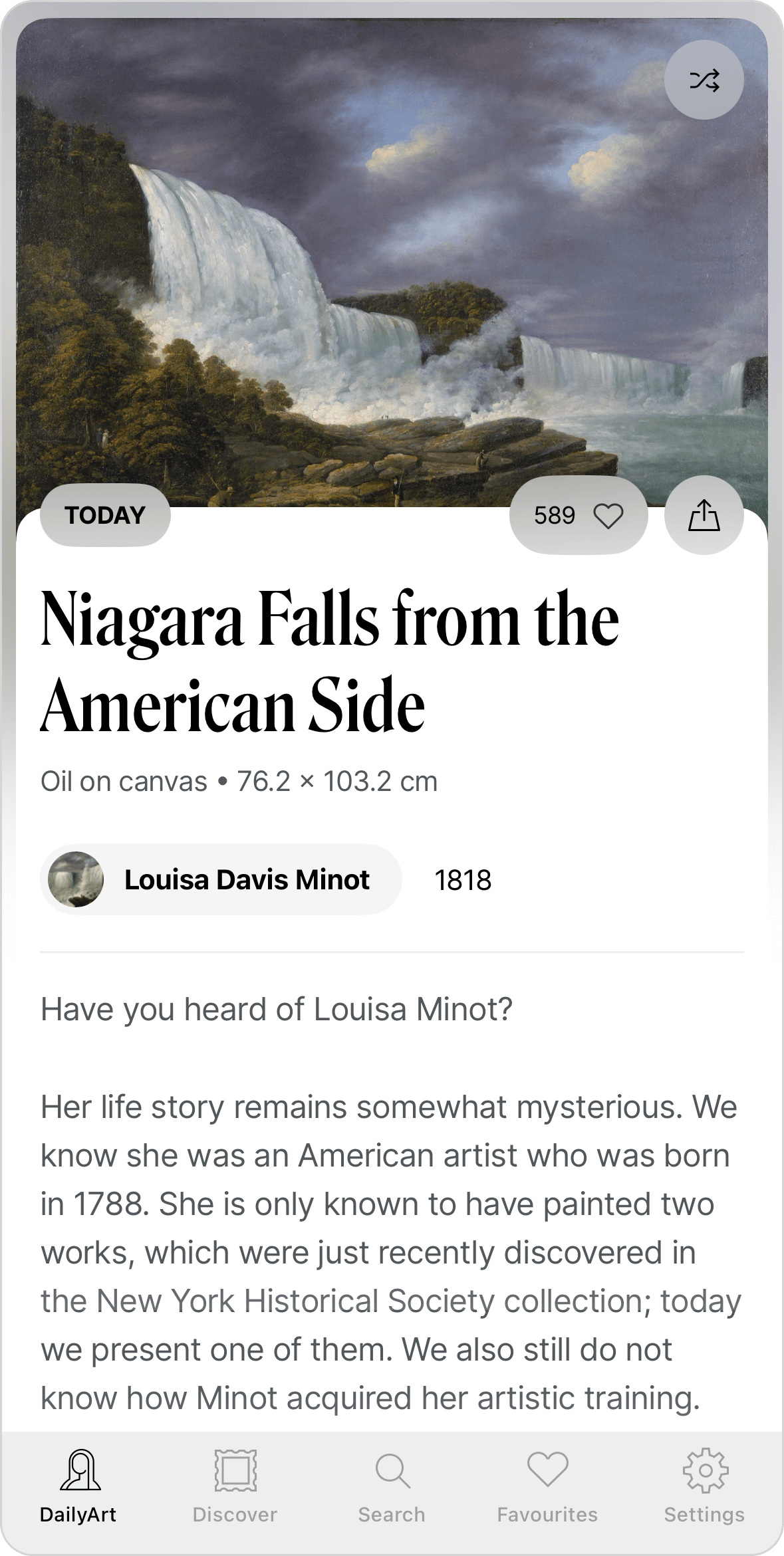
Users of this app receive one piece of art each day, along with a short story about it. The app’s catalog includes works from over 600 museums and galleries.
Varya: DailyArt is a very convenient way to explore classical art, especially since I don’t visit museums often. I enjoy being reminded of long-forgotten artists I learned about in university lectures—ones I wouldn’t recall on my own. I also appreciate that the artworks are presented in random order, which makes the experience different from visiting a museum. Each new painting feels unique and memorable. The short texts provide helpful context as well. Overall, I like the way the information is portioned—it’s well done.
Cosmos
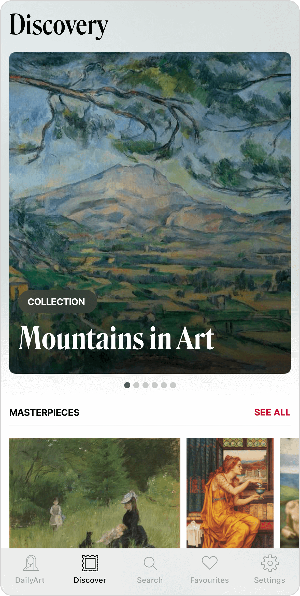
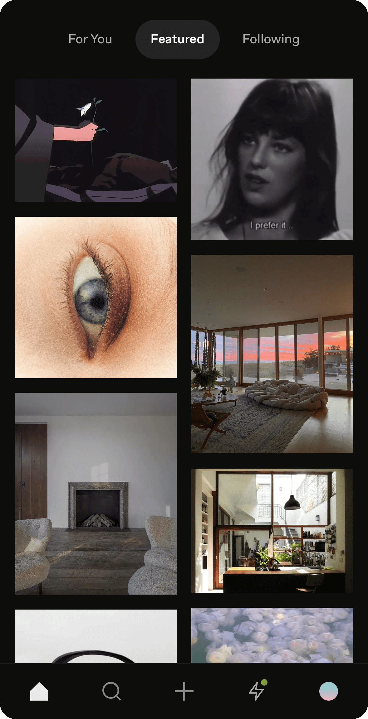
A discovery engine for creatives, Cosmos offers a unified environment for saving and curating works from a variety of sources.
Sasha: I use Cosmos for high levels of abstraction. I have different folders with names like “Naive” or “Tranquility,” where I collect images that I feel convey a particular concept. These serve as tools to inspire me on a different level—not by looking at ready-made designs and borrowing pre-made solutions, but by finding connections between unrelated objects from different spheres and categories. For instance, I recently got an idea for a popup from a picture of a vinyl record with a beautiful sticker on it. The idea is still a draft, but that’s how the process works. I might take a color scheme from a photograph, a shape from a landscape, or even a diagram from a physics textbook.
My favorite folder is called “Paper Garbage.” It holds pages from books and magazines, posters, photographs, receipts, sketchbook spreads, labels—the strange, the obscure, and the surprising. I always return to this collection for ideas.
Francisco: I find Cosmos interesting when you’re searching for very specific things. For example, if I’m looking for a type of R or B, and I just type “B” in the search bar, I end up finding a lot of variations. When you click on one version of the letter “B,” you can discover similar styles or treatments in typography. I think that’s one of the key advantages of this tool.
W1D1
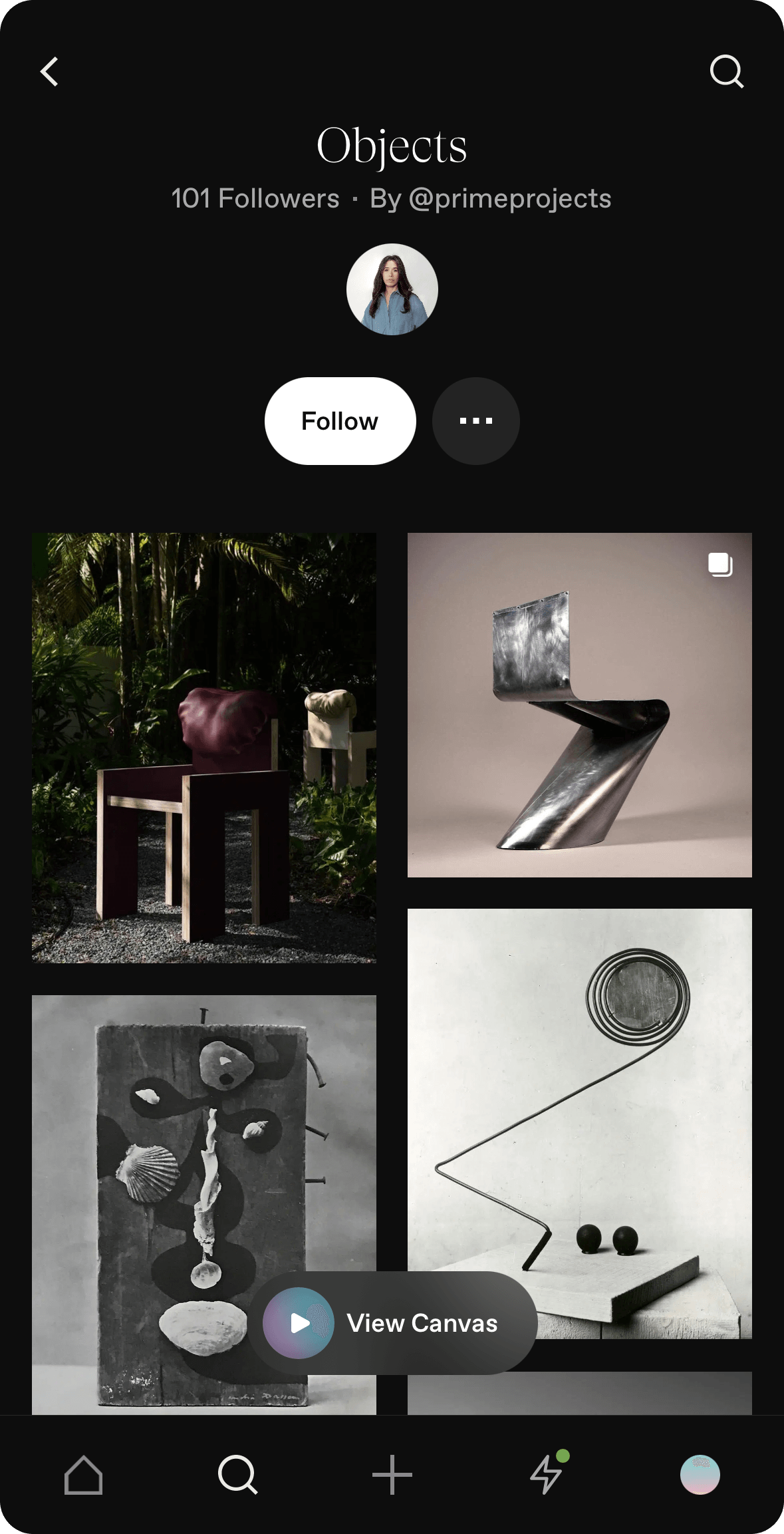
This app provides daily creativity challenges across various mediums, from photography to writing.
Tatyana: A designer friend first introduced me to the W1D1 app about three years ago. He eagerly took on the app’s challenges and would share his experiences each morning in the office kitchen. I recall one particular challenge: the app asked users to observe and photograph the intriguing interplay of light and shadow in everyday life over the course of, I believe, three days. It was a sort of Caravaggio-like chiaroscuro exercise, but with a smartphone in hand instead of a brush, and no need for perfect realism. The result was a gallery of conceptual images where third figures emerged from the shadows. It felt like your own pocket-sized gallery of modern art. Inspired, I downloaded the app myself.
Yet, it wasn’t the visual exercises that captivated me, but rather the ones that played with words. One early challenge, for instance, invited users to compose lines in the style of Mayakovsky—one word per line—accompanied by a brief instruction.
Much later, I interviewed the app’s creator, Alexey Ivanovsky. He revealed that the essence—or, as product managers might call it, the killer feature—of the app is the principle of estrangement, introduced into literature by Viktor Shklovsky. This principle encourages entering a state of mind that offers a fresh, almost “peeled” perspective on familiar things. The goal is not to find a new perspective but to see the “pure” essence of things. It partially resembles the principle of phenomenological reduction—seeing beyond familiar frameworks to access a pure experience. From this point, entirely new creative insights can emerge.
Are.na
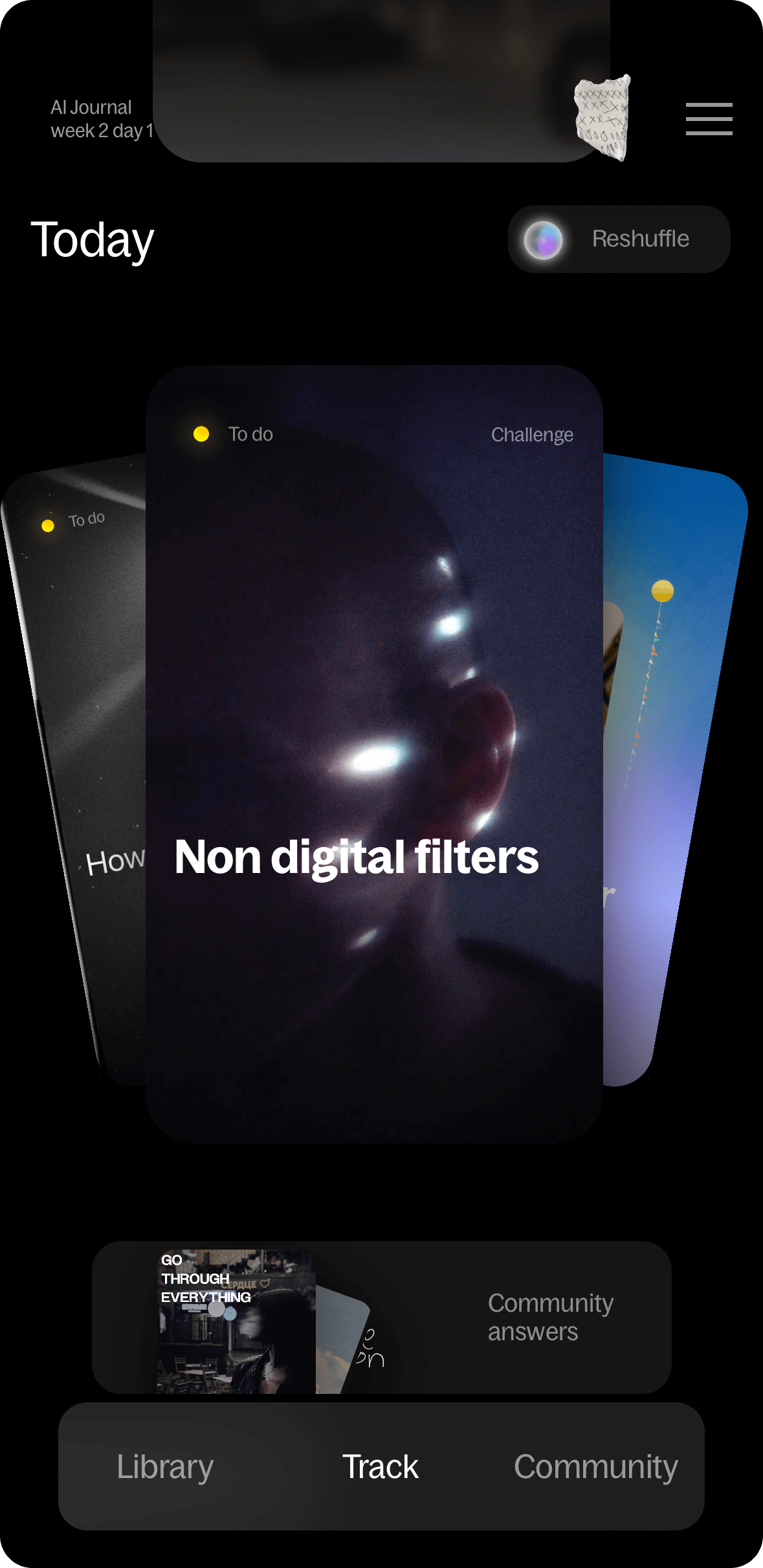
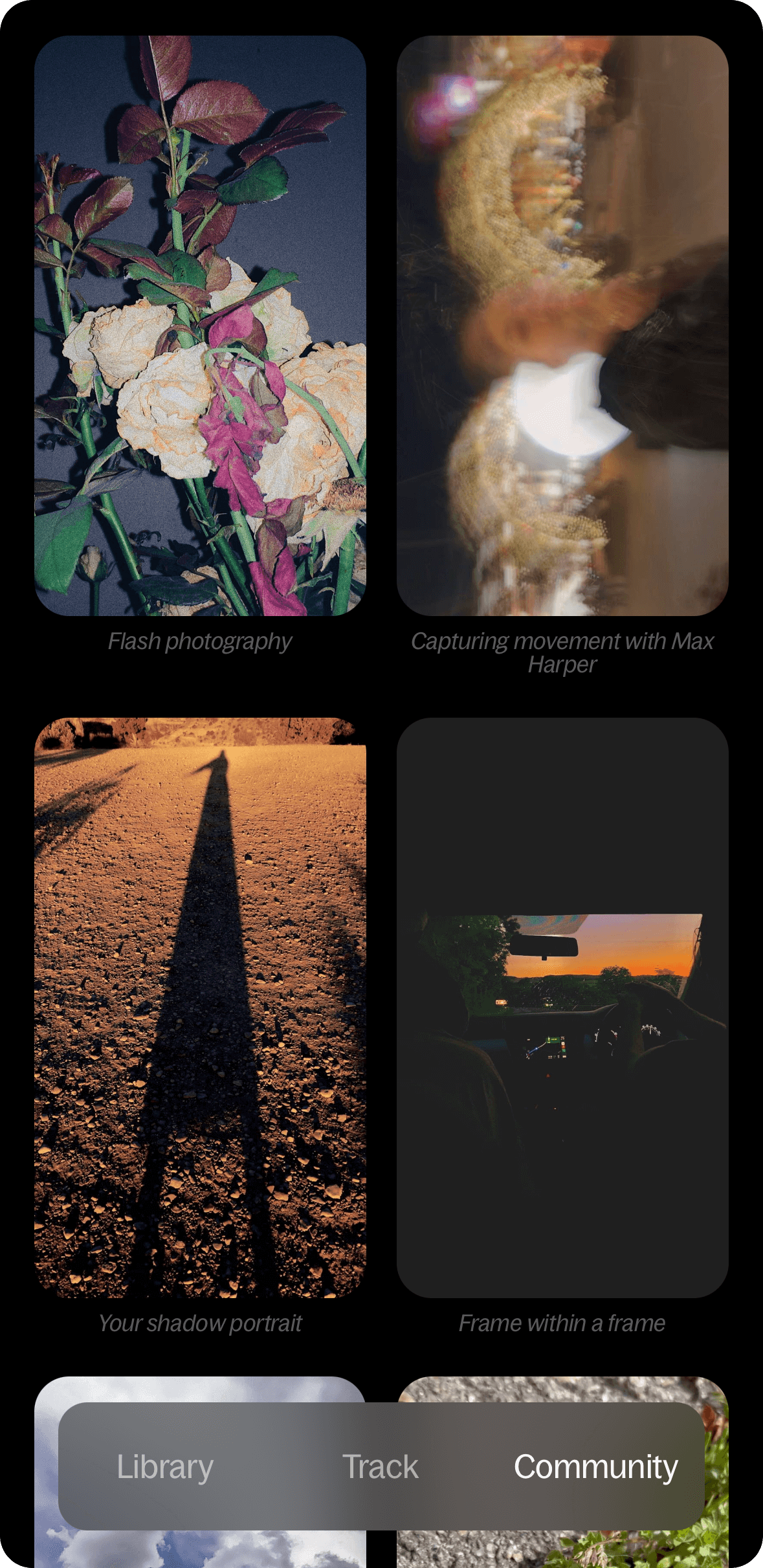
Online platform for saving and organizing content, helping users build new ideas from existing ones. It’s described by some as “playlists for ideas” or an “Internet memory palace.”
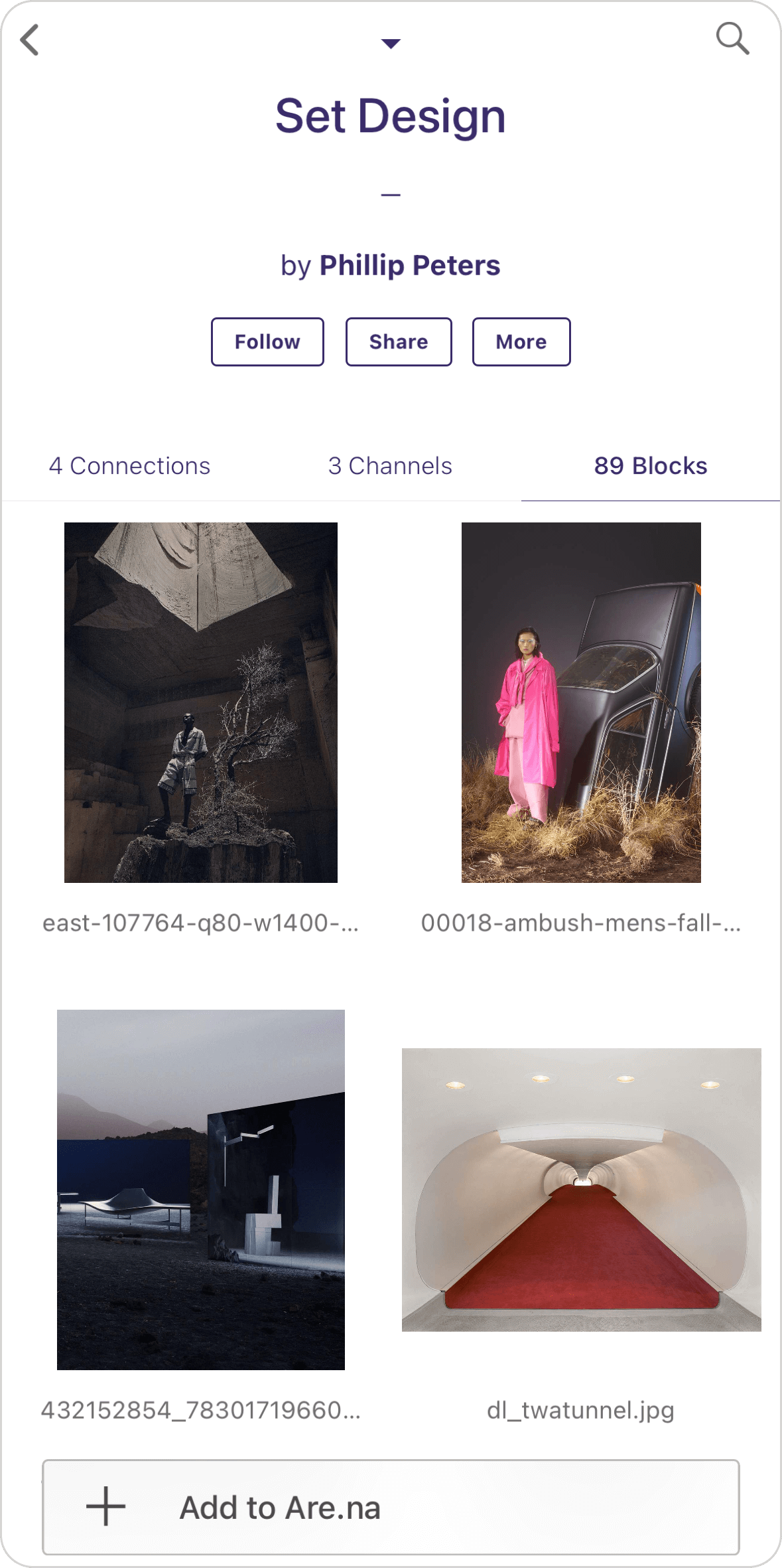
Francisco: Are.na makes it easier to connect works I like or references I search for. I can easily discover new folders from other collectors, and through a particular artwork, I can see all the folders where it’s stored. This makes it easy to find other artworks that are closely linked to each other. Additionally, you can use the search to find what a creative person you admire is archiving.
Mobbin / Curated Design / Httpster
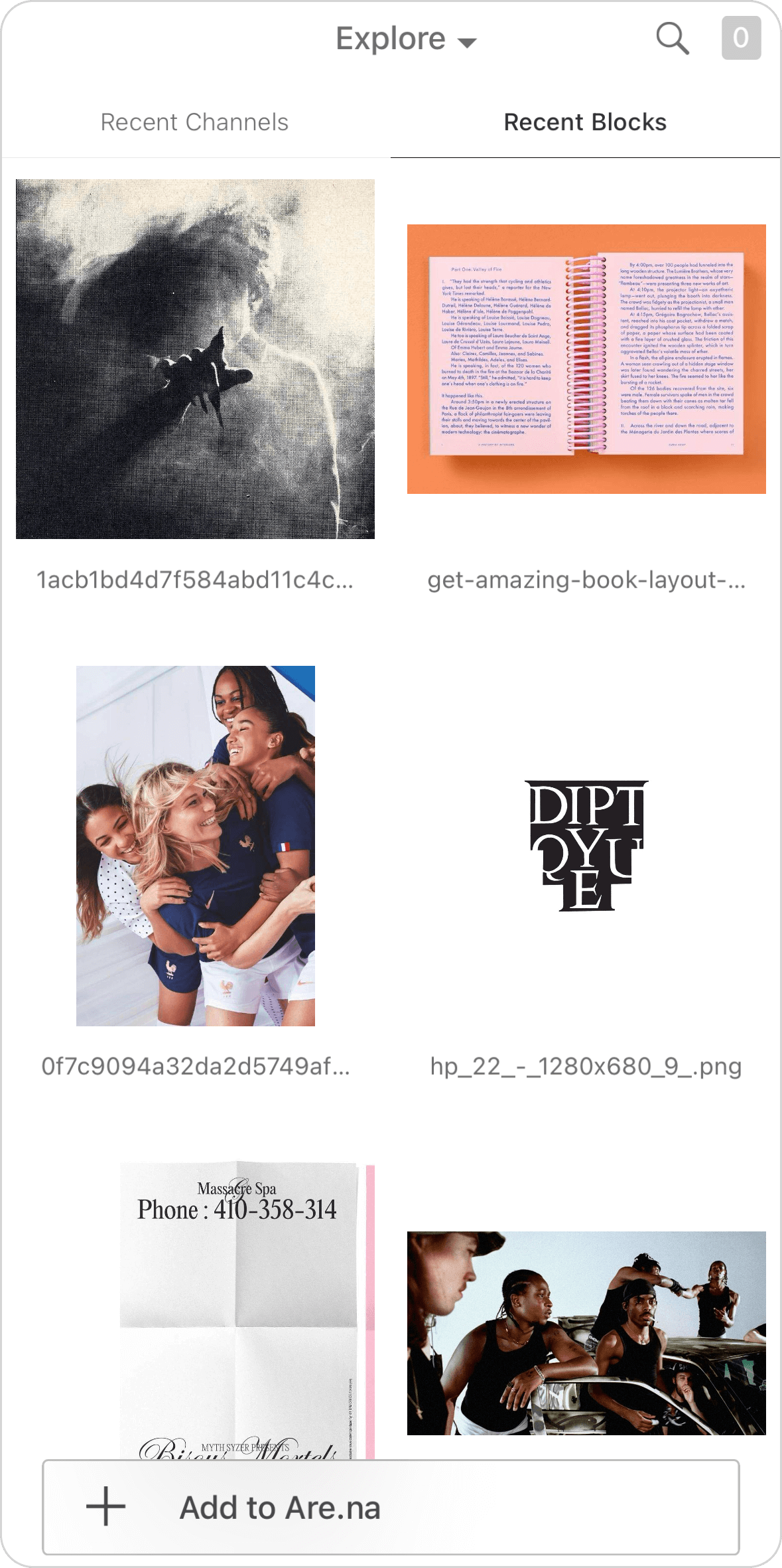
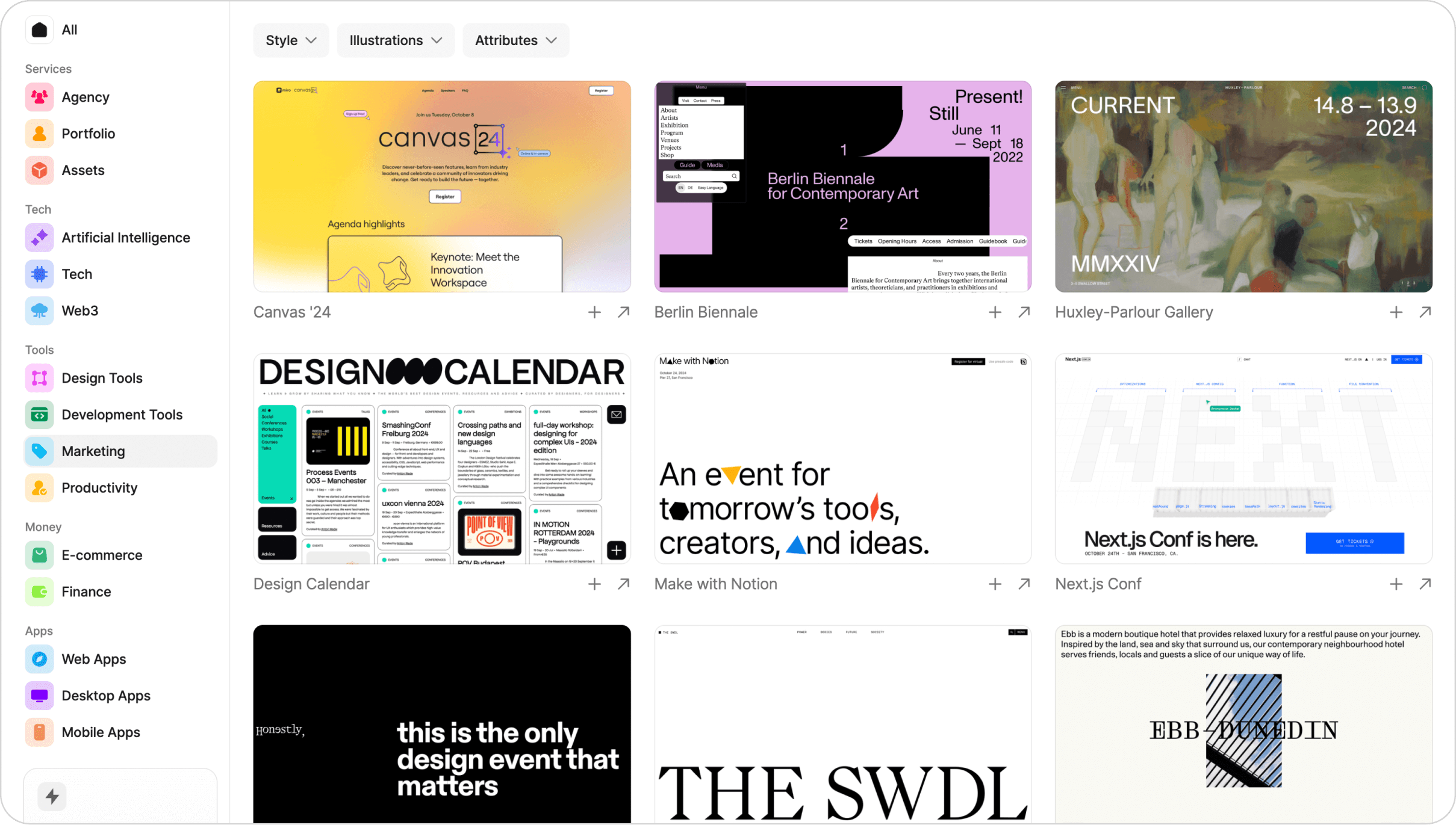
Сurated selections of mobile and web applications, websites, and designs.
Alexander: Besides just finding a reference and copying an entire site or part of it, there’s a better way to use these resources: that is, to understand how your design fits into the broader landscape and how it resonates with your target audience. If you’re designing a website for a theater, you can explore other theater websites and similar sites aimed at your audience. Informed by this, your design will communicate what type of theater it is and what sets it apart, without directly copying visual examples. Do you want to present it as a classic theater? Or as something more experimental and nontraditional? Something more geared toward adults, or a younger audience? You only gain this understanding through experience. It can be honed through unsorted examples or, more effectively, through sorted ones—and for the latter, sites like this are incredibly useful because they have categories.
Special mention: Instagram
Although Instagram isn’t a specialized creativity app, every designer we surveyed mentioned it. It’s always easily accessible, and with a well-curated feed, it can be a great source of inspiration—if not for creativity, then certainly for ideas. However, if you’ve ever tried setting up digital wellbeing filters on your phone, you’re probably already familiar with its downsides. Remember to consume in moderation.