Designing reports people want to read: Interview with Anjori Tandon
The Community Choice winner at Websites of the Year 2025 shares how the sustainability narrative shapes the design.
The third (and last) in a series of interviews with the Websites of the Year 2025 winners features the Community Choice winner Anjori Tandon, who created an engaging, expressive website for a dense impact report full of text and numbers.
In this interview, Anjori shares the design choices she used, how the sustainability narrative shaped the design, and what inspired her work on the report.

Anjori Tandon is an interdisciplinary graphic designer crafting detail-driven design across digital, print, and retail. She’s currently based in Amsterdam; previously she lived in Helsinki, where she completed her master's, and she's originally from India.
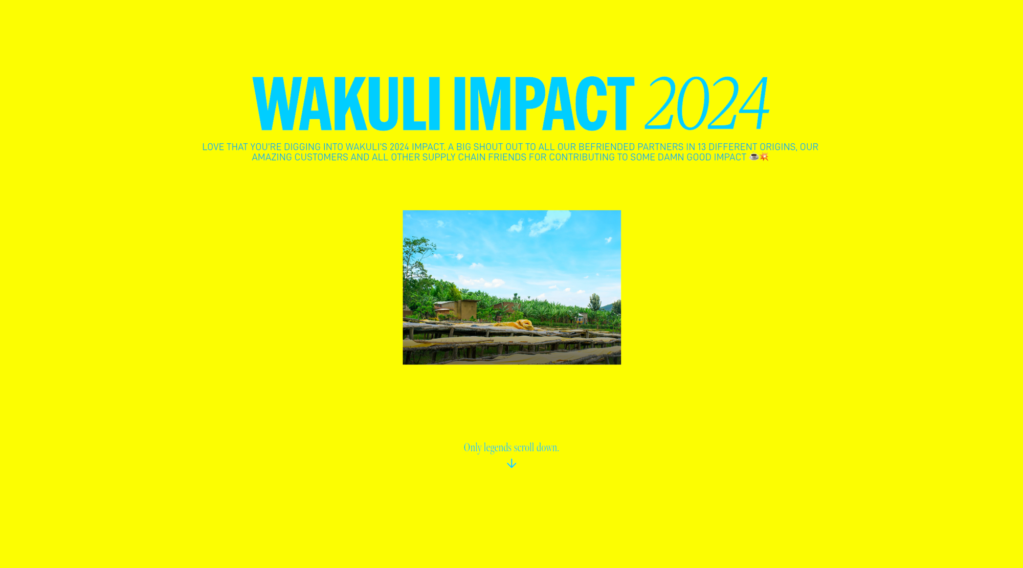
Visual language of sustainability
Wakuli is a Dutch specialty coffee company. It’s sustainable and transparent—and also very loud and proud about it. It’s our core mission and reason for being. In design, this translated into big, bold type, a strong and diverse colour palette inspired by Wakuli’s origin countries, and wide images that take up space and show the origins in their raw beauty. We also chose to show farmers in proud portraits, since they’re our partners, not just people working hard on farms—which is what many coffee brands show. The motion is clean, engaging, and not afraid to be in your face.
The project team primarily included our creative director, Daan van der Sluijs, our sourcing and impact manager, Meine van der Graaf, and me as the graphic designer. Meine collected and provided all the content for the report, as he works closely with all of our origin countries where we source coffee. Daan gave the final heads-up on all things design and tone of voice.
Impact report was the first project I worked on after joining Wakuli, so Daan helped ensure it still felt “Wakuli” through his feedback. He also gave me incredible creative freedom to shape the report as I envisioned and take design liberties. I developed the design system, layouts, animations, typography, and image selection—eventually the whole website—end to end, from ideation to execution.
Making reports fun
I tried to make the report as engaging and fun as possible for customers or others seeing or reading it for the first time. I did this through playful animations, interactive elements, and the long scrollytelling format of the website.
For the industry-specific terminology, I came up with pulsating pop-ups that are open by default but can be closed if you want. This way, these bits of information aren’t hidden away in a glossary or index but can be accessed directly while moving through the report.
I’m also pretty happy with “The Regenerative Process” section and how it translated to the website. Initially, it was a ladder-style infographic that was a bit hard to grasp all at once. But on the website, with the lines and the moving ball guiding your eye, it became much more digestible.
The “Last five years” chapter took me the most time to figure out in terms of functionality. The challenging part was working out the technical side—the timing of the fade and movement of the “Year,” and how to keep the “20__” in sight while the “__19” and so on became visible, all while scrolling through that section of text. The breakthrough came from figuring out the right timing and opacity values. Once I got the first transition right, the others came much easier. The animation of the images was kind of a happy accident that I ended up liking, so I kept it.
Speaking of references, I was super inspired by the Driftime® Impact Report 2024. I got the chance to speak alongside its creator, Abb-D Taiyo, in a Readymag webinar, which was very cool. I also really love the Rwanda website by Artem Militonian and Project Reset by Far Features Ltd. I was basically living on the Readymag examples page while making the report, so there’s that.
I had a lot of fun using Readymag’s animation and interactivity features, which helped turn what could have been a long, boring report into something fun to scroll through. Even if you go all the way through it, there’s always a new little element for the viewer to come across.
Working with Readymag
I had never worked with Readymag before this project. The choice of tool happened quite naturally, as the previous year’s report had already been designed in Readymag by Wakuli’s former graphic designer and we had the subscription.
On my train rides to work I watched tutorials, and at work I experimented with it. All in all, it’s very easy to use—the interface is super designer-friendly and full of fun features to try. I couldn’t hold back my excitement to experiment with as many of them as possible.
All the animation features proved extremely useful, especially the ability to trigger them on hover, drag, load, scroll, or click. The presets are amazing too. They sped up my workflow a lot, since I could easily replicate interactions and animations across pages.
Winning the award
It’s my first design award, so it feels super special. I was partly motivated to make this website amazing because I really wanted it to be featured on the Readymag examples page. I definitely didn’t imagine it would also win an award.
If I had to guess why the report resonated so strongly with people, it’s probably because it’s fun and engaging to read through, with little bursts of interaction that keep it fresh until the end.