Language games: Andrea Trabucco-Campos on amplifying cultural narratives in creative projects
Andrea Trabucco-Campos, a Pentagram partner, speaks on cultural contexts and their significance in personal design practice.
Andrea Trabucco-Campos is a graphic and type designer with Italian-Colombian roots who spent his formative years across countries, languages, and cultures. Now, he crafts impactful visual identities through typography, research, and cultural interactions. He’s collaborated with Apple, PayPal, The New York Times, and other major market players, helping them bridge cultural boundaries and align brand messages with cultural narratives.
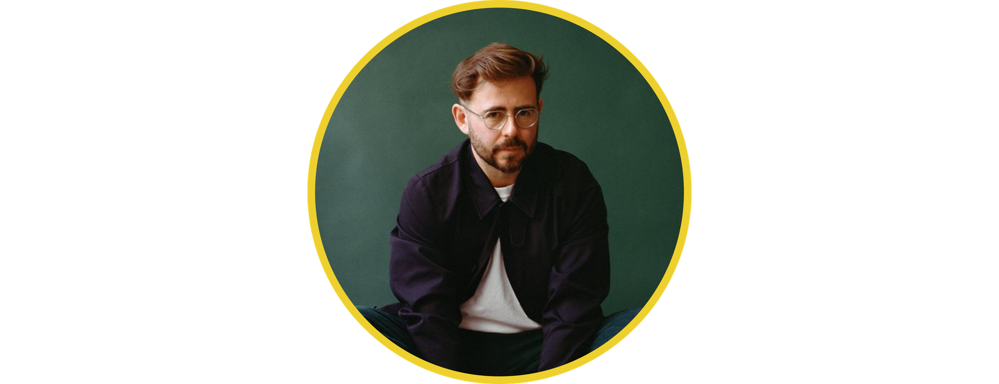
We spoke with Andrea Trabucco-Campos about how cultural contexts enhance personal design practice, why research allows eliminating contextual tensions in creative projects, and how design history helps evoke shared emotions through design.
Language as the determinator of identity
From an early age, I was aware of language: my grandfather read a lot of poetry, committed it to memory, and even practiced writing his own. I absorbed his language wit. But my linguistic sensitivity came not just from the poetic side of my family, but also from the fact that I had to speak two languages at home: Spanish with my Colombian mother and Italian with my Italian dad.
Because I had to speak different languages, I grew up with this somewhat split identity. When I went to Colombia, I wasn’t a Colombian kid—I was an Italian kid who was just partially Colombian. When I went to Italy, I was obviously Italian, but people would always stress that my mother came from Colombia, and I was partly Colombian too. In my late teens, I was struggling to understand who I was: was I 50% Colombian and 50% Italian, or 70% Italian and 30% Colombian? I shared my contemplations with my father, and he told me that those percentages didn’t make sense. “You’re 100% each: 100% Colombian and 100% Italian.” Now I feel like I’ve added another 100% of a New Yorker because I’ve been living here for almost 17 years. That insight from my dad helped me see that identity isn’t something with a fixed quantity. We now understand gender or sexual orientation as something that’s not binary, and identity is the same to me. You can have many identities within yourself, and you can have a greater sense of identity that fluctuates across different things.
I always found it very interesting that my personality in Colombia is different than my personality in Italy and also different from my personality in English-speaking countries. A great philosopher, Ludwig Wittgenstein, introduced the concept of language games, and it’s something I think about continuously. Language games are the way we speak to each other—there’s a contextual thing happening in every communication. A dialogue is a manifestation of both parties, and it defines both their communal space and every single person as an individual. When I speak to my team or get on the phone with my family, I always play different language games, and those language scenarios, in turn, shape the person I am.
I found that my bilingual experience influenced the way I design. The way I speak changes depending on where I’m speaking and who I’m speaking to. In design, it’s the same.
One of the most important questions you can ask yourself as a designer is: Who am I speaking to? Who is receiving my message?
Culture is made up of subcultures and subgroups, and that may be the biggest lesson that I learned growing up across cultures. As a designer, you need to be very mindful of all the sub-conversations and specific cues that are inhabited at every single end of the world—you can’t just walk into a room and assume that people will listen to you just because you have an opinion.
My immediate instinct in any room is to be quiet. I walk in, and I listen.
And then, at a certain point, when I’ve built up enough confidence to understand what’s going on, I map the context in my mind and speak. I took on this behavior from a very early age because I entered new contexts all the time. I was staying in Bogota and the Andes with my family and then was going back to Italy to spend time with my Roman family, and then we would go to Tuscany together—every single time, I couldn’t just peek, I had to listen. And the better you get at listening, the better you get at communicating.
Designer as a responsible translator
My work is continuously about trying to get better at identifying core elemental pieces and translating them into visuals. Not all translations are the same. A poem can be translated exceptionally well, or it can simply be translated but fail to deliver the beauty of the original language. There’s one more analogy: you’re given descriptions on a wine list, and they may come in many different ways. If you don’t know how those words translate into taste, that’s on you. The same is true for the sommelier: if you say you don’t like sweet wine, the sommelier has to be able to translate that into a taste profile and suggest the right wine. It’s all in communication, and design is also about that. You have to constantly ask yourself if you’re using words that are precise enough and know the meaning of those words in visual form. You might have great concepts, but you need to translate them in beautiful ways that are culturally relevant and powerful and will also stand the test of time.
Design isn’t a “boom” in a moment—it needs to be constructed in ways in which it can do more.
Designer Massimo Vignelli used to speak about the great responsibility we have at our job: in Vignelli’s view, we must communicate clearly and serve society by creating work that improves people’s experiences and interactions with their environment. That idea relates to modernism, which was mostly about improving the world by making people happier and their lives easier. But we now understand that the modernist program was flattening everything so that there’s an average for everyone, which isn’t the greatest way today. We now see that diversity and celebration of differences are the real important thing, and it’s also crucial to have multiple voices. I preach that in my practice. I feel comfortable in having something super loud or something super quiet, or something that can modulate its own voice as it enters new discussions, but I think as designers, we have the responsibility to honor, respect, and amplify the things that are true to any given brand, organization, people, person.
Research as the basis for understanding culture
To me, the main way to make sure there are no collisions between a brand’s vision and the audience’s cultural sensitivities is research. It’s the equivalent of listening: if you’re in a room with someone, you can listen to them, get to the essence of things, and see the core challenges they may be facing.
Research comes in when you can’t speak in person. You can’t talk to culture. You have to speak with people to track, map, and understand it.
I was working on the Rhode Island School of Design (RISD) custom type and brand identity as the creative director and had another strategist by my side. We both embarked on researching the entire organization, and we had over 110 Zoom interviews with hundreds of people. Then we did surveys with over 450 respondents from the school and created online research from all the information. Actually, I’ve laid it out with Readymag. If you research, you have great conversations, and those conversations lead to insights, and if you’re diligent enough about mapping the insights, you’ll understand what you’re ultimately building. You’re not building a research report, but an identity or a new visual expression for someone else. And I think that’s maybe the biggest difference between people who practice just strategy and, for instance, Pentagram, where we practice design. I’m very focused on design, but that doesn’t mean I’m not focused on strategy. I keep focusing on it as something that serves as a jumping-off point into the design.
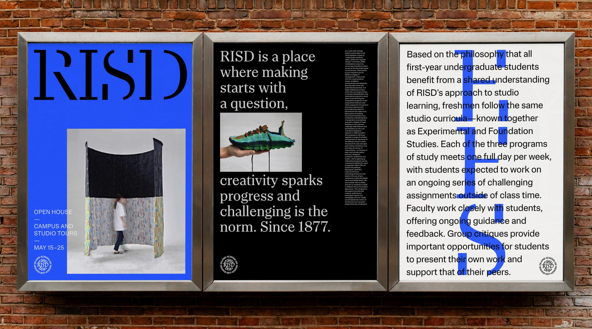
To me, building worlds for brands is the most interesting thing profession-wise, and to do that properly, I need to be solidly grounded in the realities of someone else. I think that in the RISD project, research led us to understand that people there don’t believe in design solving problems or shaping people. Students go there just to be immersed in design and art, and to learn how to experiment and to question. Once we heard these reasons over and over in different conversations, that became sort of a highlight, and it led us to a visual interpretation and a foundation for the language that they use today and will continue to use for many years.
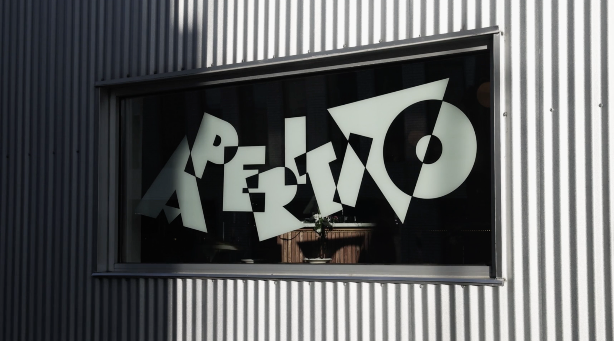
I believe we can learn new contexts through research. I’m doing an identity for a Thai restaurant at the moment, and I don’t speak Thai—nobody from my team actually speaks Thai. However, this is not an obstacle to tackling the project.
The trouble comes not from the lack of initial knowledge, but when you start making assumptions from very small pools of data.
In the context of Thai, if I see a couple of typefaces from Thailand and start assuming that all of them look similar, that’s bad research. First thing, we in the team intake as much visual culture in Thailand over the past 40 years as we can. If you’re researching well, you’ll get insights from that research, and then you need to check whether they’re right. At this point, you should have a conversation with someone from that culture to check. I don’t think you need anybody from the culture during the research phase: you can take in as much as possible yourself. But then, as you’re starting to do output, you do need to ask someone about the colors, for instance, or the numbers. In Chinese culture, like in many other cultures, certain numbers and colors have a bad connotation or a good connotation. We don’t run a research studio, but there’s a period of time in which we’re learning a lot: sometimes, we go to Thai restaurants, the Thai library, or museums and look at actual stuff. We’ve also recently acquired a bunch of books on Thai visual culture and the history of Thailand. I believe the more you go into something, the more the puzzle assembles.
Design history as a lever to activate cultural stories
When I do work for a client, I don’t present many variations. One thing we know about human nature is that people who have many options will struggle with the decision. And if we make it hard for the client to make that choice, we won’t have a great result. I end up doing two to three directions at most, and they all come with a full view of what that position entails so the decision-makers can see the connection with the core concepts.
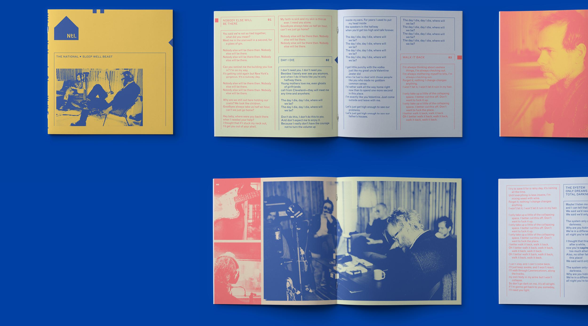
My work isn’t about figuring out whether my clients like Nike’s latest campaign or the cover of some album. I may gather those impressions, but that’s not what the conversation should be. It should be based around questions on how daring or trustworthy the brand wants to feel, how much it’s willing to push the boundary of experimentation through the visual form, and how soft or straightforward it wants the design to be.
If you can’t figure out the clear connection between business goals, strategy, and design, then you’re the one who’s missing something, not the client.
A musician may not know what the cover of their album should be—they just know the vibe and the attitude of their music. The burden of finding the visual representation of this vibe is on the designer, not the client. And if you fail at finding the connection, you should be asking yourself what you haven’t done to really immerse yourself in there. If you’ve listened closely enough, you’ll see that it all comes back to the language games.
To me, knowing the history of design is the tool to find the right match. The more you’re aware of where things have been, and the more you’re aware that there are different contexts and the words don’t mean the same, the more you start getting comfortable with the fact that you can connect those contexts. You can’t predict how your design will work, but to a certain degree, you can activate things that are alive in a context.
In Latin America, there’s a certain use of Helvetica. It’s very different from New York to Italy to Columbia, as it has trained cultural values, and that has to do with the ways it was used throughout history. You may notice that in the United States, Helvetica was heavily used throughout signage, but in Colombia, it was never used that way, but in certain contexts that were different at a cultural level. So knowing the history, you can use type as a tool to activate those stories. It’s all about understanding where the element appeared in time and what it means to reuse it. And if you know that, then you get good cultural resonance and emotion. We’re in the middle of a long line of language being passed down from generation to generation and visual forms being passed down the same way.
We’re not coming up with these things from nowhere. There’s a long-standing conversation with many, many people who came before us, and we’re only one more drop.