They shape the global visual landscape: Exploring the impact of up-and-coming female type designers
Readymag diggs into the context and ideas behind “Advertising Type: Women in Digital Design” exhibition.
The exhibit “Advertising Type: Women in Digital Design” runs from April 27—Nov 5, 2023, in New York City, giving the limelight to 15 female designers who are expanding the world of experimental type design. Created in partnership between Poster House, Ksenya Samarskaya (formerly from Type Directors Club) and Amber Weaver of You Creative Media, the showcase aims to increase the visibility of designing women and promote further diversity and inclusion across the industry.
We at Readymag were interested in digging into the context and ideas behind the exhibition. Below, the curators and several of the featured designers share how the showcase came to be.
Defying the status quo
The design field, like many others, faces significant gender imbalance, with various pervasive factors that contribute to the exclusionary status of women. In the early twentieth century, art schools in Europe and North America shifted their focus toward training a professional class of designers; however, traditional gender roles meant that women were sidelined, as they were considered less suitable for creative leadership. “By default, the design and creative field has long been dominated by white men. Culturally, our default is to assume a male artist or a male hand in something,” explains Angelina Lippert, Chief Curator and Director of Content of Poster House.
Historically, the craft of producing fonts was passed down as a family business. Type design was a highly specialized field accessible only to a select few with extensive knowledge of traditional techniques and equipment. In the early and mid-twentieth century, women were present in the type design trade, but their contributions were largely overlooked. They were often assigned tasks that required physical labor, such as cleaning and organizing, rather than strategic thinking roles. This gendered distribution of responsibilities further perpetuated the invisibility of women within the field. Amber Weaver, founder and designer behind You Creative Media, who participated in devising the concept of the exhibition, explains: “In the past, there have been some really amazing female designers who worked on the production of fonts along with men, but their work was not credited, and it sunk down in history. This fact actually inspired this exhibition.”
Things began changing in the second half of the ‘80s: with the introduction of digital tools and software, designers had the chance to create typefaces on computers, eliminating the need for costly materials and equipment, and with it, the hierarchy of the traditional office. The advancement of technology allowed a wider range of people to experiment with typefaces, which gave rise to a vibrant and wild era in type design. Working together, Amber Weaver, Ksenya Samarskaya, and Angelina Lippert set out to investigate how women and nonbinary designers continue to push the edges of type design in the present.
Céline Hurka—Dark Academia
Céline Hurka grew up in Southern Germany, studied graphic design at the Royal Academy of Art in The Hague, and now lives in the Netherlands. She mostly does freelance projects in the cultural field, where she plays a lot with fiction, emotion and atmosphere.
“Almost all of my work is developed in a completely autonomous environment. In 2021, I was fortunate to receive a grant that would cover my work for a year. Soon after, my roommate got COVID, so I decided to stay at a friend’s place with only my iPad. Out of boredom, I started a new typeface. For about 4 months, I spent hours digitally sketching and digitizing glyphs. This is how Dark Academia—a display monospace font that includes 26 letters and a bat—appeared. It took me 24 hours per letter to draw it. The typeface weaves together many personal and imaginary stories: it’s inspired by things like misty afternoons by the sea, lonely nighttime walks, unbearable yearning and limerence, by feeling melancholic and still having to work, and by losing myself in love and imagination. I imagined desolate places in pouring rain, and the whispers of a last goodbye in an alternate reality, like a dream.
Dark Academia is available for free on DaFont. Hence, I’ve seen it in lots of projects so far. For instance, last year’s graduation show at the Royal Academy of Art in The Hague featured huge vinyl lettering designed by Yana Abrasheva as part of the exhibition piece by artist Todor Rabadzhiyski. He didn't know it was my typeface, even though we vaguely knew each other.”
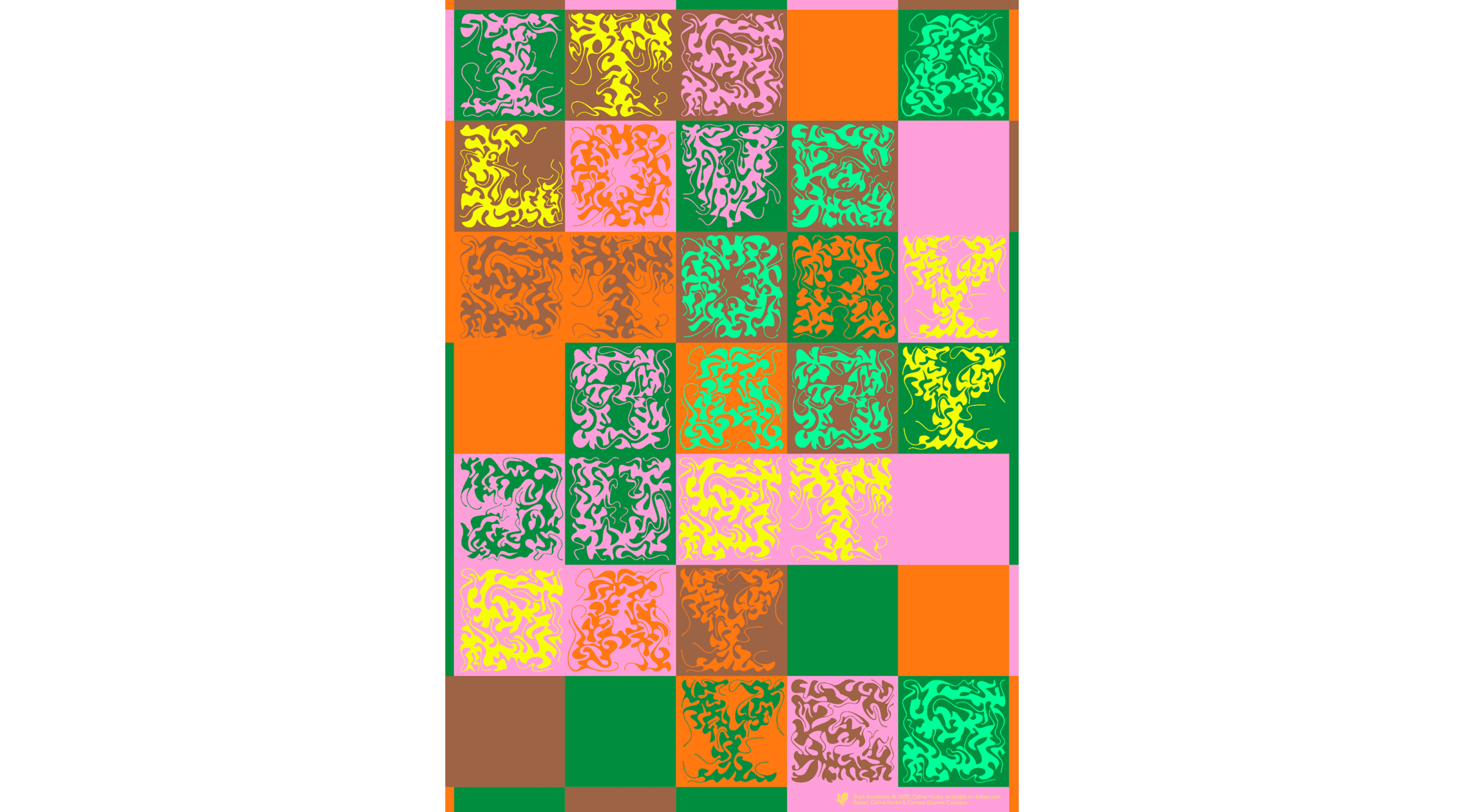
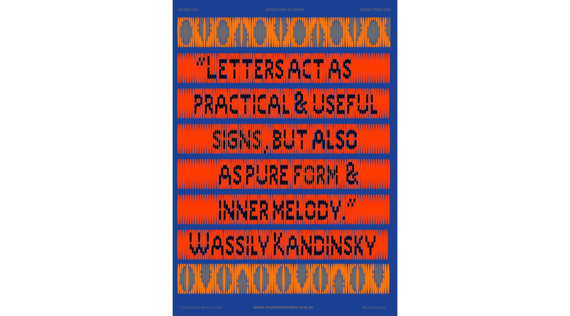
Muk Monsalve—Elmira
Muk is Mariela Monsalve—a graphic and type designer from Argentina. She teaches at the University of Buenos Aires and in the National University of Arts. Muk loves materials and experimentation, which is why, in addition to creating typefaces, she also makes huge letter installations as a part of the duo-collective Defrenéticas.
“I designed Elmira as my master’s graduation project. It started as an exploration on how an industrial power loom works and how it affects the letters found on clothing tags. I got inspired by the ‘Arazzi’ (tapestry) series by Italian conceptual artist Alighiero Boetti: after seeing it, I started to think about thread, grids, and letters made of textiles and textiles made with letters. Another thing that interested me was the transformation. When a tag is woven, the original letters are translated from digital to analogue. This is how Elmira became a sans family consisting of grotesque and “woven” styles, featuring horizontal and vertical weaves. The reverse of the Woven tags or Hang Tags have a lot of graphic value too, which is why they’re also featured as display cuts in the family.”
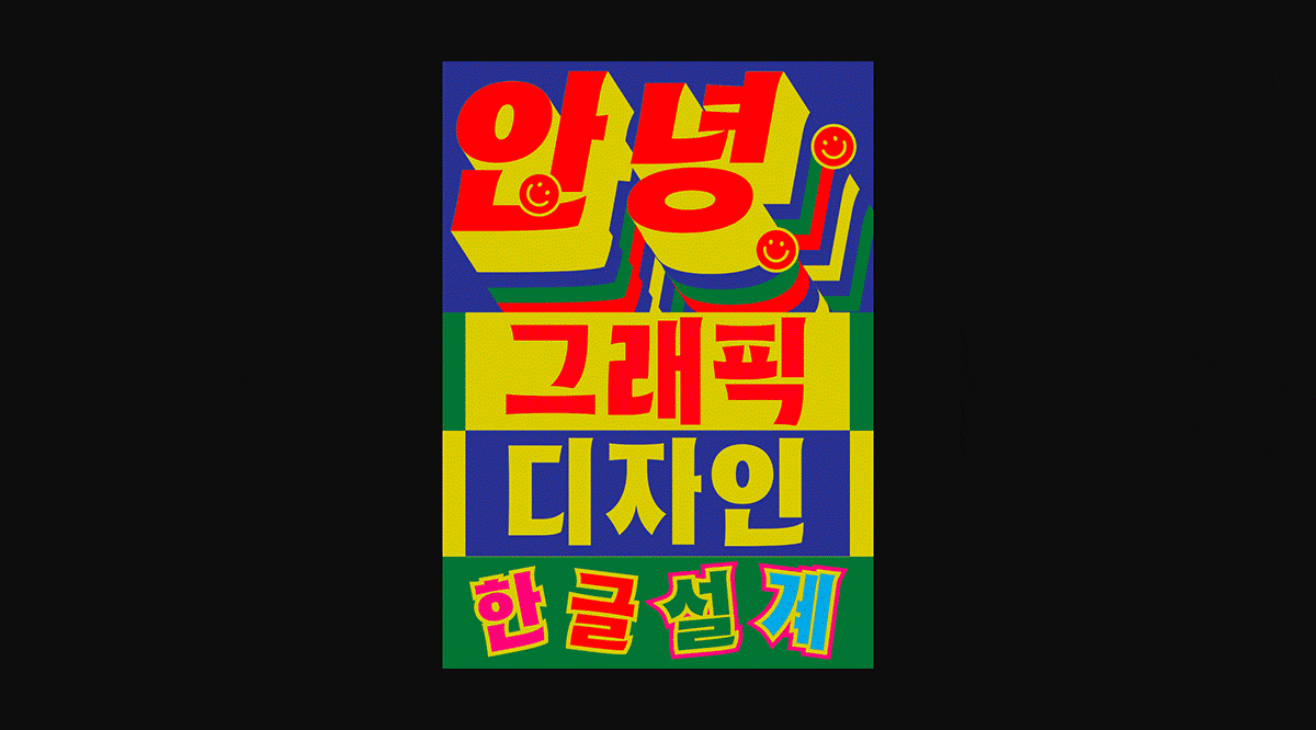
Tra Giang Nguyen—Hako Hangul
Gydient (the digital pseudonym of Tra Giang) is a future-forward creative designer & strategic thinker based in Vietnam and Germany, who draws inspiration in Bauhaus and has multidisciplinary experience in digital brand design, kinetic typography, type design, as well as AI & web3.
“I designed Hako Hangul with an intention to create a beautiful Korean typeface that would express the idea of bustling city life in Seoul. The name Hako comes from the combination of the first syllables of the words Hangul (the writing system in Korea) and Korea. I’ve been working on it for two months and am still exploring the new world of Hangul script.

Right now, I'm mostly seeing Hako Hangul being applied in kinetic design animations posted on social media and also in food advertising.”
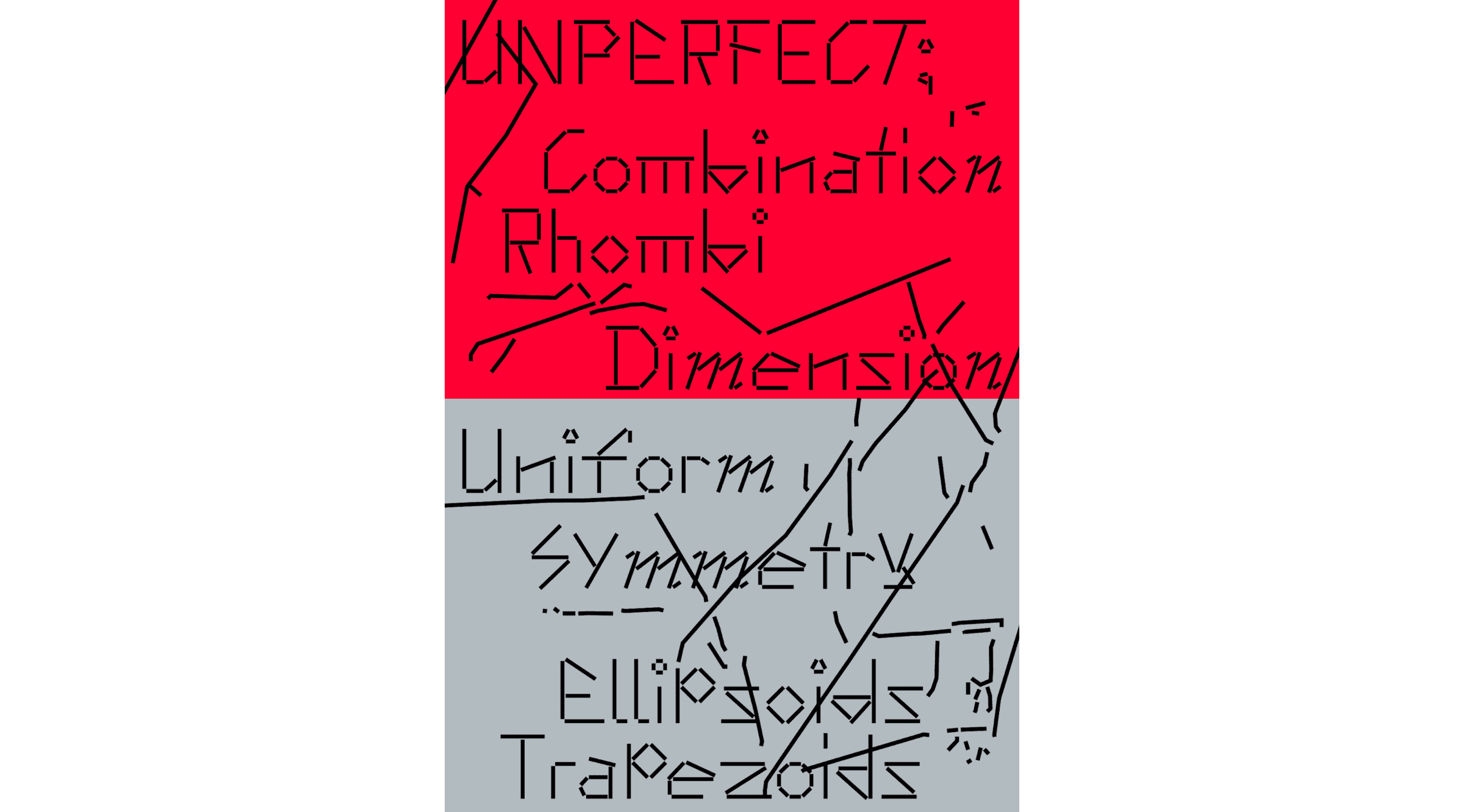
Sun Young Oh—Anthony
Sun Young Oh is an independent graphic designer from South Korea. Her focus lies in building and experimenting with new tools to create humor and play through design. She often applies random combinatorics through a self-generated system to produce unexpected visual results.
“I studied fine art before graphic design, and that has greatly influenced me: I tend to explore the boundary between them. This interest originated in 2016 as part of my self-initiated project in the university called Dialogue of 9 Artists: I took artwork from Anthony Caro, Bernard Frize, Erwin Wurm, Henri Matisse, Julie Mehretu, Marcel Duchamp, Rachel Whiteread, and Robert Mangold und Uta Barth and transformed them into typefaces.
Anthony reflects the visual impression of sculptures by British abstract sculptor Anthony Caro. His works are primarily composed of straight poles and flat panels that lean against each other. When designing the typeface, I approached the letters as abstract shapes, going beyond their conventional forms. To create the typeface, I used straight lines with the same stroke size, ensuring they didn't overlap. Additionally, I took into consideration the concept of gravity to handle each letter as a physical object. The font also includes a function where multiple styles are applied randomly. Straight mono lines make it easily modifiable, allowing for customization and adaptability to different design needs. So it's particularly well suited for projects with a playful concept where you want to inject some artistic and experimental vibes. I've actually seen Anthony in dynamic branding projects and posters with atypical or informal structures.”
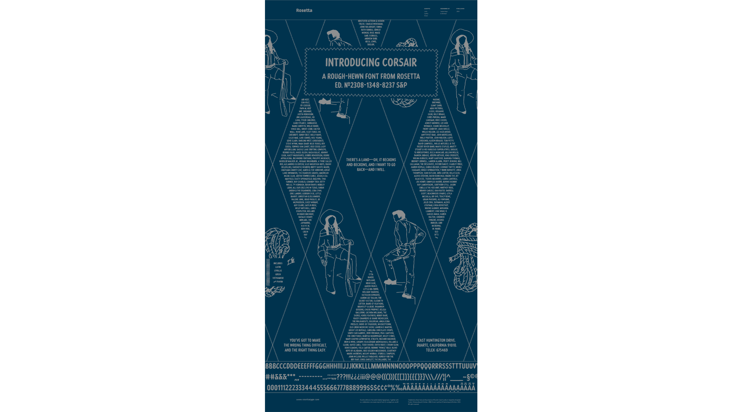
Ksenya Samarskaya — Corsair
Ksenya Samarskaya is a strategist and creative practitioner who, among other initiatives, runs an international multi-script foundry focused on custom type creation and research. Raised between Russia and the Pacific Northwest of the United States, Samarskaya is fascinated with the cultural nuance inherent in all aspects of our surroundings.
“Corsair corroborates the notion that something based on a simple, rough design can be elegant and evocative, and can look handwritten and also measured. Its practical design means it can be put to use in a number of environments, from a cafe menu to a mass-produced campaign, its slow, hand-made appeal translating with ease.
Corsair was commissioned by Best Made Co. based on a collection of leaflets intended to help discern WWII fighter aircraft, and was made to be used among their brand language of stylish outdoor gear. The feel of the typeface matches the ruggedness of the landscape it was drawn to live in. The look is that of a marker pressing in as it moves along coarse paper, the handwriting shaky, yet deliberate. The humble, unflagging font is a natural fit for blocks of tight copy, whether for album liner notes in Nashville, end credits on Red Westerns, or the pages of Japanese Americana magazines.”
Celebrating diversity
“The future is dictated by the stories that we tell today: what we collect, and what we showcase. For every exhibition or article about He!!vet*ca, there are numerous impassioned, brazen, designs giving different opinions and points of view. Those stories are wildly important to tell. For new designers coming into the industry, for historians, and for those discussing design in the boardroom, it’s important to see what dialogues and avenues are open to them, and what they’re able to build upon,” emphasizes Samarskaya.
“Today, there’s an unprecedented proliferation of type. The community, and the creations, are more vibrant and global than ever before—yet it still feels like we’re in the nascent stages of the industry, with more scripts and voices continuously entering the conversation. In the design discourse and communities I was exposed to, the ‘90s were about breaking norms; it was a grunge aesthetic that contained a lot of rebellion. The ‘20s feels much more about building. There’s a level of detail and optimism among the works, and a lot of emphasis on unearthing an individual point of view,” she sums up.