11 Questions with Claudio Guglieri
Claudio Guglieri is a design director at Microsoft Groove and Movies & TVdepartment and former Creative Director at Elephant, an agency serving exclusively Apple.

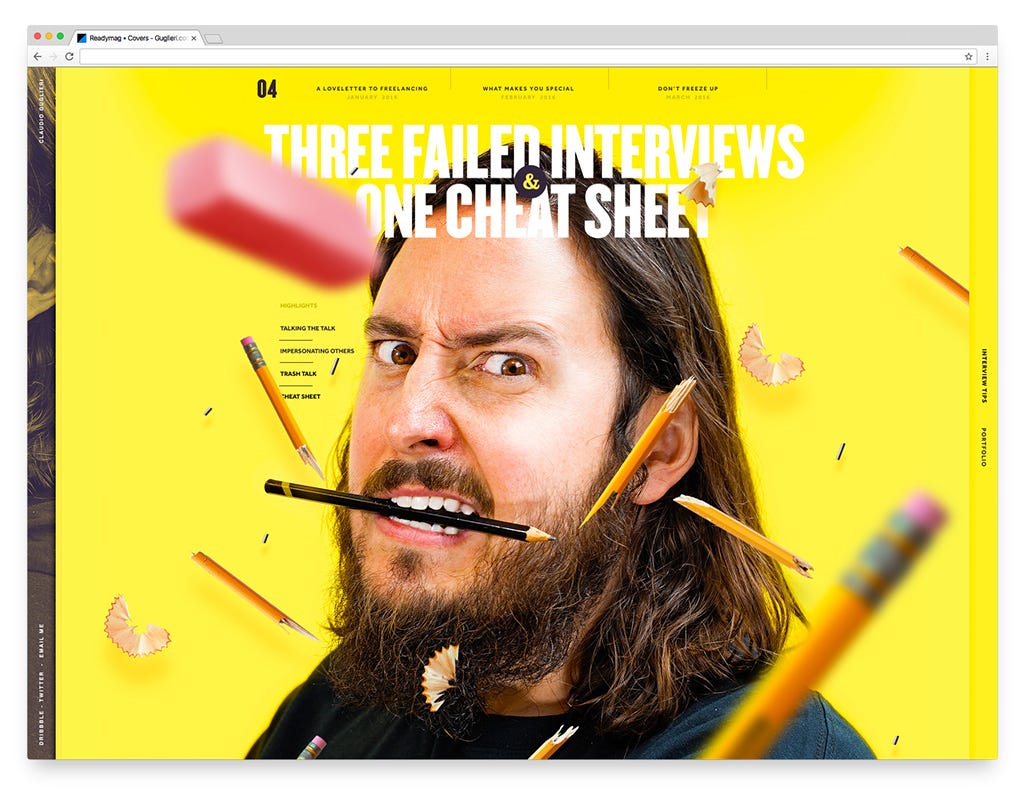
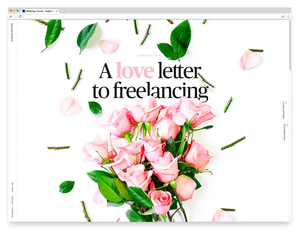
Claudio Guglieri is a design director at Microsoft Groove and Movies & TV department and former Creative Director at Elephant, an agency serving exclusively Apple. In his Readymag-based portfolio Claudio goes far beyond design and not only shows off his best projects but acts both as a journalist and a visionary.
How has design changed over the last 5–10 years?
I recently gave some talks regarding the crossing paths of Sci-Fi movies and interactive design. In general, Sci-Fi movies were an important source of inspiration at the very beginning of the internet and that influence has gone back and forth. In 2010 the skeuomorphic trend was on the peak in digital design. Even non-designers can recall old Apple products that had all these leather textures and stitches. I remember some great examples of it coming from Russia — SFCD, the agency previously known as SoftFacade, for example, was doing extremely detailed skeuomorphic interfaces and iconography. Back then ‘familiarity’ was a key factor, therefore the focus was on creating digital interfaces that would somehow resemble real world objects.
‘Familiarity’ eventually went too far and became aesthetically gimmicky. The initial reactions to it fully opposed the trend and looked elsewhere for inspiration. Metro Design from Microsoft is the best example of it, it looked at print design for inspiration.
What’s your vision of contemporary web design? Why is it like this?
After the whole ripple effect and the initial excitement around “flat design” we got to where we are now, the next logical step. Designers asked themselves — what if we combine the best of print design, augmented in the digital world with what makes the real world familiar beyond aesthetics? That’s when design started looking at the physical properties of objects and when animation gets fully in and becomes a vital part of the creation process. Physical properties like weight, speed and elevation are now everywhere in digital design. Now “familiarity” is conveyed to users through properties and behaviours instead of aesthetics or look and feel.

Which artists/schools/tendencies influence present-day design? What will be a source of inspiration tomorrow?
In the early beginning of my design career I did marketing sites and promotions for random products and video games. These projects called for a more artistic approach and the sources of inspiration were really out there, it was a bit of a free for all.
Well, I don’t work on marketing sites anymore. My job now is about figuring out customer problems and empowering users to do certain things. That’s a higher level of design, it’s systematically closer to engineering and demands deep knowledge of human psychology rather than sophisticated artistry. Because of the lack of ornamentation in UX design I would say a constant inspiration for this branch of design will always be the Bauhaus approach, or the Massimo Vignelli type of approach — it is visual and delightful but really well-structured and functional, just like a piece of architecture.
Which fonts do you use most frequently in your works? What were the most popular and in-demand fonts of 2016 in your view?
Because of where I work I quite often use the same font Segoe UI. Or sometimes it’s Schamalfette CP, a really powerful sans serif. When I was working with Apple it was all about Myriad and San Francisco and before that I always loved Publico. In my personal projects I’m pretty classy: for my Readymag-based portfolio I’ve been choosing Utopia and Nimbus. In my last post I’m exploring Bodoni and some others.
Proxima Nova was definitely the most used font in 2014 and in the past couple of years we’ve seen lots of similar fonts. Throughout the year I’ve been seeing lots of variations of Helvetica and bold grotesques yet I can’t say they capture the times we are living in. To be fair maybe that’s because my world has become much more product-driven, not necessarily reflected by the times we live in.
Name several of your favorite design instruments (programs, apps, whatever).
Due to my work I use Illustrator. I still use a lot of Photoshop, because I love to draw and do lots of photography. To make mobile apps and screens I use Sketch. And I also use Framer a lot, I don’t do motion design but I do lots of prototypes and different interactions. Framer is my favorite prototyping tool right now.
I’ve been trying Figma app recently, I like the premise of real time collaboration with other people, but I haven’t had an opportunity to use it yet.
How is Readymag helpful to you?
I do some coding myself, but it’s really scrappy, just like prototyping things. What I truly love about Readymag is its “what you see is what you get” approach. It takes the traditional two-step workflow of designing and coding and merges it into one. It’s almost like a graphic editor with enhanced capabilities for interactions and web design. Most of the time I start my work offline in Photoshop and Sketch and then I bring it to Readymag to finish it and add interactivity to it. It’s a half and half process.
Do you lack anything as a designer — instruments, fonts, technologies?
There are still big disconnections between design, motion and development. And Readymag is one of the tools, which strives to bridge this gap. I like that it makes web design a more fluent process. But I’d love to see prototyping tools like Framer somehow evolve into a framework or code base you could use in real apps.
Then regarding virtual reality, I myself have tested a bunch of headsets but there’s still a big entry barrier for getting into that world. I’d like to see more tools that bridge that gap.
What emerging digital trend are you most excited about right now?
Something I’m really excited about is how design is getting more and more platform agnostic. There are many dimensions to design depending on what discipline you use to look at it with. Design does not necessarily need the existence of a screen. Imagine everybody in the world is using some sort of mixed reality glasses, the world would be your canvas (pun intended), and that would be the end of the display biz. How will streets change as soon as we don’t need platforms to host those messages? I’m excited about a type of design that is contextual more than ever.
A couple of weeks ago I bought a Google Home assistant, it’s pretty much like Amazon Echo. At home we just talk to it, even my 3-year-old son does so. You could argue — is that design? It’s not visual, but it’s clearly helping me. As we move away from fun and crazy to being more functional, becoming more platform agnostic than visually driven seems like a natural step. I’m really excited about that.

What’s your outlook for the future of web and media? How will the human interaction with the web change? What role will design have in this process?
The internet as a single touchpoint is already gone. Now it’s all over you, it’s represented in different devices, depending on where you are and what you’re doing. For example, right now it’s my computer, but if I go for a run it might be my watch, and if I’m at home it might be that Google Home speaker. I think designers need to step up their design-thinking and understanding of the user to transcend the visual world and still remain relevant in the future. The more the Internet is embedding itself into our life, the less visual it gets.
From a literacy perspective I believe the future of media/technology will continue to lower the entry barrier required to become a user. My son doesn’t know how to speak properly yet, but he already understands what Google Home can do for him. He is used to see me talking to it now and he tries as well. He was born in an environment where talking to machines is natural (crazy). He says “Hi boo-boo” instead of “Hey Google” because he can’t pronounce it yet and after repeated attempts our Google Home now wakes up to his words, almost like it’s learning. “I’m sorry I don’t know how to help you with that” it says to him. It’s mind-blowing to me.
Is there something you’ve long wanted to ask Readymag?
How will Readymag change in two years? What’s your vision?
This is what Readymag CEO Diana Novichikhina says:
We will continue enhancing the capacity of R/m Editor. At the same time we strive to keep its interface simple and pleasant to use. We work hard to keep Readymag meeting the requirements of modern web. In addition to that, we are looking to add more integrations with third-party services. Within the next two years the range of projects that could be done with Readymag will rise substantially.