10 Questions with Anton Repponen
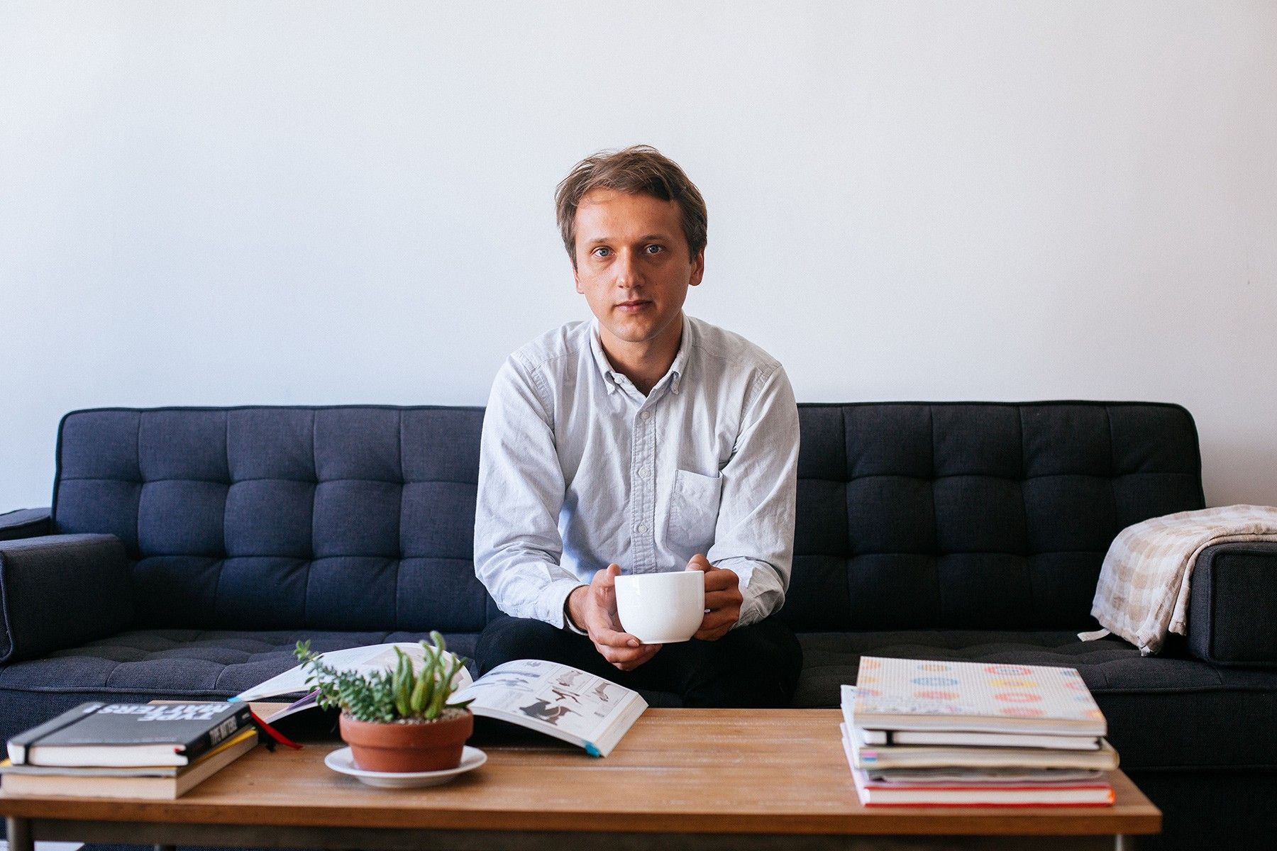
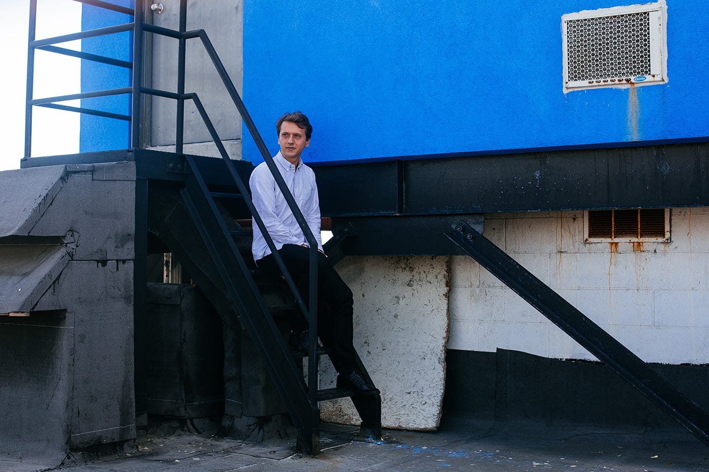
Anton Repponen is an interaction designer whose architectural, humanistic approach has earned him an estimable CV and clients such as Google, Sony, Nintendo and Balenciaga. He currently lives in New York and has set up his own studio with fellow designer Irene Pereyra.

Anton Repponen is an interaction designer whose architectural, humanistic approach has earned him an estimable CV and clients such as Google, Sony, Nintendo and Balenciaga. He currently lives in New York and has set up his own studio with fellow designer Irene Pereyra.
You’re originally from Tallinn. Tell us a bit about your creative path — how did you end up in New York and in digital design?
Yes, that’s correct. Actually I was born in St. Petersburg (Leningrad back then) but right after my birth my parents moved to Tallinn, Estonia, where I grew up and went to school.
After high school I went to study architecture, as I wanted to do something that is related to visual or design. And there I started getting into design and digital. I was mostly learning things online, consuming everything I could find. I think that influenced me a lot and nowadays I’m trying to share as much information about my process as possible.

I got my very first full-time job when I was 19 at a Finnish mobile entertainment company where I had to draw illustrations that people would download as their wallpaper backgrounds on cell phones (I actually wrote a whole story about that here). After that I worked for a very short time in a newly established company with my friends back in Tallinn, Estonia where I managed to collect a decent portfolio and put it online. Then when I was 22 I moved to Stockholm, Sweden to work for Fantasy Interactive. I spent two years over there before I got transferred to NYC where I reside now. After over eight years this October I left the company to start my own design firm here in NYC with an ex-colleague of mine. It’s going to be called “Anton & Irene” eponymously and I’m about to start working with our very first client.
Were there any significant events or influential people who helped you to realize yourself in a personal or professional way as a designer?
Definitely. I think one of the main influences for me at an early stage were my parents. They’re both fashion designers who’ve been working really hard their whole lives and I grew up surrounded by textiles, fabric patterns and sewing machines. Though it’s not directly related to what I do now, I think it’s something that’s influenced me. I even used to know how to make some clothes myself.
I’ve been treating my design work as architecture — as if I was creating a building where people will live for a very long time.
Another major influence for me was the architecture that I studied right after high-school. In general I look at my design work as an architect. For the past six to eight years I’ve been mainly involved with large scale projects that contain an enormous amount of content and that can last from six months to a year, so I’ve been treating my design work as architecture — as if I was creating a building where people will live for a very long time. It involves a lot of planning as there’s many things to consider: building a foundation that will support an entire project and its design, thinking about user behaviors and how they will interact with it, designing everything in modules allowing customization and coming up with new design languages that will allow project to grow and transform.

What’s design for you personally — science, art, or some synthesis of the two? And do you believe in design for design?
For the longest time I believed that design should serve specific purpose, like solving a problem, making things better and easier. But lately I’m not so sure about that. I still think that design is not exactly art, but somehow I see nothing wrong when design exists just for itself. You can walk in the park without any purpose and just enjoy it, there’s nothing wrong with that even if you could have spent that time in the park doing something more useful, like running, instead.
Again, designers should think when this is appropriate and when it’s not. For a long time I’ve been working on client projects completely excluding my personality from the work I did. I worked on the Google Chrome store, XBox, multiple newspapers in the US like USA Today, and there’s no place for “design for the sake of design” there. To kind of compensate my design needs I’ve been working on many personal experiments which I post regularly on my site, most of which do not have any purpose and don’t solve anything. But still, I can’t call it “art”. I like the term “design artifacts”.

Tell us a bit about your design process. How do you decide on the grid, fonts and composition?
I can write a whole book about that! The process, grid, typography, layout and composition I use come from years and years of experience and trying things out. I have a set of my own rules of what works and what doesn’t. When I work on a project I usually apply 50% of my own rules based on experience and leave 50% for experimentation, trying to do something I have done before in a new way, or figuring out things I haven’t yet tried.
In reality 40% of my design process consists of planning and thinking and the rest is actual execution. It came from my experience of being a Creative Director as I had to scope out and plan work for others, a procedure I now apply to my own work. I can spend a whole day just writing and spelling out of what needs to be done. In this way a structured method brings a lot of inspiration and helps to give ways to look at project holistically.
A lot of designers nowadays simplify things in a bad way. There are way too many designs that don’t have any emotion or personality.
The last “hot” topic for me about the design process that I talk about a lot with my colleagues with is an observation that a lot of designers nowadays simplify things in a bad way. There are way too many designs that don’t have any emotion or personality. You literally can take one design, swap the logo and it will work for something else. I always advocate bringing something unique into your work that will make your design perfect for one specific client or project.

Are you always able to explain your designs in words, or is it something you sometimes have to leave to your emotions?
I guess in the past years I’ve been able to explain all my designs, because technically that was part of my job. I had to be able to explain how things will look, feel and work exactly to our clients and designers even before they’re designed or visualized. I believe it’s quite an important skill for a designer in general. Any designer should not only be able to explain his or her design or idea, but to learn how to explain it in as fewer words as possible. Although to be honest, I have a really hard time explaining my emotions outside of work.
Photography seems to be your second passion. How did you get interested and what attracts you most in this matter? You always pay lots of attention to framing and processing images. Why is it so important to you?
It’s hard to say why. I am not a photographer really and everything I do on that front I taught myself just trying things out. In reality I take photos on a regular basis much more than I design. I got my first Zenit camera when I was around 14 and I’ve not stopped taking photos since. I also think framing and cropping images is just an extremely important part of photography regardless on what camera you shoot with and whether you retouch images or not. You just have to do it.
Retouching and editing photographs just fascinates me. I think this is the designer part of me doing this rather than the photographer. I am interested in technical part of it, in trying to figure out how I can enhance certain things in my pictures, trying to focus people’s attention to something unusual. I also think I am doing it to hide my insecurity or inability to take great shots as they are, so I have to work on them more in Photoshop.
Just this year I started to get into commercial photography and actually take client jobs. It’s been great so far, but I’m trying to be very careful and not overdo it. Photography is my personal “meditation” so I want to keep it to myself.

Continuing the topic of photography, you have published two excellent photo-stories on Readymag — let’s talk a little bit about them. How did you come up with the idea to create a New York Photo Guide?
I’ve long held the dream to work on a project that contains three things: traveling, photography, and maps. It could be anything really, but the best I could think of is a city guide. I’ve wanted to do a city guide for New York since I moved here six years ago and started taking photographs of the city. I’ve done a lot of different tests and experiments on the topic, and the NY Photo Guide I put together on Readymag platform is just one of them. It’s sort of an experiment on what bigger city guides can do. Often when I travel I look up photos online of the places I’m going. Sometimes I get curious where certain photos were taken, which lens was used, what time of the day it was etc. So the NY Photo Guide is a small test to help answer these queries. After it was published I had multiple people reaching out to me saying it actually helped them to walk around the city and take some great shots. So that made me a little happy.

Since this spring I’ve been fortunate enough to collaborate with some great people here and outside of New York to work on a full NYC guide that we’re developing and building right now. It’ll be a fully interactive city guide for everyone to use. The dream of making a proper city guide progresses in small steps, but that’s all I can say for now.
What’s a good photo story for you?
It has to be interesting and captivating and the rest will follow. If the story is boring; great photography, properly implemented interactivity and good copy will only do this much. So it should be about an interesting story or an interesting concept that people will find refreshing, exciting or learn something new from.
Interactive storytelling is a huge topic right now. What are you thoughts? How far should all this interactivity go?
I like the idea in general. I think that when a user interacts with the content there’s a higher chance that he or she will really understand it, find it exciting and learn something new, rather than when information is presented in a simple text and image manner. I don’t think it’s an approach that’s always correct for every story or article out there, and it should only be used when appropriate, but interactivity is a great tool when it’s done right.

Any ideas for your next photo story?
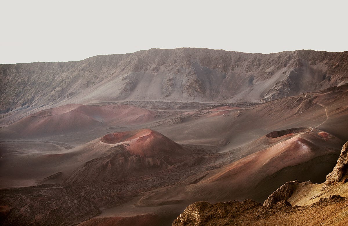
I have a lot of ideas, but very little time to work on them! Also most of my ideas are quite boring, so I’m waiting for a good one to pop up. I just got back from Maui Island, Hawaii which I’ve been to many times, so I’m thinking about doing a guide about that: magical landscapes, beaches, surf and where to hike etc.
Great! Thanks for the interview and good luck to you and Irene in your new endeavor.
Photos by Lia Bekyan