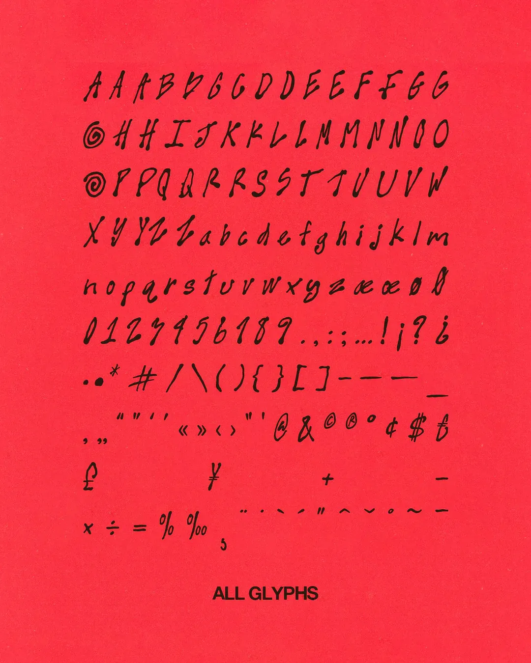
10 real, fun and flawed habits to design like humans
How to stay connected to the playful, imperfect, human side of creativity—especially when everything around you is pushing for speed, clarity, and perfection.
In a modern design world obsessed with speed, polish, and predictability, the quirks that make creative work feel alive are often the first to go. But perfection isn’t what people remember—meaning is. Drawing from her own process, designer and educator Helena from sainthelenastudio shares 10 playful, imperfect, deeply human habits that can help you keep personality at the heart of your work, even in an era of AI-driven sameness.
This text is based on a talk by sainthelenastudio, presented at the Readymag community meetup in Milan on June 26, 2025.
Growing aesthetic uniformity
Modernization has made everything smoother, more neutral, and more efficient, and with AI tools becoming increasingly dominant, this shift is accelerating. While these technologies bring speed and scalability, multiple studies and observations point to a growing aesthetic uniformity in digital design.
The trend impacts not only aesthetics, but emotional connection. Affective design theory emphasizes that emotionally engaging visuals are essential to creating memorable experiences–something often lost when personality is stripped away. But it’s personality—the detail, the care, the idea beneath the surface—that reminds us a human made this. People are starting to want that human touch again: they’re going back to film photography, vinyl, and handmade things, not because they’re better or more convenient, but because they feel more alive. The same shift is happening in design.
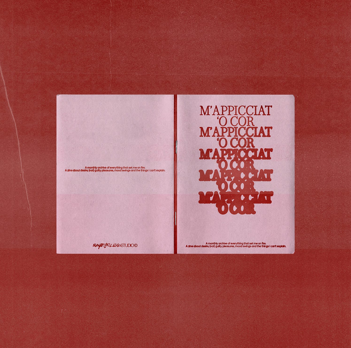
Choosing to design something that reflects real personality, even if it’s a little strange or unexpected, is a way of saying that this was made to mean something, and it reflects who I am. That’s exactly what I’m doing with m’appicciat ‘o cor (“you lit my heart on fire” in the Neapolitan dialect, a regional Italian language), a work-in-progress personal project blending a zine and a visual journal. So far, I’ve only created the cover, but the idea is to collect, each month, everything that sets my heart on fire.
Another example is my personal website, a forever work in progress. I haven’t updated my projects in a while, but I love that the “About me” section is a time capsule of when I designed it: sketches, an animated morphing video of my face, the TV show I was watching, the playlist I was listening to.
There’s no single formula for getting there, but there are habits and mindsets that can help keep creativity light, human, and full of character. Here are 10 of them.
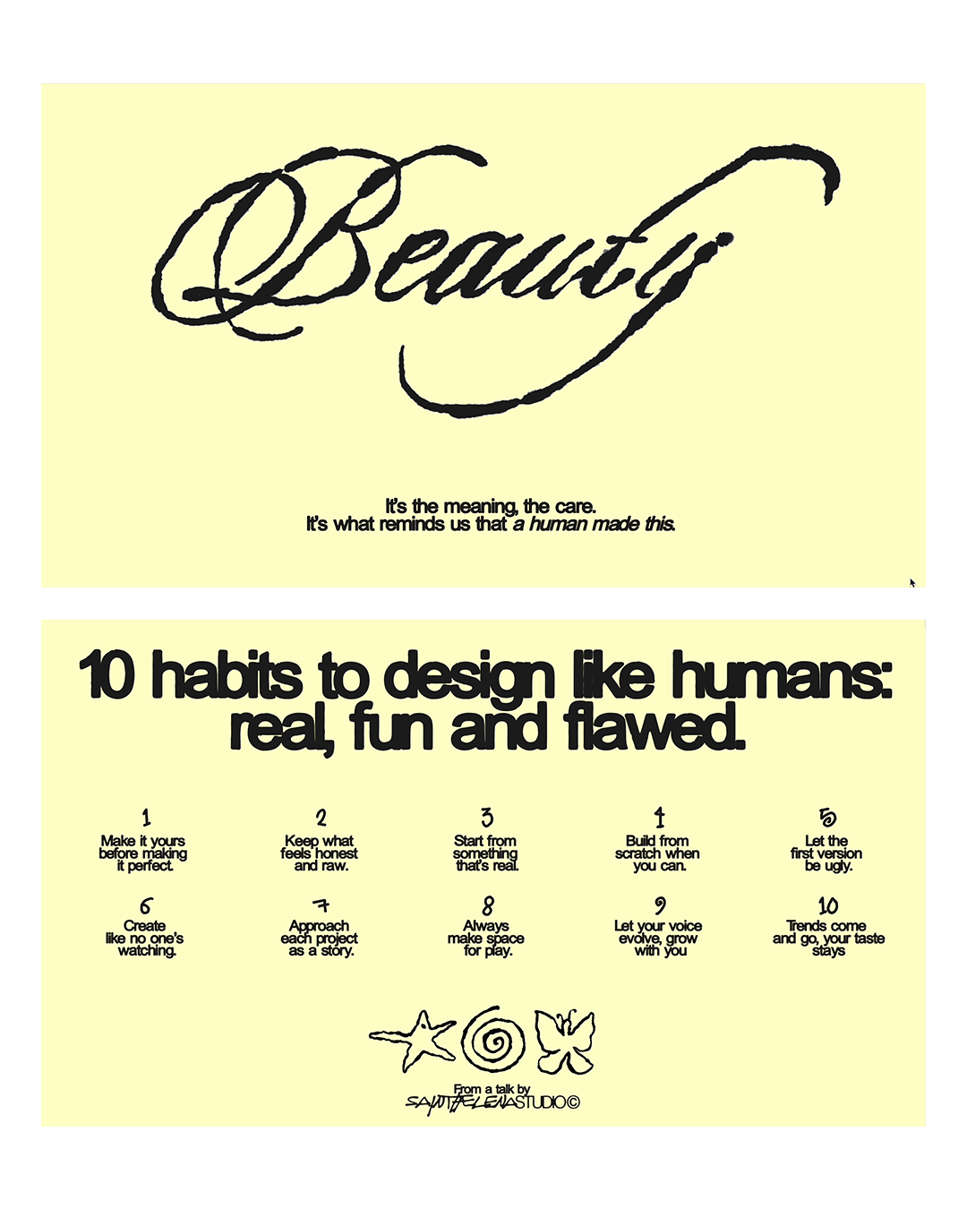
1. Make it yours before making it perfect
Even in client work, it’s worth keeping a piece of yourself in the process. Some of the most meaningful design moments often come from something playful, intuitive, or even accidental, and that’s usually what people connect with the most.
Officina Mágoa, a brand born to explore emotional growth through honest, vulnerable conversations, started with a clear ask for its identity: a minimal heart with a bandage, like the emoji ❤️🩹. I began by following my clients’ references, and we went through two full rounds of sketches and proposals based on that idea—but nothing really clicked. So I decided to break away from the brief and ask myself: what would I design if this were mine? That’s when the idea came, almost by accident: a hand making the “OK” gesture, with fingers curling into a heart. Imperfect, sketchy, and warm—just like the brand’s spirit.
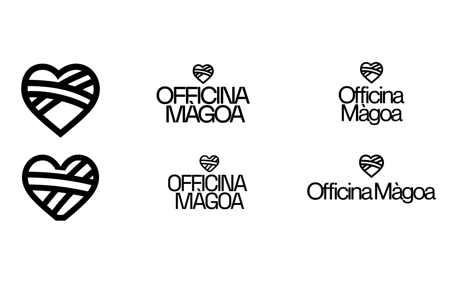
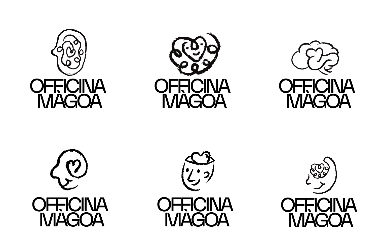
Part of the logo design process for Officina Mágoa
They loved it. And from that point on, the process became freer, more personal, and more meaningful. Sometimes the right direction is the one you find when you stop trying to get it right.
The final logo system for Officina Mágoa
2. Keep what feels raw even if it started as a mistake
Design doesn’t always need to be polished. Sometimes the imperfect bits—a quirky detail, a slightly off texture, a layout that just feels right—are what give a project its soul. If something works emotionally, don’t over-refine it just to make it cleaner.
Nessa is a gymwear brand that’s all about feeling good in your skin, without pressure or performance. When I started working on the logo, I sent over a quick hand-drawn butterfly sketch, just as a draft. But my client loved it as it was—grain, texture, uneven lines and all—so we kept it. Even the vector version was redrawn carefully to preserve that raw, organic feeling.
The wordmark followed the same path: starting from a slightly irregular font, I redrew the letters by hand to make them feel human, as if they were written with a pencil rather than typed on screen. That decision to embrace the imperfect became the foundation of the entire brand: a visual language that’s expressive, personal, and deeply connected to its values.
Sometimes what feels right emotionally is the right choice, even if it began as a throwaway sketch.
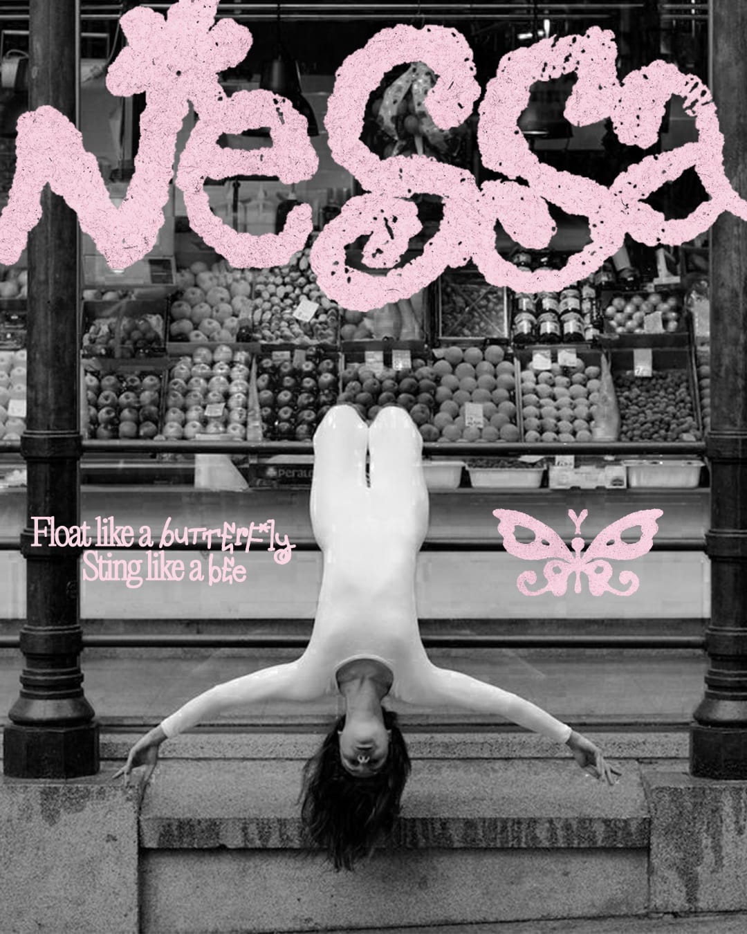
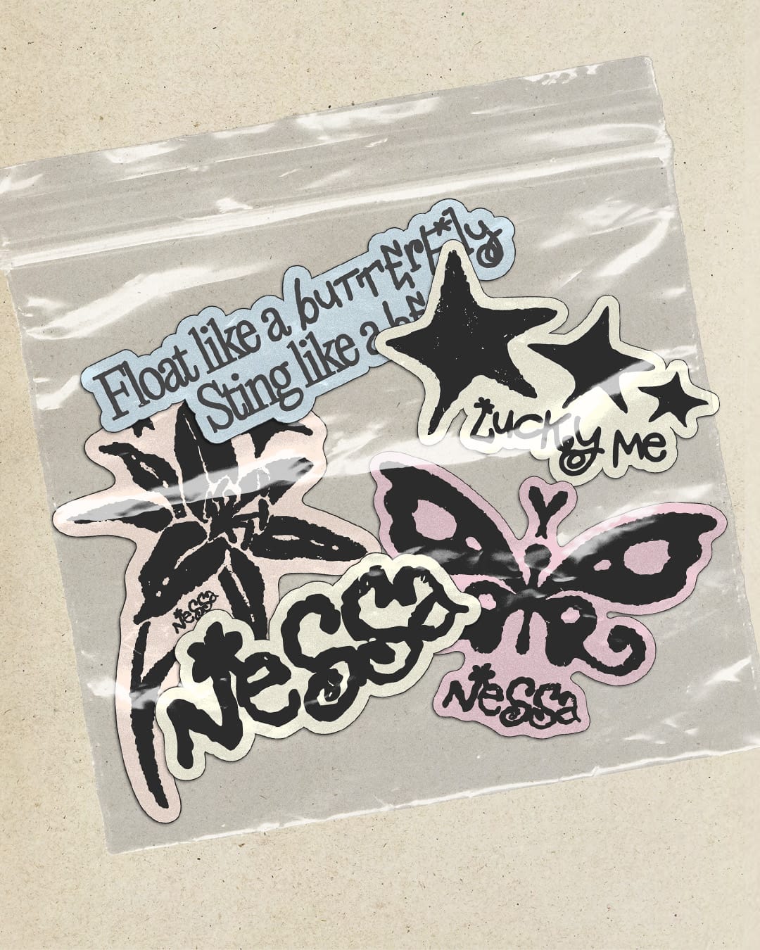
Nessa branding by sainthelenastudio
3. Start from something real
A scanned sketch, a real life object, a texture. Grounding the design in real-world inspiration often brings depth that digital-only work can lack. It adds friction in the best way.
Paper Archive was meant to be a website for a photographer, but from the start, it felt more like a memory box than a portfolio. The client ghosted me, so I turned it into a Readymag template, and honestly, I’m glad I did, because now I can’t wait to see how others will make it theirs, filling it with the objects and passions that shape their own lives.
The whole concept was built around a tactile, nostalgic feeling, with real scans, layered objects, and personal details scattered across the homepage: crossword puzzles, dried flowers, a record that moves out of its slip case on hover, a digital camera, even a post-it where you can write notes. Everything is draggable, slightly animated, arranged to feel like a real desk, not a layout. The archive works like a physical album, with scanned Polaroids and postcards, complete with creases and scratches. Even the Contact page plays along: there’s a Polaroid of the artist and a post-it that unfolds to show clients’ contact details.
And while all the photos are placeholders for now, the site is already full of personality, because the design isn’t just there to present the work, it becomes part of the work. That’s what I love: using design to build spaces that feel like people.
Paper Archive website that became a Readymag template, available for purchase
4. Build from scratch when you can
Presets are convenient and fun, but they can erase what makes a project unique. Starting fresh takes more time, but it creates space for ideas that wouldn’t exist otherwise—ideas that are truly yours.
When I came across the Sriracha Display font by Andrey Azizov, something clicked in my brain. A font entirely made using actual Sriracha sauce, drawn letter by letter, scanned and digitized, it was the most unexpectedly brilliant example of building from scratch. As Azizov tells it for Supergraphic: “I bought a few bottles and went up to my roof in what can only be described as a spicy science experiment. After hours of work and teary eyes I had a font’s worth of letters that I digitized and edited to make them as beautiful and useful as possible.”
There’s something so meaningful in that kind of process, creating with your own hands, and starting from nothing but an idea. No templates, no shortcuts: just time, effort, and a totally personal point of view. It reminded me that sometimes the most unique results come from stepping away from the screen and getting your hands dirty—literally.
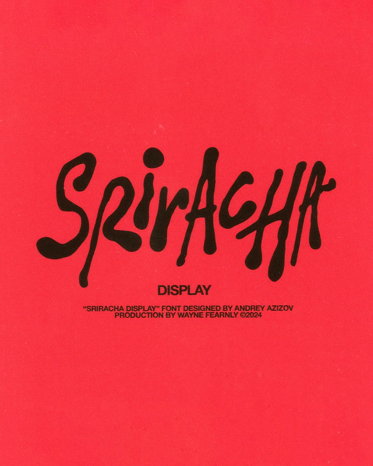
“Sriracha Display” font by Andrey Azizov
5. Let the first version be ugly
Everything starts a little rough, vague, unbalanced, not quite there—and that’s okay. Give the work time to evolve. Don’t rush to make it “look good” before it has something to say.
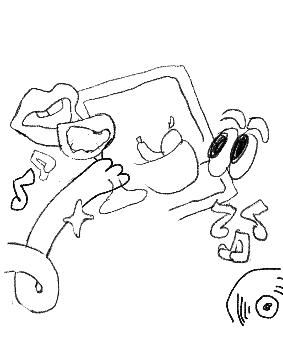
For most of my projects, especially illustrations, I always start with a loose sketch. It’s not meant to be pretty, it’s just there to start, like cracking open the page or breaking the silence on the iPad screen. With Music Atelier, a project that curates and organizes music events across Italy, some of the illustrations actually came to life during our briefing calls.
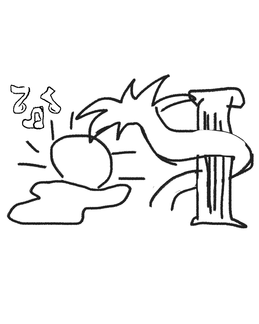
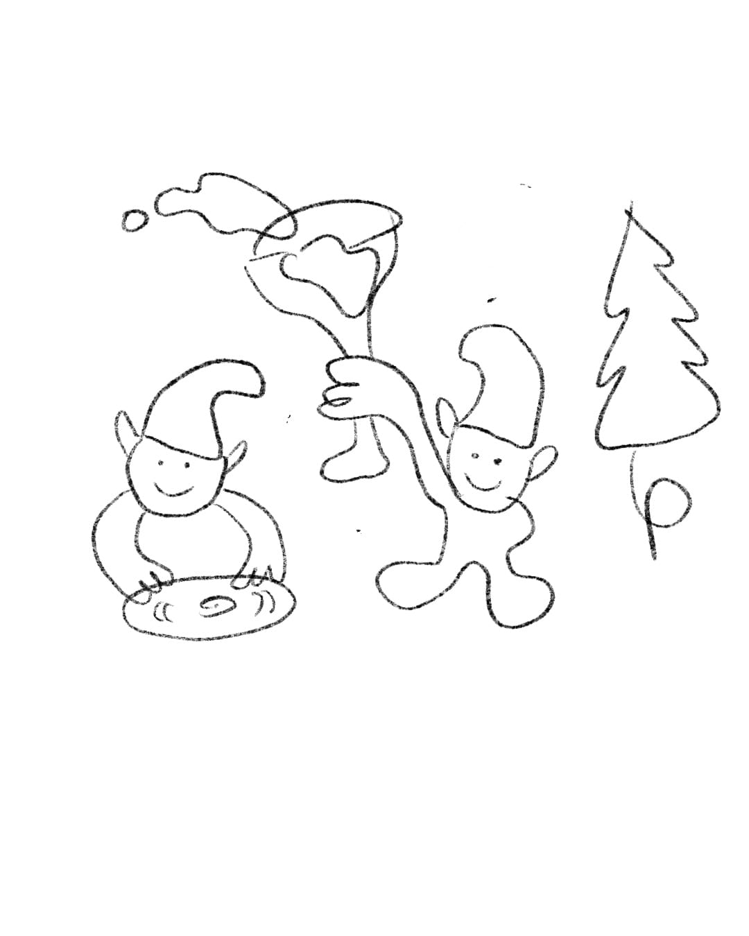
First versions of event flyers for Music Atelier
They’re quick, messy, and sometimes a bit silly, but they’re the root of everything that comes after. That spark of spontaneity is just as valid, and just as valuable, as the polished outcome.
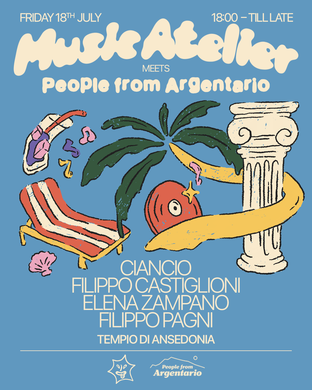
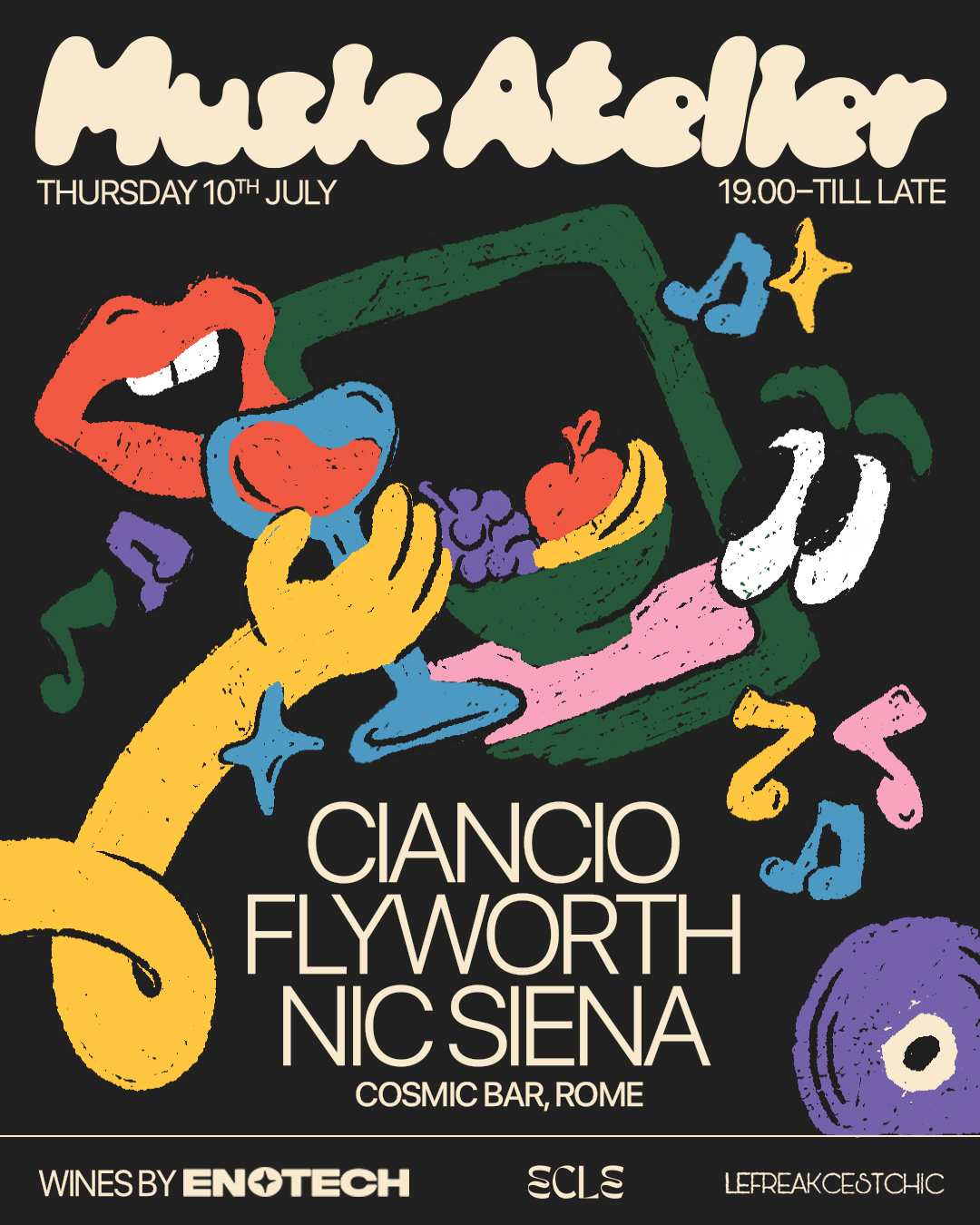

Final versions of event flyers for Music Atelier
6. Create like no one’s watching
Stop designing for approval or performance. The best ideas often come from messing around, working from bed in your pajamas, having crumbs on your keyboard and not being super hot while designing. Not knowing exactly what you’re doing is in, and you should be okay with that.
Since I started sharing my work online, I’ve noticed how being a creator has affected my process. When I’m designing, I often catch myself thinking: should I film this? And honestly, that part can be stressful. Especially when the process is messy—which it usually is.
When I first started creating content, I felt like I needed the right setting: a cute outfit, makeup, an aesthetic space to film in. But the reality is that most of the time I design from my sofa, in my half-unpacked home because I just moved in. I design while eating (not ideal, but it happens), with my hair all over the place, wearing my biggest t-shirt and comfiest sweatpants. Sometimes I’m working on a train, or at my aunt’s house while babysitting her cat, with the cat literally sitting on my laptop.
And that’s fine—that’s the freedom I wanted when I chose to freelance. The work doesn’t have to look good while it’s being made, it just has to feel natural and real.
7. Approach each project as a story, not just a solution
A brand is more than its final logo or polished guidelines: it’s the story you build into it. Every choice of type, color, or visual element can carry a piece of that story, making the identity feel alive rather than sterile. You don’t have to be literal: the visuals can hint at the atmosphere, values, and moments that shaped the project. When the design reflects both the outcome and the journey—the ideas, shifts, and decisions along the way—it creates a deeper connection between the work and the people who experience it.
For Così Cosà, an organisation that hosts “Cerchi Filosofici”, open, philosophy-inspired discussion circles, the story was there from the start. It was born from something deeply human: those late-night conversations with friends, sitting on plastic chairs outside a bar or by the beach, asking questions about everything and nothing. The name itself, Così Cosà, isn’t a real word, but it means “so-so” in Italian in a playful, casual way, almost “a bit random”. It’s both a nod to the opposite of how philosophy is usually approached in academia and a blank space, an open invitation to join without expectations.
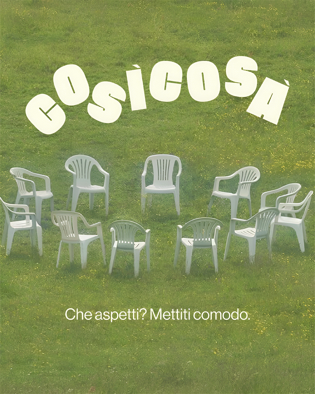
The entire visual identity grew from a quick, almost throwaway sketch of a classic monobloc plastic chair. It’s not a literal logo for “discussion circles”, but it perfectly captures the intent: each meeting has a secret theme, revealed only at the start, so people show up for the conversation, not the headline.
Social posts capture the atmosphere of places and moments, with candid photographs of the chair. Illustrations are simple and spontaneous, like the doodles you make on a napkin while talking at the bar. The tone is intentionally informal, making reflection and dialogue feel like an everyday practice that belongs to everyone.
8. Always make space for play
Not every idea needs to become a final product: some things are just experiments, visual jokes, or inside references. Those moments of creative play help keep the spark alive, and often lead to bigger things.
For this one, I just wanted to try out some packaging software, so I made a cookie box I’d love to see on a supermarket shelf, with my favorite kind of cookies (of course): chocolate chip. I gave it an edgy and fun vibe with a crocodile mascot biting into a cookie and the name Cranky Crunch, along with bold colors, sketched illustrations, a handwritten logo paired with a classic serif, and a cute puzzle on the back to entertain myself while having my lil breakfast. I never printed it, it never became a real project—but it was fun, and that was enough.
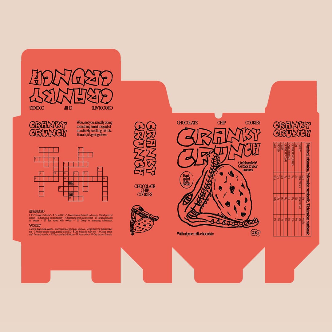
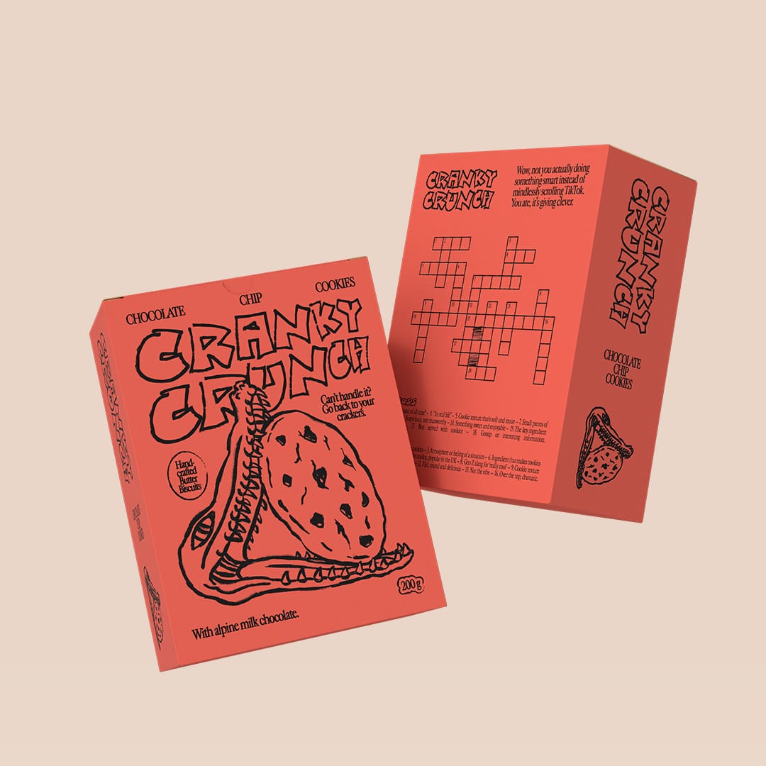
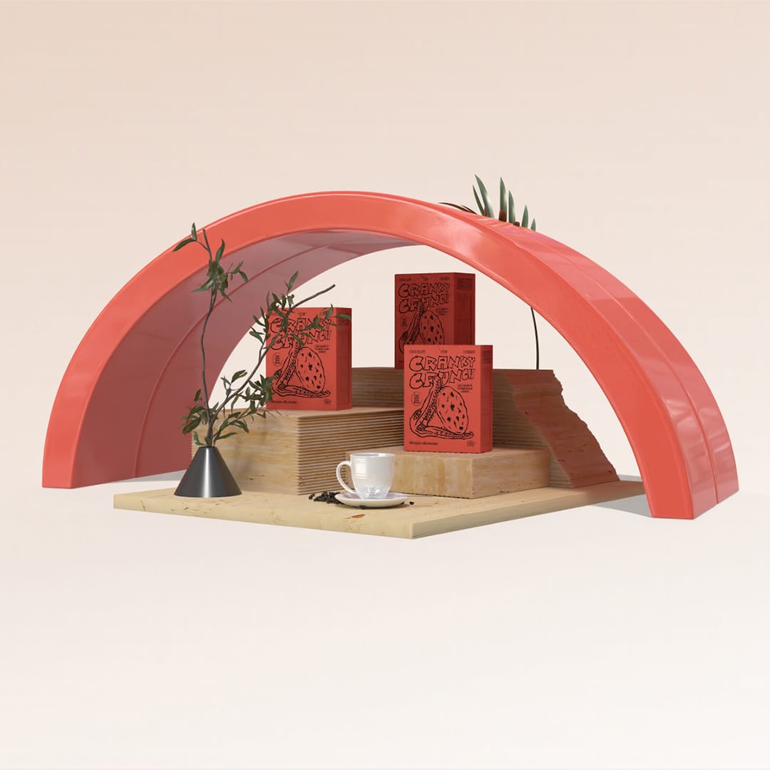
Packaging design for Cranky Crunch
9. Let your voice evolve
Your taste, your process, your style: they’re not fixed. What feels like “you” today might not feel right tomorrow. That’s a good thing—it means you’re growing. Let your work change with you.
I have this habit of “insulting” my old designs, logos, and posters, but I shouldn’t. They represented what I liked and what resonated with me at the time. One fun way to see how your style has evolved is to redesign your old projects. I do this all the time, like completely restyling my website every now and then. My personal branding has already changed three times since I started freelancing, and even though I think my current logo is here to stay, everything around it keeps evolving: business cards, my website, even my profile photos. This winter I loved my headshot; now I can’t stand it, because it just doesn’t feel like me anymore. And that’s exactly the point—letting your work grow with you.
sainthelenastudio’s branding elements
10. Let your taste lead, not the trends
Trends come and go, but your taste is what stays. It’s what makes your work feel personal and consistent over time. Honor it. Shape it. Let it lead, even if it’s not what’s trending on your feed.
Over the years, I’ve found my own visual language: rough sketched and illustrated elements, nature and animal references, music and food themes, and typography that pairs a creative display font with a clean sans serif. And I’ve noticed something, clients usually come to me for that style, not because I’m following the latest trend. That’s the point: your style becomes your signature, and it’s worth protecting, even when the feed is screaming for something else.
What’s most powerful about designing this way—playfully, expressively, a little offbeat—is that it doesn’t take anything special. You don’t need permission or to follow the rules. You just need a story, and the desire to share it in a way that feels true to you. Because design, at its core, isn’t about making things perfect—it’s about making things meaningful.